U.S. TOTAL PET SPENDING $63.4B…UP $2.6B: MID-YEAR UPDATE
In a reversal of the normal flow, we first looked at the performance of each of the 4 Pet Industry Segments in the Consumer Spending Survey conducted by the USBLS. We saw a definite disparity between the segments, both in the overall performance and in the demographics of consumer spending behavior. Now let’s put these different parts together to get the Industry Total covering the period 7/1/2014 to 6/30/2015.
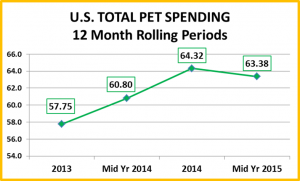
Total Pet Spending is now $63.38 B. Let’s put that into perspective with recent history.
After strong growth in 2014, spending in the first half of 2015 was down. Let’s compare like time frames:
- 2014 vs 2013: Sales up $6.6B (+11.4%)
- By Half Year vs previous year: Jan>Jun 14 up $3.05B; July>Dec 14 up $3.52B
- Mid-Year 2015 vs Mid-Year 2014: Sales up $2.6B (+4.2%)
- By Half Year vs previous year: July>Dec 14 up $3.52B; Jan>Jun 15 down –$0.94B
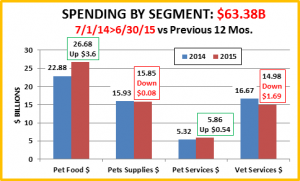
Now, let’s look at the numbers by Industry Segment:
Observations
- Food is driving the entire increase…with a little help from Services.
- It’s not a 12 month issue…Total Sales were up $6.6B in 2014 and the Jul>Dec 14 $ are included in both the annual and mid-year reports. Let’s look closer.
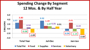
In this chart we look at $ change by segment overall and by 6 month time periods.
Observations – Does Price Matter?
- July to December of 2014 was a “dream” half year. All 4 segments were up…3 for about a $ Billion each.
- January to June of 2015 brought a different story. Retail pricing is likely a factor:
- Supply Prices were up versus a year ago…sales fell $1 Billion.
- Food Prices were up…slightly for the entire 12 months which countered the recent deflation and contributed to the huge increase. Notice the different behavior in these 2 product segments.
- Services saw their growth slow in the first half of 2015 as inflation reached 3.2%.
- Veterinary Services had a precipitous, inflation driven drop in virtually all age and income demographic groups. Only the Over 65 and Under 25 age groups and the Under $30K income group showed increases. Note: 65> and <25 make up a big portion of the Under $30K group.
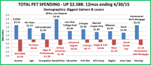
Total Pet Spending increased $2.58B in the 12 months ending June 30, 2015 versus the same period a year earlier. Two segments were up and two were down. In the next chart we’ll “Show you the money”! We’ll identify the specific segments within each demographic category with the biggest gain or loss in Total Pet $pending.
- Income Winner – Over $100K. Money does matter. These high income households, 21% of the total number, generated 137% of the Total Pet Spending increase…so the remaining 79% of U.S. H/H’s were down a total of –$.95B. Although even the over $100K group had a drop in Veterinary Spending, -$0.2B.
- Income Loser – Middle Income America – The $50>$80K group had a $0.4B increase in Food but spending fell in every other segment, including a -$2.9B drop in Veterinary.
- Age Winner – The 65>74 group, primarily aging “Boomers”, spent 1.29% of their total H/H expenditures on their pets and had increased spending in every segment.
- Age Loser – The 45>54 age group has the highest income, but their spending still decreased slightly in every segment except Services which was up $0.2B.
- Occupation Winner – Self Employed had a spending increase in every segment but Supplies, which was down –$0.2B. Most of their increase was due to a $1.2B increase in Veterinary spending.
- Occupation Loser – Managers and Professional increased spending in 3 segments, including a $1B increase in Food. However, this was not enough to overcome a -$3.7B drop in Veterinary spending.
- Race/Ethnic Winner – The White, not Hispanic group generated 192% of the Industry’s total increase but even they were down -$0.3B in Supplies.
- Race/Ethnic – African-Americans actually had increased spending in Supplies and Services but decreases in Food and especially Veterinary, -$1.3B pushed them negative. Hispanic and Asian Groups were also down in Total Pet Spending by -$1B.
- Education Winner – The group with Less than a College Degree had the largest Total increase, including even a $0.1B increase in Veterinary spending. Although their spending on Supplies was down -$0.2B.
- Education Loser – The Advanced Degree group was the only education level with a decrease in Total Pet Spending and it was only -$0.05B. Pet Parenting crosses every level of Education.
- H/H Size Winner – 2 People only was the big winner with increases in everything but Services. Although every H/H size of 2 or more people had an increase in Total Pet spending.
- H/H Size Loser – 1 Person H/H Spending was driven down by decreases in Supplies and Veterinary.
- H/H Composition Winner – With increases in all segments, Married Couple Only H/H’s had the biggest gain.
- H/H Composition Loser – Single and All/Other Households – No surprise here.
- Region Winner – Midwest: A big increase in Food and Services; Flat in Vet and down -$0.5B in Supplies.
- Region Loser – West had increases in 3 Segments but a -$2.3B drop in Veterinary made the difference.
- Area Type Winner – Rural areas with <2500 Population and not within a Metropolitan Area are surprisingly the biggest winner with increases in every segment but Supplies, which was down -$0.2B. Never fear, The Urban areas outside the Central City are also up $1B, despite a -$1.1B decrease in Veterinary spending.
- Area Type Loser – A decrease of –$1.1B in Veterinary Spending made the Central City negative…slightly.
- Housing Tenure Winner – Homeowners without a mortgage is a bit unexpected. They are down slightly in Supplies and Services – a total of only -$0.06B. Food & Veterinary are up an incredible $3.6B.
- Housing Tenure Loser – Another surprise. Homeowners with Mortgages were up $1.9B in Food and Services but down -$0.1B in Supplies and -$3.1B in Veterinary. Even Renters were up $0.4B overall.
Comments
Without the spectacular performance by Pet Food, this would be a completely different report. Food was the positive “Driver” across almost all demographic segments. Some of the winners and losers were the “usual suspects” – High income and White, not Hispanic were big gainers. Central City and Singles lost ground. However, there were some groups that are new to the chart. Among the winners were the 65>74 age group, 2 person H/H’s, Married Couple Only and Homeowners without a mortgage. Actually these 4 groups all reflect many demographic characteristics of older Baby Boomer H/H’s. The under 25 group also had a good showing and are also more likely to be 2 person households. Unusual losers were Homeowners with mortgages and Mgrs/Professionals. In September, we’ll see how the second half of 2015 matches up against the “dream” second half of 2014.
