Retail Channel Monthly $ Update – March Final & April Advance

It has been a full year since the Retail market bottomed out in April 2020, so this month’s retail update is particularly significant. Consumer spending behavior continues to evolve. In this report we will track the changes, migration between channels and the retail recovery with data from two reports provided by the U.S. Census Bureau.

The Reports are the Monthly Retail Sales Report and the Advance Retail Sales Report. Both are derived from sales data gathered from retailers across the U.S. and are published monthly at the same time. The Advance Report has a smaller sample size so it can be published quickly – about 2 weeks after month end. The Monthly Final Report includes data from all respondents, so it takes longer to compile the data – about 6 weeks. Although the sample size for the Advance report is smaller, the results over the years have proven it to be statistically accurate with the final monthly reports. The biggest difference is that the full sample in the Final report allows us to “drill” a little deeper into the retail channels.

We will begin with the Final Retail Report for March and then move to the Advance Retail Report for April. Remember, the maximum retail impact of the pandemic occurred in April 2020, but it began in March. We will compare 2021 to both 2020 and 2019 to document the progress that the retail market has made towards a full recovery.

Both reports include the following:

  • Total Retail, Restaurants, Auto, Gas Stations and Relevant Retail (removing Restaurants, Auto and Gas)
  • Individual Channel Data – This will be more detailed in the “Final” reports and we fill focus on Pet Relevant Channels

The information will be presented in detailed charts to facilitate visual comparison between groups/channels of:

  • Current Month change – % & $ vs previous month
  • Current Month change – % & $ vs same month in 2020 and 2019
  • Current YTD change – % & $ vs 2020 and 2019
  • Monthly and Year To Date $ will also be shown for each group/channel

First, the March Final. Retail hit bottom in April but began recovery, hitting record $ in December. In January & February $ fell but were still records for those months. Sales skyrocketed in March, beating December for a new all time $ record. Here are the major retail groups. (All Data is Actual, Not Seasonally Adjusted)

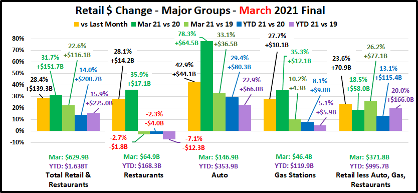
The final total is $2.0B more than the Advance report projected a month ago. All Groups but Relevant Retail were up. The specifics were: Auto: +$1.7B; Restaurants: +$0.9B; Gas Stations: +$0.8B; Relevant Retail: -$1.2B. All groups were up vs February and Total Retail set a new monthly record of $629.9B. Total $ales broke $600B for the first time in December and set individual monthly records in both January and February thanks to strong performances by Relevant Retail and Auto. In March, all groups contributed to the new monthly record and all, but Restaurants were positive in all measurements. Restaurants are still slightly negative vs 2019 and YTD but overall, Retail is strongly recovering.

Now, let’s see how some Key Pet Relevant channels were doing in March.

  • Overall– All 11 channels were up vs February and 10 of 11 were up vs March 2020 and March 2019. In YTD $, 10 were up vs 2020 and 9 vs 2019. March was a strong month, both overall and in the details.
  • Building Material Stores – Their amazing lift continues. The ongoing surge came as a result of pandemic spending patterns developed in 2020. Consumers began focusing on their homes. They’re still showing 20+% increases, with Farm Stores leading the way with 30+% increases in all measurements. Sporting Goods stores are not in this group but have a similar spending pattern. Sales took off in May, hit a record peak in December and continued strong into 2021, spiking in March. Compared to 2019, they are +67.6% vs March and +51.6% YTD
  • Food & Drug – Supermarkets finished 2020 up +$77.7B. Sales are up vs February but down vs the March 2020 binge. They are up YTD vs 2019 but about even with 2020. Drug Stores ended up +$17B (+5.7%) for 2020. Their $ fell in January and February but March $ set a new record. All measurements are positive and YTD $ are +3.0%.
  • General Merchandise Stores – $ in all channels had been falling from their December peak but sales in March grew 25% from February. Discount Department Store were having problems even before the pandemic, but they led the way in the March lift, +34.9% vs February. Clubs/SuperCtrs and $ Stores remain strong. These channels promote value. Their success in all measurements reinforces its importance in Consumer spending decisions.
  • Office, Gift & Souvenir Stores– March brought a big $ lift…finally. They were hard hit by the pandemic and still have negative numbers vs 2019 – monthly and YTD. Recovery is still a long way off but might be on the horizon.
  • Internet/Mail Order – The pandemic has accelerated this channel’s growth. Last March they were up 12.5% YTD vs 2019. This year they are up 46.6%. The pandemic lift spending pattern basically doubled the rate of increase.
  • A/O Miscellaneous – This is a group of small to midsized specialty retailers – chains and independents. It includes Florists, Art Stores and Pet Stores (22>24% of total $). Pet Stores were usually essential, but most stores were not. Stores began reopening in May and the $ grew. Their 2020 total sales were up +11.6%. March YTD sales are +$4.8B (+23.2%) vs 2020 and +$7.6B (+42.8%) vs 2019. Recovery is here and with continuing growth!

The Relevant Retail Segment began recovery in May, reached a record level in December, then $ fell in January & February. March set a new monthly record and virtually all members of this group are showing growth. Currently the key drivers are the Internet, SuperCtrs/Clubs/$ Stores and Hdwe/Farm. Now, here are the Advance numbers for April.

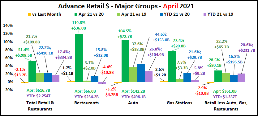
2020 will always be a memorable year for both its traumas and triumphs. In April & May we experienced the 2 biggest retail spending drops in history, but the problems actually began in March. Sales increased slightly from February but were $34.1B less than March 2019. Retail sales began to recover in June and in October, YTD Total Retail turned positive for the 1st time since February. In December, Total Retail broke the $600B barrier – a historic first. While sales fell from their December peak, monthly sales records were set in both January and February. Then they took off again in March, breaking $600B again while setting a new monthly sales record of $627.9B. April sales were down slightly but were the second highest in history. April Sales from all the major groups were close to March $. YTD Restaurant $ were down slightly from 2019. This is the only negative vs 2020 or 2019 for any group. In April of 2020 Retail sales fell $100B from 2019, the biggest monthly year over year drop in history. In March 2021 sales were up $152B over 2020. In April, the increase over 2020 was $209B. Certain retail segments and other areas of the economy are still suffering, and spending habits have changed but the overall Retail marketplace has recovered and is stronger than ever.

Total Retail – In March, Total Retail set a record for the most spending in any month in any year. In April, $ales dipped by -$13.2B (-2.1%) to $616.7B but were still $209.5B (51.4%) more than April 2020 – a new record increase, double the size of last year’s record drop. If you compare the YTD 2021 spending to 2019, you see an increase of $334.8B (+17.4%). That is an average annual spending increase of 8.4%. If you just looked at these strong topline growth numbers, you would not suspect that a retail spending crisis had ever happened. Always look below the surface.

Restaurants – This is the only big group with any negative measurements. Last February YTD sales were up 8.1% vs 2019. The Pandemic changed that. Restaurants started to close or cease in person dining in March and sales fell -$33.3B (-52.5%) compared to March 2019. Sales bottomed out in April at $30.1, the lowest April sales since 2003. Sales started to slowly increase in May but never reached a level higher than 88% compared to the previous year. 2021 started off slowly. Through February,  YTD sales were down -16.7% from pre-pandemic 2020 and -10.0% from 2019. In March sales took off. They grew slightly in April but were more than double April 2020 and even ahead of 2019. YTD their $ are ahead of 2020 but still $10.8B (-4.4%) behind 2019. They are not “there yet” but their recovery is strengthening.

Auto (Motor Vehicle & Parts Dealers)   – Staying home causes your car to be less of a focus in your life. Sales began to fall in March 2020 and hit bottom in April. Auto Dealers began combating this “stay at home” attitude with fantastic deals and a lot of advertising. It worked. They finished 2020 up 1% vs 2019 and have returned to a strong positive pattern in 2021. The “attitude” grew amazingly positive in March and slowed only slightly in April as sales exceeded $142B in both months, by far the 2 biggest months in history. To show how well consumers responded to their campaign you just need to look at the data. This group has exceeded $110B in monthly sales only 10 times in history. 8 of those occurred after the onset of the pandemic.  YTD Avg Growth Since 2019 = +12.6% – the best performance of any big group.

Gas Stations – Gas Station $ales have been a mixed bag. If you drive less, you visit the gas station less often. Sales turned down in March 2020 and reached their low point in April. They moved up but generally stayed about 15% below 2019 levels for the rest of 2020. In February they were still behind 2020 in monthly and YTD $ but ahead of 2019 in both measurements. In March, sales skyrocketed. They increased only slightly in April but were 77.4% above the April 2020 “bottom”. They have been positive in all measurements vs both 2019 and 2020 since March. Their comeback continues but there is another factor that must be considered – inflation. Gas prices can be pretty volatile. They dipped in the first 2 months of the pandemic but then returned to more normal levels for the balance of 2020. They began strongly inflating in 2021, peaking in April. The April 2021 prices were 49.6% above April 2020. That means that 64% of the 77.4% year over year lift came from just higher prices. Analyzing retail can be complicated. YTD Avg Growth = +2.9%

Relevant Retail – Less Auto, Gas and Restaurants – This is what we consider the “core” of U.S. retail and has traditionally accounted for about 60% of Total Retail Spending. When you look at the individual channels in this group, you see a variety of results due to many factors – non-essential closures, binge buying, online shopping and a consumer focus on “home”. However, overall, April 2020 was the only month in which spending in this group was down vs 2019. Monthly $ales exceeded $400B for the first time ever in December ($407B). They finished 2020 up $260B, +7.1%. Their performance was the only reason that Total Retail was able to finish 2020 with positive numbers, +0.5%. Sales fell in January and February but continued to set monthly records. In March they turned sharply up again but dipped slightly in April. Currently, they are up $80.1B, +28.5% vs April 2020 and  +$195.5B, +16.8% YTD. We should note that March ($371.8B) and April ($361.0B) spending were the third and fourth highest monthly totals of all time, trailing only December 2020 and December 2019. We should also note that the Relevant Retail group has posted positive numbers versus last year and YTD for every month since April 2020 and their average YTD growth rate since 2019 now stands at +9.8%. Through April virtually all channels have now turned positive vs 2020 and 2019. However, the primary drivers throughout the pandemic were and continue to be Nonstore, Grocery, SuperCenters/Clubs/$ Stores plus a never ending “spring lift” from Hardware/Farm and Sporting Goods.

Now let’s look at what is happening in the individual retail channels to see where the $ are coming from. April was not as big as March, but you will see that some of the increases vs 2020 are literally “off the charts”. The groups are less defined than in the Final Monthly reports and we will look across the whole market, not just pet relevant outlets.

Sales in only 2 of 13 channels were up vs record March $ but Only 1 channel was down vs March 2020 $ and 2020 YTD. A different channel was down vs 2019 numbers. (Relevant Retail YTD Avg Annual Growth Rate since 2019 = +9.8%)

After hitting bottom in April 2020, Relevant Retail has now beaten the previous year’s $ for 12 consecutive months. The group set an all-time record of $407B in December and finished  2020 +$260B vs 2019. They started 2021 strong, with record sales in every month including #3 and #4 all time in March & April. Essential channels are still the primary drivers:

  • Nonstore Retailers – The biggest driver. Online shopping continues to grow in # of households and in $.
  • Food & Beverage – Grocery– Restaurant $ are improving but consumers continue to eat & drink more at home.
  • Bldg Materials/Garden/Farm– Their “Spring” lift continues unabated as consumers focus on their home.
  • SuperCtrs/Club/Value/$ Strs – They keep the GM channel positive. Value is still a major consumer priority.

Regarding the Individual Large Channels (Includes YTD Avg Annual Growth Rate since 2019)

General Merchandise Stores – Even though sales dropped in April, all other numbers remain positive. Department Stores $ remain up vs 2020 but down vs 2019. They were having problems before the Pandemic. The growth by Club/SuperCtr/$ stores has slowed to +7.4% in April, down from +14.7% in January but these stores are still the key.

  • YTD Avg Annual Growth: All GM = +5.7%; Dept Stores = -2.9%; Club/SuprCtr/$ = +7.4%

Food and Beverage, plus Health & Personal Care Stores – Sales in Grocery were down in March and April from 2020 – No surprise, as these were 2020 binge months – especially March. The Health, Personal Care group finished 2020 at +1.8%. 2021 has started even better. With a strong March & April, YTD they are +7.8% vs 2020 and +8.5% vs 2019.

  • YTD Avg Annual Growth: Grocery = +6.6%; Health/Drug Stores = +4.2%

Clothing and Accessories; Electronic & Appliances; Home Furnishings – March & April have been spectacular for all these channels. The increases vs April 2020 were literally off the chart for Electronics and Clothing. All of these groups are now positive in all measurements vs 2020 or 2019.

  • YTD Avg Annual Growth: Clothing = +0.6%; Electronic/Appliance = +2.0%; Furniture = +10.4%

Building Material, Farm & Garden & Hardware – Their Spring lift began on time in 2020 and it has never stopped. They have greatly benefited from consumers turning their focus to their home needs. They finished 2020 +53B (+13.8%). Sales took off in March and increased in April. They are +32.9% vs April 2020 and +25.5% YTD. Avg Annual Growth = +15.2%

Sporting Goods, Hobby and Book Stores – Book & Hobby stores are open but Sporting Goods stores have driven the lift in this group. Consumers turned their attention to personal recreation and sales in Sporting Goods outlets took off. The group ended 2020 +5.5% vs 2019. The growth accelerated in 2021. January > April set monthly records and March had the most $ of any non-December month in history. In April they are +59.4% vs 2020. YTD Avg Annual Growth = +17.2%

All Miscellaneous Stores – Pet Stores were deemed essential but most other stores were not, so closures hit this group particularly hard. Sales hit bottom at -$3.8B in April then began to rebound. They finished with a strong December and ended 2020 down $1.0B, -0.7%. In March and April sales took off. April sales were only up 0.6% from March but +87.4% from April 2020. Remember, only 2 channels had a March>April increase. Their YTD sales are now 30.4% above 2020 and 27.0% more than 2019. It appears that their recovery has become very real. YTD Avg Annual Growth = +12.7%

NonStore Retailers – 90% of the volume of this group comes from Internet/Mail Order/TV businesses. The COVID-19 crisis accelerated the movement to online retail. In February 2020 NonStore $ were 8.6% YTD. In December monthly sales exceeded $100B for the 1st time. They ended 2020 at +21.4%, +$162.9B. Their increase was 63% of the total $ increase for Relevant Retail Channels. Their 2020 performance far exceeded their 12.9% increase in 2019 and every month in 2021 has produced record $. April is +14.2% vs 2020 and YTD $ are +20.8%. YTD Avg Annual Growth = +18.7%

Note: Almost without exception, online sales by brick ‘n mortar retailers are recorded with their regular store sales.

Recap – 2020 was quite a year. April & May had the 2 biggest year over year sales decreases in history while December sales broke $600B for the first time. 2021 may become even more memorable. April and March had the 2 biggest year over year monthly sales increases in history. The total increase was +$361B for these 2 months, more than twice the -$175B decrease in the 3 months from March>May 2020. In 2021, March and April also took the top 2 spots for monthly sales. At yearend 2020, Restaurants, Auto and Gas Stations were still struggling but Auto had largely recovered. Relevant retail had segments that also struggled but overall, they led the way for Total Spending to finish the year +0.5% vs 2019. 2021 has started out even more positive. The Auto Segment is setting sales records. Gas Stations $ are now all positive and YTD Restaurant $ are only slightly below 2020 and 2019. As documented in the report, the recovery in Relevant retail has become real for virtually all channels and monthly sales continue to set records. Retail recovery is here…now!

Comparing the Spending Demographics of the Industry Segments – SIDE BY SIDE

The first six reports of our Pet Spending Demographics analysis have been very detailed, data driven and intense. We looked at the industry as a whole and each of the individual Industry segments separately. Recent years have seen some turmoil. 2017 was a year of Value and consumers responded with a $9.8B Pet spending increase. In 2018 we saw the very real impact of outside influence on the industry as the FDA warning on grain free dog food caused an immediate $2.3B drop in spending in the second half. New tariffs also flattened spending in Supplies in the second half. However, there was some good news. Veterinary Spending grew slightly but Services had a record increase. That brought us to 2019. Food had a strong rebound, but the impact of the Tariffs really hit home. Supplies $ fell a record $2.98B. Services had a small decrease but essentially remained stable at their new higher spending level. Veterinary $ also had another small increase but a high inflation rate actually caused the amount of Veterinary Services to fall. The result was a net decrease of 0.2% in Total Pet $. So, the turmoil continued but so did the youth movement. There were some exceptions, but Pet Spending continued to move away from Baby Boomers and towards the younger groups, especially Gen X.

We have often referenced the similarities and differences in spending between Total Pet and the individual industry segments. Total Pet Spending is a sum of the parts and not all parts are equal. In this final report we are going to put the segments side by side to make the parallels, differences and changes from 2018 more readily apparent. We will address:

  • “The big spenders” – those groups which account for the bulk of pet spending.
  • The best and worst performing segments in each of twelve demographic categories
  • The segments with the biggest changes in spending $ – both positive and negative
  • And of course, the “Ultimate Spending CUs”

The emphasis is on “visual” side by side comparisons to allow you to quickly compare the industry segments. We’ll try to minimalize our comments. You can always reference one of the specific reports for more details. We’ll also break the charts up into smaller pieces that are demographically related to make the comparison more focused and easier.

Before we get started, let’s take a look at the current market share of the industry segments. The following 2 charts show the 2019 share of spending for each segment and the evolution over the past 27 years. 1992 was the last year that the Food Segment accounted for 50% of Total Pet Spending. By the way, Total Pet Spending was $16.2B in 1992. We have come a long way – +384%; annual growth rate of 6.01%. This will help put our comparisons into better perspective.

Food: 39.8%; Up from 36.7%

Supplies: 21.4%; Down from 25.2%

Veterinary: 27.8%; Up from 27.0%

Services: 11.0%; Down from 11.1%

The Food segment rebounded to almost 40% of Pet $. Back in 2015 it was 43.5%, the highest level since 1998. At the same time, Pet Supplies fell to 21.4%, the lowest level since 2002. This is at least a short term reversal of the most visible long term industry trend – the decline of Food share as Supplies gained in importance. This began in the 90’s when Pet Owners became Pet Parents. At the same time, Pet Chains and Super Stores came to the forefront and there was a big Pet Product expansion into the Mass Market. In 2019 Veterinary spending had a slight gain, but it has been the most stable through the years. After the big lift in 2018, Services held onto to their new level of importance. Food trends and the impact of petflation on Supplies have put the Product segments on a roller coaster ride in recent years.

Now let’s get started with a look at the “Big Spenders”. The following 2 charts will compare the market share and performance in all Pet Industry segments by the groups responsible for the bulk of the spending in 10 demographic categories. These are the groups that we identified in our Total Pet analysis to generate at least a 60% market share of spending. As you recall, in Pet Services, we had to alter two groups slightly to better target the spending. However, to have a true side by side comparison we need to use the same groups for all. The market share dips below 60% in 2 cases, to a low of 57.0%. This lowest share is related to Veterinary CU Composition and is primarily due to a spectacular year by Singles. The other is in Services and reflects the urban nature of the segment. Even the low point is within 5% of our target and 96% of all measurements meet or exceed the 60% requirement, so the comparison is very valid.

The chart makes it especially easy to compare performance across categories. Remember, performance levels above 120% show a very high level of importance for this category in terms of increased spending. Unfortunately, it also indicates a high spending disparity among the segments within the category. There are 2 charts, each with 5 categories.

  • White, Non-Hispanic – This group has an 84+% market share in every Segment. Minorities account for 31.4% of CUs but only 9 to 15% of spending in any segment. Factors: Lower income for Hispanics and African Americans and lower Pet ownership in Asians and African Americans. They had a slight share gain in Total with larger gains in Services and especially Food. Veterinary was unchanged but the Supplies share plummeted, replacing Food on the bottom.
  • Homeowners – Homeownership is very important in Pet Ownership and subsequently in all Pet Spending. It also increases with age. This group’s share of Total Pet bounced back after falling below 80% for the first time in 2018. Veterinary again held its ground, but Food and Services had share increases of 4%. Supplies lost 3 points in share and is now the only segment under 80%. Homeowners with or w/o a Mtge were up in Food and down in Supplies. Their results were mixed in the Service segments. Renters spent less in all segments but Veterinary.
  • 2+ People in CU2 is the magic number in pet ownership. This year, all segments but Food fell in share and performance because Singles had another good year. This group is still under 120% because spending peaked at 3 person CUs in all segments, but Services (2 person CUs) then went down in 4+ CU’s. In both Service segments the performance of 5+ person CUs is actually worse than singles.
  • Associates Degree or Higher – Higher education often correlates with higher income and we see a similar spending pattern. The group grew in size but fell in share and performance in all segments, but Services. The biggest decrease in share (-2.8%) and performance (-7.7%) came in Veterinary, while Services gained 3.7% in share. Spending became a little more balanced in terms of Education in all but the most discretionary segment – Services.
  • Everyone WorksIncome is important, and the # of Earners became more important in 2019, with one exception – Services. The difference in Services came from a big lift from Single, No Earner. Younger CUs have more earners and pet spending has been skewing towards the younger generations. Note: 2 Segments have reached the 120% level.

  • All Wage & Salary Earners – Incomes vary widely in this group, so performance tends to be lower. However, all segments, but Services gained in share and performance. The biggest gains came in Food and Veterinary. The Food increase was driven by White Collar while the Veterinary lift came from all workers while their “Bosses” spent less.
  • Over $70K Income INCOME MATTERS MOST IN PET SPENDING! As spending becomes more discretionary the importance of income increases. Food still has the lowest share and performance but had the biggest gains. The only segment with decreased share and performance was Veterinary. Veterinary spending became more income balanced while Food went in the opposite direction.
  • 35 to 64 yrs – Includes the 3 highest income segments. This group increased both share and performance In Total Pet due to Food where performance reached 120%. Supplies had a minimal increase but both Services segments fell with Services performance falling below 120%. All ages in the group spent more on Food but the results were mixed for other segment. Overall, the best performance came from the 35>44 yr olds, followed by 55>64.
  • All Suburban – Most Pet $ are spent here and they gained ground in all segments but Supplies. The biggest driver in their performance was the bigger Suburbs, 2500>. The biggest lift was in Services where performance broke 100% for the 1st time. Rural, Central City and Suburbs <2500 all decreased spending in Total Pet and 3 of 4 Segments.
  • Married Couples – Marriage has been important to spending in all segments. In 2019 it became less important in all segments but Food. The biggest drops came in Supplies and Veterinary. In fact, Veterinary share fell below 60% and performance below 120%. Overall, couples only did the worst but also remember that Singles had a strong year.

Now we’ll drill a little deeper to look at the Best and Worst performing segments in each category. Color Highlighted cells are different from Total Pet; * = New Winner/Loser; ↑↓ = 5+% Performance Change from 2018. We will divide the categories into related groups. First, those related to Income.

  • IncomeIncome matters, and its importance is growing in the Product Segments. The disparity between first and last place increased by 30% in Food but doubled in Supplies. The Veterinary winner dialed down from $200k> in 2018 and the disparity decreased by 16%. The gap in Services is still astronomical but down 6% from 2018. The changes in Veterinary helped to decrease Total Pet disparity by 8% but the difference is still huge in this category.
  • # Earners More earners = more income. 2 Earners became the magic number which reflects the importance of Gen X and Millennial CUs. In Supplies, 3 Earners, the highest income group, won. The disparity grew in Food but fell in Veterinary. However, the number of Earners gained in importance in all segments but Services.
  • Occupation Self-Employed and Mgrs & Professionals are #1 and #2 in CU income and expenditures. They again occupy all the top spots. The bottom spots are again occupied by either Retirees or Blue Collar workers. The disparity is growing in Food while decreasing in all other segments and Total Pet. However, this category still clearly reinforces the importance of income in Pet Spending.

Next are demographics of which we have no control – Age, Generation and Racial/Ethnicity

  • Racial/Ethnic – As expected, White Non-Hispanics are the top performer in all segments and now African Americans occupy all the bottom slots. They have the lowest income and only 25% own Pets. The disparity is large and growing in all areas but Supplies. It is not growing in Supplies because Whites spend the most and had the biggest drop.
  • AgeThe highest income 45>54 yr olds are the top performers in all but Veterinary. They took over the leadership in Pet Spending in 2018. Last year the loser in all categories was 75+. They were largely replaced by the youngest group. Once again, the disparity is growing in Food and shrinking in Veterinary.
  • GenerationBoomers still rule Food. All else belongs to Gen X. The only change from 2018 is that Millennials dialed back their Services spending. The vast majority of 35>54 yr-olds are Gen Xers so you can see the ties to the Age data.

  • EducationWinning and losing is closely tied to more and less Education which generally correlates with income. The only difference is in Supplies where the performance became a little more balanced.
  • CU CompositionMarried Couples Only are still on top in 2 categories. The biggest change was the rise of couples with an oldest child 18>. Single Parents had a terrible year and are now at the bottom in all segments.
  • CU Size– 3 is now the top number in Pet but 2>4 are all strong. Performance drops off at both ends, 1 or 5+ CUs.

  • Housing – Homeowners w/Mortgage and Renters are the perennial winner and loser.
  • Area– Suburbs <2500 population perform the best except for the new winner, Suburbs 2500> in Services. In terms of worst performer, it is Central City in Food and Total Pet, but Rural in all other segments.
  • Region – 3 different winners, with the Northeast a surprise in Total. The South is again the overall worst performer.

Here are two summary charts. The first compares the averages.

The big change in Food is immediately apparent. In the past, the performance difference grew as you moved from Food to Supplies to Services and spending became more discretionary. In 2019, the difference between winners and losers in Food increased by 34%. The Supplies difference was down minimally. Services fell 5% and the disparity in Veterinary was down 10%. Spending became more balanced in every segment but Food. The increase in Food was so large that it pushed the Total Pet disparity up 1%.

  • Food – In Food the best and worst are actively moving apart – much less balanced in more demographics.
  • Supplies – Despite a big drop in $, the relative performance in Supplies remained rather stable.
  • Veterinary – The performance of both winners and losers fell significantly, but the gap narrowed about 10%.
  • Services – The performance of the Best and Worst both declined but they still moved a little closer together.

This chart shows the number of new winners/losers.

Total Pet had few changes, especially in losers. Total Pet is a sum of the segments. This can mitigate or even cancel out extreme differences in segments. Always look below the surface.

  • Pet Food had a large increase in spending, a complete reversal from 2018. However, there were only 7 changes, which is the same as last year when spending fell sharply in the second half.
  • Supplies is the most stable. A record drop in $ produced very little change in top or bottom performance.
  • The Veterinary spending increase was minimal but a 46% change in winners/losers is evidence of some turmoil.
  • Services had a decrease in $ and but their performance change was 29%, the same as Food.

Now, let’s look at the Demographic Segments with the Biggest Changes in $. We’ll truly see some differences between the Industry Segments. We have color highlighted differences from Total Pet. Plus:

  • Boxed w/green = Winner/Loser same as 2018
  • ↕ = Flipped from 1st to Last or vice versa

First, the Income related categories.

  • Income – There was no clear pattern with 4 different winners but 3 were under $40K. There were 3 different losers but 4 earned less than $70K. It appears that the biggest changes – up or down, came from lower income segments.
  • # Earners1 Earner, 2+ CUs had another bad year, losing in 4 areas. 2 Earners had the best year, with 3 wins. Singles had an OK year. They had 2 wins – split between 1 and No Earner. Of course, 1 Earner, Singles did lose in Services.
  • Occupation A bad year for the “bosses” in every area but Food. Self-Employed won in Food and Mgrs & Professionals lost in every area but Food. Retirees had 1 win and 1 loss. Most of the winning came from lower level wage earners. All this indicates a move towards more demographically balanced spending.

Now the Age and Racial/Ethnic Categories

  • Racial Ethnic White, non-Hispanics won in all but Supplies, where they were the big loser. They spent the most on discretionary Supplies, so this is no surprise. The other 4 losers were split between Hispanics and African Americans, the lowest income groups. African Americans had the smallest decrease in Supplies because they never spent much.
  • Age There were 4 different winners, with 75+ being a big surprise. 4 losers were evenly split between 35>44 and 45>54 as they dialed back from 2018. The 35>44 group flipped to last in 2 areas. The <25 group did lose in Food.
  • GenerationThe younger groups continue to excel, winning in 4 areas. The oldest generation did have the biggest increase in Services. Boomers lost Total Pet and Veterinary while those born before 1946 came in last in Food. Gen X did finish last in 2 areas including a flip from 1st in Services. However, they are still the biggest Pet Spenders.

Now, here are more Demographic Categories in which the consumers can make choices.

  • EducationA College degree is better, but we had 2 winners without one, including those without a HS Diploma. Also, 3 losers had at least an Associates degree. It appears that spending is becoming a little more balanced.
  • CU Comp. – 2019 was about all adult CUs. Married Couples Only had another bad year but they did flip in Food. Singles won in Veterinary and Total. Married CUs with kids won and lost in Services and Single Parents lost in Food.
  • CU Size It was a good year for 1 person CUs and bad for 2 people. The other wins/losses were split between 3 & 5+.

  • HousingHomeowners w/o Mortgage won twice, flipping from last both times. Homeowners w/Mtge are on top in 2 categories but lost Supplies. Renters won in Supplies but lost 3 times. It was a little more mixed than usual.
  • Area4 of the 5 the winners are over 2500 pop with big Suburbs winning 3. Central City won Supplies with the smallest decrease but lost in 3 areas, including 2 flips. Small Suburbs, <2500 won Food but lost Veterinary. The Suburbs ruled but we should note that Rural was a No Show. In 2018 they lost in 3 areas and in 2017 they won in 2.
  • Region The Northeast won 3, all flips, but lost Services. The Midwest had the opposite story – 3 losses and 1 win with 3 flips. The South flipped to 1st in Food but lost Supplies. What about the West? They were the best performer in Supplies and Services and last year won Food. They were up in 3 areas and down in 2 but the changes were small.

The next chart compares the number of repeats, “flips” and new segments among the 12 winners and 12 losers for each category. The idea is to look for patterns in the data that cross segments. Let’s take a look.

  • Segments were either up or down…by a lot or a little. There seems to be a different pattern in those segments with an overall increase vs those with a decrease, regardless of the size of the change.
  • In terms of repeats, you see more stability in Food/Vet ($ ↑) than in Supplies/Services ($ ↓).
  • There are also twice as many flips in the segments with a decrease in $. Supplies had the biggest decrease in $ and the most flips from 1st to last (50%). Only 12% of segments in Food or Vet flipped to last. Food rebounded from a big drop in 2018 but only 3 segments flipped from last to first so the $ didn’t come from most of last year’s losers.
  • You can see how the combined segments made Total Pet stable – the most repeats, few flips and the least new.

Next, there were so many positive contributors that in each individual report we recognized 6 segments that didn’t win but still performed so well that they deserved Honorable Mention. I reviewed that list again and came up with segments that won Honorable Mention in more than one segment. Here are the “SUPER Honorable Mentions” for 2019…

You can immediately see that it was an unusual year as 3 segments made the list, even with small decreases in Supplies. Another trend is obvious. All received honorable mention in Veterinary spending. This segment became more balanced in multiple categories. All of the segments on the list are generally “low profile” but contributed notably to the industry. One group deserves special notice. The $70>79K segment actually had the biggest increase in Total Pet $ of any income group. They did it with a strong performance in all segments, including a +11.8% increase in Food.

Although the results were mixed, with numerous individual changes, I saw these trends of note:

  1. Youth Movement – The Boomers continue to fade as the Gen Xers step up, with the Millennials close behind.
  2. Sub-Urbanization – Center City flips every year with the $ change. The Suburbs are the key. Suburbs <2500 are the top performers but the Suburbs 2500> spend the most and are the only area that increased $ every year since 2016.
  3. “2” is a less “Magic” number – Singles again had the biggest spending increase, and 3 Person CUs are the best performer in Total Pet and all segments but Services.
  4. Changes in spending balance – The performance gap between the best and worst narrowed in both Services segments. However, the disparity in Pet Food grew by 34%. That’s not good in this truly necessary segment.
  5. Income is still the most important factor – While the gap between best and worst narrowed in Services and Veterinary, it widened in Products, especially Food. The best performer is always $150K+ while the worst is <$30K.

And Finally, What you have all been waiting for…

THE ULTIMATE 2019 PET SPENDING CUs – Side by Side

Color Highlighted cells are different from Total Pet; * = New in 2019

Methodology – The segments are chosen because they have the highest annual CU spending of any segment in the category. They may or may not have the most total dollars. That would depend upon the number of CUs in the group.

Final Comment – These “winners” further reinforce the key factors in increased pet spending:

  • Marriage – A commitment to another person demonstrates that you can make a commitment to your pet “children”.
  • CU Size – The “magic” number has changed from 2 to 3.
  • Homeownership – Owning and controlling your own space has long been a key factor in Pet Parenting.
  • More space – Small suburbs near a big metro area offer the convenience of the city, plus room for more pets.
  • Income Matters Most – High Income, A High Paying Occupation, A College Degree, At Least 2 Earners. These are characteristics present in all of the Ultimate Pet Spending CUs.
  • Generation– The Boomers have officially passed the torch to Gen X. Age Note: All 45>54 and 60% of 35>44 are Gen Xers.

I hope that this Visual Comparison helped you to get a “satellite view” of Pet Industry Spending in 2019. Please refer back to the individual segment reports to get more details.