U.S. PET INDUSTRY $ALES IN 2019: $95.7B – TAKING A CLOSER LOOK

Global Pet Expo was the showcase of the Pet Industry. It also was the forum for a major announcement from the American Pet Products Association (APPA). The revenue for the Total Pet Industry in 2019 was stated to be $95.7B. This was a huge change from 2018 numbers of $72.56B. The difference “is a result of APPA’s efforts to refine and improve its research methodology. In some cases, categories have been revised to include services or products that were previously excluded as reliable data was difficult to obtain.”

The APPA also produced revised numbers for 2018 so a comparison between the 2 years is possible. They reported that in 2018 the Pet Industry totaled $90.50B. That is $17.94B (24.7%) more than they had previously reported. That is a big revision. Let’s put an $18B increase in Consumer Spending into better perspective. $18B is 40% more than we spent on bread in 2018 and about equal to the spending on each of these categories …

  • Fresh & frozen chicken
  • Fresh Milk & Cream
  • Coffee & Tea at home
  • Beer & Wine “out on the town”
  • All non-prescription drugs
  • Non-business computers & hardware

That is a big gap in data. We can’t compare current data to years earlier than 2018 so in effect 60 years of Pet Spending History has been wiped out. It has also been removed from the APPA website so, we are left with the “here and now”…

In 2019 the APPA reported $95.7B for the Total Pet Industry. This is a $5.2B (5.75%) increase over $90.5B in 2018. As we have done in the past, we will take the APPA Retail numbers and figure in the impact of inflation or deflation so that we can see the true change in the amount of goods and services.

Since 2009 and the Great Recession, inflation has not been a big factor in the Pet Industry. In fact, both Food & Supplies have had multiple years of deflation since then. The Services segments have also dialed back their price increases to a certain extent. 2017 saw an all-time record low inflation rate of 0.4% for Total Pet. In 2018, it moved up slightly to 1.25% but in 2019, it almost tripled to 3.25%, the highest rate since 2009. Increasing prices can slow consumer spending in discretionary segments, like Supplies. In Veterinary Services spending, strong inflation has reduced the frequency of visits, especially among lower income groups.

Here are the specifics from 2019.

Pet Food and Services had the best year of any groups but still over 40% of the spending lift came from price increases.

  • Pet Food – In 2018 Pet Food prices deflated slightly, -0.02% so a CPI increase of 2.88% in 2019 was a big turnaround. However, the segment still generated a relatively strong “real” increase of 4.09%.
  • Pet Services – There has been strong competitive pressure in this segment as more outlets began offering services. This expansion may have stabilized as inflation returned to a more “normal” rate of 2.51% for this segment. The demand for Services is still there as real growth of 3.68% was the second best of any industry segment.
  • Veterinary – The Veterinary segment is known for strong inflation. Since they began measuring it in 1997, Veterinary prices have increased at a rate 35% faster than human medical care. The inflation had slowed in the last two years, but it bounced back in 2019 with a rate of 4.14%, the highest rate since 2011 and 18% higher than human medical care. We see the impact on the numbers as over 71% of a 5.8% Retail increase was from prices.
  • Supplies – Since the great recession, many categories in this segment have been commoditized. This means that inflation/deflation noticeably affects consumer spending. The tariffs which began late in 2018 drove prices up 2.83% in 2019. As a result, real growth was only 0.38% as prices accounted for over 88% of a 3.2% increase.

The next chart puts the 2019 increases into a more “visual” perspective.

This makes it readily apparent that the major driving force behind the increase in Retail Pet $ in 2019 was inflation. This is somewhat of a surprise compared to recent years. Since 2009, the depth of the great recession, the average annual inflation rate for Total Pet through 2018 was 1.31%. During the same period, the overall U.S. annual inflation rate averaged 1.76% so Total Pet was a relative “value” compared to other consumer expenditures. However, as we all know by now, we need to look deeper. While both of the Services segments maintained an inflation rate above the national CPI, Total Pet prices were driven down by 5 deflationary years in both Food and Supplies. In fact, Supplies’ prices in 2018 were 4.3% below the level in 2009. In 2019 Total Pet Inflation jumped up to 3.25%, 148% higher than the average of the previous 9 years. Is it any wonder that it was such a big factor in spending?

As we have seen in our demographic analysis of Pet Spending from the US BLS Consumer Expenditure Survey, money (income) is the single biggest factor in increased spending. Price changes can cause significant changes in spending behavior in the more discretionary segments. Since 2009 Supplies have been on a spending roller coaster as prices moved up and down in the short term. Veterinary inflation has caused a reduction in visit frequency and depressed spending in lower income groups. The Services Segment is the most discretionary, but an increased number of outlets and the resulting competition have reduced inflation and driven big increases because pet parents do like and want the convenience of Services. For years, Pet Food was immune from the impact of inflation. After all, you don’t buy more pet food than you need just because it is cheaper.  Then came the era of Super Premium Foods. At first, these foods were only available at an exceptionally high price so the first wave of consumers to upgrade were generally better educated with higher incomes. Then came a savior, (or demon, if you prefer) the internet. Suddenly prices were more affordable for more people. The mass market stores also stepped in. The overall increased competition flattened and even deflated prices, so a new wave of Super Premium upgrades produced a much deeper market penetration of this food category.

Now, let’s get back to the present. Although we can’t compare 2019 to any year other than 2018, we can look back to the beginning of the Pet Industry and compare it to the industry’s long term growth, even with the revised numbers.

The earliest data that we have from any source is from the US BLS Consumer Expenditure Survey in 1960. Total Pet Spending in that year was $1.08B. That may seem incredibly small but becomes believable when you consider…

  • 57% fewer H/Hs (73m less)
  • Only 40% of H/Hs had a pet
  • Value of $1 in 1960 was $8.64

Let’s do the math and compare the long term Retail $ & Real Growth rates to the 2018>2019 increase:

  • Average annual retail growth
    • 1960 > 2018: +7.9%
    • 2018 >2019: +5.7%
  • Average “Real” annual growth
    • 1960 >2018: +4.2% (53.2%)
    • 2018 >2019: +2.5% (43.4%)

Obviously, 2019 wasn’t an auspicious start to a new “era”. The lower retail growth is understandable as it becomes more difficult to maintain a % growth rate over a long period. The big concern is the percentage of growth that is real. It was below 50%, which is certainly below the norm. To generate a “normal” year, the growth in 2019 needed to be +$6.3B,  $1.1B more than we got. Veterinary inflation needs to be dialed back and we need relief from tariffs on Supplies.

Now, we have an unexpected and even bigger factor, COVID-19. The rapidly growing pandemic has had an immediate and sometimes devastating impact on the U.S. marketplace. Together, we will get through this health and business crisis. However, the long term impact on consumer spending behavior is unknown. We’ll just have to wait and see.


Comparing the Spending Demographics of the Industry Segments – SIDE BY SIDE

The first six reports of our Pet Spending Demographics analysis have been very detailed, data driven and intense. We looked at the industry as a whole and each of the individual Industry segments separately. 2017 was a year of Value and consumers responded with a $9.8B Pet spending increase. 2018 was a different story. We saw the very real impact of outside influence on the industry. The mid-year FDA warning on grain free dog food caused an immediate $2.3B drop in spending in the second half as many consumers reversed their 2017 upgrade. New tariffs flattened spending in Supplies in the second half, after a $1B lift in the first 6 months. Inflation increased in Veterinary and the small spending lift came almost totally from price increases. On the upside, the Service segment had the best year ever. There were unusual “heroes” and “villains” in the 2018 Pet story. Baby Boomers have long driven the growth of the industry. 2018 was their worst year ever – spending drops in every segment – Total: -$6.5B. The good news is that everyone else stepped up, especially the Gen Xers and Millennials. This produced a small increase, but these younger groups have different characteristics, so the spending demographics changed to reflect the younger lifestyle.

We have often referenced the similarities and differences in spending between Total Pet and the individual industry segments. Total Pet Spending is a sum of the parts and not all parts are equal. In this final report we are going to put the segments side by side to make the parallels, differences and changes from 2017 more readily apparent. We will address:

  • “The big spenders” – those groups which account for the bulk of pet spending
  • The best and worst performing segments in each of twelve demographic categories
  • The segments with the biggest changes in spending $ – both positive and negative
  • And of course, the “Ultimate Spending CUs”

The emphasis is on “visual” side by side comparisons to allow you to quickly compare the industry segments. We’ll try to minimalize our comments. You can always reference one of the specific reports for more details. We’ll also break the charts up into smaller pieces that are demographically related to make the comparison more focused and easier.

Before we get started, let’s take a look at the current market share of the industry segments. The following 2 charts show the 2018 share of spending for each segment and the evolution over the past 26 years. 1992 was the last year that the Food Segment accounted for 50% of Total Pet Spending. By the way, Total Pet Spending was $16.2B in 1992. We have come a long way – +385%; annual growth rate of 6.26%. This will help put our comparisons into better perspective.

Food: 36.7%; Down from 40.3%

Supplies: 25.2%; Up from 24.1%

Veterinary: 27.0%; Up from 26.8%

Services: 11.1%; Up from 8.8%

The Food segment dropped below the 40% level again, to its lowest level since 2011. In 2015 it was 43.5%, the highest level since 1998. All other segments increased share, although the Veterinary gain was slight. The biggest gain was by Services as they reached a historic new high. Prior to this year their share had been relatively stable, as was Veterinary Services. The most visible long term trend has been the decline of Food share as Supplies gained in importance. The 90’s brought “Pet Parents”, the rise of Pet Chains and Super Stores and a big expansion in the Mass Market. Retailers filled their shelves with Supplies and Consumers filled their Homes. The 2012 and 2018 shares for Food and Supplies look fairly stable but they mask an annual roller coaster ride caused by new premium food trends and deflation in Supplies.

Now let’s get started with a look at the “Big Spenders”. The following 2 charts will compare the market share and performance in all Pet Industry segments by the groups responsible for the bulk of the spending in 10 demographic categories. These are the groups that we identified in our Total Pet analysis to generate at least a 60% market share of spending. As you recall, in some segments, we had to alter some groups slightly to better target the spending. However, to have a true side by side comparison we need to use the same groups for all. The market share dips below 60% in 3 situations, to a low of 53.5%. Two are related to Food, which is yet more evidence that pet parenting is demographically widespread. The other is in Services and reflects the urbanization trend. Even the low point is within 10.8% of our target and 94% of all measurements meet or exceed the 60% requirement, so the comparison is very valid.

The chart makes it especially easy to compare performance across categories. Remember, performance levels above 120% show a very high level of importance for this category in terms of increased spending. Unfortunately, it also indicates a high spending disparity among the segments within the category. There are 2 charts, each with 5 categories.

  • White, Non-Hispanic – This group has an 83+% market share in every Segment. Minorities account for 31.5% of CUs but only 9 to 17% of spending in any segment. Factors: Lower income for Hispanics and African Americans and lower Pet ownership in Asians and African Americans. They maintained share in Total, but loss share in Food and Services. Food replaced Supplies at the bottom. Supplies and Veterinary gained share and slightly increased performance.
  • 2+ People in CU – 2 is the magic number in pet ownership. In the past, performance has been remarkably even across all segments. This year, all segments but Supplies fell in share and performance because Singles had a great year. This group is still under 120% because spending tends to go down in larger CU’s, with the exception of 4 person CUs in Supplies. In both Service segments the performance of 5+ person CUs is actually worse than singles.
  • Homeowners – Homeownership is very important in Pet Ownership and subsequently in all Pet Spending. It also increases with age. Due to the youth movement, this group’s share of spending fell below 80% for the first time. Veterinary and Supplies gained some ground, but Food and Services had big drops. It was also a pretty good year for Renters which correlates to the urbanization movement.
  • Over $50K Income INCOME MATTERS MOST IN PET SPENDING! Food still has the lowest share and performance as Pet Ownership remains common across lower incomes. The importance of income increases as spending in industry segments becomes more discretionary – like Supplies and Services, or higher priced – like Veterinary. This group gained share in all segments but Food. Performance fell slightly in all but Services due to a subpar year by some groups in the $50>99K range.
  • Associates Degree or Higher – Higher education often correlates with higher income and we see a similar spending pattern. The group gained in share and performance in all segments, but especially in Food where the less educated groups reversed their 2017 upgrade. Formal Education after HS returned to prominence in all pet spending.

First Note: 2 Big groups have segments with performance under 100%. This truly indicates more balanced spending.

  • All Wage & Salary Earners – Incomes vary widely in this group, so performance tends to be lower. However, all segments, but Food gained in share and performance. The drops in Food were driven by Self-employed and Retirees who were among the few groups to spend more on Pet Food.
  • Everyone Works – Income is important, but the # of Earners tends to be less important, with one new exception. Younger CUs have more earners. Services spending skewed younger in 2018, in part because they recognized and needed the convenience. This was the first segment to break the 120% mark for this group.
  • 35 to 64 yrs – Includes the 3 highest income segments. This group increased both share and performance in all segments but Food. Gen Xers and Millennials both had a very good year, so spending is becoming more balanced across age groups and even moving younger as the 55>64 year olds had a bad year. The exception is Food where the Boomers still dominate.
  • Married Couples – Being married makes a big difference in spending in all segments. A minimum performance of 122% says it all. However, Singles had a great year in 2018, so Married Couples fell in share and performance in all but Supplies. Married Couples w/children spent more. It was Married Couples only that caused the drop.
  • All Suburban – Most Pet $ are spent here but the share and performance of this group has become more volatile. Supplies and Veterinary have been fairly stable. However, in 2017 the Suburbs lost ground in Food due to a spending lift by Rural. In 2018, this turned around but was replaced by a huge lift in Services by Central City.

Now we’ll drill a little deeper to look at the Best and Worst performing segments in each category. Color Highlighted cells are different from Total Pet; * = New Winner/Loser; ↑↓ = 5+% Performance Change from 2017. We will divide the categories into related groups. First, those related to Income.

  • Income – Higher Income = Higher Performance. Lower Income = Lower performance. Income matters and it matters most in the nonfood segments. Last year the top performer in Food was the over $200K group but it is still a high income group. The performance and disparity are astronomical in the service segments. The winning performance in these segments is dropping, but so is the losing one. This shows that gains are being made in the mid-range.
  • # Earners – More earners = more income. Once again, income is even more important to the nonfood segments. In Food, the 1 Earner, 2+ CUs had a bad year as their spending fell -17.5% but they still hung on to the top spot and the performance disparity gap is closing. In Supplies and Services, the number of Earners is becoming more important.
  • Occupation – Self-Employed and Mgrs & Professionals are #1 and #2 in CU income and expenditures. They now occupy all the top spots. The Self-Employed rebounded incredibly strong after a bad 2017. Blue Collar workers won in Food last year, but the victory was short lived as they dialed back their upgrade in 2018. As you can see by the arrows, the disparity is growing in 2 segments and Total Pet. This category clearly demonstrates the importance of income in Pet Spending.

Next are demographics of which we have no control – Age, Generation and Racial/Ethnicity

  • Racial/Ethnic – As expected, White Non-Hispanics are the top performer in all segments. African Americans have the lowest average income and only 25% own Pets. Asians have high income but only 24.7% own pets. (Ownership data from the 2017 American Housing Survey)
  • Age – The 55>64 group had a bad year. They were replaced at the top by 35>44 in Services and 45>54 in Total. The 45>54 year olds have the highest income and the most CU expenditures. Now they are the leaders in pet spending.
  • Generation – 55>64 are all Boomers. The vast majority of 45>54 and 35>44 are Gen Xers so this data closely mirrors the age group category. We should also note that Millennials got off the bottom in both Food and Services.

Now, we’ll go back to demographics in which we have some control.

  • Education – Winning and losing is closely tied to more and less Education which also correlates with income.
  • CU Composition – Married Couples Only had a bad year but are still on top in 3 categories. In Supplies and Services, you see the family/youth trends. Singles had a good year but are still at the bottom in 3 segments, but not Total.
  • CU Size– “2” is still the top number in Pet but 2>4 are all strong. Performance drops off at both ends of the CU size spectrum – 1 or 5+.

  • Housing – Homeowners w/Mortgage and Renters are the perennial winner and loser.
  • Area– Areas <2500 population (which includes Rural) perform the best except for the new winner, Central City in Services. In terms of worst performer, it is Central City in the Products segments and Rural in the Services segments.
  • Region – Same winners as 2017 with the West on top. The South is the overall worst but 92.5% is not too bad.

Here are two summary charts. The first compares the averages.

It is immediately apparent that the difference grows as you move from Food to Supplies to Services. Spending becomes more discretionary. The difference between winners and losers dropped significantly in Total Pet and all segments but Supplies. This indicates a growing balance in spending in these segments.

  • Food – In Food the best and worst are actively moving together – more balance in more demographics.
  • Supplies – In Supplies the relative performance remained rather stable. The increase in the difference came from slightly poorer performance by the worst segments.
  • Veterinary – The winners performance fell significantly, and the losers turned up a little, so the gap narrowed.
  • Services – The record spending increase positively affected 91% of 92 demographics segments and the Best and Worst moved closer together.

This chart shows the number of new winners/losers.


2018 Veterinary Spending was $21.23B – Where did it come from…?

Now we will turn our attention to the final Industry Segment – Veterinary Services. We’ll see some similarities to Services but some big differences from the Product Segments. For years, Veterinary Services prices have had high inflation. This has resulted in CU income becoming the most dominant factor in spending behavior and a reduction in visit frequency. Consumers paid more, just used Veterinary Services less often. The high inflation and prices also resulted in consumers trading Veterinary $ in reaction to big spending changes in other segments, primarily Pet Food.

Things changed in 2017 as Veterinary pricing had an all-time record low inflation rate.  Consumers responded with a 7.2% increase in visit frequency and spent $2.5B more on Veterinary Services. In 2018 inflation began to return to more normal levels. Visit frequency fell slightly -0.2% and spending essentially plateaued. Consumers spent $0.56B more (+2.7%) but since inflation was 2.6%, virtually all of the lift was from increased prices. In this report we’ll look deeper.

We’ll start with the groups who were responsible for the bulk of Veterinary spending in 2018 and the $0.56B increase. The first chart details the biggest pet Veterinary spenders for each of 10 demographic categories. It shows their share of CU’s, share of Veterinary spending and their spending performance (Share of spending/share of CU’s). One difference from the product segments is immediately apparent. In order to better target the bulk of the spending we have altered the income group. Another difference is in performance – 6 of 10 groups perform above 120%. This is down from 7 in 2017 and now equal to Supplies. Services leads with 7 and Food trails with 4. This means that these big spenders are performing well but it also signals that there is a large disparity between the best and worst performing segments. Income is clearly the biggest factor in Veterinary Spending.  The categories are presented in the order that reflects their share of Total Pet Spending which highlights the differences of the 9 matching categories.

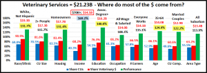
  1. Race/Ethnic – White, not Hispanic (90.9%) up from (90.0%) This group accounts for the vast majority of spending in every segment., but a 91% share is extraordinary. The 131.7% performance rating ranks #3 in terms of importance in Veterinary Spending demographics and reflects the spending disparity. Hispanics, African Americans and Asians account for 31% of U.S. CU’s, but they only spend 9% of Vet $. Asians and African Americans have a significantly lower percentage of pet ownership and African Americans have the lowest average CU income.
  2. # in CU – 2+ people (81.6%) down from (84.1%) This group, which is over 70% of U.S. CUs, lost share and their performance fell from 118.0% to 115.7%. Even with a drop in performance, they still rank 7th in terms of importance in terms of Veterinary Spending. The loss in share and performance was driven by decreased spending by  2 and 3 person CUs in conjunction with a huge, $0.61B increase by singles.
  3. Housing – Homeowners (83.4%) up from (82.5%) Homeownership is a major factor in pet ownership and spending in all industry segments. In terms of importance to Veterinary spending, their 131.4% performance rating, up from 131.2%, keeps homeownership in 4th place. The slight increase in share and performance was driven by a $1.1B increase in spending by Homeowners w/Mtge. Everyone else spent less. We should note that Homeownership is not as important to Veterinary Spending as it once was. In 2015 their share was 88.4% with performance of 141.8%.
  4. Education – Associates Degree and Higher (76.3) up from (73.8%) Income generally increases with education. It is also important in understanding the need for regular Veterinary care. Market share was up as was performance, which went from 137.3% to 140.0%. Education became stronger as the 2nd most important factor in Vet spending. The lift came from BA/BS and Associates Degrees. All groups with a formal degree after HS performed at 119+%.
  5. Age – 35>64 (66.1%) up from (65.9%) This group switched back to 35>64 after a year as 45>74 because the 35>44 yr olds were up $0.8B while the 65>74 yr olds spent $0.2B less. Performance was also up, going from 123.4% to 124.9%. The gains would have been greater, but 55>64 spent $0.6B less. Age remained 5th in terms of importance.
  6. Occupation – All Wage & Salaried (66.5%) up from (65.8%) – All Wage and Salary Earners took over from “I’m the Boss”, which included Mgrs & Professionals, Self-employed and Retirees. Mgrs & Professionals and Self Employed drove the increase but they are not in the same group. This kept the the group’s share gain down and performance only increased from 107.5% to 108.3%. Occupation was #6 in importance. Now, it is the least important category.
  7. # Earners – “Everyone Works” (66.5%) up from (65.9%) In this group, all adults in the CU are employed. The share gain comes from a big year by working singles. Performance was basically steady, 115.1%, up from 115.0%. The gain from Singles was balanced by a spending drop by 2 earner CUs.
  8. Income – Over $70K (68.2%) up from (65.0%) We changed this group from over $50K because Veterinary Spending is so affected by CU income and the $70K level is where the behavior changes. Only the <$30K group spent less but the decrease was huge, -$0.8B. The performance of the $70K group stayed at 169.2%, clearly showing that higher income is THE most important factor in increased Vet spending.
  9. CU Composition – Married Couples (60.6%) down from (63.8%) Married couples have a big market share and 120+% performance in all segments. They loss share due to a big decrease from Couples only and an increase from singles and Unmarried, 2+ Adult CUs. Their performance also fell to 122.2% from 128.9%, but they moved up to 6th place in importance because the Occupation Category had an even worse year.
  10. Area – Suburban (63.2%) up from (62.9%) Suburban CU’s are the biggest spenders in every segment. They gained a little in share and in performance, which was 113.9%, up from 113.1%. They maintained the middle ground as Center City was up $0.79B while Rural america spent $0.64B less.

We changed 1 of the groups because Higher income is by far the biggest single factor in Veterinary spending. We see the impact of this in many groups as it often contributes to the big spending disparity between segments. The most notable changes were that occupation became less important, education moved up and spending skewed a little younger.

Now, we’ll look at 2018’s best and worst performing Veterinary spending segments in each category.

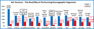
Almost all of the best and worst performers are those that we would expect. However, there are 6 that are different from 2017. This is much more than Supplies (3) but less than Services (8) and Food (7). This suggests some instability but unlike Food or Services, there is no big change in $, up or down. The changes from 2017 are “boxed”. We should note:

  • Income – The 258.8% Performance by the $200K> group is down from last year’s 286.0% but is still very high.
  • Generation – This is a Big Change. Boomers have “owned” this segment since….
  • Occupation – Self -Employed took over from Mgrs & Professionals. They are the 2 highest income segments.
  • Education – The BA/BS group took over from the usual winner, Adv. College Degree.
  • Age – The 45>54-year olds, the group with the highest income, solidified their position at the top. By the way, only CUs in the 35>64 age range perform above 100%.
  • CU Composition – It was a bad year for Married Couples Only and a good year for Singles, but both maintained their positions at the top and bottom of performance.
  • # in CU – 2 people CUs, married or unmarried are the best performers. Single people perform better than only one other type of CU – the ones with 5 or more people.
  • Region – Northeast won again – 4 straight years. The South is the only region performing below 100%.

It’s time to “Show you the money”. Here are segments with the biggest $ changes in Veterinary Spending.

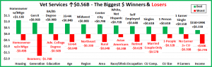
Spending was up a modest 2.7% but there was turmoil, and this is where we see it. There were only 2 repeats and 10 segments flipped from 1st to last or vice versa. The only segment with more turmoil was Food. There were surprise winners – Gen X, 35>44, Center City, Singles and surprise losers – Boomers, Adv. Degrees, 55>64, Married Couple only. Last year there were 4 categories where all segments spent more . This year there were none. Here are the specifics:

  • Housing – Homeowners w/o a Mtge flipped from 1st to last.
    • Winner – Homeowner w/Mtge – Veterinary: $11.90B; Up $1.13B (+10.5%)
      • 2017: Homeowner w/o Mtge
    • Loser – Homeowner w/o Mtge – Veterinary: $5.80B; Down $0.49B (-7.7%)
      • 2017: Renter
    • Comment – Last year all groups spent more. This year it was only Homeowners w/Mtge. The Homeowners w/o mtge numbers were driven down by a big spending decrease by Retirees.
  • Generation – Gen X just edged out Millennials for the win.
    • Winner – Gen X – Veterinary: $6.67B; Up $0.91B (+15.9%)
      • 2017: Baby Boomers
    • Loser – Baby Boomers – Veterinary: $8.21B; Down $1.76B (-17.7%)
      • 2017: Silent
    • Comments – The Boomers were the only generation to spend less on Veterinary Services. One factor was their adult children moving out to their own homes. The other Generations spent more producing a positive result.
  • Education – Those with a BA/BS Degree are repeat winners and are up $2.48B (+44%) since 2015.
    • Winner – BA/BS Degree – Veterinary Spending: $8.06B; Up $0.90B (+12.6%)
      • 2017: BA/BS Degree
    • Loser – Adv. College Degree – Veterinary Spending: $5.39B; Down $0.50B (-8.5%)
      • 2017: Associates Degree
    • Comment – Associates Degree had a big turnaround and got out of the cellar with the biggest increase of any segment, +24.9%. They were replaced at the bottom by Adv. Degrees, an unusual spot for this group.
  • Age – Last year the winner was the older Gen Xers – 45>54. This year it is their younger siblings – 35>44.
    • Winner – 35>44 yrs – Veterinary Spending: $3.83B; Up $0.84B (+28.3%)
      • 2017: 45>54 yrs
    • Loser – 55>64 yrs – Veterinary Spending: $4.78B; Down $0.64B (-11.9%)
      • 2017: 75+ yrs
    • Comment: Veterinary spending by age group was a mixed bag. <25: +$0.14B; 25>34: -$0.02B; 35>54: +$1.03B; 55>74: -$0.88B; 75+: +$0.31B. As you look at the ups and downs, a spending rollercoaster ride “ for the ages” might be a more apt description of the pattern in this category. By the way, the 75+group was up 39%.
  • Region – A dual flip in this category.
    • Winner – Midwest – Veterinary Spending: $5.00B; Up $0.80B (+19.0%)
      • 2017: Northeast
    • Loser – Northeast – Veterinary Spending: $4.33B; Down $0.33B (-7.2%)
      • 2017: Midwest
    • Comment – The South finished second again. The Northeast lost but are still the best performing segment.
  • Area Type – Central City flipped from last to first.
    • Winner – Central City – Veterinary Spending: $6.47B; Up $0.79B (+13.8%)
      • 2017: Suburbs >2500
    • Loser – Rural – Veterinary Spending: $1.34B; Down $0.64B (-32.2%)
      • 2017: Central City
    • Comment – Central City led the way, but all areas except Rural spent more.
  • Race/Ethnic – With a 91% share of Veterinary $, White, non-Hispanics increased their dominance in this segment.
    • Winner – White, Not Hispanic – Veterinary: $19.31B; Up $0.71B (+3.8%)
      • 2017: White, Not Hispanic
    • Loser – Asian American – Veterinary: $0.17B; Down $0.24B (-58.9%)
      • 2017: African Americans
    • Comment – Asian Americans have low pet ownership but the highest income. They spent 59% less. African Americans have low pet ownership and the lowest income. They spent 60% more. Hispanics are 2nd in pet ownership and 3rd in income. They spent 20% less. There is no clear pattern for minority spending.
  • Occupation – Self-Employed flipped from last to first.
    • Winner – Self-Employed– Veterinary Spending: $2.11B; Up $0.64B (+43.5%)
      • 2017: Mgrs & Professionals
    • Loser – Retired – Veterinary Spending: $3.54B; Down $0.62B (-15.0%)
      • 2017: Self-Employed
    • Comment – Self-Employed and Mgrs & Professionals spent $1.02B more. This overcame the $0.62B decrease by Retirees. Blue Collar workers also posted a $0.12B increase, but the Tech/Sls/Clerical group spent $0.04B less.
  • CU Composition – A final double flip.
    • Winner – Single – Veterinary: $3.90B; Up $0.61B (+18.6%)
      • 2017: Married, Couple Only
    • Loser – Married, Couple Only – Veterinary: $6.77B; Down $0.57B (-7.8%)
      • 2017: Single
    • Comment – Singles had a strong year in every category. In Veterinary spending Unmarried 2+ Adult CUs and Single Parents also spent more. For all Married CU’s, only those with an oldest child over 6 had an increase.
  • # in CU – Singles flipped from last to first.
    • Winner – Single – Veterinary Spending: $3.90B; Up $0.61B (+18.6%)
      • 2017: 2 People
    • Loser – 3 People – Veterinary Spending: $3.60B; Down $0.32B (-8.3%)
      • 2017: Single
    • Comment: The winning numbers were 3 and 1. CUs of all other sizes spent less.
  • # Earners – The winner flipped from last to first and would be a big surprise in most years.
    • Winner – 1 Earner, Single – Veterinary Spending: $2.57B; Up $0.55B (+27.5%)
      • 2017: 2 Earners
    • Loser – No Earner, 2+ CU – Veterinary Spending: $1.61B; Down $0.39B (-19.4%)
      • 2017: 1 Earner, Single
    • Comment – While Income is of primary importance to increased Veterinary Spending, the number of earners remains on the lower tier of spending drivers. The 2018 Veterinary spending data reinforces this. 1 Person CUs, with 1 or no earner spent more. In 2+ person CUs, No Earners and 2 Earners spent less while 1 and 3+ Earners spent more. 2 and 3+ Earner CUs have the highest incomes but are in opposite “camps”. There is no clear spending pattern in the # of Earners category.
  • Income – In 2018, $150 to $199K was the winner. The winner is inevitably an over $100K group in this segment.
    • Winner – $150 to $199K – Veterinary Spending: $2.74B; Up $0.33B (+13.7%)
      • 2017: $100K>149K
    • Loser – <$30K – Veterinary Spending: $1.79B; Down $0.77B (-29.9%)
      • 2017: $30 to $39K
    • Comment – The only group to spend less was <$30K but the lift was driven by $70K>, +$1.05B.

We’ve now seen the winners and losers in terms of increase/decrease in Veterinary Spending $ for 12 Demographic Categories. 2018 saw slow growth in Veterinary spending, mostly in the second half. There was a surprising amount of turmoil with 22 of 24 winners/losers being new or flipping positions. Most of the winners were not unexpected but there were some surprises like Gen X, 35>44 and Singles. This reinforces the “youth movement” in Veterinary Spending. However, there were also “hidden” segments that didn’t win but made a significant contribution to the 2018 spending increase. These groups don’t win an award, but they certainly deserve….

HONORABLE MENTION

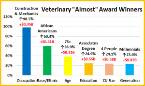
First let’s call out a Blue Collar subsegment. Construction/Mechanics, +98.5%. African Americans also earned their spot, +60.3%. It wasn’t all about youth as the oldest Americans spent 38.9% more. Formal Education is also important but not just College Grads. Assoc. Degree spent $0.55B more. 4 People CUs and Millennials also had big increases reinforcing the youth movement. While the lift wasn’t as big as last year, it was still widespread as 58 of 92 demographic segments (63%) spent more on Veterinary Services in 2018.

Summary

2016 and 2017 produced a combined increase of $3.6B in Veterinary Spending as inflation moved to record low levels. In 2018 we had the Baby Boomer Spending “Bust” which especially impacted Food and Veterinary. They dialed back their Food upgrade and cut back on Veterinary. Another significant factor was that many adult children moved out of their parents’ homes to become financially independent. This group, plus the Gen Xers stepped up to overcome the decrease from the Boomers. Veterinary Spending became a little more balanced in terms of age and also occupation in 2018.

Veterinary services and spending should be a definite need, like Food, but there are many indications that it is becoming more discretionary and determined by income. It is very obvious when we look at performance. (Share Vet $/Share CUs)

  • <$30K – 29.4%
  • $30>50K – 71.7%
  • $50>70K – 80.3%
  • $70>99K – 119.1%
  • $100>149K – 161.5%
  • $150>199K – 209.1%
  • $200K> – 258.8%

The “break even” point (100%) occurs at $70K+. CU’s over $70K (40.3%) account for 68% of Veterinary $. In 2018 this group continued to grow in numbers and gained share. Performance remained steady at 169%. One lower income group, $40>49K had a strong year, +28%. However, the <$30K group has almost become a non-participant in Veterinary.

The performance of other big spending groups is also very important in the Veterinary segment. We identified six demographic categories with high performing large groups. (There were 7 for Services, 6 for Supplies and 4 for Food) .  Consumers have no control over Race/Ethnicity or Age but in addition to Income – Education, Homeownership, and Marriage are important factors in Veterinary spending. The high performance in these groups also demonstrates the big spending disparities among segments within these categories.

There were some changes of note. Occupation ceased to be a major factor in spending, but formal Education after HS became even more important. Marriage lost ground as Singles stepped up their spending. Veterinary spending also skewed younger in 2018 so the big age group changed back to 35>64 from 45>74.

2018 saw a small spending increase (+2.7%) for Veterinary Services. 63% of all segments increased spending but with a 2.6% inflation rate, almost all of the lift came from prices. The lift was driven by Gen Xers and Millennials which was reflected in the strong performance of numerous segments like Singles, Married with oldest Child over 6, Center City and 35>44 yr olds. The importance of income to spending in this segment was reinforced and a definite concern came to the forefront. CUs with income <$30K (29%) spend 15% of Food $ but only 8% of Veterinary $. Is inflation putting necessary Vet Care out of reach for this group? In 2019 Veterinary Inflation jumped to 4.14%. We’ll see what happens.

Finally – The “Ultimate” Veterinary Services Spending Consumer Unit consists of 2 people – a married couple only. They are in the 45 to 54 age range. They are White, but not of Hispanic origin. At least one of them has a BA/BS Degree. They both work in their own business and their total income exceeds $200K. They live in a small suburb, adjacent to a big city in the Northeastern U.S. and are still paying off the mortgage on their home.