2018 U.S. TOTAL PET SPENDING $78.60B…UP ↑$1.47B
In 2018 Total Pet Spending in the U.S. was $78.6B, a $1.47B (1.9%) increase from 2017. This was a huge change from the $9.84B increase in 2017. There were a number of factors behind the smaller increase, including some outside the control of the industry. The FDA warning regarding grain free dog food wreaked havoc in the second half and the new tariffs on supplies flattened spending during that period. Veterinary prices turned up again resulting in a net “no gain” in the amount purchased by consumers. There was also a human factor as a significant number of adult children living with their parents moved out and took their pets with them. The Services segment saved the year with a spectacular increase in spending as consumers finally responded to the convenience of significantly more outlets. Here are the $ changes:
- A -$2.27B (-7.3%) drop in Food
- A $1.22B (+6.6%) increase in Supplies
- A $0.56B (+2.7%) increase in Veterinary
- An unprecedented $1.95B (+28.9%) lift in Services
Let’s see how these numbers blend together at the household (CU) level. In any given week, 27.2 Million U.S. CU’s (1/5) spent money on their Pets – food, supplies, services, veterinary or any combination – down from 28.4M in 2017.
In 2018, the average U.S. CU (pet & non-pet) spent a total of $598.41 on their Pets. This was a small 0.8% increase from the $593.63 spent in 2017. However, this doesn’t “add up” to a 1.9% increase in Total Pet Spending. With additional data provided from the US BLS, here is what happened.
- 1.1% more CU’s
- Spent 6.4% more $
- 5.3% less often
If 67% of U.S. CU’s are pet parents, then their annual CU Total Pet Spending was $893.15. Now, let’s look at the recent history of Total Pet Spending. The rolling chart below provides a good overview. (Note: All numbers in this report come from or are calculated by using data from the US BLS Consumer Expenditure Surveys – The 2016>2018 Totals include Veterinary Numbers from the Interview survey, rather than the Diary survey due to high variation)

- In 2015, the Food upgrade began, but early in the year consumers were trading $ in other segments to pay for it.
- In 2016, they were intensely value shopping for super premium foods. They started spending some of this saved money on Supplies and Veterinary Services, but not quite enough as spending fell slightly for the year.
- In 2017, spending took off in all but Services, especially in the 2nd half. Consumers found more $ for their Pets.
- In 2018 a spectacular lift in Services overcame the FDA issue in Food, tariffs on Supplies and inflation in Veterinary.
Now we’ll look at some Demographics. First, 2018 Total Pet Spending by Income Group

Only CU’s with an income over $100K increased Total Pet Spending and most of the increase came from $150K+.
Nationally: · Total Pet: ↑$1.47B · Food: ↓$2.27B · Supplies: ↑$1.22B · Services: ↑$1.95B · Veterinary: ↑$0.56B
- < $70K – (59.7% of U.S. CUs); CU Pet Spending: $383.10, -2.7%; Total $: $29.88B, ↓$1.49B (-4.8%) from …
- Food ↓$1.53B
- Supplies ↑$0.07B
- Services ↑$0.47B
- Vet ↓$0.50B
Money matters a lot to this group, especially to those on the low end. They were quick to dial back Food spending after the FDA warning. They also cut Veterinary spending and Supplies $ were essentially flat. However, the convenience of more readily available Services appealed to this group too.
- >$70K – (40.3% of U.S. CUs); CU Pet Spending: $914.90, +0.4%; Total $: $48.72B, ↑$2.96B (+6.5%) from…
- Food ↓$0.74B
- Supplies ↑$1.15B
- Services ↑$1.49B
- Vet ↑$1.05B
This group continues to grow, up 6.1% in 2018. This accounted for almost all of their spending increase. They also show that income remains the single biggest factor in Pet Spending. 40% of U.S. CUs spent 62% of Total Pet $. Although they too spent less on Food, without them, Total Pet $ would have been down $1.5B.
- < $30K – (28.7% of U.S. CUs); CU Pet Spending: $259.13, -9.5%; Total $: $9.47B, ↓$1.44B (-13.2%) from…
- Food ↓$0.64B
- Supplies ↓$0.05B
- Services ↑$0.011B
- Vet ↓$0.77B
This lowest income group demonstrated their price sensitivity in 2018. However, even they managed to eke out a small increase in Services spending.
- $30>$70K – (31.0% of CUs); CU Pet Spending: $493.91, +0.2%; Total $: $20.41B, ↓$0.06B (-0.3%) from…
- Food ↓$0.89B
- Supplies ↑$0.11B
- Services ↑$0.46B
- Vet ↑$0.27B
This low to middle income group is by necessity price sensitive, but is also committed to their pets. They dialed back Food $. However, they had a strong increase in both Service Segments and a little in Supplies.
- $70>$99K – (14.5% of CUs); CU Pet Spending: $670.87, -3.9%; Tot $: $12.92B, ↓$0.49B (-3.6%) from…
- Food ↓$0.69B
- Supplies ↓$0.16B
- Services ↑$0.13B
- Vet ↑$0.24B
This upper middle income group reacted negatively to the situations in Food and Supplies. Pet Services saw a 13% increase and they did ramp up their Veterinary spending by 7%, but it was not enough to compensate.
- $100K>$149K– (13.1% of CUs); CU Pet Spend: $874.85, -2.9%; Tot $: $15.34B, ↑$0.32B (+2.2%) from…
- Food ↓$0.80B
- Supplies ↑$0.56B
- Services ↑ $0.38B
- Vet ↑$0.18B
They were the Star of the income groups in 2015 and 2017. In 2016, they had the worst performance with decreased spending in every segment. They are very responsive to industry trends, especially in Pet Food. They have the money to do what is needed or what they want, but are still very “value” conscious.
- $150K> – (12.7% of CUs); CU Pet Spending: $1238.40, +2.0%; Total $: $20.46B, ↑$3.12B (+18.0%) from…
- Food ↑$0.75B
- Supplies ↑$0.75B
- Services ↑$0.99B
- Vet ↑$0.6
Money Matters! They are the proof. They are the best performing income group in Total Pet Spending with 12.7% of U.S. Households generating 26.0% of all Pet $. They are also the only income group to increase annual Pet Spending every year since 2014. In fact they have furnished 55% of the Pet Industry’s $14.3B spending increase since 2014. There is more good news. This group is growing. They added 2.5 million CUs in 2018, a 17% increase. In fact their $3.12B was primarily fueled by additional CUs. It does demonstrate that pet spending grows with consumers’ income, especially once you reach the $150K+ level.
Income Recap – The top 2 drivers in consumer spending behavior are value (quality + price) and convenience. That makes income , especially disposable income, very important. You see this in the huge difference in pet spending behavior at the opposite ends of the income spectrum and the increase/decrease spending dividing line of $100K. This line is somewhat deceptive as there were still values to be had in Veterinary and Supplies that appealed to most groups for much of the year. Plus, all groups responded to the increased convenience in Services. The biggest issue was in Food. The FDA warning about grain free elicited 2 different responses. Many in the <$150K groups dialed their spending back to more traditional foods, but the $150K+ group may have upgraded to even more expensive varieties. The trend to super premium has made income more important to this segment and more susceptible to big swings in spending.
Next let’s look at 2018 Total Pet Spending by Age Group

All groups but 55>64 yr olds spent more but the 35>44 yr olds led the way.
Nationally: · Total Pet: ↑$1.47B · Food: ↓$2.27B · Supplies: ↑$1.22B · Services: ↑$1.95B · Veterinary: ↑$0.56B
- <25 – (5.8% of U.S. CUs); CU Pet Spending: $355.36, +37.3%; Total $: $2.79B, ↑$0.81B (+41.0%) from…
- Food ↑$0.50B
- Supplies ↑$0.004B
- Services ↑$0.18B
- Vet ↑$0.13B
This youngest group stepped up in 2018, but they are the only group to increase Pet $ every year since 2014.
- 25-34 – (16.2% of U.S. CUs); CU Pet Spending: $489.10, +9.5%; Total $: $10.35B, ↑$0.79B (+8.3%) from…
- Food ↑$0.20B
- Supplies ↑$0.30B
- Services ↑$0.31
- Vet ↓$0.02B
These older Millennials are just starting their families and careers, so they are prone to trading $ between segments. However, they have shown slow, but steady total pet spending growth since 2015.
- 35-44 – (16.7% of CUs); CU Pet Spending: $659.61, +13.9%; Total $: $14.46B, ↑$2.31B (+19.0%) from…
- Food ↓$0.05B
- Supplies ↑$0.56B
- Services ↑$0.96B
- Vet ↑$0.84B
This group has the largest families and is in the middle of building their careers. This makes them very sensitive to value. However, they have a growing commitment to their pets. Their Food spending was basically unchanged, but they truly “stepped” up with big increases in the other segments, especially Services and Veterinary.
- 45-54 – (17.5% of U.S. CUs); CU Pet Spending: $769.35, +5.4%; Total $: $17.73B, ↑$0.56B (+3.3%) from…
- Food ↓$0.32B
- Supplies ↑$0.27B
- Services ↑$0.43B
- Vet ↑$0.19B
This group has the highest income and now occupies the top spot in Pet Spending. This was their second consecutive annual increase, which hasn’t happened since 2009, when the Boomers owned this group. They did this despite having 2% fewer CUs. Food spending dropped but all other segments were up, especially Services.
- 55-64 – (18.6% of U.S. CUs); CU Pet Spending: $709.69, -18,1%; Total $: $17.50B, ↓$3.95B (-18.4%) from…
- Food ↓$3.51B
- Supplies ↑$0.18B
- Services ↑$0.03B
- Vet ↓$0.64B
Here is the problem. These younger Baby Boomers had a huge drop in Food and Veterinary. They are committed to their Pets and react very strongly to changes in the market as is evident in the chart. Whether it is a hot new food trend, value shopping or an FDA warning, they get on board quickly and the “swing” can be $ Billions.
- 65-74 – (14.7% of U.S. CUs); CU Pet Spending: $587.88, +0.3%; Total $: $11.29B, ↑$0.42B (+3.9%) from…
- Food ↑$0.75B
- Supplies ↓$0.09B
- Services ↑$0.006B
- Vet ↓$0.24B
This group is growing, +4.2%. Many are retired and now 80% are Baby Boomers. They are careful with their money, but their commitment to their pets is very apparent as 1.05% of their total spending is on their companion animals. They didn’t follow the lead of the younger Boomers and cut back on Pet Food $. They spent 18% more, but they helped pay for it by reducing their CU spending in the Veterinary and Supplies segments.
- 75> – (10.4% of U.S. CUs); CU Pet Spending: $332.53, +9.5%; Total $: $4.48B, ↑$0.52B (+13.0%) from…
- Food ↑$0.18B
- Supplies ↔$0.00B
- Services ↑$0.03B
- Vet ↑$0.31B
Pet Parenting is more difficult, and money is tight for these oldest Pet Parents, but their commitment is still there. They increased spending in 3 of the 4 industry segments, with significant lifts in Food and Veterinary.
Age Group Recap: The age dividing lines in Total Pet Spending were very clear. The 55>64 year old Baby Boomers had a huge drop in spending which was driven by Food and Veterinary. However, the industry had a positive year due to increases by literally every other group. The younger groups, especially the 35>44 year olds had the biggest lift but the 65+ year olds also contributed a $0.94B increase.
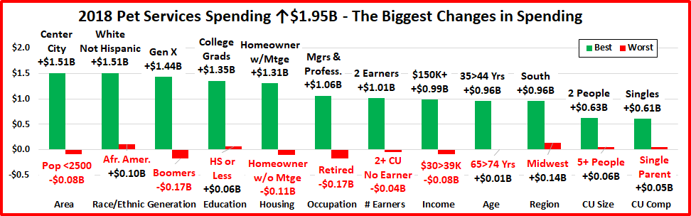
Normally, we now look at the biggest winners and losers in each demographic category. However, this didn’t reflect the true situation in 2018. As we saw in the age group analysis, the “loser” was very defined. However, it took a group effort to produce a positive result. In our final graph, we’ll look at where these demographic spending lines were drawn.
Key Demographic “Dividing Lines” for 2018.

In 2018, 50 of 82 Demographic Segments (61%) spent more on their Pets. Usually, this would produce a strong increase, but the biggest single segment drops were so large that the overall increase was only 1.9%. Let’s look at the specifics:
Generations – Boomers have long been the biggest positive factor in the pet industry. In 2018, their influence turned negative as their spending fell -$6.48B. This affected a huge number of demographic categories. You see this over and over again in the downside entries on the chart. The younger generations led the way up, but in fact all other generations spent more on their pets in 2018 and ultimately overcame the “Boomer Bust”.
Age– The 55>64 yr olds are all Boomers. Every other group spent more, with the 35>44 yr olds leading the way, +$2.81B.
Education – As usual, higher education means higher income, better informed product decisions and more Pet $.
Housing – If you paid monthly for housing, you spent more on pets. 38% of Boomer CUs are homeowners w/no Mtge.
Area – This one goes against the norm. Lower population areas generally spend more on Pets. The 2018 situation reflects the continued urbanization of America, which is being driven both by the younger groups and downsizing older CUs.
Occupation – This demographic clearly reflects the importance of income in Pet spending.
CU Composition – We see the positive influence of both young and old groups here. Singles tend to be at either end of the age spectrum and Married, with children CUs are invariably younger. Married, w/no children CUs usually have “room” for more pet spending, but not in 2018.
CU Size – The usual phrase has been “It just takes 2” and 2 person CUs led the pack in spending. In 2018 it was “Any number but 2.”
Income – Income matters in Pet Spending with big disparities between high and low and a dividing line at $100K in 2018.
# of Earners – # of earners is not quite as important as total income, but it is definitely a factor. The “everyone works” CUs led the upside while 1 earner 2+ CUs, which generally have the greatest financial pressure, had the biggest decrease.
Racial/Ethnic – Hispanics and African Americans had a significantly greater increase in pet spending than the much larger White, not Hispanic group. This goes back to the generational differences, as these minorities are 33% of all Millennial and Gen Xer CUs, but only 22% of Baby Boomers.
Finally: The Pet Industry came out on top in 2018, but just barely. Besides normal concerns and trends, there were unusual outside issues like the FDA warning and tariffs. However, their impact was primarily on Baby Boomers, so the problem was simple. The solution, as we have seen, was not. Fortunately, virtually everyone else stepped up to produce a Pet Spending increase. I don’t know if this trend will continue but it is obviously time to take a deeper look at generational pet spending.