PET STORES – A 30 YEAR HISTORY from 1987 to 2017
Pet Products are sold seemingly everywhere today – 160,000 retail outlets of all kinds – clothing stores, supermarkets, gas stations, the internet. That number climbs to over 200,000 when you add in the services outlets. However, when you think of the beginning of this colossal industry, you must think of the independent pet store as the seed that became the mighty oak. We will take a look back to 1987 to see where this channel was and how it has evolved through the years.
The data in this report is courtesy of the U.S. Census Bureau. Their Economic Census is done every 5 years in years ending in “2” and “7”. The early years have only basic information but since 1997, more detailed information is readily available. In 2017 they did change some classifications which will make a few comparisons no longer possible.
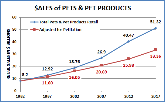
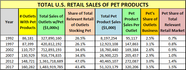
Let’s get started. Here is a detailed chart on some key measurements and a graph of their growth from 1987 > 2017.
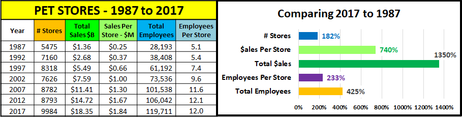
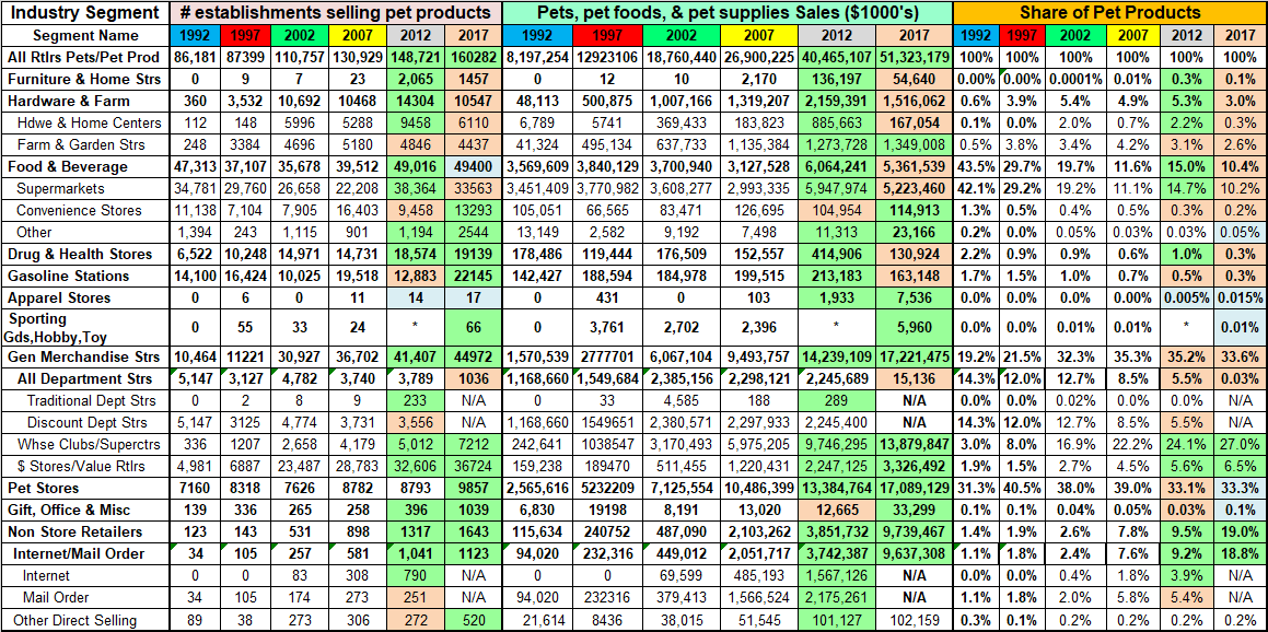
The little chart has a wealth of information, and the graph shows the spectacular overall results. First, the number of stores almost doubled but the key factor was that the sales per store is 7.4 times greater. The number of stores increased but superstores and chains became the dominant type. This is evident by the fact that the number of employees per store is 2.3 times more in 2017 than it was in 1987. Add this to the attitudinal conversion of pet owners to pet parents, with an ever increasing personification of their pets and you get 13.5 times more $.
Now let’s drill deeper. Sales increased +$16.99B (+1249%). How much of the increase was real or just due to petflation?
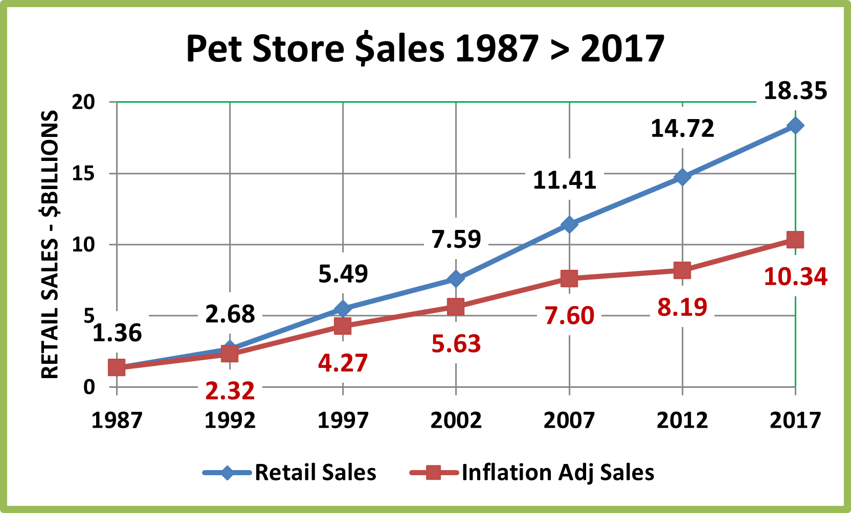
The annual growth rate in “full” $ was 9.0% from 1987 to 2017. Pet Food and Supply prices went up 77.5% during this time. This is an annual inflation rate of 1.9% which is better than the overall 2.6% CPI rate during this period. This made the “real” growth rate 7.0%. That’s damn good and means that 77.3% of Pet Store $ growth has been real. However, this doesn’t tell the whole story. On the chart you see that real growth flattened from 2007 to 2012. This was largely due to the fact that Pet Food and Supply prices increased an incredible 17.0%. (8.2% per year) from 2007 to 2009. Coming at the onset of the recession, this drove consumers to look for value. The result was that consumers moved strongly to other channels. Pet Stores’ share of total pet products sales fell from 39.0% in 2007 to 33.1% in 2012 and Total General Merchandise took over the top spot in Pet Products sales. All the Food and Supply prices have fallen or at least flattened out since 2009. Total Pet Products inflation from 2009 to 2017 was 1.1%, an annual rate of 0.13% – almost nothing. As a result, “real” sales for Pet Stores returned to a more normal path.
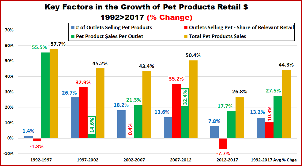
Now, let’s take a look at the progress of the key contributing factors over the years in 5 year segments.

- 1987 to 1992 – The Number of Pet Stores grew significantly – from 5475 to 7150 (+30.8%). The number of employees per store is about the same. Superstores and chains were just getting started so these were mostly traditional sized stores. The amount of sales per store increases 50% as American’s love for pets truly begins to show. The result – sales basically double in 5 years.
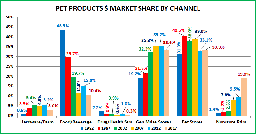
- 1992 to 1997 – The rise of Superstores. Note the 37.1% increase in employees per store. They are being built and they generate significantly more volume per store – +76.6%. The result – sales more than double in 5 years. In 1997 Pet Stores pushed Supermarkets out of the top spot in Pet Products sales, with 40% of all $.
- 1997 to 2002 – Superstores continue to rise but at a cost to the independents. The net result is 692 fewer outlets (-8.3%). The Sales per store increases 50.8% which reflects the higher percentage of larger format stores. The total channel sales growth rate slows markedly from the previous 10 years, but sales were still up +38.2%.
- 2002 to 2007 – The channel bounces back with a 15.2% increase in stores – most of which are chains and superstores. The per store sales goes up another 30.5%, reflecting this change. The result – sales grow 50.3%. They continue to hold their ground in the overall marketplace, with 39% of all Pet Products Sales.
- 2007 to 2012 – Huge price increases…plus a major recession. There is no growth in the number of stores, but an even higher percentage are superstores. The overall channel sales growth – +29.9% – exactly mirrors the per store growth. Also consider:
- The overall pet food and supplies category (in all channels) grew 50% from 2007 to 2012.
- Actual Pet Store Sales from 2007-2012 was only up 6.6% – (Factoring in the huge price increases)
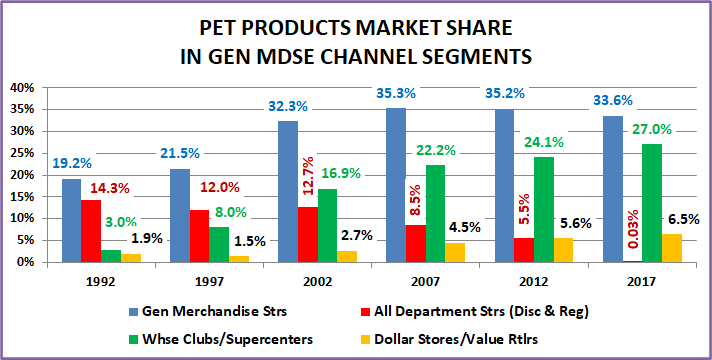
- The result – Pet Store Sales grew but had a big loss in pet products market share – down to 33.1%
- 2012 to 2017 – Inflation essentially ends, and more outlets are opened, +13.5%. Per store sales were also up slightly, +9.8%. This produced an overall sales increase of +24.7%. Products were +27.7% which resulted in a minimal gain in market share to 33.3%. This is small, but significant because Pet Stores and $ stores were the only brick ‘n mortar outlets to gain pet products market share in a major consumer movement to the internet.
Through the years, pet Stores have grown larger in size but paused their growth in numbers from 2007 to 2012, largely due to the great recession. During this recession period, their growth in revenue slowed to +29% and did not kept pace with the overall market in the Pet Food and Supplies category, so they lost some market share. However, they bounced back in the 2012 to 2017 period, with more stores and a total sales increase of 24.7% (Products $ were +27.7%). Although this was the smallest $ percentage increase in history it was very significant. The Pet Products marketplace is incredibly competitive, and a new major player is now in the game – the internet. Pet Stores, with their vast array of pet products and services and $ stores, with their value and convenience were the only 2 brick ‘n mortar retail channels to gain share in Pet Products in what was a tsunami like movement of consumers to internet shopping. It shows that Pet Stores have not lost their appeal and that they are both resilient and adaptable in changing circumstances.
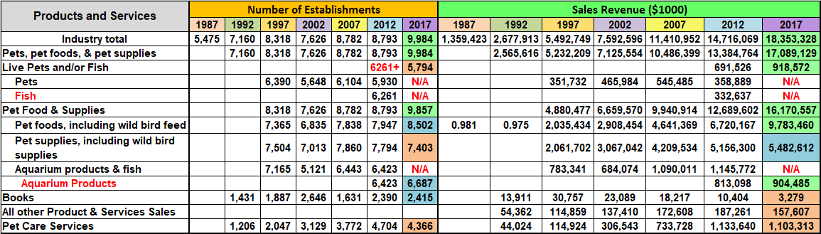
Now, let’s look deeper into the retail sales numbers for Pet Stores for trends in specific Product segments. There is sales data from the U.S. Economic Census back to 1987. From 1997 on the data gets reasonably detailed. As I said the Census Bureau changed their product classification system in 2017. This will keep us from doing some comparisons to earlier years. However, I have built a chart which is inclusive of both systems to maximize our ability to compare specific data.
The chart contains all available data. The 2017 numbers are highlighted to indicate the % change from 2012.
- Green = 10%> Increase
- Blue = <10% Increase
- Pink = Any Decrease
Here are the details which are followed by specific category observations for each 5 year period.
Observations 1992 to 1997
- Data was limited in 1992 but we saw strong growth in store count as superstores and other chains rapidly expanded.
- Sales in Pets and Pet Products more than doubled, +103.9% as Pet Stores became the #1 “go to” channel for Pet Products. Over 95% of Pet Stores’ total sales came from Pets and Pet Products in both 1992 and 1997.
- There was a hint of growing diversity as Pet Services $ grew by 260% and A/O revenue more than doubled. Pet Book sales also doubled as they reached what would be their all-time high in $.
Observations 1997 to 2002
- The store count fell 8% due to the loss of many independent stores. Total revenue increased 38% but the $ per store increased 50%, which reflects the dominance of the larger stores.
- Pets and Pet Products $ales increased +36.2%, which was slightly less than total revenue so their share of Total Pet Store $ dipped to 93.8%. This came from a combination of factors.
- The number of stores carrying live pets (nonfish) fell -11.8% but sales increased +32.5%. Obviously, the sales were becoming more concentrated. Fish and aquarium supplies was a different story. The numbers are bundled but Total Aquarium (Fish & Products) fell -28.5% in store count and -12.7% in $. This Category became markedly less popular.
- Pet Services continued strong growth, with a 53% increase in store count and a 267% increase in sales. A/O revenue increased +19.6%. Books were available in 40.2% more stores but began their long revenue slide -24.9% in $.
- Non Aquarium Pet Supplies increased sales $1.0B, +48.8% to $3.1B, which allowed them to slightly widen their razor thin lead over Pet Food as the #1 category in Pet Stores.
- Pet Food sales increased sales by $0.9B, +42.9% to $2.9B. We should note that in 1997 and 2002 Pet Food was carried in 2% fewer stores than Pet Supplies. However, there is no doubt that Food is the primary driver in most pet store consumer visits. It is the most “needed” category for Pet Parents. That’s why it’s put at the back of the store.
- Pet Store offerings became a little more diverse. However, 78.7% of Pet Stores’ total revenue in 2002 and 89.5% of the increase from 1997 came from Pet Food and Non-Aquatic Pet Supplies. They are the key categories.
Observations 2002 to 2007
- Total revenue increased to $11.4B. (+50.3%) as store count grew 15.2%, primarily due to chains.
- The sale of pets (non-fish) increased both in number of stores (+8.1%) and sales volume (+17.1%).
- In 2007 Pet Foods became the largest segment. Sales were $4.6B, +$1.7B (+59.6%). This was due to the initial move to premium which began in 2004 and the 2007 melamine recall which began the “buy Made in the USA” trend.
- Pet Supplies share of $ is much higher in Pet Stores than in the overall market. Sales hit $4.2B, +$1.1B (+37.3%) but the growth rate was below the overall market. This segment is very vulnerable to migration to other channels.
- Between 2002 and 2007, Aquarium products came back strong, with spectacular growth in the number of outlets – +25.8% and volume, +$405M (+59.3%). Sales reached a billion dollars for the first time – $1.09B to be exact.
- A/O products $ grew +25.6% but Pet Books continued their slide, -21.1%. Their drops pretty much mirror the overall book market as more and more consumers turn to other sources and to electronic formats.
- The Service Segment provided by Pet Stores reached $734M, up $427M (+139%) in revenue – Now 6.4% of Total $.
Observations 2007 to 2012
- Total revenue hit $14.7B, a $3.3B increase (+29%). However, the store count remained stagnant at just under 8800.
- Pets, Food and Supplies sales increased $2.9B to $13.3B. However, this 27.6% increase was considerably below the 50% increase in the overall Pet Products market, which resulted in a large drop in market share for Pet Stores.
- Pets (nonfish) were sold in 3% fewer outlets…but the drop in sales was very significant… -34%.
- Pet Foods remained the largest segment with strong growth, +44.8%. This $2.1B gain accounted for 63% of the increase in the total $ for the channel. This is probably a reflection of the strength of “premium” pet food sales. Notably, the number of stores stocking pet food exceeded the number stocking supplies for the first time…ever.
- Pet Supply Sales increased $0.9B (22.5%). This is less than half of the increase of the overall market and reflects the consumer migration to other channels. Prices deflated after 2009 and more categories became commoditized.
- Fish and Aquarium Products had no growth in the number of outlets and only 5% growth in sales. Considering the overall inflation rate during the period (+4.4%), “real” sales were essentially flat.
- A/O products growth slowed to +8.5%. Book sales continued to fall and in 2012 were less than half of 2002.
- Services were offered in 25% more Pet Stores and sales grew +$0.4B (+54.5%) to reach $1.1B, which was 7.7% of total revenue. Services is a great opportunity to gain business which can’t migrate to the Mass Market channels.
- Pets, Services and Channel Differentiated Premium Pet Foods and Products are keys to maintaining the consumer traffic and sales in the Pet Store Channel. The U.S. consumer is looking for value. The generally higher prices on supplies and “regular” food in these stores have encouraged the migration to other channels.
Observations 2012 to 2017
- Total Revenue increased $3.6B, +24.7% to reach $18.4B. The store count grew +13.5% to 9984 – almost hit 10,000.
- Pets and Pet Products $ was $17.1B, a $3.7B (+27.7%). This was strong enough for Pet Stores to be only 1 of 2 retail channels to actually gain share (only 0.2%) in Pet Products $ against the strong consumer movement to the internet.
- Live pets/fish $ grew +$0.23B, +32.9% to $0.9B but the % of stores stocking any live animals fell to a record low 58%.
- Pet Food $ales soared to $9.8B, up +$3.1B (+45.5%) and for the first time, in 2017 accounted for more than half of total Pet store revenue – 53.3%. The number of stores stocking pet food was 14.8% more than the number stocking supplies. Pet Food provided 83.8% of the lift in Pet Products $ and 86.1% of the increase in total pet store revenue. Pet Food and more specifically super premium pet food was the primary reason that Pet Stores held their ground and even gained a little share in the overall Pet Products marketplace.
- Pet Supplies also increased sales, +$0.3B (+6.3%) but it was far less than food and their share of total Pet Store revenue fell to a record low 39.8%. The number of stores stocking Pet Supplies fell 5% and only 74.1% of Pet Stores stocked Pet Supplies – a record low.
- Aquarium Products, excluding live fish, showed some positivity. The number of stores stocking Aquarium Products increased +4.1% and sales increased +$0.1B, +11.2% to a total of $0.9B.
- All other products and services has always been a very small part of pet stores revenue but sales have always increased…until 2017 when they fell -16% and their share of total $ fell to 0.9%.
- The number of Pet Stores carrying books actually increased by 1% but sales plummeted to $3.3M, which is -89% below the sales from 20 years ago in 1997.
- The number of Pet Stores offering Pet Services actually fell -7.2% from 2012 and sales decreased -$30M (-2.7%) to $1.103B. This is a bit of a surprise but it came as a result of competition. Pet Services outlets grew in number, giving Pet Parents more options and better prices. This segment had not yet drawn a significant amount of new users. According to the US BLS Consumer Expenditure Survey, this changed in 2018 and spending skyrocketed. I’m sure that Pet Stores got their share. This segment is an important allure for Pet Parents who want one stop pet shopping.
- Pet Stores strongly increased sales from 2012 to 2017 and even gained a small amount of share in the total Pet Product marketplace where the internet cut into virtually every other channel’s business. This was primarily due to the consumer demand for Super Premium Pet Foods, where Pet Stores were the “go to” source.
Wrapping it up
Pet Stores pioneered the pet industry but they also led the way in trends that have spurred the spectacular growth of the industry since 1987. The rise of superstores and chains provided unprecedented space for Pet Supplies. This was important for existing manufacturers but it was especially important for new companies. There was finally retail space for a “flood” of new products. According to the US BLS Consumer Expenditure Survey, in 1987 Pets Supplies accounted for 13.9% of Total Pet Spending. Then came Pet Superstores and chains. By 1996 the Pet Supplies share of Total pet $ was 23.5%. It has remained near this level ever since. Although larger Pet Stores showed the way, this spurred a radical expansion of pet product distribution across the whole retail marketplace. Another key industry trend was the move to premium Pet Food. Pet Stores led the way again. They had the room for new premium foods, which became increasingly desired by Pet Parents. This trend began in about 2004. The 2007 Melamine recall accelerated the movement as consumers moved successively to made in the USA, then to all ingredients from the USA, next to all natural and now to super premium. Plus, you can add the latest big movement – pet health supplements, often in treat form.
Take a look at the following graph to better “see” the business impact of these trends on Pet Stores.
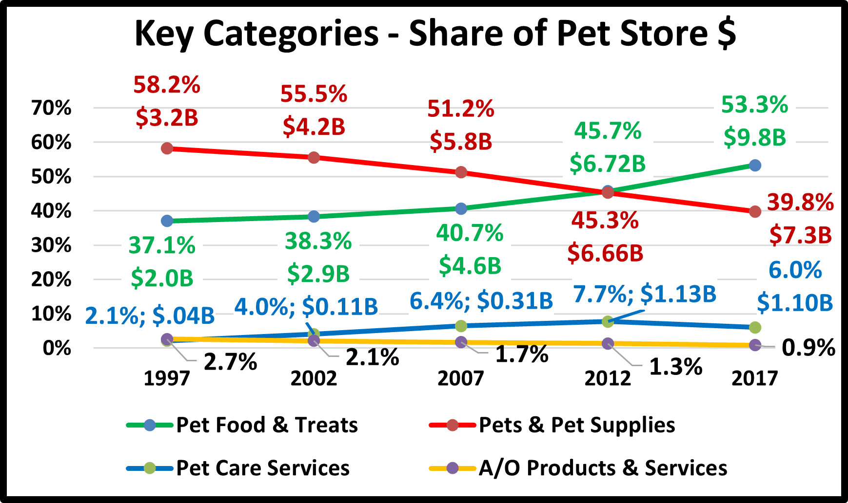
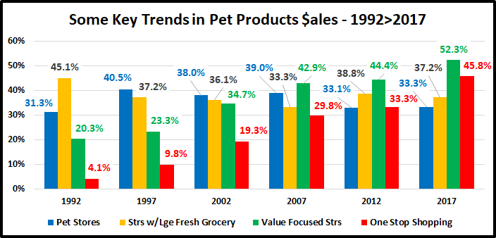
In 1997, Pets and Supplies $ dominated the channel with 58.2% of the total revenue. Food started to gain ground between 2002 and 2007 when premiumization began. They moved to the top in 2012 when overall Pet Stores lost considerable market share to other channels. Then Super Premium Foods took off and Pet Stores were the “go to” outlet. In 2017, the share of sales for Pet Food had essentially flipped from 2007. The A/O business has always been small but is now becoming insignificant. The Services Segment is small, around 6% of total revenue since 2007, but it is not insignificant. Offering Pet Services makes Pet Stores more of a one stop shopping experience for Pet Parents and is a big positive point of differentiation. This differentiation and the “one stop shopping” that it provides for Pet Parents was a key factor that allowed Pet Stores to hold their market share against the internet wave that began from 2012 to 2017.
There’s more to the story!
Larger format pet stores bundled into chains – big and small was obviously a great idea but more than that, the timing was perfect – for society, for consumer attitude and for the retail marketplace. To take a closer look at this timing, we have to go back over 75 years to the passing of the G.I. Bill in 1944. This rewarded Veterans for their service by providing education and job training benefits to help advance their after service careers. It also offered low interest home mortgages which was a major reason that the homeownership rate for the U.S. rose from 40% in 1940 to 60% in 1960. Also, more space was needed for this expansion which resulted in the creation of the suburbs, a new concept which offered the convenience of urban living with more space for households.
The soldiers returning from World War II also helped create another movement – more children. U.S. birthrates soared from 1946 to 1964, creating the largest generation – the Baby Boomers. Many of them grew up in this new suburban environment – which offered more space in a home that was owned and controlled by their parents. Pets began to be added to the household mix – sometimes in a big way. I am a Boomer. By the time that I was in 3rd grade (1956), my older brother and I had 2 dogs, 2 cats, a canary, a parakeet, a hamster and…a raccoon. In those days dogs and cats were “outdoor” animals. They didn’t come into the house but we let them take refuge in the basement during inclement weather. As we moved into our early teens, we no longer required a babysitter. While our parents worked, we roamed the neighborhood, especially in the summer. Our dogs were our constant companions. In the summer, we spent more time with them than we did with our parents. They became siblings to us so it is no surprise that when we grew up, we bought suburban homes, started families and added Pet “children” to our household.
So the changes in society and consumer attitudes were underway. However, we still needed major changes in the retail marketplace. When Boomers were growing up, Department Stores “ruled”. This channel has never embraced pet products. This indicated that they weren’t in tune with consumers and was an early sign that they would fade. In the 60’s discount stores came into being. First came general merchandise, Wal-Mart, K-Mart, Target. They grew and ultimately progressed to SuperCenters and Clubs in the 90’s. Consumers became used to large stores with a huge product selection. In the late 80’s and 90’s this concept trickled down as large format specialty stores came to the forefront – Toys R Us, Office Depot, Circuit City, Barnes & Noble, etc. Consumers were ready for Pet Super Stores.
There is one more key element – money. Income has been and continues to be the driving force in increased pet spending. Let’s go back to the key players. In 1991 the oldest Baby Boomers were turning 45. 45>54 is the highest income age group so in the 90’s, the biggest generation was entering their peak earning years. Pet Parents finally had outlets that not only filled their pets’ wants and needs but introduced new ones and… they had the money to buy it all.
The creation and development of larger format pet stores and chains was literally a positive example of the “perfect storm”. It was a great idea, all the elements were in place and the timing was perfect. Pet stores continue to evolve as the does the market. The store size has dialed back a little to make shopping a little more convenient. The channel is also not just huge chains. Small chains and local independents are also strong. The successful outlets are adapting to a virtual world, offering features like BOPIS. However, one thing will remain unchanged and that guarantees their continued success. Pets are very personal. Boomers were the first pet parents but they passed this mantle on to their children and it has now become the norm across the U.S. In fact the relationship has become even stronger as we increasingly personify our pets. This has led to substantial growth in categories like apparel but probably had its greatest impact on categories related to health. It fueled the spectacular and ever growing movement to higher quality, super premium foods and now medical supplements. Pet Parents want and need the opportunity for personal interaction when shopping for their pets, especially when considering any new product. This can only happen in Pet Stores.