
Comparing the Spending Demographics of the Industry Segments – SIDE BY SIDE
The first six reports of our Pet Spending Demographics analysis have been very detailed, data driven and intense. We looked at the industry as a whole and each of the individual Industry segments separately. Recent years have seen some turmoil. 2017 was a year of Value and consumers responded with a $9.8B Pet spending increase. In 2018 we saw the very real impact of outside influence on the industry as the FDA warning on grain free dog food caused an immediate $2.3B drop in spending in the second half. New tariffs also flattened spending in Supplies in the second half. However, there was some good news. Veterinary Spending grew slightly but Services had a record increase. That brought us to 2019. Food had a strong rebound, but the impact of the Tariffs really hit home. Supplies $ fell a record $2.98B. Services had a small decrease but essentially remained stable at their new higher spending level. Veterinary $ also had another small increase but a high inflation rate actually caused the amount of Veterinary Services to fall. The result was a net decrease of 0.2% in Total Pet $. So, the turmoil continued but so did the youth movement. There were some exceptions, but Pet Spending continued to move away from Baby Boomers and towards the younger groups, especially Gen X.
We have often referenced the similarities and differences in spending between Total Pet and the individual industry segments. Total Pet Spending is a sum of the parts and not all parts are equal. In this final report we are going to put the segments side by side to make the parallels, differences and changes from 2018 more readily apparent. We will address:
- “The big spenders” – those groups which account for the bulk of pet spending.
- The best and worst performing segments in each of twelve demographic categories
- The segments with the biggest changes in spending $ – both positive and negative
- And of course, the “Ultimate Spending CUs”
The emphasis is on “visual” side by side comparisons to allow you to quickly compare the industry segments. We’ll try to minimalize our comments. You can always reference one of the specific reports for more details. We’ll also break the charts up into smaller pieces that are demographically related to make the comparison more focused and easier.
Before we get started, let’s take a look at the current market share of the industry segments. The following 2 charts show the 2019 share of spending for each segment and the evolution over the past 27 years. 1992 was the last year that the Food Segment accounted for 50% of Total Pet Spending. By the way, Total Pet Spending was $16.2B in 1992. We have come a long way – +384%; annual growth rate of 6.01%. This will help put our comparisons into better perspective.
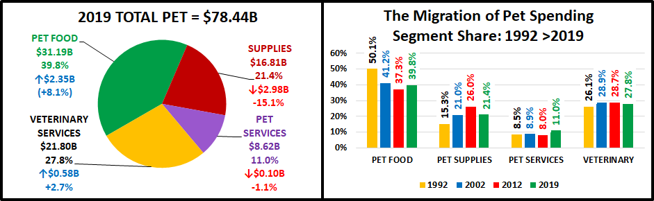
Food: 39.8%; Up from 36.7%
Supplies: 21.4%; Down from 25.2%
Veterinary: 27.8%; Up from 27.0%
Services: 11.0%; Down from 11.1%
The Food segment rebounded to almost 40% of Pet $. Back in 2015 it was 43.5%, the highest level since 1998. At the same time, Pet Supplies fell to 21.4%, the lowest level since 2002. This is at least a short term reversal of the most visible long term industry trend – the decline of Food share as Supplies gained in importance. This began in the 90’s when Pet Owners became Pet Parents. At the same time, Pet Chains and Super Stores came to the forefront and there was a big Pet Product expansion into the Mass Market. In 2019 Veterinary spending had a slight gain, but it has been the most stable through the years. After the big lift in 2018, Services held onto to their new level of importance. Food trends and the impact of petflation on Supplies have put the Product segments on a roller coaster ride in recent years.
Now let’s get started with a look at the “Big Spenders”. The following 2 charts will compare the market share and performance in all Pet Industry segments by the groups responsible for the bulk of the spending in 10 demographic categories. These are the groups that we identified in our Total Pet analysis to generate at least a 60% market share of spending. As you recall, in Pet Services, we had to alter two groups slightly to better target the spending. However, to have a true side by side comparison we need to use the same groups for all. The market share dips below 60% in 2 cases, to a low of 57.0%. This lowest share is related to Veterinary CU Composition and is primarily due to a spectacular year by Singles. The other is in Services and reflects the urban nature of the segment. Even the low point is within 5% of our target and 96% of all measurements meet or exceed the 60% requirement, so the comparison is very valid.
The chart makes it especially easy to compare performance across categories. Remember, performance levels above 120% show a very high level of importance for this category in terms of increased spending. Unfortunately, it also indicates a high spending disparity among the segments within the category. There are 2 charts, each with 5 categories.

- White, Non-Hispanic – This group has an 84+% market share in every Segment. Minorities account for 31.4% of CUs but only 9 to 15% of spending in any segment. Factors: Lower income for Hispanics and African Americans and lower Pet ownership in Asians and African Americans. They had a slight share gain in Total with larger gains in Services and especially Food. Veterinary was unchanged but the Supplies share plummeted, replacing Food on the bottom.
- Homeowners – Homeownership is very important in Pet Ownership and subsequently in all Pet Spending. It also increases with age. This group’s share of Total Pet bounced back after falling below 80% for the first time in 2018. Veterinary again held its ground, but Food and Services had share increases of 4%. Supplies lost 3 points in share and is now the only segment under 80%. Homeowners with or w/o a Mtge were up in Food and down in Supplies. Their results were mixed in the Service segments. Renters spent less in all segments but Veterinary.
- 2+ People in CU – 2 is the magic number in pet ownership. This year, all segments but Food fell in share and performance because Singles had another good year. This group is still under 120% because spending peaked at 3 person CUs in all segments, but Services (2 person CUs) then went down in 4+ CU’s. In both Service segments the performance of 5+ person CUs is actually worse than singles.
- Associates Degree or Higher – Higher education often correlates with higher income and we see a similar spending pattern. The group grew in size but fell in share and performance in all segments, but Services. The biggest decrease in share (-2.8%) and performance (-7.7%) came in Veterinary, while Services gained 3.7% in share. Spending became a little more balanced in terms of Education in all but the most discretionary segment – Services.
- Everyone Works – Income is important, and the # of Earners became more important in 2019, with one exception – Services. The difference in Services came from a big lift from Single, No Earner. Younger CUs have more earners and pet spending has been skewing towards the younger generations. Note: 2 Segments have reached the 120% level.
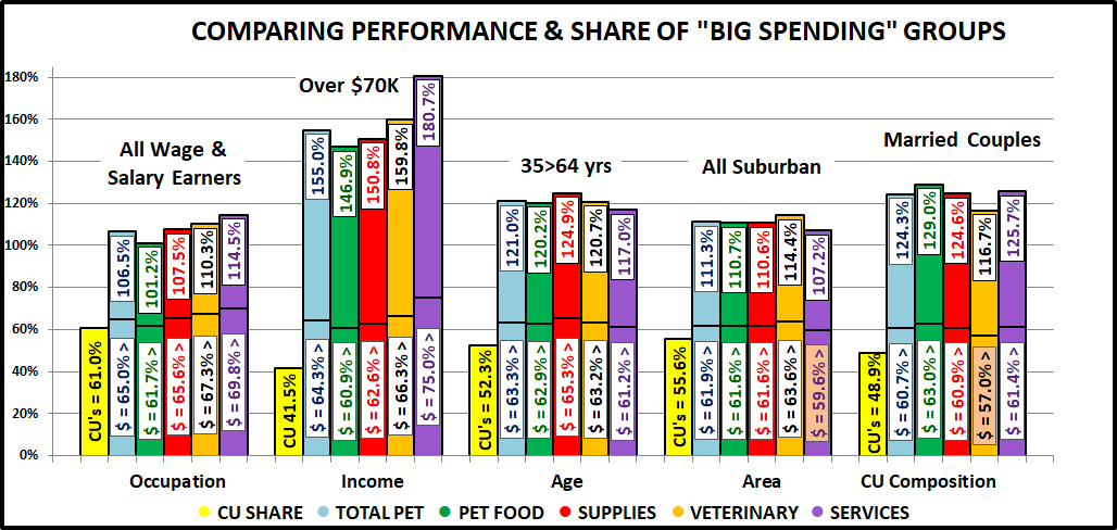
- All Wage & Salary Earners – Incomes vary widely in this group, so performance tends to be lower. However, all segments, but Services gained in share and performance. The biggest gains came in Food and Veterinary. The Food increase was driven by White Collar while the Veterinary lift came from all workers while their “Bosses” spent less.
- Over $70K Income – INCOME MATTERS MOST IN PET SPENDING! As spending becomes more discretionary the importance of income increases. Food still has the lowest share and performance but had the biggest gains. The only segment with decreased share and performance was Veterinary. Veterinary spending became more income balanced while Food went in the opposite direction.
- 35 to 64 yrs – Includes the 3 highest income segments. This group increased both share and performance In Total Pet due to Food where performance reached 120%. Supplies had a minimal increase but both Services segments fell with Services performance falling below 120%. All ages in the group spent more on Food but the results were mixed for other segment. Overall, the best performance came from the 35>44 yr olds, followed by 55>64.
- All Suburban – Most Pet $ are spent here and they gained ground in all segments but Supplies. The biggest driver in their performance was the bigger Suburbs, 2500>. The biggest lift was in Services where performance broke 100% for the 1st time. Rural, Central City and Suburbs <2500 all decreased spending in Total Pet and 3 of 4 Segments.
- Married Couples – Marriage has been important to spending in all segments. In 2019 it became less important in all segments but Food. The biggest drops came in Supplies and Veterinary. In fact, Veterinary share fell below 60% and performance below 120%. Overall, couples only did the worst but also remember that Singles had a strong year.
Now we’ll drill a little deeper to look at the Best and Worst performing segments in each category. Color Highlighted cells are different from Total Pet; * = New Winner/Loser; ↑↓ = 5+% Performance Change from 2018. We will divide the categories into related groups. First, those related to Income.
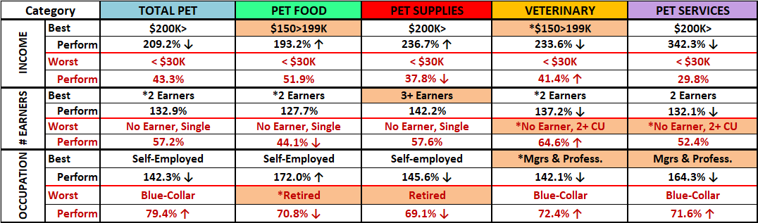
- Income – Income matters, and its importance is growing in the Product Segments. The disparity between first and last place increased by 30% in Food but doubled in Supplies. The Veterinary winner dialed down from $200k> in 2018 and the disparity decreased by 16%. The gap in Services is still astronomical but down 6% from 2018. The changes in Veterinary helped to decrease Total Pet disparity by 8% but the difference is still huge in this category.
- # Earners – More earners = more income. 2 Earners became the magic number which reflects the importance of Gen X and Millennial CUs. In Supplies, 3 Earners, the highest income group, won. The disparity grew in Food but fell in Veterinary. However, the number of Earners gained in importance in all segments but Services.
- Occupation – Self-Employed and Mgrs & Professionals are #1 and #2 in CU income and expenditures. They again occupy all the top spots. The bottom spots are again occupied by either Retirees or Blue Collar workers. The disparity is growing in Food while decreasing in all other segments and Total Pet. However, this category still clearly reinforces the importance of income in Pet Spending.
Next are demographics of which we have no control – Age, Generation and Racial/Ethnicity

- Racial/Ethnic – As expected, White Non-Hispanics are the top performer in all segments and now African Americans occupy all the bottom slots. They have the lowest income and only 25% own Pets. The disparity is large and growing in all areas but Supplies. It is not growing in Supplies because Whites spend the most and had the biggest drop.
- Age – The highest income 45>54 yr olds are the top performers in all but Veterinary. They took over the leadership in Pet Spending in 2018. Last year the loser in all categories was 75+. They were largely replaced by the youngest group. Once again, the disparity is growing in Food and shrinking in Veterinary.
- Generation – Boomers still rule Food. All else belongs to Gen X. The only change from 2018 is that Millennials dialed back their Services spending. The vast majority of 35>54 yr-olds are Gen Xers so you can see the ties to the Age data.
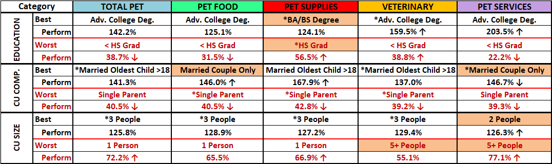
- Education – Winning and losing is closely tied to more and less Education which generally correlates with income. The only difference is in Supplies where the performance became a little more balanced.
- CU Composition – Married Couples Only are still on top in 2 categories. The biggest change was the rise of couples with an oldest child 18>. Single Parents had a terrible year and are now at the bottom in all segments.
- CU Size– 3 is now the top number in Pet but 2>4 are all strong. Performance drops off at both ends, 1 or 5+ CUs.
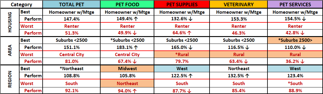
- Housing – Homeowners w/Mortgage and Renters are the perennial winner and loser.
- Area– Suburbs <2500 population perform the best except for the new winner, Suburbs 2500> in Services. In terms of worst performer, it is Central City in Food and Total Pet, but Rural in all other segments.
- Region – 3 different winners, with the Northeast a surprise in Total. The South is again the overall worst performer.
Here are two summary charts. The first compares the averages.
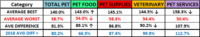
The big change in Food is immediately apparent. In the past, the performance difference grew as you moved from Food to Supplies to Services and spending became more discretionary. In 2019, the difference between winners and losers in Food increased by 34%. The Supplies difference was down minimally. Services fell 5% and the disparity in Veterinary was down 10%. Spending became more balanced in every segment but Food. The increase in Food was so large that it pushed the Total Pet disparity up 1%.
- Food – In Food the best and worst are actively moving apart – much less balanced in more demographics.
- Supplies – Despite a big drop in $, the relative performance in Supplies remained rather stable.
- Veterinary – The performance of both winners and losers fell significantly, but the gap narrowed about 10%.
- Services – The performance of the Best and Worst both declined but they still moved a little closer together.
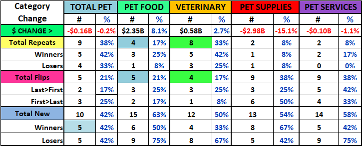
This chart shows the number of new winners/losers.
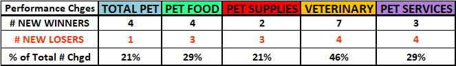
Total Pet had few changes, especially in losers. Total Pet is a sum of the segments. This can mitigate or even cancel out extreme differences in segments. Always look below the surface.
- Pet Food had a large increase in spending, a complete reversal from 2018. However, there were only 7 changes, which is the same as last year when spending fell sharply in the second half.
- Supplies is the most stable. A record drop in $ produced very little change in top or bottom performance.
- The Veterinary spending increase was minimal but a 46% change in winners/losers is evidence of some turmoil.
- Services had a decrease in $ and but their performance change was 29%, the same as Food.
Now, let’s look at the Demographic Segments with the Biggest Changes in $. We’ll truly see some differences between the Industry Segments. We have color highlighted differences from Total Pet. Plus:
- Boxed w/green = Winner/Loser same as 2018
- ↕ = Flipped from 1st to Last or vice versa
First, the Income related categories.

- Income – There was no clear pattern with 4 different winners but 3 were under $40K. There were 3 different losers but 4 earned less than $70K. It appears that the biggest changes – up or down, came from lower income segments.
- # Earners – 1 Earner, 2+ CUs had another bad year, losing in 4 areas. 2 Earners had the best year, with 3 wins. Singles had an OK year. They had 2 wins – split between 1 and No Earner. Of course, 1 Earner, Singles did lose in Services.
- Occupation – A bad year for the “bosses” in every area but Food. Self-Employed won in Food and Mgrs & Professionals lost in every area but Food. Retirees had 1 win and 1 loss. Most of the winning came from lower level wage earners. All this indicates a move towards more demographically balanced spending.
Now the Age and Racial/Ethnic Categories

- Racial Ethnic – White, non-Hispanics won in all but Supplies, where they were the big loser. They spent the most on discretionary Supplies, so this is no surprise. The other 4 losers were split between Hispanics and African Americans, the lowest income groups. African Americans had the smallest decrease in Supplies because they never spent much.
- Age – There were 4 different winners, with 75+ being a big surprise. 4 losers were evenly split between 35>44 and 45>54 as they dialed back from 2018. The 35>44 group flipped to last in 2 areas. The <25 group did lose in Food.
- Generation – The younger groups continue to excel, winning in 4 areas. The oldest generation did have the biggest increase in Services. Boomers lost Total Pet and Veterinary while those born before 1946 came in last in Food. Gen X did finish last in 2 areas including a flip from 1st in Services. However, they are still the biggest Pet Spenders.
Now, here are more Demographic Categories in which the consumers can make choices.
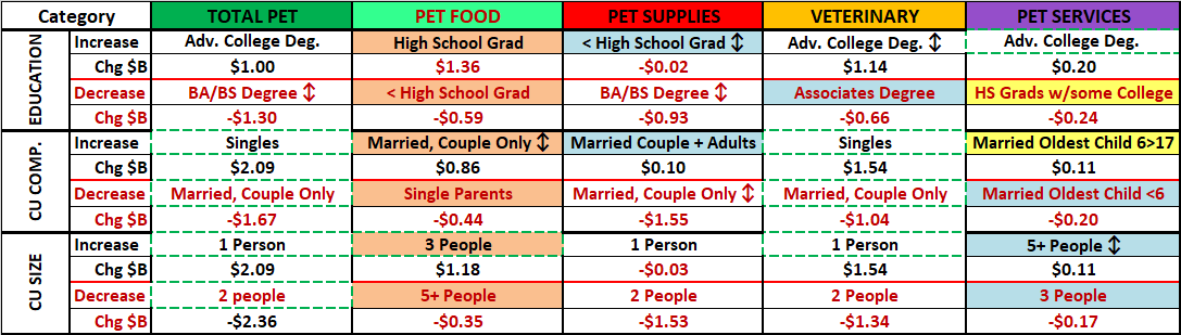
- Education – A College degree is better, but we had 2 winners without one, including those without a HS Diploma. Also, 3 losers had at least an Associates degree. It appears that spending is becoming a little more balanced.
- CU Comp. – 2019 was about all adult CUs. Married Couples Only had another bad year but they did flip in Food. Singles won in Veterinary and Total. Married CUs with kids won and lost in Services and Single Parents lost in Food.
- CU Size– It was a good year for 1 person CUs and bad for 2 people. The other wins/losses were split between 3 & 5+.

- Housing – Homeowners w/o Mortgage won twice, flipping from last both times. Homeowners w/Mtge are on top in 2 categories but lost Supplies. Renters won in Supplies but lost 3 times. It was a little more mixed than usual.
- Area – 4 of the 5 the winners are over 2500 pop with big Suburbs winning 3. Central City won Supplies with the smallest decrease but lost in 3 areas, including 2 flips. Small Suburbs, <2500 won Food but lost Veterinary. The Suburbs ruled but we should note that Rural was a No Show. In 2018 they lost in 3 areas and in 2017 they won in 2.
- Region – The Northeast won 3, all flips, but lost Services. The Midwest had the opposite story – 3 losses and 1 win with 3 flips. The South flipped to 1st in Food but lost Supplies. What about the West? They were the best performer in Supplies and Services and last year won Food. They were up in 3 areas and down in 2 but the changes were small.
The next chart compares the number of repeats, “flips” and new segments among the 12 winners and 12 losers for each category. The idea is to look for patterns in the data that cross segments. Let’s take a look.
- Segments were either up or down…by a lot or a little. There seems to be a different pattern in those segments with an overall increase vs those with a decrease, regardless of the size of the change.
- In terms of repeats, you see more stability in Food/Vet ($ ↑) than in Supplies/Services ($ ↓).
- There are also twice as many flips in the segments with a decrease in $. Supplies had the biggest decrease in $ and the most flips from 1st to last (50%). Only 12% of segments in Food or Vet flipped to last. Food rebounded from a big drop in 2018 but only 3 segments flipped from last to first so the $ didn’t come from most of last year’s losers.
- You can see how the combined segments made Total Pet stable – the most repeats, few flips and the least new.
Next, there were so many positive contributors that in each individual report we recognized 6 segments that didn’t win but still performed so well that they deserved Honorable Mention. I reviewed that list again and came up with segments that won Honorable Mention in more than one segment. Here are the “SUPER Honorable Mentions” for 2019…

You can immediately see that it was an unusual year as 3 segments made the list, even with small decreases in Supplies. Another trend is obvious. All received honorable mention in Veterinary spending. This segment became more balanced in multiple categories. All of the segments on the list are generally “low profile” but contributed notably to the industry. One group deserves special notice. The $70>79K segment actually had the biggest increase in Total Pet $ of any income group. They did it with a strong performance in all segments, including a +11.8% increase in Food.
Although the results were mixed, with numerous individual changes, I saw these trends of note:
- Youth Movement – The Boomers continue to fade as the Gen Xers step up, with the Millennials close behind.
- Sub-Urbanization – Center City flips every year with the $ change. The Suburbs are the key. Suburbs <2500 are the top performers but the Suburbs 2500> spend the most and are the only area that increased $ every year since 2016.
- “2” is a less “Magic” number – Singles again had the biggest spending increase, and 3 Person CUs are the best performer in Total Pet and all segments but Services.
- Changes in spending balance – The performance gap between the best and worst narrowed in both Services segments. However, the disparity in Pet Food grew by 34%. That’s not good in this truly necessary segment.
- Income is still the most important factor – While the gap between best and worst narrowed in Services and Veterinary, it widened in Products, especially Food. The best performer is always $150K+ while the worst is <$30K.
And Finally, What you have all been waiting for…
THE ULTIMATE 2019 PET SPENDING CUs – Side by Side
Color Highlighted cells are different from Total Pet; * = New in 2019

Methodology – The segments are chosen because they have the highest annual CU spending of any segment in the category. They may or may not have the most total dollars. That would depend upon the number of CUs in the group.
Final Comment – These “winners” further reinforce the key factors in increased pet spending:
- Marriage – A commitment to another person demonstrates that you can make a commitment to your pet “children”.
- CU Size – The “magic” number has changed from 2 to 3.
- Homeownership – Owning and controlling your own space has long been a key factor in Pet Parenting.
- More space – Small suburbs near a big metro area offer the convenience of the city, plus room for more pets.
- Income Matters Most – High Income, A High Paying Occupation, A College Degree, At Least 2 Earners. These are characteristics present in all of the Ultimate Pet Spending CUs.
- Generation– The Boomers have officially passed the torch to Gen X. Age Note: All 45>54 and 60% of 35>44 are Gen Xers.
I hope that this Visual Comparison helped you to get a “satellite view” of Pet Industry Spending in 2019. Please refer back to the individual segment reports to get more details.

