Pet Products Spending by Generation: Mid-Year 2019 Update
Pet Products spending totaled $46.61B for the 12-month period ending 6/30/19. This was a decrease of $4.56B (-8.9%). Total U.S. spending for the period totaled $8.23 Trillion, up $280B (+3.5%). Big decreases in Food, due to the FDA grain free warning and Supplies, due to tariffs sent Pet Products Spending in the opposite direction from Total U.S. spending.
In this report we will update Pet Products Spending for arguably the most popular demographic measurement – by Generation. Baby Boomers built the Pet Industry and they still have the biggest share of Total Pet and Pet Products $. However, in 2018 Gen Xers took the lead in pet spending per household, but the group that gets the most “press” is the Millennials. They are the future. Are they stepping up in life and in spending?
We also have some special news this year – both good and bad. The good news is that Gen Z, born 1997 and later, now have enough CUs for a reliable sample. We will start reporting their CU characteristics and spending separately from Millennials in this report. We won’t be able to compare any data to track their movement for another year. When appropriate, we will consolidate the numbers from all CUs born in 1981 or after so we can compare it to last year. The bad news is that the Greatest Generation, born before 1928, is now too small to accurately measure. Their spending will now be included with the Silent Generation. The new group will be everyone born before 1946. Now, let’s get started. As always, the numbers come from or are calculated from data in the US BLS Consumer Expenditure Survey.
First, let’s define each generation and look side by side at their share of Consumer Units (H/H’s) and Total Spending.
Generations Defined
Gen Z: Born 1997 and after
In 2019 age 18 to 22
Millennials: Born 1981 to 1996
In 2019 age 23 to 38
Gen X: Born 1965 to 1980
In 2019 age 39 to 54
Boomers: Born 1946 to 1964
In 2019 age 55 to 73
Silent/Greatest: Born <1946
In 2019 age over 73

- Boomers are still the largest group with 43.3M CUs (32.8%) and the biggest spenders – $2.8T. They are losing ground in both areas. However, their spending performance in relation to their share of CUs is still 102%.
- Gen X is ranked second in size and spending and both are growing. Their spending performance is 123%, by far the best of any group. They are likely to take the lead in total spending by the end of 2019.
- Millennials are the largest generation in sheer numbers, but third in CUs. More are developing financial independence and their spending reached $1.87T – 3rd place. However, their spending performance is only 93%.
- The oldest Silent/Greatest generations are losing CUs and their overall spending was down $25B.
- Gen Z is the newest generation, so their low numbers are to be expected. Avg CU age is just 19.7 yrs.
Age certainly affects behavior but there are other CU characteristics, like income, family situation and home ownership that make a difference both in Total Spending and in Pet Spending. Let’s look at some of these key differences.

- Singles had a big year, but 2+ people CUs account for 77.7% of all Pet Products Spending. (down from 84.8% in 2018)
- The size of the CU and number of children is all about Family responsibility and all the financial pressures that this generates. The CU size overall is unchanged from Mid-2018 and still peaks with the Gen Xers. However, the Boomers decreased by 0.1 person. Perhaps, their Millennial kids are finally moving out?
- Married couples with children under 18 are an important group with 22.6% of all CUs. They more than earn their share with 27.7% of all Pet Products spending and 29.2% of Supplies Spending. However, as the number of children grows, the increased financial responsibility can slow Pet Spending.
- Boomers still average 2+ people in the CU. However, they are much less likely to have children <18 at home. As their human children leave home, they turn their attention and spending to their Pet Children who are still with them.
- Pet Products spending is also tied to the number of earners in a CU. 2+ Earner CUs account for 41% of the total but they spend 51% of Pet Products $. Most “earning” is being done by Gen Xers, Millennials and Boomers, with Gen Xers at the top, as to be expected. Boomers are down 0.1 as more move into retirement, but Gen Z is stepping in.
- Homeownership – Owning and controlling your own space has always been a key to increased Pet Ownership and spending. Homeowners currently account for 78.1% of all Pet Products Spending, which was driven down from 80.2% largely by the performance of Homeowners w/o Mtges. Renters spent slightly more overall, +0.6% but all groups spent less on Pet Products in the 1st half of 2019.
- Nationally, Homeownership moved up slightly to 63.47%. Gen Xers moved up from 62% to 65%, beating the national average for the first time. As you can see Homeownership increases regularly with age.
- The Millennials are now up to 41% but they are still 15% below the rate for the older generations when they were the same age.
- Boomers dropped from 78% to 76% and Gen Z got started with 10% of CUs owning a home.
Next, we’ll compare the Generations to the National Avg. :
In Income, Spending, Pet Products Spending and Pet Products Share of Total $pending
CU Avg Income – $81.220; Total Spending – $62.438; Pet Products Spending – $353.94; Pet Products Share – 0.57%

- Income – The 39>54-year-old Gen Xers are the leaders. The Boomers earn over 20% less and their income will continue to fall as they age. Millennials income is still 10% less than the Boomers and only 70% of the Gen Xers. The big drops are at both ends of the age range with the retired Silent/Greatest and the “just getting started” Gen Zers.
- Total Spending – The Gen Xers make the most and spend the most, but their spending is not out of line with their income. Boomers also spend more than the average, but their income can still support it. The Millennials’ spending is also very much in line with their income as they approach the national average in both areas. Spending doesn’t fall as fast as income with the older generations. In fact, they are actually deficit spending in relation to their after tax income. Gen Z is in an even worse deficit situation as they spend 25% more than they make.
- Avg CU Pet Products Spending – Gen X briefly took over the top spot at the end of 2018 but lost it to the Boomers because of a big drop in Supplies spending in the 1st half of 2019. Only Boomers and Gen X spend more than the national average. The Millennials are closing the gap but still trail the Gen Xers and Boomers by over 20%. The oldest CUs spend about half as much per CU on Pet Products as the top 2. The Gen Zers are just getting started with Pet Parenting so they spend only about ¼ of the national average.
- Pet Products Share of Total Spending – One measure of the level of commitment to their Pets.
-
- The Pet Products share of total spending fell to 0.57% as Pet Products CU spending fell 9.7% while total spending was up 2.7%. Only Boomers exceed the National Average but everyone over 23 years of age is at least 81% of the national average.
- All groups decreased their pet products spending in terms of its share of their overall spending. However, the biggest drops came from the older groups, especially the Boomers.
- Millennials are in 3rd place in both income and total spending but moved up to 2nd place in Pet Products Spending share. They are committed to their pet children.
- Much of the drop for the Oldest Americans came as a result of bundling the Greatest with the Silent Generation. The 74 to 91-year-old Silents still have a strong commitment to their pet companions.
Now let’s look at Pet Products $ spent by Generation and their share of the total.

- In terms of 2019 Mid-Yr Performance, the older groups were down, and the younger groups were up, especially <39.
- Boomers still have the largest share, but Millennial/Gen Z gained the most, moving up to 23.1% from 19.4% in 2018.
- Overall – Ave CU spent $353.94 (-$37.96); 2019 Mid-Yr Pet Products spending = $46.61B, Down $4.56B (-8.9%)
- There were big drops in both halves. July>Dec 18, Down $2.52B; Jan>Jun 2019, Down $2.04B
- Boomers – Ave CU spent $416.00 (-$86.14); 2019 Mid-Yr Pet Products spending = $18.03B, Down $4.44B (-19.8%)
- Huge drop in 2018 and continued down in 2019. – Jul>Dec 18, Down $3.82B; Jan>Jun 19, Down $0.62B.
- Gen X – Ave CU spent $406.63 (-$4.41); 2019 Mid-Yr Pet Products Spending = $14.40B, Up $0.01B (+0.07%)
- Up in 2018, down in 2019. Only 2.6% more CUs “saved” them.– Jul>Dec 18, Up $0.75B; Jan>Jun 19, Down $0.74B
- Millennial/Gen Z– Ave CU spent $295.22 (-$3.15); 2019 Mid-Yr Pet Products Spending = $10.77B, ↑$0.82B (+8.3%)
- Due to 6.5% more CUs, they had an increase in both halves. – Jul>Dec 18, Up $0.77B; Jan>Jun 19, Up $1.23B.
- Millennials Only – Ave CU spent $319.56; 2019 Mid-Yr Pet Products Spending = $10.44B
- Gen Z Only – Ave CU spent $49.08; 2019 Mid-Yr Pet Products Spending = $0.33B
- Due to 6.5% more CUs, they had an increase in both halves. – Jul>Dec 18, Up $0.77B; Jan>Jun 19, Up $1.23B.
- Silent/Greatest – Ave CU spent $207.36 (-$42.99); 2019 Mid-Yr Pet Products Spending = $3.42B, ↓$0.95B (-21.8%)
- Down in both halves but the big drop came in 2019. Jul>Dec 18, Down $0.13B; Jan>Jun 19, Down $0.82B.
All Generations spent less per CU. The biggest drops came from the oldest groups who spent much less and decreased in numbers. The increase from younger groups was due to more CUs. Let’s look at individual segments. First, Pet Food
- The impact of the FDA grain free warning hit the Boomers…hard. The response in the oldest group was delayed.
- The younger groups grew in both halves – Gen X won the 2nd half of 2018 – Millennials/GenZ won the 1st half of 2019
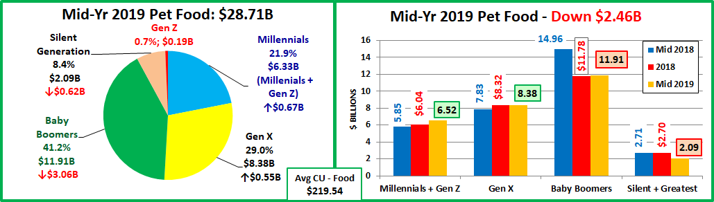
- Overall – Ave Cu spent $219.54 (-$20.90); 2019 Mid-Yr Food spending = $28.71B, Down $2.46B (-7.8%)
- After a big drop in the 2nd half of 2018, spending turned up… barely. Jul>Dec 18 (-$2.51B); Jan>Jun 19 (+$0.05B)
- Boomers – Ave CU spent $274.51 (-$58.79); 2019 Mid-Yr Food spending = $11.91B, Down $3.05B (-20.4%)
- July>Dec 18 (-3.18B) – In reaction to FDA warning. Then things calm down. Jan>Jun 2019 (+$0.13B)
- Gen X – Ave CU spent $237.87 (+$15.42); 2019 Mid-Yr Food spending = $8.38B, Up $0.55B (+7.0%)
- Another reaction to the FDA warning – buy even more costly food. Jul>Dec 18 (+$0.49B); In Jan>Jun 19 (+0.06B)
- Millennial/Gen Z – Ave CU spent $177.13 (-$0.03); 2019 Mid-Yr Food Spending = $6.52B, Up $0.67B (+11.4%)
- Jul>Dec 18 (+$0.19B); Jan>Jun 19 (+$0.48B). More CUs generate more $pending.
- Millennial Only – Ave CU spent $192.35; 2019 Mid-Yr Pet Food Spending = $6.33B
- Gen Z Only – Ave CU spent $49.08; 2019 Mid-Yr Pet Food Spending = $0.19B
- Jul>Dec 18 (+$0.19B); Jan>Jun 19 (+$0.48B). More CUs generate more $pending.
- Silent/Greatest – Ave CU spent $128.95 (-28.46); 2018 Mid-Yr Food spending = $2.09B, Down $0.62B (-22.9%)
- It appears that they reacted to the FDA warning, but not until 2019. Jul>Dec 18 (-0.01B); Jan>Jun 19 (-$0.61B)
Only Gen X CUs spent more on food. The Boomers and oldest group were negatively impacted by the FDA warning. The younger groups increased spending, but the Millennial/Gen Z group did it because of more CUs. Now, Supplies.

- Boomers still have the largest share but Supplies spending skews younger – Gen X, Millennials & Gen Z control 58%.
- The spending drop skews older and is widespread, including all groups older than Millennials.
- Overall – Ave CU spent $134.40 (-$17.06); 2019 Mid-Yr Supplies spending = $17.71B, Down $2.10B (-10.6%)
- Supplies spending grew for 24 months. That ended with new tariffs. Jul>Dec 18 (-$0.01B); Jan>Jun 19 (-$2.09B)
- Baby Boomers – Ave CU spent $141.49 (-$16.60); 2019 Mid-Yr Supplies spending = $6.12B, Down $1.38B (-18.4%)
- The drop was strong and consistent over both halves. Jul>Dec 18 (-$0.64B); Jan>Jun 19 (-$0.74B)
- Gen X – Ave CU spent $168.76 (-$19.83); 2019 Mid-Yr Supplies spending = $6.56B, Down $0.54B (-8.2%)
- Increased “tariff” prices affects even the wealthiest group. Jul>Dec 2018 (+$0.26B); Jan>Jun 19 (-$0.80B)
- Millennials/Gen Z – Ave CU spent $118.09 (-$3.12); 2019 Mid-Yr Supplies spending = $4.25B, Up $0.16B (+3.9%)
- Overall lift from more CUs. Tariffs “hit home” in the 1st half of 2019. Jul>Dec 18 (+$0.48B); Jan>Jun 19 (-$0.32B)
- Millennials Only – Ave CU spent $127.21; 2019 Mid-Yr Supplies spending = $4.11B
- Gen Z Only – Ave CU spent $37.94; 2019 Mid-Yr Supplies spending = $0.14B
- Overall lift from more CUs. Tariffs “hit home” in the 1st half of 2019. Jul>Dec 18 (+$0.48B); Jan>Jun 19 (-$0.32B)
- Silent/Greatest – Ave CU spent $78.41 (-14.53); 2019 Mid-Yr Supplies spending = $1.32B, Down $0.34B (-20.0%)
- The drop began in the 2nd half of 2018 then accelerated in 2019. Jul>Dec 18 (-$0.12B); Jan>Jun 19 (-$0.22B).
In the 2nd half of 2016, Supplies began 24 months of growth which resulted in a $5B (33%) spending increase. Gen X and Boomers fueled 73% of the growth but the Millennials also stepped up in the last 12 months with a $0.94B increase. A big factor in this lift was pricing. Prices deflated for 22 months so Supplies were a great value for everyone. That changed in 2018 as new tariffs were added, effective in September. In anticipation, prices began moving up in the Spring. Supplies spending flattened in the 2nd half of 2018 then plummeted $2B in the 1st half of 2019. The price increase affected all generations as CU spending on Supplies fell for every group.
In the final chart we will compare each generation’s share of spending on Total Products, Pet Food and Pet Supplies to their share of CU’s and see “Who is earning their share?” Then we will review their actual performance numbers.
Performance = Share of Spending/Share of CU’s; 100+% indicates you are “earning your share”
If a share of market is outlined, then performance exceeds 100%.

- Silent/Greatest Generation Performance – Pet Products: 57.1%; Pet Food:56.4%;Pet Supplies:58.3%
- This group is all over 73 yrs old. Pet ownership is more difficult after age 75 and this is reflected in the low share of Pet Products spending. However, the desire and the commitment are still there. Their performance is very consistent between Food and Supplies, but both will drop as they age.
- Baby Boomers Performance – Pet Products: 117.8%;Pet Food: 125.5%; Pet Supplies: 105.3%
- The Boomers truly led the way in building the pet industry and they are still at it. They are earning their share and are the spending leader in both Food and Supplies. With the FDA warning and the Supplies Tariffs, their overall performance is down sharp[y from last year. Ultimately this will fade even more as they age. They will undoubtedly lead in Food for a number of years, but Gen X may outperform them in Supplies by year end.
- Gen X Performance – Pet Products: 114.0%; Pet Food:117.1%; Pet Supplies: 125.6%
- The Gen Xers are next in line and next in performance to the Boomers. They significantly outperform the Boomers on supplies and their Food performance is again above 100%. Gen Xers range in age from 39 to 54. They already make and spend the most money. As they grow older, their children will start to move away from home and their focus will increasingly turn to their Pet Children. Expect their overall performance to continue above the 110% level and to surpass the Boomers in the not too distant future.
- Millennials Performance – Pet Products: 91.4%; Pet Food: 89.4%; Pet Supplies: 94.6%
- The Millennials are widely touted as the future of the industry. This is ultimately true, but the future is still a ways off. The Millennials are currently 23 to 38 years old. They have a lot of pets, but their responsibilities are growing, and they are still a little short on income. There is no doubt that are deeply committed to their pets as they took over the #2 spot in Pet Products spending as a share of total spending. They now only trail the Boomers. They are 16 years away from occupying the highest income age group. Plus, they are having children later so the spending lift from children leaving will also undoubtedly be delayed. With all things considered, they may be 15 years away from Pet Spending dominance.
- Gen Z Performance – Pet Products: 25.5%; Pet Food: 23.8%; Pet Supplies:28.2% They’re Just getting started!
A Final Word – In the 2018 mid-year update, Pet Products Spending was up $5.3B. The increase was driven by the Boomers (48%) and Millennials (38%). Millennials were the most consistent with spending lifts in both halves for Food and Supplies. Mid-Yr 2019 was quite different. The 2018 FDA grain free warning drove Food spending down $2.46B while added tariffs on Supplies raised prices, resulting in a $2.1B drop in spending. The Boomers owned the biggest share of both decreases but the oldest group also contributed -$1B. On the plus side, in Food the younger groups were both up – a total of $1.2B. In Supplies all groups but Millennial/Gen Z spent less. One thing didn’t change from 2018. The Millennials were the most consistently positive. They were the only group to spend more on both Food and Supplies.