U.S. PET SUPPLIES SPENDING $17.71B (↓$2.10B): MID-YR 2019 UPDATE

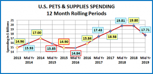
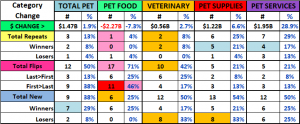
In our mid-year analysis of Pet Food spending, we saw that the spending plummeted in the 2nd half of 2018 then flattened out at the beginning of 2019. Pet Supplies spending took the exact opposite path. Mid-Year 2019 Pet Supplies spending was $17.71B, down $2.1B (-10.6%). The first half spending drop in 2019 effectively puts spending in this segment back to the level of 2 years ago in Mid-Yr 2017. The following chart should put the recent spending history of this segment into better perspective.

Here are this year’s specifics:

  • Mid Yr 2019: $17.71B; ↓$2.10B (-10.6%) from Mid Yr 2018. The -$2.10B came from:
    • Jul > Dec 2018: ↓$0.01B
    • Jan > Jun 2019: ↓$2.09B

Like Pet Food, Pet Supplies spending has been on a roller coaster ride. However, the driving force is much different. Pet Food is “need” spending and has been powered by a succession of “must have” trends. Pet Supplies spending is largely discretionary, so it has been impacted by 2 primary factors. The first is spending in other major segments. When consumers ramp up their spending in Pet Food, like upgrading to Super Premium, they often cut back on Supplies. However, it can go both ways. When they value shop for Premium Pet Food, they take some of the saved money and spend it on Supplies. The other factor is price. Pet Supplies prices reached their peak in September of 2009. Then they began generally deflating and in March 2018 were down -6.7% from 2009. Although it is not a hard and fast rule, Price inflation in this largely discretionary segment can retard sales, usually by reducing the frequency of purchase. On the other hand, price deflation generally drives Supplies spending up. Innovation can “trump” both of these influencers. If a new “must have” product is created, something that significantly improves the pet parenting experience, then consumers will spend their money. The perfect example of this is the successive waves of new food trends. Unfortunately, we haven’t seen much significant innovation in the Supplies segment recently.

Recent history gives a perfect example of the Supplies roller coaster. In 2014 Supplies prices dropped sharply, while the movement to Super Premium Food was barely getting started – Supplies spending went up $2B. In 2015, consumers spent $5.4B more on Pet Food. At the same time, Pet Supplies prices went up 0.5%. This was a “killer” combination as Supplies spending fell $2.1B. In 2016 consumers value shopped for Food, saving $2.99B. Supplies spending stabilized by mid-year then increased by $1B in the second half when prices fell sharply. Consumers spent some of their “saved” money on Supplies. Supplies prices continued to deflate throughout 2017. Food spending increased $4.61B in 2017 but this came from a limited group, generally older CUs, less focused on Supplies. The result was a $2.74B increase in Supplies spending. This appeared to be somewhat of a break with the overall pattern of trading $ between segments.

In the first half of 2018 Pet Food spending slowed to +$0.25B. Supplies’ prices switched from deflation to inflation but were only up 0.1% versus the first half of 2017. During this period Supplies Spending increased by $1.23B. With new Tariffs scheduled to start in September, prices began to climb in the second half of 2018. They were up 1.7% in the second half and with implementation of the tariffs, grew an additional 1.7% in the first half of 2019. Halfway through 2019 Supplies prices were a full 3.4% higher than they were a year earlier. The impact of the tariffs on the Supplies segment is very clear. Spending became flat in the second half of 2018, then took a nosedive in the 1st half of 2019 – down -$2.1B. In one 6 month period Supplies gave back 40% of the $5B it had gained from July 2016 to June 2018.

Let’s take a closer look at the data, starting with the two most popular demographic measures – age and income. In the graphs that follow we will compare spending for the Mid-year 12 months ending 6/30/19 to the previous period ending 6/30/18. In our graphs we will also include the 2018 yearend $pending. This will also allow you to see the spending changes in the 2nd half of 2018 and the 1st half of 2019.

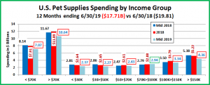
The first graph is for Income, which has been shown to be the single most important factor in increased Pet Spending, especially in Pet Supplies and both of the Service segments.

Here’s how you get the change for each half using the $50>70K group as an example:

Mid-yr Total Spending Change: $2.43B – $2.47B = Down $0.04B (Note: green outline = increase; red outline = decrease)

  • 2nd half of 2018: Subtract Mid-18 ($2.47B) from Total 2018 ($2.61B) = Spending was up $0.14B in 2nd half of 2018.
  • 1st half of 2019: Subtract Total 2018 ($2.61B) from Mid-19 ($2.43) = Spending was down $0.18B in 1st half of 2019.

  • In an exact reversal of the Mid-yr 2018 pattern, the decrease in Supplies Spending was widespread across income groups. The only yearly increase came from the $70>100K group. They were up in both halves. They did have a $2B decrease in Food spending during this time so they may have spent a small amount of those $ on Supplies.
  • In another reversal, the biggest decrease came from the over $150K group. Their $1.02B drop accounted for 49% of the segment’s total decrease while they only have 13.1% of the CU’s. They gave back most of last year’s $1.5B gain but the drop was mitigated because this group is gaining members faster than any other income segment, +11.4%.
  • The pattern of the under $50K groups matches the $150K+ segment with drops in both halves. Their combined $1.03B drop also accounted for 49% of the total decrease. However, they account for 46.0% of all CUs and their numbers are shrinking, down 1.6 million, -2.7% in the last year.
  • The upper and lower middle income groups, $50>70K and $100>150K, had their own pattern with a lift in the second half of 2018 and a drop at the start of 2019. The $ changes were larger for the higher income group.
  • Did tariffs have an impact? Income groups totaling 113M CU’s (86%) spent less on Supplies in the 1st half of 2019.

Now let’s look at Pet Supplies spending by Age Group.

  • Every Age group had an overall annual decrease and only the under 25 group had an increase in the 1st half of 2019.
  • The 25>44 year olds were the only ones to spend more in the second half of 2018, +$0.32B. However, they gave it all back and more, down -$0.94B in the 1st half of 2019.
  • The two smallest spending groups, <25 and 75+ had only small decreases, under -5%. However, the Supplies spending in each of the other groups fell at least -9%. Obviously, the inflation from tariffs affected all ages.

Now let’s look at what is happening in Supplies spending at the start of 2019 across the whole range of demographics. In our final chart we will list the biggest $ moves, up and down by individual segments in 11 demographic categories. Remember, the drop in the 1st half of 2019 was -$2.09B, a big change from the -$0.01B decrease in the 2nd half of 2018.

  • The first thing that you notice is that the biggest decreases are radically larger than the biggest increases.
  • The downturn is also very widespread as in 5 of the 11 categories all segments decreased Supplies Spending. This is a radical turnaround from last year when 4 categories had increased supplies spending in all segments. The “flip” from last year is even more evident in the details. In the 1st half of 2018, 89% of all segments spent more on Supplies. In 2019, only 8 segments spent more. That means 90% spent less – a total reversal.
  • The list of losers is a veritable roster of the usual Supplies spending winners – Gen X, White, not Hispanic, Homeowners w/Mtge, $150K+, BA/BS, Suburban, 2 Earners… The answer is that the groups who buy the most Supplies were the groups most impacted by the price increases.
  • There are a couple of minor bright spots. Like the Food segment, Singles were the unexpected winners in 3 categories. This reflects their increasing focus on their pets. It also can be seen beneath the surface in the <25 and 75+ age groups. They had by far the smallest decreases and are also the most likely to be in a 1 person CU.
  • The other positive is that both African Americans and Hispanics increased their spending overall and in both halves.

The 24 month Spending winning streak for Supplies which began in the second half of 2016 came to an end in the second half of 2018. During that time spending on Pet Supplies increased $4.97B (+33.5%). It was also widespread across America. Of 82 separate demographic segments, only 1 spent less on Supplies in that period – the Greatest Generation. This 91+ year old group has now become too small to be accurately measured.

What are the market conditions that affect Supplies spending? We have to first note that the world changed for Supplies because of the great recession. Prices have generally deflated since then and spending in the segment became more sensitive to changes in price. Prices go up…spending drops, usually due to reduced purchase frequency. Prices go down… spending turns up. This situation did not exist prior to the recession.

The other factor is spending in other segments, especially Food. Pet spending comes out of “one bucket”. A big increase in one segment can result in a cut back in others and big savings can generate more spending. The recent upgrade to Super Premium Food was such a big $ commitment that it magnified this effect.

In 2018, something new was added – outside influence. The FDA warning on grain free dog food had an immediate and negative impact on the Food segment. For Supplies, it was the implementation of added tariffs. Although the tariffs were not official until September, prices in the Supplies segment began to turn up in the Spring. In the 2nd half they were 1.9% above 2017 and kept increasing. The 1st half 2019 CPI was 3.4% above the 1st half of 2018. The result was that Supplies spending flattened out then plummeted in the first half of 2019, down -$2.1B. Inflation has now come to the forefront in Supplies Spending. It continued to increase. By the 2nd half of 2019 prices had increased 4.0% in 18 months. Unless consumers adjust their behavior, this does not bode well for the 2nd half of 2019. We’ll get that data in September.




U.S. Census Bureau Small Business Pulse Survey – Measuring the Impact of COVID-19

Small Businesses are at the core of our nation’s economy and the challenges they face are important to everyone. To better understand the impact of COVID -19 on these businesses, the U.S. Census Bureau is reaching out to small businesses in order to aid decision-makers in serving their urgent needs. For the Survey, the Census Bureau defines a small business as a single location business with employment between 1 and 499 and receipts of at least $1,000.

Consisting of 16 questions, this 5-minute survey reaches close to 1 million businesses split across a 9-week rotation to reduce burden and lessen survey fatigue. The survey reaches out to small businesses in every area of the U.S. Economy. The first survey was conducted between 4/26/20 and 5/2/20 and results were released on 5/14. This report includes the data from that initial survey as well as the data from the weeks ending 5/9 and 5/16. It will be presented in charts that will allow you to track the evolution of the responses as we progress through this crisis.

The results are categorized by major NAICS code classification. This report will show the National Average plus results from 5 big groups which are relevant to the pet industry:

  • National Avg: Covers All Major Areas with a few Exceptions like Agricultural Production and Religious Organizations
  • Product Related Groups:
    • 31-33: Manufacturers – All manufacturers
    • 42: Wholesalers/Distributors – Wholesalers/Distributors of any type products
    • 44-45: Retail Trade – This includes everything from gas stations to Pet Stores (#453910). No restaurants
  • Services Related Groups:
    • 54: Professional, Scientific and Technical Services – Legal, Advertising Agencies, etc… and Vet Clinics (#541940)
    • 81: Other Services – Funeral Homes, Barber Shops, Auto Repair, etc … and Pet Care Services (#812910)

Each group will have a separate section in the report which will have 3 charts showing the group’s responses to some particularly relevant questions about the impact of COVID-19.

Here are the charts and the questions that will be answered on each:

Chart #1: Impact of Covid-19 on Your Business

  1. Overall, how has this business been affected by the COVID-19 pandemic?

Chart #2: Key Business Elements – Weekly Changes

  1. In the last week, did this business have a change in operating revenues?
  2. In the last week, did this business have disruptions in its supply chain?
  3. In the last week, did this business temporarily close any of its locations for at least one day?
  4. In the last week, did this business have a change in the number of paid employees?

Chart #3: Government Assistance & Your Outlook For The Future

  1. Since 3/13, has this business requested/received financial assistance from Paycheck Protection Program (PPP)?
  2. Since 3/13, has this business received any financial assistance from any Federal Program?
  3. In your opinion, how much time will pass before this business returns to its usual level of operations?

Advance Observations (Spoiler Alert)

  1. The negative impact is widespread and deep across the U.S. Economy.
  2. Business measurements, like revenue, closures and employment are generally moving in the right direction, but… slowly.
  3. As we come fully to grip with the crisis, it becomes more apparent that recovery will take quite some time.

Now Let’s Look at the Details

We will start with the overall National Small Business Response Averages.

Then, we will move to the Product Related Groups and Wrap it up with Services.

At the conclusion there will be a link to download a PDF copy of the report!

NATIONAL AVERAGE

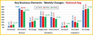
  • Total Negative is down slightly. The biggest drop is in large negative as both the moderate negative and little/no effect groups move up.

  • All measurements are moving steadily in the right directions. Although it is at an extremely low level, the group with an increase in revenue basically doubled in 2 weeks. Supply chain problems remain an issue and over 1/3 of the businesses still are reporting closures but this is down 20% from May 2nd. Employment is definitely slowly improving.

  • ¾ of all small businesses requested help from the PPP. It is finally coming through as 89% of those that submitted a request have received funds as of 5/16. With help from numerous Government agencies, like the Small Business Association, 72% of the Small Businesses have received financial assistance.
  • In terms of outlook the biggest decrease came in those expecting to return to normal in 2 to 3 months while the biggest increase came in the over 6 months group.
  • Things are turning in the right direction in basically every measurement, but the movement is slow. As businesses became involved in the reality of the situation, it is becoming increasingly obvious that a return to normal will take some time.

MANUFACTURERS

  • Total negative is slightly below the national average, but their evolving pattern is similar – a drop in large negative with increases in moderate negative and little/no effect. However, their Moderate negative share now ranks #1.

  • Their Revenue is moving in the right direction but the gain in the number with an increase was miniscule. While their Supply chain issues are significant, they have the lowest percentage of closures for any group. The employee count is also coming together but like Revenue, the gain in the number adding personnel was small.

  • 4 out 5 Manufacturers have requested PPP assistance and as of 5/16, 87% of those who applied had received funds. 77.8% of Small Manufacturers have received some Federal Financial assistance. This is the highest % of the 5 groups.
  • Although there was a slight increase in those stating that their was little or no impact on their business, the biggest movement in the projections is to over 6 months, which grew from 32.4% to 38%. The 2 to 6 month group fell from 51.9% to 45.1%.
  • The manufacturing segment is ultimately dependent upon retail so slowed business there will ultimately work its way up the distribution chain. This group is generally moving in the right directions but changes, especially increases tend to happen at a slower pace.

WHOLESALERS/DISTRIBUTORS

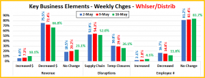
  • The overall negative impact has remained stable and very high, ranked 2nd of all 5 groups. However, it is moderating slightly. Little impact is up slightly. Overall, positivity is down slightly but is still the 2nd highest, behind Retailers.

  • Revenue is moving in the right direction. However, the percentage with decreased $ is the highest of all groups. Supply Chain problems are over 50% and 2nd highest, while Closures have the 2nd lowest rate. Employment remains very stable and moving towards a return to normal.

  • 70% have applied for PPP assistance and 87% have received funds. However, this group has the highest percentage of businesses receiving no Federal financial assistance of any kind – 34%.
  • Their outlook is also moving towards a longer recovery time. 38.6% of Distributors now believe that it will take over 6 months to return to normal, the highest percentage of any group. The size of the groups who saw little or no impact on their business and those who think they will never return to normal has stayed about equal, unlike any other industry segment.
  • The recovery of Distributors is dependent upon the recovery of their retail customers. The faster the Retail Business returns, the faster the distributors gain $. The key is that they need to be ready and able to handle it.

THE RETAIL TRADE

  • The overall negativity is the lowest of any group and is increasingly seen as moderate. However, the biggest reason the number is low is that 8.7% of Retailers are seeing a positive impact. Online retailers are one example.

  • While the situation is still dire, Retailers are having the best results in terms revenue flow, with 22.2% having increased $. They are doing this despite having a very high rate of Supply Chain problems and Closures, although Closures are down 27% in 2 weeks. Employment is also improving, and they lead the way with 9.7% adding workers.

  • Over ¾ of Retailers have applied for PPP assistance. By 5/16, 87% of those that applied had received funds. In fact, 74.5% of all Small Business retailers have received some type of financial assistance from the federal government.
  • On May 2, 53% of retailers said things would be back to normal in 2 to 6 months. In 2 weeks that number has fallen to 46% and the number that think that recovery will take more than 6 months has risen to almost 35%.
  • Next to the Health Care Segment, the Retail Segment is where we see the biggest visual impact of the COVID-19 pandemic. With stay at home and closures, we are seeing a huge movement to online shopping. However, that is not enough. This segment, without restaurants accounted for $5.4 trillion dollars in consumer sales in 2019. That’s a lot of ground to make up. Plus, the fate of the manufacturing and distributing segments is directly tied to Retail.

PROFESSIONAL, SCIENTIFIC and TECHNICAL SERVICES (INCLUDES VETERINARY CLINICS)

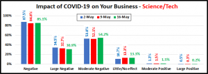
  • Their initial perceived negative impact of COVID-19 was high at 87.5%, but it was still the lowest of the 5 groups. Also, many more, over 50%, believed the impact to be moderate rather than large. They also have the highest percentage saying there will be little or no impact from COVID-19 on their business.

  • In terms of Revenue change they have the most consistency of any group – the highest percentage of no change, 32.9% – the lowest percentage with an increase and the second lowest percentage with a decrease. They also have faced the least amount of Supply problems as well as the lowest percentage of closures of any group dealing directly with consumers. Employment shows the highest percentage of no change while the increases/decreases are headed in the right directions.

  • 71% applied for PPP and by 5/16, 91% had received their funds. In regard to overall Government aid, 69% have received Federal financial assistance. Only Distributors, at 64% had a lower number.
  • Despite their stability in business elements and the fact that 1 in 9 say that COVID-19 has had little or no impact on their business, the outlook on recovery time for most has worsened. The group estimating a 2 to 6 month return to normalcy has fallen from 53% to 48%, under half. Over 1/3 now think it will take 6+ months to recover.

OTHER SERVICES (INCLUDES PET CARE SERVICES)

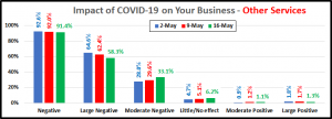
  • At 92%, COVID-19 had the biggest negative impact on this group. It was also very severe. Although it has moderated slightly, the ratio of businesses with Large Negative over those with Moderate Negative remains at nearly 2 to 1.

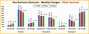
  • 80% of businesses reported a change in revenue in the week ending 5/16. The negative number was 65%. This was the highest among those interacting with consumers, but down significantly from the 78% peak. Those reporting increased $ is up to 14.9%, 2nd place behind Retailers. Supply Chain problems remain high and they have the highest percentage of closures. In terms of Employment, they are moving in the right direction – slowly. They are below the national average in additions, lowest of the group of 5 in “no change” and highest in the group for decreases.

  • 80% have applied for PPP and as of 5/16, 86% of received funds. 74% of the group have received some Federal aid $.
  • 32% of this group originally expected a return to normal in 3 month or less. The size of that optimistic group has dialed back to 26%. The mid-range 4 to 6 month group has remained steady at 27%. However, the group that projects 6+ months to recovery now represents 1 in every 3 businesses. We should also note that 1 in 11 businesses say they will never return to normal, the highest number in our group of five.

That wraps it up for the 5/16 update. If you would like a PDF copy of the report, click the button below.


Retail Channel Monthly $ Update – March Final & April Advance

Time for our monthly update on U.S. retail sales by channel. The current COVID-19 crisis has caused turmoil in the Retail Marketplace. Consumer spending behavior has changed and continues to evolve. In this report we will track the changes and migration between channels. We will do that with data from two reports provided by the U.S. Census Bureau.

The Reports are the Monthly Retail Sales Report and the Advance Retail Sales Report. Both are derived from sales data gathered from retailers across the U.S. and are published monthly at the same time. The Advance Report has a smaller sample size so it can be published quickly – approximately 2 weeks after month end. The Monthly Final Report includes data from all respondents, so it takes longer to compile the data – about 6 weeks. Although the sample size for the Advance report is smaller, the results over the years have proven it to be statistically accurate with the final monthly reports. The biggest difference is that the full sample in the Final report allows us to “drill” a little deeper into the retail channels.

This means to get the full picture in our monthly channel update we need to look at the latest release of both reports. We will begin with the Final Retail Report from March and then move to the Advance Retail Report for April. This will also allow us to better track the consumers’ evolving spending behavior in terms of channel migration.

Both reports include the following:

  • Total Retail, Restaurants, Auto, Gas Stations and Relevant Retail (removing Restaurants, Auto and Gas)
  • Individual Channel Data – This will be more detailed in the “Final” reports and we fill focus on Pet Relevant Channels

The information will be presented in detailed charts to facilitate visual comparison between groups/channels of:

  • Current Month change – % & $ vs previous month
  • Current Month change – % & $ vs same month in 2019
  • Current YTD change – % & $ vs 2019
  • Monthly and Year To Date $ will also be shown for each group/channel

We’ll start with the March Final report. This was the first month of the crisis. The impact is very visible. First, we will look at some major retail groups. (Note: The Data in all graphs is Actual, Not Seasonally Adjusted)

It looks just like the Advance report projected a month ago. All 3 of the groups that are down in YTD $ were up at least 8% through February. March is the start of the traditional Spring lift, but not in 2020. If you can’t go out, you don’t think about a new car. It also doesn’t matter how cheap gas is if you aren’t driving.
The “Relevant” retail is the only positive and we know that it is being driven up by binge/panic buying of necessities. Food is the biggest driver. If you can’t go out to eat, you cook at home.

Now, let’s see how some Key Pet Relevant channels were doing in March.

Observations – We’ll look at them in groups

  • Building Material Stores – This group typically has their biggest annual lift in Spring. It appears that this is unchanged. In fact, there is a significant increase over last year. Farm Stores are doing especially well with double digit increases over March 2019 and YTD. Although Sporting Goods stores are not included in this group, they have a similar Spring lift pattern. March Sales were up from February, but still down 8% vs 2019.
  • Food & Drug – This is where we see the greatest positive impact from “Stay at Home”. Supermarket sales are skyrocketing – +30% vs 2019. Drug stores are also experiencing a big lift as consumers stock up on necessities.
  • General Merchandise Stores – It’s about Food. Sales in $ Stores, Clubs and SuperCenters are all up 12+% vs 2019. Most traditional Department stores are closed and the shopping in many Discount Department stores is often limited to essentials. This has helped depress sales by -10% vs March 2019.
  • Office, Gift and Souvenir Stores – Most of these stores are deemed non-essential. You see the result.
  • Internet/Mail Order – “Stay at home” has further accelerated this channel’s growth. This will likely continue as the crisis has introduced many new consumers to online shopping.
  • A/O Miscellaneous – This is a group of small to midsized specialty retailers – chains and independents. It includes Florists, Art Stores and Pet Stores. Pet Stores generally account for 22 to 24% of this group’s total sales. The group was up 21% YTD in February. Although that pace has slowed slightly to +17%. Consumers are still shopping for essentials, like Pet Products in these outlets.

March was certainly a terrible month for retail spending, the biggest Total Retail $ drop in history. Binge/panic buying buoyed up the Relevant Retail sector but that is temporary and non-essential business closures became widespread by the end of the month.  We’ll see what a full month of shuttered doors brings. Here are the Advance numbers for April.

March was terrible, with the biggest spending drop in history. However, it was nothing compared to April. It is obvious that a full month of stay at home and business closing orders had a huge impact across the Retail Marketplace.

Total Retail – Total Retail spending fell $108B, -21.2%. This unprecedented drop is literally 3 times greater than the record decrease set in March. Remember, 2020 started off strong. Spending through February was up $60B, +6.6% versus 2019. Then came the COVID-19 crisis and now it is down -$82B – a $142B turnaround in just 2 months.

Restaurants – Spending was up $9B through February, +8.1%. In March Social Distancing began and many restaurants closed. Spending fell $18B, turning a $9B increase into a $9B decrease. April brought a full month of the restrictions and spending plummeted, down $31B, -49% vs 2019. Many restaurants are offering delivery and curbside pickup, but this can’t replace eating in restaurants. This group is now down $40B YTD.

Automobile & Gas Stations – If you can’t go out, except for necessities, then your car becomes less of a focus in your life. Buying a car is definitely less of a priority. Auto Dealers, both new and used, are trying to combat this with some fantastic deals and a lot of advertising. It doesn’t seem to be working. In terms of Gas Stations, prices are down sharply but as we have said, it doesn’t really matter much how cheap gas is if you’re not driving.

Relevant Retail – Less Auto, Gas and Restaurants – Many non-essential businesses were forced to shutter their doors in March. However, there was also a rash of binge/panic buying as consumers literally battled over toilet paper and sanitary wipes. The closure of restaurants, schools, and businesses, along with many people now working from home caused a big lift in home cooking. This drove up spending at Supermarkets, SuperCenters and Warehouse Clubs. These 2 factors overcame the impact of closures and Relevant Retail Spending in March was up 6.3% and YTD 5.9%, +$49B. Then came April, with a full month of closures. Plus, while grocery spending continued to be strong, the bingeing and hoarding slowed markedly. Spending dropped $43B, -13.4% from March and cut the YTD growth in half. However, the YTD, +2.1% for Relevant Retail is the only positive number in any measurement for any of the big groups on the entire graph.

Now let’s look at what is happening in the individual retail channels across America. In April, spending turned down in Relevant Retail. Let’s see if we can find any positives. These groups are less defined than in the Final Monthly reports and we will look all across the whole market, not just pet relevant outlets.

A full month of stay at home resulted in few “winners” and the impact on the “losers” is even more pronounced.

 Observations

You quickly see that the negative impact from a full month of stay at home, closures and reduced discretionary spending was widespread. Only 3 groups had positive numbers for April:

  • Nonstore Retailers – Stay at home has moved even more consumers to online shopping.
  • Grocery Stores – Stay at home means “eat at home”. Food sales continue to surge.
  • Bldg Materials/Garden/Farm – A near normal Spring lift as “at home” consumers also focus “on their home”.

The panic/binge buying of March ended in April as spending fell in all but 2 groups – Nonstore and Bldg Materials.

Regarding the Individual Large Channels

General Merchandise Stores – April also wiped out the overall YTD gains of GM stores. Regular Department stores are closed, and discount department stores continued their downward sales trend. Club/SuperCtr/$ stores had provided the only positive note. In April consumers dialed back their panic buying and Spending on discretionary items was also down significantly. This combination of factors drove sales down 6.7%, -$3.1B vs April 2019 in this largest GM group.

Food and Beverage, plus Health & Personal Care Stores – The initial March wave of binge/panic buying in March ended in April. The Grocery segment is still being driven by increased Food sales, up 14.5%, +$8B. However, sales in the Health, Personal Care group turned down, essentially wiping out the previous YTD gains. While Drug Stores are essential, many Personal Care stores are shuttered.

Clothing and Accessories; Electronic & Appliances; Home Furnishings – Some Electronic stores are deemed essential but most of the other stores in these groups are not. All saw a huge 60+% drop in sales but Clothing stores took the biggest hit, down 89.3%, -$19.1B from 2019. Even before the crisis, their online sales were growing, but not enough.

Building Material, Farm & Garden & Hardware – This channel has its biggest spending lift in the Spring. With many consumers sheltering in place, their focus has turned to their needs at home, including house and yard repair and improvement. Their spending pattern is the closest to “normal” of any brick ‘n mortar group. The Spring lift is apparently still “on” as their sales are up 7% over March, 2.6% over April 2019 and 5.6% YTD.

Sporting Goods, Hobby and Book Stores – Many Book and Hobby stores have been classified as non-essential, but most Sporting Goods stores are open. They also usually have a big spending lift in the Spring. However, with organized sports on hold, many parks closed, and non-essential travel discouraged, the need for products in the sporting goods arena is greatly diminished. This group was down 24% in March, but the decline increased in April – Down $3B, -48.7% vs 2019.

All Miscellaneous Stores – This group is mostly small to medium specialty stores – both chains and independents. While Pet Stores are essential, most other stores in this group are not. In March, YTD sales for this group were up solely because of a spectacular early year performance by the All Other Subgroup, which includes Pet Stores. In April this was not enough to overcome a full month of closures as Sales for All Miscellaneous Stores were down across the board.

NonStore Retailers – 90% of the volume of this group comes from Internet/Mail Order/TV businesses. In April, the ongoing movement to online accelerated. They were up 12.1% in March. Their April increase was 21.2%, +$13.1B. They took over the lead from Grocery Stores in all sales measurements regardless if it is in $ or % increase. Two things are significant. Unlike many other channels that had a big lift in March, their $ sales didn’t fall off in April. They were 6.7% higher. Also, their YTD sales are up 13.8%, exceeding their 12.9% annual increase in 2019. This early year lift bodes well for 2020 as much of their annual lift is usually driven by Christmas Holiday spending, which is still to come.

Note: Almost without exception, online sales by brick ‘n mortar retailers are recorded along with their store sales in their regular channel. Whether they are up or down, their online sales are included in the totals.

Recap – April clearly shows the huge fundamental impact that the COVID-19 pandemic has had on the American way of life and consumer spending. The impact is also evolving as we saw the panic buying in March end in April. As the situation continues, spending will no doubt move back to a more routine pattern – a new normal. No one knows how long the current situation will last and what long term impact it will have on U.S. consumers’ spending behavior. We will continue to monitor the data and provide you with regular updates as the situation evolves.

A Final Note From the Census Bureau: Due to COVID-19 many businesses are operating on a limited capacity or have ceased operations completely. The Census Bureau has monitored response and data quality and determined estimates in the Advance Retail Report for April 2020 and Monthly Retail Report for March 2020 both meet publication standards.

U.S. PET FOOD SPENDING $28.90B (↓$2.46B): MID-YEAR 2019 UPDATE

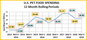
The US BLS just released their Mid-Year Update of the Consumer Expenditure Survey covering the period 7/1/2018 to 6/30/2019. The report shows Pet Food (& Treat) Annual Spending at $28.90B, down $2.46B (-7.8%). The following charts and observations were prepared from calculations based upon data from that report and earlier ones. The first chart will help put the $28.90B into historical perspective and truly show you the roller coaster ride that is Pet Food Spending.

Here are the current numbers:

  • Mid 2019: $28.90B; ↓$2.46B (-7.8%) from Mid-18. The net -$2.46B in Mid 2019 came from:
    • Jul>Dec 2018: Down $2.51B from 2017.
    • Jan>Jun 2019: Up $0.05B from 2018.

Historical research has shown that Pet Food spending has been on a roller coaster since 2000, with 2 years up, followed by a flat or even declining year. This up and down “ride” has been driven by a succession of Food trends. The most recent were “Natural” in 2011 and “Super Premium” in 2014. Another factor was added in 2013 – deflation. As consumers opted for higher quality, more expensive pet food, competition became more intense, with the Internet now becoming a key player. 2013 was a definitely a game changer for this segment as it began an extended period of deflation which continued through 2018. Midway through 2018, Pet Food prices were still 2.3% lower than in 2013.

The spending drops in 2013 and 2016 were driven by pet parents value shopping for their recently upgraded pet food.

As it turns out, 2014 brought out yet another new factor in Pet Food spending. For over 30 years Baby Boomers have been the leaders in the Pet Food, both in spending and in adopting new products. They still spend the most, but it turns out that the 25>34 year old Millennials led the movement to Super Premium in late 2014. The older groups, especially Boomers followed in 2015 and spending rose $5.4B. At the same time, the Pet Food spending of the 25>34 yr olds dropped. At first, we thought they had rolled back their upgrade. However, it turns out they were leading the way in another element of the trend to Super Premium – value shopping. The Boomers once again followed their lead and spending fell -$2.99B in 2016. For consumers, the Super Premium upgrade movement consisted of 3 stages:

  1. Trial – The consumer considers the benefits vs the high price and decides to try it out. Usually from a retail outlet.
  2. Commitment – After a period of time, the consumer is satisfied and is committed to the food.
  3. Value Shop – After commitment, the “driver” is to find a cheaper price! – The Internet, Mass Market, Private label

This brought us to 2017. Time for a new “must have” trend. That didn’t happen but the competitive pricing situation brought about another change. Recent food trends have been driven by the higher income and higher education demographics. However, the “value” of Super Premium was established and now more “available”. Blue Collar workers led a new wave of spending, +$4.6B, as Super Premium more deeply penetrated the market. After the big lift in 2017, 2018 started off slowly, +$0.25B. Then came the FDA warning on grain free dog food. Many of the recent Super Premium converts immediately rolled back their upgrade and spending fell -$2.51B. This 2018 decrease broke a 20 year spending pattern. What came next? In the 1st half of 2019, Pet Food spending was stable, +$0.05B.

Let’s look deeper, starting with the 2 most popular demographic measures – age & income. The graphs will show both the current and previous 12 months $ as well as 2018 yearend. This will allow you to track the spending changes between halves.

The first graph is Income, which has been shown to be the single most important factor in increased Pet Spending. Here’s how you get the change for each half using the $150K+ group as an example:

$150K+ Mid-yr Total Spending Change: $6.05B – $5.02B = Up $1.03B (Note green outline = increase; red outline = decrease)

  • 2nd half of 2018: Subtract Mid-17 ($5.02B) from Total 2018 ($5.57B) = Spending was up $0.55B in 2nd half of 2018.
  • 1st half of 2019: Subtract Total 2018 ($5.57B) from Mid-19 ($6.05B) = Spending was up $0.48B in 1st half of 2019.

  • The over $150K group was the only group unaffected by the FDA grain free warning as spending grew consistently in both halves. If they had concerns about grain free, they apparently upgraded to even more expensive options.
  • The over $100K groups and the under $30K group had the only annual increases. However, the under $30K group had their lift in the second half of 2018, which was very unusual. Their spending flattened in the first half of 2019.
  • Besides the High Income pattern, there appear to be 2 other spending patterns based upon income. The Middle Income group, from $50K to $150K was most affected by the FDA warning with a spending drop in the second half of 2018. As income increased, the impact lessened until it was minimal at $100>150K. Spending rebounded very slightly in the first half of 2019 for all of these groups and the amount of the increase grew along with income.
  • The Lower Income group, under $50K had almost the opposite pattern. They showed a spending increase in the last half of 2018, with the biggest increase coming from the <$30K group. In the first half of 2019, spending in the $30>$50K group fell -$0.78B, a huge drop. The <$30K spending was flat. However, this data suggests that the $50K income level is a key dividing point in Pet Food Spending behavior, at least in the era of Super Premium. It also demonstrates once again that analyzing pet food spending behavior is a complex process.

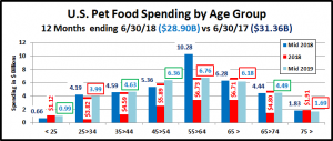
Now let’s look at Pet Food spending by Age Group.

  • The 45>54 yr olds had the biggest 2019 1st half lift and were the only group with increased spending in both halves. They have the highest income, so it is to be expected that their behavior matches that of the $150K+ income group.
  • Annual decreases occurred in 3 groups – 75+, 55>64, 25>34. However, the oldest and youngest (75+ & <25) had the only 2019 decreases and shared the same overall pattern. A 2018 2nd half lift followed by the drop in 2019 suggests that they were slower to act than other groups, first in upgrading food and then in reacting to the FDA warning.
  • Although the 2019 lift was sometimes minor, all age groups from 25>64 spent more on Pet Food in the first half of 2019. This is a good sign for the second half of 2019.

That brings us to the obvious question, “What is happening in Pet Food spending at the start of 2019 across the whole range of demographic categories?” We will endeavor to answer that in our final chart. We will list the biggest $ moves, up and down by individual segments in 11 demographic categories.

The increase in the 1st half of 2019 was bland – up $0.05B but this bland result came from some tumultuous spending behavior…Always look deeper.

  • There are big differences between the winner and loser in all categories but Area. You also see that the losers are often much bigger than the winners. The overall slight increase came from 44 of 80 segments (55%) spending more.
  • You see the negative spending by the older groups reflected in the spending drops by these demographics – over 65, Retired, Homeowners w/o Mtge, Silent/Greatest Generations and $30>49K income. (Avg Retired income is $42.8K)
  • In terms of positives, one thing immediately stands out. Thank God for Singles, especially if they are working. They had the biggest increase in 3 demographic categories. That’s unusual to say the least.
  • Two “usual” winners are back on top – Homeowners w/Mtge and White, not Hispanic.
  • Income matters, as is demonstrated by wins by $150K+ and the 45>54 yr olds, but education not as much. The winner was HS Grads, but all college educated groups, from Associates Degree to PHD also spent more on Pet Food.
  • In Generations, the Millennials/Gen Z won. However, all but the very oldest groups spent more. Even the Boomers bounced back with a small $0.12B increase after a -$3.18B drop in the second half of 2018.
  • Speaking of bouncing back, Blue Collar workers also started to recover after a bad second half of 2018.
  • There are 2 “losers” that raise some concern – Married Couple Only and 1 earner, 2+ people CUs. Married Couples Only are a perennial winner but their share of Pet Food spending fell from 40% to 27%. 1 earner, 2+ CUs had a big lift in both halves of 2018. Perhaps their big 2019 decrease is also a delayed reaction to the FDA warning.

So, what will happen in the second half of 2019? It is a good sign that 55% of demographic segments are spending more in the first half of 2019 than they did in 2018. Also, Gen Xers, Millennials and even Boomers spent more so the increase is widespread. Considering these trends in conjunction with the big spending drop in the second half of 2018 a continued lift in the second half of 2019 is likely. However, there is another factor – inflation. Pet Food prices trended down from Mid-yr 2013 to Mid-yr 2018. Then they turned up and continued to increase through 2019. In the first half pet food prices were up 2.1% vs 2018. In the second half they were 3.6% higher.  Will this impact spending? We don’t know. One thing is certain. We definitely need a new “must have” pet food trend.

The Pet Food segment continues to become more complex. In September, we’ll see what the 2nd half of 2019 brings.


Retail Channel Monthly $ Update – February Final & March Advance

The current health crisis, with its stay at home restrictions, has resulted in many business closures and generally disrupted the U.S. Retail Marketplace. As consumer spending behavior evolves, we will regularly track the changes and migration between channels. We will do this with data provided by the U.S. Census Bureau.

The Census Bureau constantly gathers sales data from retailers across the U.S. and publishes the results every month. Two reports are released approximately mid-month. They are the Advance Retail Sales report and the Monthly Retail Sales report. The Retail Sales Report is more detailed and includes data from all respondents, but it is published about 6 weeks after month end. The Advance Report is released at the same time and gives a quick look at the most recent month. The sample size for the advance report is smaller so it doesn’t drill as deep into the channels, but the results have proven to be statistically accurate with the final monthly reports.

We will publish monthly updates covering both reports. They will include:

  • Total Retail, Restaurants, Auto, Gas Stations and Relevant Retail (removing Restaurants, Auto and Gas)
  • Individual Channel Data – This will be more detailed in the “Final” reports and we fill focus on Pet Relevant Channels

The information will be presented in detailed charts to facilitate visual comparison between groups/channels of:

  • Current Month change – % & $ vs previous month
  • Current Month change – % & $ vs same month in 2019
  • Current YTD change – % & $ vs 2019
  • Monthly and Year To Date $ will also be shown for each group/channel

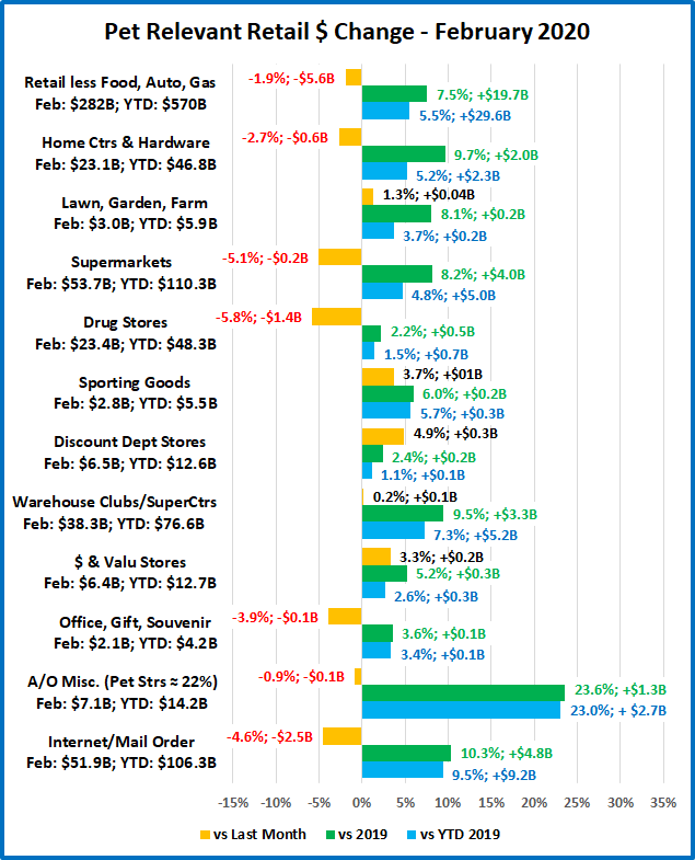
Let’s get started with February. This data is from the Final Report and will show us the status of the retail market before the crisis. First, we will take a look at some major retail groups. (Note: All Data is Actual, Not Seasonally Adjusted)

February traditionally has the lowest retail spending of any month. We are just coming off of the holiday season, including Christmas closeout buying in January but it is still mid-winter, so the Spring spending lift has not begun.

As you can see, February spending went well with all of these groups having a strong performance vs 2019. The Year to Date numbers were also very positive. The relevant retail group (less Auto, Gas & Restaurants), which most impacts the Pet Industry, was up 5.7% YTD. This pace was significantly higher than 2019’s 3.7% annual increase.

Everything was looking good. Let’s see how some Key Pet Relevant channels were doing.

Observations – We’ll look at them in groups

  • Building Material Stores – This group typically has their biggest annual lift in Spring. It appears that they are getting an early start with a significant increase over last year. Farm Stores even had an increase over January. Although Sporting Goods stores are not included in this group, they have a similar Spring lift pattern. They are also off to a strong start after being down 1.6% in 2019.
  • Food & Drug – These stores tend to have more balanced monthly spending with less pronounced lifts. Supermarkets had a strong monthly lift vs 2019 which may reflect an early start on anticipated necessity buying.
  • General Merchandise Stores – From $ Stores to Warehouse Clubs. All had a similar pattern of increases. Once again, this undoubtedly reflects early stocking up on necessities in anticipation of possible future shortages.
  • Office, Gift and Souvenir Stores – They have the expected pattern. Sales fading after the holidays, with a more normal 3.6% increase for the month.
  • Internet/Mail Order – Their pattern is also “usual” as this segment continues strong growth.
  • A/O Miscellaneous – This is a group of small to midsized specialty retailers – chains and independents. It includes Florists, Art Stores and Pet Stores. Pet Stores generally account for 22 to 24% of this group’s total sales. A strong January was followed with an even stronger February, + 24%. This was a continuation of the 23% annual increase for this group in 2019. Pet Stores were surely a significant contributor to the big numbers.

February was certainly a strong month for retail spending. If we were not in the current health & business crisis, the numbers would bode well for a record spending year in 2020. However, we are definitely in an unprecedented situation. Let’s see the advance numbers for March.

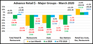
First, the big spending groups.

This is certainly a big change from February.

Total Retail – Overall retail spending fell $36B, -7.0%. This is the largest one month year over year decrease since they began doing the survey in 1951. Sales were still up from February which gives us an indication of just how big the March lift is in a normal year.

It is readily apparent where the stay at home and business closing orders were having the maximum impact.

Restaurants – Spending for the month was down 25%, $16.4B from 2019. Remember this segment was up $10B, 8.8% YTD in February. One month turned it completely around. Obviously, delivery and pick up can’t make up the difference from the widespread ban on eating in restaurants.

Automobile & Gas Stations – Obviously, if you can’t go out, except for necessities, then your car becomes less of a focus in your life. Buying a car is less of a priority and it doesn’t matter much how cheap gas is if you’re not driving.

Relevant Retail – Less Auto, Gas and Restaurants – Although many non-essential businesses were forced to shutter their doors in March, overall, this segment showed strong growth in the month. There was a double digit increase in spending over February and sales vs March 2019 and YTD 2019 were also up sharply. Building upon the strong February lift, this group is up 5.3% for year to date spending over 2019. That is 43% greater than their 3.7% annual increase in 2019. Undoubtedly, much of the lift was due to binge spending on necessities, from hand sanitizer and cleaning products to toilet paper. However, the closure of restaurants, schools, and businesses, along with many people now working from home caused a lift in home cooking. This necessitated increased spending at Supermarkets, SuperCenters and Warehouse Clubs. This should continue but the binge shopping will fade as routines become more stabilized.

Now let’s look at what is happening in the individual retail channels across America. Spending is up in Relevant Retail. Let’s see which groups are winning and losing. These groups are less defined than in the Final Monthly reports and we will look all across the market, not just pet relevant outlets.

The positive or negative impact of the COVID-19 crisis is readily apparent.

Observations

Sales are either up or down, across the board – vs last month, last year or year to date, with 1 exception – Miscellaneous Stores. This group still has a YTD increase vs 2019 due to strong early year performance by the All/Other Misc. subgroup.

While the plus or minus rule is generally true, the reasons behind it are often somewhat cloudy. In most states businesses were deemed essential or non-essential, which dictated if and how that they can remain open. Food and drug stores are obviously essential everywhere, but many other groups fall into a grey area. Also, some general merchandise stores were allowed to stay open, but could only sell essential products. Let’s take a brief look at the results. When possible, will bundle them into larger groups.

General Merchandise Stores – Overall, their increase vs last year is slightly above normal at 5.7%, +$3.3B. SuperCenters, Clubs and $ stores all provide necessities and are showing a strong 12.7% increase. However, in many areas they are prevented from selling non-essential products. Department Stores are a mixed bag. The Discount Stores are open at least for necessities but the traditional Department Stores are closed, which drove a big decrease in spending.

Food and Beverage, plus Health & Personal Care Stores – Grocery stores are obviously essential and driven by the initial wave of binge, necessity spending. Their 27%, $15.5B increase over 2019 is the largest of any channel. Liquor stores are also essential, and they are showing plus numbers too. While Drug Stores are essential, many Personal Care stores are shuttered. The Health, Personal Care increase is higher than usual, but the lowest of any of any positive performing group.

Clothing and Accessories; Electronic & Appliances; Home Furnishings – Electronic stores are generally deemed essential but most of the other stores in these groups are not. Clothing stores took the biggest hit, down 52%, -$11.5B from 2019. We should note that even before the pandemic, consumers bought 30% of their clothing online.

Building Material, Farm & Garden & Hardware – This channel has its biggest spending lift in the Spring. With many consumers sheltering in place, their focus has turned to their needs at home. One of these is obviously house and yard repair and improvement. Their March sales are up 10.1%, +$3.5B over 2019.

Sporting Goods, Hobby and Book Stores – While many Book and Hobby stores have been classified as non-essential, most Sporting Goods stores are open. They also usually have a big spending lift in the Spring. However, with organized sports on hold, many parks closed, and non-essential travel discouraged, the need for products in the sporting goods arena is greatly diminished. Together, this group is down 24% versus March 2019.

All Miscellaneous Stores – This group is mostly small to medium specialty stores – both chains and independents. While Pet Stores are essential, most other stores in this group are not. The only reason that their YTD sales are up is because of a spectacular early year performance by the All Other Subgroup, which includes Pet Stores.

NonStore Retailers – 90% of the volume of this group comes from Internet/Mail Order/TV businesses. This channel is up 12.1%, +$7.3B in March. This puts them second only to Grocery in terms of the size of their March increase. This is no real surprise as spending has increasingly moved online in recent years. In fact, the 12.1% increase is actually smaller than their 12.9% annual increase in 2019. However, it is unusual, coming this early in the year, as much of the annual lift is usually driven by Christmas Holiday spending.

Note: Almost without exception, online sales by brick ‘n mortar retailers are recorded along with their store sales in their regular channel. Whether they are up or down, their online sales are included in the totals.

Recap – The COVID-19 pandemic has had a fundamental impact on the American way of life and consumer spending. When you look at the winners and losers you see a common theme. The winners are focused on home and necessities. The losers are truly placed in the discretionary category, at least for now.

Much of the initial lift was undoubtedly caused by panic buying, out of fear. As the situation continues, spending will no doubt move back to a more routine pattern. No one knows how long this will last and what long term impact it will have on U.S. consumers’ spending behavior. We will continue to monitor the data and provide you with regular updates as the situation evolves.

WANT A COPY?

If you would like a copy of any of the charts, just click on the individual chart. An image will appear. Right click on the image. You can then copy or save it.

If you would like a copy of the whole report, just click on the button below to download a PDF file.


U.S. Retail Trade – 2019 $ales Update by Channel – Internet/Mail Order Wins Gold!

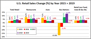
The Total U.S. Retail Market in 2019 reached $6.2 Trillion dollars – up $214B (+3.6%). This is less than last year’s (+4.9%). For this report, we will focus on the “Relevant Retail” Total – removing Restaurants, Auto and Gas Stations from the data. This segment totals $3.7 Trillion. Driven by the Internet/Mail Order Segment, Non-Store Retailers moved to the top of the chart. 2019 will forever be seen as a major waypoint in the U.S. Retail Marketplace.

How are specific Retail Channels performing? We’ll start with a market overview and then work our way down.

(Base Data is from the U.S. Census Bureau Retail Trade Report)

Remember: This data is very relevant to the Pet Industry. According to the last Economic Census:

  1. Retailers other than Pet Stores generated 66.9% of all the Pet Products revenue in the U.S.
  2. Pet Products, on average, generated 1.94% of the total revenue of all non-pet stores that chose to stock them.

  • Restaurants (Food Service) – 12.4% of Total Retail – Up $33B, +4.5%, down significantly from last year’s (+6.4%).
  • Automobile Sales – 20.1% of the Total – Revenue grew $48B, +3.9%. A turnaround from recent slowing growth.
  • Gas Stations – 8.2% of the Total – Up $2B, +0.4% from 2018. In 2019 Gas prices stabilized and growth flattened out after 2 years of strong inflation had driven sales up.
  • Retail, Less Food, Auto and Gas – Up $132B, +3.7% to $3.7 Trillion, down from last year’s +4.3%, but this segment did outperform the total market for the first time since 2016. This segment is 59.3% of the Total U.S. Retail market.

To put this year into perspective, let’s look at the overall performance over the last 5 years.

The growth rate of the U.S. retail market increased each year until 2019. Each segment contributes but has a different pattern. Restaurants have the highest overall growth rate, but it has generally slowed since 2015, especially in 2019. The Automobile segment rate also peaked in 2015 and slowed every year until 2019, when they were the only segment to beat their 2018 rate. Gas Stations are the smallest segment but also the most volatile. Double digit deflation drove sales down in 2015-2016. Then double digit inflation drove sales up in 2017-2018. In 2019 prices stabilized and so did sales. Our “Relevant Retail” Segment has been the most consistent, at or near 4% growth each year. The growth rate fell in 2019 but it exceeded the growth rate of the total market for the first time since 2016. The 2019 Relevant Retail growth rate will serve as a benchmark as we review the performance of the individual channels. Above 3.7%, a channel is gaining market share. Below 3.7%, they are losing ground.

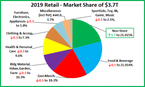
Now, we’ll slice up the U.S. “Relevant Retail” Channel “Pie”

These are large slices of the U.S. Relevant Retail pie. If you look closely you will see a troubling situation. 1 division maintained its share but 7 lost ground. Only 1 division, Non-Store retailers increased their share of the total retail market…a lot. They moved up from 3rd to 1st, edging out Food & Beverage by 0.001% ($28B) – a virtual tie for #1. Three divisions – General Merchandise Stores, Food and Beverage and Non-Store account for 61.3% of the total. This is up slightly from 60.2% in 2018. The increase is all due to Non-Store Retailers as the other two segments continue to lose market share. All three are very important to the Pet Industry. Based upon the last U.S. Economic Census, these three major divisions produced 59.7% of total Pet Products sales. Consumers spend a lot of money in Pet Specialty Stores – 33.1% of their Pet Products $. However, they spend over 80% more in these 3 major retail channels. Pet products are “on the list” wherever the consumer shops.

Because they are so huge, major Divisions of the market generally don’t show much movement in market share in just one year so the changes in Non-Store, General Merchandise, Furniture/Electronics, Clothing and Bldg Materials are very significant. Each of the major divisions includes a number of sub segments. For example, General Merchandise includes Traditional Department Stores, Discount Department Stores, Supercenters and Clubs as well as $ and Value Stores. These specific retail channels can have even greater movement in share because this is the level that the consumer “views” when making their initial shopping choice. Change at this level is where any ongoing consumer shopping migration first becomes apparent.

Here is the Market Share change “Rule” for 2019: To gain 0.1% in Market Share your $ increase must exceed the amount generated by a 3.7% sales increase PLUS an additional $3.7B. Example: If a channel did $100B in 2018, they need to do $100 +$3.7 + $3.7 = $107.4B to gain just 0.1% in 2019 share. You will see channels with revenue increases that still lose share because their increase was less than 3.7%. It shows that even small changes in share are significant.

With that overview, we’re ready to drill deeper into the data. Let’s look at the 2019 performance of some of the specifically “Pet Relevant” Channels to see which are doing the best…and worst in gaining consumer spending. Eleven of the twelve were chosen because they generated at least 1% of the Total Pet Products (food & supplies) spending in the last Economic Census – 2012. I have also included Traditional Department stores on the list. Even though they have never truly embraced Pet Products, they have long been a fixture in the U.S. Retail Marketplace. Their continued decline, as consumers migrate to outlets which better fit their needs, has profoundly affected U.S. retail shopping as generally they were the “anchor” stores for the Shopping Malls across America.

We will use 2 graphs to illustrate the situation in these Pet Relevant Channels. The first will show the % change in sales in 2019 vs 2018. The next will “show us the money” – $ gained or lost. Then we will have observations on each segment.

Remember, you must be up at least 3.7% or you’re losing market share!

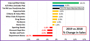
8 of these pet relevant channels are showing increased sales. However, in market share, only 2 are gaining, while 10 are losing. It is no surprise that internet/mail order is the breakaway winner. However, in addition to moving online, the other trend that is apparent is that consumers are also shopping more frequently at retail specialty stores, like Pet. In the next chart, we’ll “show you the money!” Remember, the Total increase for the “Relevant Retail” Market was $132B and you must be up 3.7% PLUS $3.7B just to gain just 0.1% in Market Share.

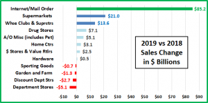
The spectacular growth of the Internet is obvious and becoming more dominant as the $ increase in this segment was more than double the combined increase of Supermarkets, SuperCenters/Clubs and Home Centers. The increase by $ Stores slowed in 2019 but their continued growth is evidence that consumers want value plus the convenience offered by these smaller outlets. The A/O Miscellaneous segment continues to maintain and gain as consumers desire more personalized service in certain categories – like Pet Products. One bit of information is concerning. Farm stores declined in sales for the second consecutive year. They are a small retail channel, but a key outlet for Pet Products.

OBSERVATIONS BY CHANNEL (Note: % of Total Business from Pet Products for stores that stock Pet)

  • Internet/Mail Order – $688.9B, Up $85.2B (+14.1%) – 64.7% of the total increase for the $3.7T Relevant Retail Market came from Internet/Mail Order. In fact, they generated 39.8% of the increase in the Total U.S. Marketplace. The Consumer Migration to this channel continues and is even accelerating as they gained +1.7% in Market Share. In 2016 they passed SuperCtrs/Clubs in sales and this year they edged out Supermarkets for the top segment spot in the entire market. Note: Sales on TV are also included in this group. (1.2% Pet)
  • Super Markets – $667.4B, Up $21.0B (+3.3%) Despite increasing sales, this large sub-segment continues to lose ground. Sales are up $80B since 2015 but Market Share is down 0.41%. The Internet/Mail order channel has increased focus on grocery products and became the leading retail channel in 2019. (1.6% Pet)
  • Department Stores – $42.6B, Down $5.1B (-10.7%). Their decline continues. 50 years ago, they “ruled” the GM category. However, they failed to adapt to the changing wants and needs of the consumer. One small example of this is their failure to address America’s growing relationship with our companion animals. (N/A Pet)
  • Discount Department Stores – $92.5B, Down $2.7B (-2.8%). The rise of this segment started the downhill slide of Department Stores but their tenure at the top of GM was relatively brief as the SuperCtrs/Clubs offered true 1 stop shopping. Now, they have to battle the Internet. After a small lift in 2018, sales turned down again. (2.3% Pet)
  • SuperCenter/Club Stores – $491.9B, Up $13.6B, (+2.8%). These outlets, with their broad mixture of grocery and general merchandise…at great prices, quickly became a dominant force in the retail market – second only to Supermarkets in Market Share for many years. In 2016 they were passed by Internet/MO. Consumers still like them as their sales are still growing, but not enough. They continue to lose market share – Down 0.1%     (2.4% Pet)
  • $ & Value Stores – $85.2B, Up $2.5B, (+3.0%). – A Great Value and easy to shop – 2 of U.S. Consumers’ major “wants”. This segment has shown steady growth in recent years, but it slowed in 2019. (4.3% Pet)
  • Drug Stores – $292.1B, Up $7.1B, (+2.5%). There still is a lot of turmoil in this segment. Intense competition has led to a large number of mergers and acquisitions, which have slowed growth. (0.3% Pet)
  • Sporting Goods – $1.8B, Down -$0.7B, (-1.6%). A Minor player in Pet. The turmoil in the category caused by mergers, acquisitions and store closings has slowed but they continue to lose share. (N/A Pet)
  • Home Centers – $298.2B, Up $3.1B, (+1.0%). These large, “project driven” outlets have never done a significant Pet Business. The top 2 retailers, Home Depot & Lowes are the drivers, but overall, they lost -0.2% in share.     (0.6% Pet)
  • Hardware – $27.3B, Up $0.5B, (+1.9%). Extensive weather damage in 2017 & 2018 had a huge impact on this channel, turning sales sharply upward. 2019 was a little calmer and sales plateaued. (2.6% Pet)
  • Farm and Garden Stores – $42.0B, Down -$1.3B, (-2.9%). This segment has been growing in recent years in both overall sales and in Pet, but it was largely driven by Tractor Supply. However, like 2018, a strong increase by TSC in 2019 couldn’t overcome the decline in sales from other outlets. Market share is down 0.2% since 2017. (8.9% Pet)
  • A/O Miscellaneous Stores $87.0B, Up $5.1B, (+6.3%). Florists, Pet Stores, Art Dealers…are typical of the segments bundled into this group. Pet Stores account for over 20% of the $ in this segment. These stores, whether chain or independent, tend to be small to medium in size. Their increase again exceeded the market so these stores, which focus on another consumer trend – a more personalized shopping experience, are “holding their own” against the large format retailers and the internet. +0.1% in share since 2015. (Pet Stores $ are 91% Pet Products)

The chart below puts the Market Share of each of these segments for 2019, 2018 & 2017 in a visual format so that it is easier to appreciate the relative sizes. Growth in share since 2017 is indicated by a green box, a decline is boxed in red.

Now we’ll wrap it up with a brief summary and a detailed chart for future reference.

SUMMARY 

Pet Stores remain the #1 channel for Pet Products. However, in the Relevant Retail Market, there are 3 Olympic Medalists. SuperCenters & Clubs are firmly entrenched with the Bronze medal. Since 2016, the race for the Gold has been between SuperMarkets and the Internet/Mail Order Channel. In 2019, Internet/Mail Order gained 1.7% in share and took the Gold away from Supermarkets/Grocery for the first time… ever. Supermarkets and other channels are trying to fight back by creating and emphasizing online ordering programs. However, it appears to be too little, too late to stave off the internet juggernaut.

In 2019 the annual increase in the Relevant Retail market slowed to 3.7%, after 2 years of increasing rates. Although, like that last slow year, the increase in the “Relevant Retail” market was larger than the increase in the Total Retail Market. In 2019 Gasoline prices were again a major factor as they stabilized and flattened sales, which lowered the Total Retail increase. The Internet/Mail Order Channel provided the only excitement and 64.7% of the growth in Relevant Retail. SuperMarkets, SuperCenter/Clubs, Drug and Home Centers increased sales by $44.8B but all lost market share. Traditional & Discount Department stores continued their decline while sales growth in the easy to shop and save, $ Stores also slowed. Besides Internet/ Mail Order, only the small to medium A/O Miscellaneous Stores (Includes Pet) gained ground in the market by appealing to consumers desiring a more personalized shopping experience.

The U.S. Retail Market continues to grow and evolve as the consumer migrates to the channels which best fulfill their current wants and needs. This is not a new phenomenon. It has always been that way. In 2019, the “Channel of Choice” is Internet/Mail Order. Now, with the current health crisis and resulting retail shut down, the environment has radically changed. Internet/Mail Order will prosper but shopping in many Brick ‘n Mortar stores may be changed forever.

Finally, the Chart below contains Detailed 2017 > 2019 Sales Performance Data for over 30 U.S. Retail Channels.


U.S. PET INDUSTRY $ALES IN 2019: $95.7B – TAKING A CLOSER LOOK

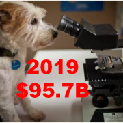
Global Pet Expo was the showcase of the Pet Industry. It also was the forum for a major announcement from the American Pet Products Association (APPA). The revenue for the Total Pet Industry in 2019 was stated to be $95.7B. This was a huge change from 2018 numbers of $72.56B. The difference “is a result of APPA’s efforts to refine and improve its research methodology. In some cases, categories have been revised to include services or products that were previously excluded as reliable data was difficult to obtain.”

The APPA also produced revised numbers for 2018 so a comparison between the 2 years is possible. They reported that in 2018 the Pet Industry totaled $90.50B. That is $17.94B (24.7%) more than they had previously reported. That is a big revision. Let’s put an $18B increase in Consumer Spending into better perspective. $18B is 40% more than we spent on bread in 2018 and about equal to the spending on each of these categories …

  • Fresh & frozen chicken
  • Fresh Milk & Cream
  • Coffee & Tea at home
  • Beer & Wine “out on the town”
  • All non-prescription drugs
  • Non-business computers & hardware

That is a big gap in data. We can’t compare current data to years earlier than 2018 so in effect 60 years of Pet Spending History has been wiped out. It has also been removed from the APPA website so, we are left with the “here and now”…

In 2019 the APPA reported $95.7B for the Total Pet Industry. This is a $5.2B (5.75%) increase over $90.5B in 2018. As we have done in the past, we will take the APPA Retail numbers and figure in the impact of inflation or deflation so that we can see the true change in the amount of goods and services.

Since 2009 and the Great Recession, inflation has not been a big factor in the Pet Industry. In fact, both Food & Supplies have had multiple years of deflation since then. The Services segments have also dialed back their price increases to a certain extent. 2017 saw an all-time record low inflation rate of 0.4% for Total Pet. In 2018, it moved up slightly to 1.25% but in 2019, it almost tripled to 3.25%, the highest rate since 2009. Increasing prices can slow consumer spending in discretionary segments, like Supplies. In Veterinary Services spending, strong inflation has reduced the frequency of visits, especially among lower income groups.

Here are the specifics from 2019.

Pet Food and Services had the best year of any groups but still over 40% of the spending lift came from price increases.

  • Pet Food – In 2018 Pet Food prices deflated slightly, -0.02% so a CPI increase of 2.88% in 2019 was a big turnaround. However, the segment still generated a relatively strong “real” increase of 4.09%.
  • Pet Services – There has been strong competitive pressure in this segment as more outlets began offering services. This expansion may have stabilized as inflation returned to a more “normal” rate of 2.51% for this segment. The demand for Services is still there as real growth of 3.68% was the second best of any industry segment.
  • Veterinary – The Veterinary segment is known for strong inflation. Since they began measuring it in 1997, Veterinary prices have increased at a rate 35% faster than human medical care. The inflation had slowed in the last two years, but it bounced back in 2019 with a rate of 4.14%, the highest rate since 2011 and 18% higher than human medical care. We see the impact on the numbers as over 71% of a 5.8% Retail increase was from prices.
  • Supplies – Since the great recession, many categories in this segment have been commoditized. This means that inflation/deflation noticeably affects consumer spending. The tariffs which began late in 2018 drove prices up 2.83% in 2019. As a result, real growth was only 0.38% as prices accounted for over 88% of a 3.2% increase.

The next chart puts the 2019 increases into a more “visual” perspective.

This makes it readily apparent that the major driving force behind the increase in Retail Pet $ in 2019 was inflation. This is somewhat of a surprise compared to recent years. Since 2009, the depth of the great recession, the average annual inflation rate for Total Pet through 2018 was 1.31%. During the same period, the overall U.S. annual inflation rate averaged 1.76% so Total Pet was a relative “value” compared to other consumer expenditures. However, as we all know by now, we need to look deeper. While both of the Services segments maintained an inflation rate above the national CPI, Total Pet prices were driven down by 5 deflationary years in both Food and Supplies. In fact, Supplies’ prices in 2018 were 4.3% below the level in 2009. In 2019 Total Pet Inflation jumped up to 3.25%, 148% higher than the average of the previous 9 years. Is it any wonder that it was such a big factor in spending?

As we have seen in our demographic analysis of Pet Spending from the US BLS Consumer Expenditure Survey, money (income) is the single biggest factor in increased spending. Price changes can cause significant changes in spending behavior in the more discretionary segments. Since 2009 Supplies have been on a spending roller coaster as prices moved up and down in the short term. Veterinary inflation has caused a reduction in visit frequency and depressed spending in lower income groups. The Services Segment is the most discretionary, but an increased number of outlets and the resulting competition have reduced inflation and driven big increases because pet parents do like and want the convenience of Services. For years, Pet Food was immune from the impact of inflation. After all, you don’t buy more pet food than you need just because it is cheaper.  Then came the era of Super Premium Foods. At first, these foods were only available at an exceptionally high price so the first wave of consumers to upgrade were generally better educated with higher incomes. Then came a savior, (or demon, if you prefer) the internet. Suddenly prices were more affordable for more people. The mass market stores also stepped in. The overall increased competition flattened and even deflated prices, so a new wave of Super Premium upgrades produced a much deeper market penetration of this food category.

Now, let’s get back to the present. Although we can’t compare 2019 to any year other than 2018, we can look back to the beginning of the Pet Industry and compare it to the industry’s long term growth, even with the revised numbers.

The earliest data that we have from any source is from the US BLS Consumer Expenditure Survey in 1960. Total Pet Spending in that year was $1.08B. That may seem incredibly small but becomes believable when you consider…

  • 57% fewer H/Hs (73m less)
  • Only 40% of H/Hs had a pet
  • Value of $1 in 1960 was $8.64

Let’s do the math and compare the long term Retail $ & Real Growth rates to the 2018>2019 increase:

  • Average annual retail growth
    • 1960 > 2018: +7.9%
    • 2018 >2019: +5.7%
  • Average “Real” annual growth
    • 1960 >2018: +4.2% (53.2%)
    • 2018 >2019: +2.5% (43.4%)

Obviously, 2019 wasn’t an auspicious start to a new “era”. The lower retail growth is understandable as it becomes more difficult to maintain a % growth rate over a long period. The big concern is the percentage of growth that is real. It was below 50%, which is certainly below the norm. To generate a “normal” year, the growth in 2019 needed to be +$6.3B,  $1.1B more than we got. Veterinary inflation needs to be dialed back and we need relief from tariffs on Supplies.

Now, we have an unexpected and even bigger factor, COVID-19. The rapidly growing pandemic has had an immediate and sometimes devastating impact on the U.S. marketplace. Together, we will get through this health and business crisis. However, the long term impact on consumer spending behavior is unknown. We’ll just have to wait and see.


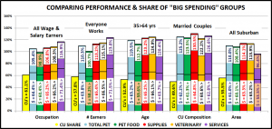
Comparing the Spending Demographics of the Industry Segments – SIDE BY SIDE

The first six reports of our Pet Spending Demographics analysis have been very detailed, data driven and intense. We looked at the industry as a whole and each of the individual Industry segments separately. 2017 was a year of Value and consumers responded with a $9.8B Pet spending increase. 2018 was a different story. We saw the very real impact of outside influence on the industry. The mid-year FDA warning on grain free dog food caused an immediate $2.3B drop in spending in the second half as many consumers reversed their 2017 upgrade. New tariffs flattened spending in Supplies in the second half, after a $1B lift in the first 6 months. Inflation increased in Veterinary and the small spending lift came almost totally from price increases. On the upside, the Service segment had the best year ever. There were unusual “heroes” and “villains” in the 2018 Pet story. Baby Boomers have long driven the growth of the industry. 2018 was their worst year ever – spending drops in every segment – Total: -$6.5B. The good news is that everyone else stepped up, especially the Gen Xers and Millennials. This produced a small increase, but these younger groups have different characteristics, so the spending demographics changed to reflect the younger lifestyle.

We have often referenced the similarities and differences in spending between Total Pet and the individual industry segments. Total Pet Spending is a sum of the parts and not all parts are equal. In this final report we are going to put the segments side by side to make the parallels, differences and changes from 2017 more readily apparent. We will address:

  • “The big spenders” – those groups which account for the bulk of pet spending
  • The best and worst performing segments in each of twelve demographic categories
  • The segments with the biggest changes in spending $ – both positive and negative
  • And of course, the “Ultimate Spending CUs”

The emphasis is on “visual” side by side comparisons to allow you to quickly compare the industry segments. We’ll try to minimalize our comments. You can always reference one of the specific reports for more details. We’ll also break the charts up into smaller pieces that are demographically related to make the comparison more focused and easier.

Before we get started, let’s take a look at the current market share of the industry segments. The following 2 charts show the 2018 share of spending for each segment and the evolution over the past 26 years. 1992 was the last year that the Food Segment accounted for 50% of Total Pet Spending. By the way, Total Pet Spending was $16.2B in 1992. We have come a long way – +385%; annual growth rate of 6.26%. This will help put our comparisons into better perspective.

Food: 36.7%; Down from 40.3%

Supplies: 25.2%; Up from 24.1%

Veterinary: 27.0%; Up from 26.8%

Services: 11.1%; Up from 8.8%

The Food segment dropped below the 40% level again, to its lowest level since 2011. In 2015 it was 43.5%, the highest level since 1998. All other segments increased share, although the Veterinary gain was slight. The biggest gain was by Services as they reached a historic new high. Prior to this year their share had been relatively stable, as was Veterinary Services. The most visible long term trend has been the decline of Food share as Supplies gained in importance. The 90’s brought “Pet Parents”, the rise of Pet Chains and Super Stores and a big expansion in the Mass Market. Retailers filled their shelves with Supplies and Consumers filled their Homes. The 2012 and 2018 shares for Food and Supplies look fairly stable but they mask an annual roller coaster ride caused by new premium food trends and deflation in Supplies.

Now let’s get started with a look at the “Big Spenders”. The following 2 charts will compare the market share and performance in all Pet Industry segments by the groups responsible for the bulk of the spending in 10 demographic categories. These are the groups that we identified in our Total Pet analysis to generate at least a 60% market share of spending. As you recall, in some segments, we had to alter some groups slightly to better target the spending. However, to have a true side by side comparison we need to use the same groups for all. The market share dips below 60% in 3 situations, to a low of 53.5%. Two are related to Food, which is yet more evidence that pet parenting is demographically widespread. The other is in Services and reflects the urbanization trend. Even the low point is within 10.8% of our target and 94% of all measurements meet or exceed the 60% requirement, so the comparison is very valid.

The chart makes it especially easy to compare performance across categories. Remember, performance levels above 120% show a very high level of importance for this category in terms of increased spending. Unfortunately, it also indicates a high spending disparity among the segments within the category. There are 2 charts, each with 5 categories.

  • White, Non-Hispanic – This group has an 83+% market share in every Segment. Minorities account for 31.5% of CUs but only 9 to 17% of spending in any segment. Factors: Lower income for Hispanics and African Americans and lower Pet ownership in Asians and African Americans. They maintained share in Total, but loss share in Food and Services. Food replaced Supplies at the bottom. Supplies and Veterinary gained share and slightly increased performance.
  • 2+ People in CU – 2 is the magic number in pet ownership. In the past, performance has been remarkably even across all segments. This year, all segments but Supplies fell in share and performance because Singles had a great year. This group is still under 120% because spending tends to go down in larger CU’s, with the exception of 4 person CUs in Supplies. In both Service segments the performance of 5+ person CUs is actually worse than singles.
  • Homeowners – Homeownership is very important in Pet Ownership and subsequently in all Pet Spending. It also increases with age. Due to the youth movement, this group’s share of spending fell below 80% for the first time. Veterinary and Supplies gained some ground, but Food and Services had big drops. It was also a pretty good year for Renters which correlates to the urbanization movement.
  • Over $50K Income INCOME MATTERS MOST IN PET SPENDING! Food still has the lowest share and performance as Pet Ownership remains common across lower incomes. The importance of income increases as spending in industry segments becomes more discretionary – like Supplies and Services, or higher priced – like Veterinary. This group gained share in all segments but Food. Performance fell slightly in all but Services due to a subpar year by some groups in the $50>99K range.
  • Associates Degree or Higher – Higher education often correlates with higher income and we see a similar spending pattern. The group gained in share and performance in all segments, but especially in Food where the less educated groups reversed their 2017 upgrade. Formal Education after HS returned to prominence in all pet spending.

First Note: 2 Big groups have segments with performance under 100%. This truly indicates more balanced spending.

  • All Wage & Salary Earners – Incomes vary widely in this group, so performance tends to be lower. However, all segments, but Food gained in share and performance. The drops in Food were driven by Self-employed and Retirees who were among the few groups to spend more on Pet Food.
  • Everyone Works – Income is important, but the # of Earners tends to be less important, with one new exception. Younger CUs have more earners. Services spending skewed younger in 2018, in part because they recognized and needed the convenience. This was the first segment to break the 120% mark for this group.
  • 35 to 64 yrs – Includes the 3 highest income segments. This group increased both share and performance in all segments but Food. Gen Xers and Millennials both had a very good year, so spending is becoming more balanced across age groups and even moving younger as the 55>64 year olds had a bad year. The exception is Food where the Boomers still dominate.
  • Married Couples – Being married makes a big difference in spending in all segments. A minimum performance of 122% says it all. However, Singles had a great year in 2018, so Married Couples fell in share and performance in all but Supplies. Married Couples w/children spent more. It was Married Couples only that caused the drop.
  • All Suburban – Most Pet $ are spent here but the share and performance of this group has become more volatile. Supplies and Veterinary have been fairly stable. However, in 2017 the Suburbs lost ground in Food due to a spending lift by Rural. In 2018, this turned around but was replaced by a huge lift in Services by Central City.

Now we’ll drill a little deeper to look at the Best and Worst performing segments in each category. Color Highlighted cells are different from Total Pet; * = New Winner/Loser; ↑↓ = 5+% Performance Change from 2017. We will divide the categories into related groups. First, those related to Income.

  • Income – Higher Income = Higher Performance. Lower Income = Lower performance. Income matters and it matters most in the nonfood segments. Last year the top performer in Food was the over $200K group but it is still a high income group. The performance and disparity are astronomical in the service segments. The winning performance in these segments is dropping, but so is the losing one. This shows that gains are being made in the mid-range.
  • # Earners – More earners = more income. Once again, income is even more important to the nonfood segments. In Food, the 1 Earner, 2+ CUs had a bad year as their spending fell -17.5% but they still hung on to the top spot and the performance disparity gap is closing. In Supplies and Services, the number of Earners is becoming more important.
  • Occupation – Self-Employed and Mgrs & Professionals are #1 and #2 in CU income and expenditures. They now occupy all the top spots. The Self-Employed rebounded incredibly strong after a bad 2017. Blue Collar workers won in Food last year, but the victory was short lived as they dialed back their upgrade in 2018. As you can see by the arrows, the disparity is growing in 2 segments and Total Pet. This category clearly demonstrates the importance of income in Pet Spending.

Next are demographics of which we have no control – Age, Generation and Racial/Ethnicity

  • Racial/Ethnic – As expected, White Non-Hispanics are the top performer in all segments. African Americans have the lowest average income and only 25% own Pets. Asians have high income but only 24.7% own pets. (Ownership data from the 2017 American Housing Survey)
  • Age – The 55>64 group had a bad year. They were replaced at the top by 35>44 in Services and 45>54 in Total. The 45>54 year olds have the highest income and the most CU expenditures. Now they are the leaders in pet spending.
  • Generation – 55>64 are all Boomers. The vast majority of 45>54 and 35>44 are Gen Xers so this data closely mirrors the age group category. We should also note that Millennials got off the bottom in both Food and Services.

Now, we’ll go back to demographics in which we have some control.

  • Education – Winning and losing is closely tied to more and less Education which also correlates with income.
  • CU Composition – Married Couples Only had a bad year but are still on top in 3 categories. In Supplies and Services, you see the family/youth trends. Singles had a good year but are still at the bottom in 3 segments, but not Total.
  • CU Size– “2” is still the top number in Pet but 2>4 are all strong. Performance drops off at both ends of the CU size spectrum – 1 or 5+.

  • Housing – Homeowners w/Mortgage and Renters are the perennial winner and loser.
  • Area– Areas <2500 population (which includes Rural) perform the best except for the new winner, Central City in Services. In terms of worst performer, it is Central City in the Products segments and Rural in the Services segments.
  • Region – Same winners as 2017 with the West on top. The South is the overall worst but 92.5% is not too bad.

Here are two summary charts. The first compares the averages.

It is immediately apparent that the difference grows as you move from Food to Supplies to Services. Spending becomes more discretionary. The difference between winners and losers dropped significantly in Total Pet and all segments but Supplies. This indicates a growing balance in spending in these segments.

  • Food – In Food the best and worst are actively moving together – more balance in more demographics.
  • Supplies – In Supplies the relative performance remained rather stable. The increase in the difference came from slightly poorer performance by the worst segments.
  • Veterinary – The winners performance fell significantly, and the losers turned up a little, so the gap narrowed.
  • Services – The record spending increase positively affected 91% of 92 demographics segments and the Best and Worst moved closer together.

This chart shows the number of new winners/losers.


2018 Veterinary Spending was $21.23B – Where did it come from…?

Now we will turn our attention to the final Industry Segment – Veterinary Services. We’ll see some similarities to Services but some big differences from the Product Segments. For years, Veterinary Services prices have had high inflation. This has resulted in CU income becoming the most dominant factor in spending behavior and a reduction in visit frequency. Consumers paid more, just used Veterinary Services less often. The high inflation and prices also resulted in consumers trading Veterinary $ in reaction to big spending changes in other segments, primarily Pet Food.

Things changed in 2017 as Veterinary pricing had an all-time record low inflation rate.  Consumers responded with a 7.2% increase in visit frequency and spent $2.5B more on Veterinary Services. In 2018 inflation began to return to more normal levels. Visit frequency fell slightly -0.2% and spending essentially plateaued. Consumers spent $0.56B more (+2.7%) but since inflation was 2.6%, virtually all of the lift was from increased prices. In this report we’ll look deeper.

We’ll start with the groups who were responsible for the bulk of Veterinary spending in 2018 and the $0.56B increase. The first chart details the biggest pet Veterinary spenders for each of 10 demographic categories. It shows their share of CU’s, share of Veterinary spending and their spending performance (Share of spending/share of CU’s). One difference from the product segments is immediately apparent. In order to better target the bulk of the spending we have altered the income group. Another difference is in performance – 6 of 10 groups perform above 120%. This is down from 7 in 2017 and now equal to Supplies. Services leads with 7 and Food trails with 4. This means that these big spenders are performing well but it also signals that there is a large disparity between the best and worst performing segments. Income is clearly the biggest factor in Veterinary Spending.  The categories are presented in the order that reflects their share of Total Pet Spending which highlights the differences of the 9 matching categories.

  1. Race/Ethnic – White, not Hispanic (90.9%) up from (90.0%) This group accounts for the vast majority of spending in every segment., but a 91% share is extraordinary. The 131.7% performance rating ranks #3 in terms of importance in Veterinary Spending demographics and reflects the spending disparity. Hispanics, African Americans and Asians account for 31% of U.S. CU’s, but they only spend 9% of Vet $. Asians and African Americans have a significantly lower percentage of pet ownership and African Americans have the lowest average CU income.
  2. # in CU – 2+ people (81.6%) down from (84.1%) This group, which is over 70% of U.S. CUs, lost share and their performance fell from 118.0% to 115.7%. Even with a drop in performance, they still rank 7th in terms of importance in terms of Veterinary Spending. The loss in share and performance was driven by decreased spending by  2 and 3 person CUs in conjunction with a huge, $0.61B increase by singles.
  3. Housing – Homeowners (83.4%) up from (82.5%) Homeownership is a major factor in pet ownership and spending in all industry segments. In terms of importance to Veterinary spending, their 131.4% performance rating, up from 131.2%, keeps homeownership in 4th place. The slight increase in share and performance was driven by a $1.1B increase in spending by Homeowners w/Mtge. Everyone else spent less. We should note that Homeownership is not as important to Veterinary Spending as it once was. In 2015 their share was 88.4% with performance of 141.8%.
  4. Education – Associates Degree and Higher (76.3) up from (73.8%) Income generally increases with education. It is also important in understanding the need for regular Veterinary care. Market share was up as was performance, which went from 137.3% to 140.0%. Education became stronger as the 2nd most important factor in Vet spending. The lift came from BA/BS and Associates Degrees. All groups with a formal degree after HS performed at 119+%.
  5. Age – 35>64 (66.1%) up from (65.9%) This group switched back to 35>64 after a year as 45>74 because the 35>44 yr olds were up $0.8B while the 65>74 yr olds spent $0.2B less. Performance was also up, going from 123.4% to 124.9%. The gains would have been greater, but 55>64 spent $0.6B less. Age remained 5th in terms of importance.
  6. Occupation – All Wage & Salaried (66.5%) up from (65.8%) – All Wage and Salary Earners took over from “I’m the Boss”, which included Mgrs & Professionals, Self-employed and Retirees. Mgrs & Professionals and Self Employed drove the increase but they are not in the same group. This kept the the group’s share gain down and performance only increased from 107.5% to 108.3%. Occupation was #6 in importance. Now, it is the least important category.
  7. # Earners – “Everyone Works” (66.5%) up from (65.9%) In this group, all adults in the CU are employed. The share gain comes from a big year by working singles. Performance was basically steady, 115.1%, up from 115.0%. The gain from Singles was balanced by a spending drop by 2 earner CUs.
  8. Income – Over $70K (68.2%) up from (65.0%) We changed this group from over $50K because Veterinary Spending is so affected by CU income and the $70K level is where the behavior changes. Only the <$30K group spent less but the decrease was huge, -$0.8B. The performance of the $70K group stayed at 169.2%, clearly showing that higher income is THE most important factor in increased Vet spending.
  9. CU Composition – Married Couples (60.6%) down from (63.8%) Married couples have a big market share and 120+% performance in all segments. They loss share due to a big decrease from Couples only and an increase from singles and Unmarried, 2+ Adult CUs. Their performance also fell to 122.2% from 128.9%, but they moved up to 6th place in importance because the Occupation Category had an even worse year.
  10. Area – Suburban (63.2%) up from (62.9%) Suburban CU’s are the biggest spenders in every segment. They gained a little in share and in performance, which was 113.9%, up from 113.1%. They maintained the middle ground as Center City was up $0.79B while Rural america spent $0.64B less.

We changed 1 of the groups because Higher income is by far the biggest single factor in Veterinary spending. We see the impact of this in many groups as it often contributes to the big spending disparity between segments. The most notable changes were that occupation became less important, education moved up and spending skewed a little younger.

Now, we’ll look at 2018’s best and worst performing Veterinary spending segments in each category.

Almost all of the best and worst performers are those that we would expect. However, there are 6 that are different from 2017. This is much more than Supplies (3) but less than Services (8) and Food (7). This suggests some instability but unlike Food or Services, there is no big change in $, up or down. The changes from 2017 are “boxed”. We should note:

  • Income – The 258.8% Performance by the $200K> group is down from last year’s 286.0% but is still very high.
  • Generation – This is a Big Change. Boomers have “owned” this segment since….
  • Occupation – Self -Employed took over from Mgrs & Professionals. They are the 2 highest income segments.
  • Education – The BA/BS group took over from the usual winner, Adv. College Degree.
  • Age – The 45>54-year olds, the group with the highest income, solidified their position at the top. By the way, only CUs in the 35>64 age range perform above 100%.
  • CU Composition – It was a bad year for Married Couples Only and a good year for Singles, but both maintained their positions at the top and bottom of performance.
  • # in CU – 2 people CUs, married or unmarried are the best performers. Single people perform better than only one other type of CU – the ones with 5 or more people.
  • Region – Northeast won again – 4 straight years. The South is the only region performing below 100%.

It’s time to “Show you the money”. Here are segments with the biggest $ changes in Veterinary Spending.

Spending was up a modest 2.7% but there was turmoil, and this is where we see it. There were only 2 repeats and 10 segments flipped from 1st to last or vice versa. The only segment with more turmoil was Food. There were surprise winners – Gen X, 35>44, Center City, Singles and surprise losers – Boomers, Adv. Degrees, 55>64, Married Couple only. Last year there were 4 categories where all segments spent more . This year there were none. Here are the specifics:

  • Housing – Homeowners w/o a Mtge flipped from 1st to last.
    • Winner – Homeowner w/Mtge – Veterinary: $11.90B; Up $1.13B (+10.5%)
      • 2017: Homeowner w/o Mtge
    • Loser – Homeowner w/o Mtge – Veterinary: $5.80B; Down $0.49B (-7.7%)
      • 2017: Renter
    • Comment – Last year all groups spent more. This year it was only Homeowners w/Mtge. The Homeowners w/o mtge numbers were driven down by a big spending decrease by Retirees.
  • Generation – Gen X just edged out Millennials for the win.
    • Winner – Gen X – Veterinary: $6.67B; Up $0.91B (+15.9%)
      • 2017: Baby Boomers
    • Loser – Baby Boomers – Veterinary: $8.21B; Down $1.76B (-17.7%)
      • 2017: Silent
    • Comments – The Boomers were the only generation to spend less on Veterinary Services. One factor was their adult children moving out to their own homes. The other Generations spent more producing a positive result.
  • Education – Those with a BA/BS Degree are repeat winners and are up $2.48B (+44%) since 2015.
    • Winner – BA/BS Degree – Veterinary Spending: $8.06B; Up $0.90B (+12.6%)
      • 2017: BA/BS Degree
    • Loser – Adv. College Degree – Veterinary Spending: $5.39B; Down $0.50B (-8.5%)
      • 2017: Associates Degree
    • Comment – Associates Degree had a big turnaround and got out of the cellar with the biggest increase of any segment, +24.9%. They were replaced at the bottom by Adv. Degrees, an unusual spot for this group.
  • Age – Last year the winner was the older Gen Xers – 45>54. This year it is their younger siblings – 35>44.
    • Winner – 35>44 yrs – Veterinary Spending: $3.83B; Up $0.84B (+28.3%)
      • 2017: 45>54 yrs
    • Loser – 55>64 yrs – Veterinary Spending: $4.78B; Down $0.64B (-11.9%)
      • 2017: 75+ yrs
    • Comment: Veterinary spending by age group was a mixed bag. <25: +$0.14B; 25>34: -$0.02B; 35>54: +$1.03B; 55>74: -$0.88B; 75+: +$0.31B. As you look at the ups and downs, a spending rollercoaster ride “ for the ages” might be a more apt description of the pattern in this category. By the way, the 75+group was up 39%.
  • Region – A dual flip in this category.
    • Winner – Midwest – Veterinary Spending: $5.00B; Up $0.80B (+19.0%)
      • 2017: Northeast
    • Loser – Northeast – Veterinary Spending: $4.33B; Down $0.33B (-7.2%)
      • 2017: Midwest
    • Comment – The South finished second again. The Northeast lost but are still the best performing segment.
  • Area Type – Central City flipped from last to first.
    • Winner – Central City – Veterinary Spending: $6.47B; Up $0.79B (+13.8%)
      • 2017: Suburbs >2500
    • Loser – Rural – Veterinary Spending: $1.34B; Down $0.64B (-32.2%)
      • 2017: Central City
    • Comment – Central City led the way, but all areas except Rural spent more.
  • Race/Ethnic – With a 91% share of Veterinary $, White, non-Hispanics increased their dominance in this segment.
    • Winner – White, Not Hispanic – Veterinary: $19.31B; Up $0.71B (+3.8%)
      • 2017: White, Not Hispanic
    • Loser – Asian American – Veterinary: $0.17B; Down $0.24B (-58.9%)
      • 2017: African Americans
    • Comment – Asian Americans have low pet ownership but the highest income. They spent 59% less. African Americans have low pet ownership and the lowest income. They spent 60% more. Hispanics are 2nd in pet ownership and 3rd in income. They spent 20% less. There is no clear pattern for minority spending.
  • Occupation – Self-Employed flipped from last to first.
    • Winner – Self-Employed– Veterinary Spending: $2.11B; Up $0.64B (+43.5%)
      • 2017: Mgrs & Professionals
    • Loser – Retired – Veterinary Spending: $3.54B; Down $0.62B (-15.0%)
      • 2017: Self-Employed
    • Comment – Self-Employed and Mgrs & Professionals spent $1.02B more. This overcame the $0.62B decrease by Retirees. Blue Collar workers also posted a $0.12B increase, but the Tech/Sls/Clerical group spent $0.04B less.
  • CU Composition – A final double flip.
    • Winner – Single – Veterinary: $3.90B; Up $0.61B (+18.6%)
      • 2017: Married, Couple Only
    • Loser – Married, Couple Only – Veterinary: $6.77B; Down $0.57B (-7.8%)
      • 2017: Single
    • Comment – Singles had a strong year in every category. In Veterinary spending Unmarried 2+ Adult CUs and Single Parents also spent more. For all Married CU’s, only those with an oldest child over 6 had an increase.
  • # in CU – Singles flipped from last to first.
    • Winner – Single – Veterinary Spending: $3.90B; Up $0.61B (+18.6%)
      • 2017: 2 People
    • Loser – 3 People – Veterinary Spending: $3.60B; Down $0.32B (-8.3%)
      • 2017: Single
    • Comment: The winning numbers were 3 and 1. CUs of all other sizes spent less.
  • # Earners – The winner flipped from last to first and would be a big surprise in most years.
    • Winner – 1 Earner, Single – Veterinary Spending: $2.57B; Up $0.55B (+27.5%)
      • 2017: 2 Earners
    • Loser – No Earner, 2+ CU – Veterinary Spending: $1.61B; Down $0.39B (-19.4%)
      • 2017: 1 Earner, Single
    • Comment – While Income is of primary importance to increased Veterinary Spending, the number of earners remains on the lower tier of spending drivers. The 2018 Veterinary spending data reinforces this. 1 Person CUs, with 1 or no earner spent more. In 2+ person CUs, No Earners and 2 Earners spent less while 1 and 3+ Earners spent more. 2 and 3+ Earner CUs have the highest incomes but are in opposite “camps”. There is no clear spending pattern in the # of Earners category.
  • Income – In 2018, $150 to $199K was the winner. The winner is inevitably an over $100K group in this segment.
    • Winner – $150 to $199K – Veterinary Spending: $2.74B; Up $0.33B (+13.7%)
      • 2017: $100K>149K
    • Loser – <$30K – Veterinary Spending: $1.79B; Down $0.77B (-29.9%)
      • 2017: $30 to $39K
    • Comment – The only group to spend less was <$30K but the lift was driven by $70K>, +$1.05B.

We’ve now seen the winners and losers in terms of increase/decrease in Veterinary Spending $ for 12 Demographic Categories. 2018 saw slow growth in Veterinary spending, mostly in the second half. There was a surprising amount of turmoil with 22 of 24 winners/losers being new or flipping positions. Most of the winners were not unexpected but there were some surprises like Gen X, 35>44 and Singles. This reinforces the “youth movement” in Veterinary Spending. However, there were also “hidden” segments that didn’t win but made a significant contribution to the 2018 spending increase. These groups don’t win an award, but they certainly deserve….

HONORABLE MENTION

First let’s call out a Blue Collar subsegment. Construction/Mechanics, +98.5%. African Americans also earned their spot, +60.3%. It wasn’t all about youth as the oldest Americans spent 38.9% more. Formal Education is also important but not just College Grads. Assoc. Degree spent $0.55B more. 4 People CUs and Millennials also had big increases reinforcing the youth movement. While the lift wasn’t as big as last year, it was still widespread as 58 of 92 demographic segments (63%) spent more on Veterinary Services in 2018.

Summary

2016 and 2017 produced a combined increase of $3.6B in Veterinary Spending as inflation moved to record low levels. In 2018 we had the Baby Boomer Spending “Bust” which especially impacted Food and Veterinary. They dialed back their Food upgrade and cut back on Veterinary. Another significant factor was that many adult children moved out of their parents’ homes to become financially independent. This group, plus the Gen Xers stepped up to overcome the decrease from the Boomers. Veterinary Spending became a little more balanced in terms of age and also occupation in 2018.

Veterinary services and spending should be a definite need, like Food, but there are many indications that it is becoming more discretionary and determined by income. It is very obvious when we look at performance. (Share Vet $/Share CUs)

  • <$30K – 29.4%
  • $30>50K – 71.7%
  • $50>70K – 80.3%
  • $70>99K – 119.1%
  • $100>149K – 161.5%
  • $150>199K – 209.1%
  • $200K> – 258.8%

The “break even” point (100%) occurs at $70K+. CU’s over $70K (40.3%) account for 68% of Veterinary $. In 2018 this group continued to grow in numbers and gained share. Performance remained steady at 169%. One lower income group, $40>49K had a strong year, +28%. However, the <$30K group has almost become a non-participant in Veterinary.

The performance of other big spending groups is also very important in the Veterinary segment. We identified six demographic categories with high performing large groups. (There were 7 for Services, 6 for Supplies and 4 for Food) .  Consumers have no control over Race/Ethnicity or Age but in addition to Income – Education, Homeownership, and Marriage are important factors in Veterinary spending. The high performance in these groups also demonstrates the big spending disparities among segments within these categories.

There were some changes of note. Occupation ceased to be a major factor in spending, but formal Education after HS became even more important. Marriage lost ground as Singles stepped up their spending. Veterinary spending also skewed younger in 2018 so the big age group changed back to 35>64 from 45>74.

2018 saw a small spending increase (+2.7%) for Veterinary Services. 63% of all segments increased spending but with a 2.6% inflation rate, almost all of the lift came from prices. The lift was driven by Gen Xers and Millennials which was reflected in the strong performance of numerous segments like Singles, Married with oldest Child over 6, Center City and 35>44 yr olds. The importance of income to spending in this segment was reinforced and a definite concern came to the forefront. CUs with income <$30K (29%) spend 15% of Food $ but only 8% of Veterinary $. Is inflation putting necessary Vet Care out of reach for this group? In 2019 Veterinary Inflation jumped to 4.14%. We’ll see what happens.

Finally – The “Ultimate” Veterinary Services Spending Consumer Unit consists of 2 people – a married couple only. They are in the 45 to 54 age range. They are White, but not of Hispanic origin. At least one of them has a BA/BS Degree. They both work in their own business and their total income exceeds $200K. They live in a small suburb, adjacent to a big city in the Northeastern U.S. and are still paying off the mortgage on their home.


2018 Pet Services Spending was $8.72B – Where did it come from…?

Next, we will look at Pet Services. They are by far the smallest Segment at $8.72B but in 2018, they made the most “noise”. Spending increased $1.95B (+28.9%). This was by far the biggest increase in history. The number of outlets offering Services has been strongly increasing in recent years as brick ‘n mortar retailers look for a way to combat the growing influence of online outlets. After all, you can certainly buy products, but you can’t get your dog groomed on the Internet. This created a highly price competitive market for Pet Services. In 2017 there was a slight increase in visit frequency, but Pet Parents just paid less. This resulted in a 1.0% decrease in Services spending. In 2018 consumer behavior changed as a significant number decided to take advantage of the increased availability and convenience of Pet Services and spending literally took off.

To better appreciate the significance of this huge spending lift, let’s put it into historical perspective. The $1.95B increase in Pet Services spending was larger than the total annual spending for the segment for every year prior to 1999. It was also more than twice as big as the previous largest increase of $0.82B in 2012. This is great news as Pet Services now has a stronger “presence” at the Pet Industry “table” and Pet Spending becomes a little more balanced. Let’s look a little deeper into the demographics.

Let’s start by identifying the groups most responsible for the bulk of Services spending in 2018 and the $1.95B increase. The first chart details the biggest Pet Services spenders for each of 10 demographic categories. It shows their share of CU’s, share of Services spending and their spending performance (Share of spending/share of CU’s). The differences from the products segments are immediately apparent. In order to better target the bulk of the spending we had to alter the groups in three categories – income, education and area. The performance level should also be noted as 7 of 10 groups have a performance level above 120%. This compares to 6 for Total Pet, Veterinary and Supplies but only 4 for Food. These big spenders are performing well but it also indicates that there is a large disparity between the best and worst performing segments. Income is absolutely the biggest factor in Services Spending. The categories are presented in the order that reflects their share of Total Pet Spending which highlights the differences of the 7 matching groups.

  1. Race/Ethnic – White, not Hispanic (85.5%) down from 87.9%.This big group accounts for the vast majority of spending in every segment but Services Spending became slightly more diverse in 2018 as their performance fell from 128.3% to 123.8%. However, they are still tied for 5th in terms of importance.
  2. # in CU – 2+ people (77.3%) down from 79.8% The share of market for 2+ CU’s is very close for all segments but lowest in Services and the only one with a share less than 80%. Their performance of 109.6% is down from 111.9% also last. The explanation is that Singles had a great year. They are 29.5% of CUs and spent 44% more on Services.
  3. Housing – Homeowners (80.8%) down from 86.4%. Homeownership is a big factor in pet ownership and spending in all industry segments. The Homeowners’ share of Services spending fell sharply in 2018 as did their performance, from 137.4% to 127.3%. Homeownership fell from 3rd to a tie for 5th in terms of importance for increased Services spending. Homeowners w/mtge spent 34% more, but those w/o a mtge spent 5% less and … Renters $ were up 82%.
  4. Income – Over $70K (72.3%) up from 71.2% This group’s performance rating is 179.4%, down from 185.2% but still shows that CU income is the single most important factor in increased Pet Services Spending. The slight gain in share with a slight drop in performance can be explained by the slowly growing CU income. CUs under $70K spent 27% more on Services but they had 2% fewer CUs. The over $70K spent 23% more but gained 6% in CUs.
  5. Education – College Grads (68.9%) up from 68.8% Income generally increases with education. Services spending moves up with each increasing level of education. This is why we again shifted the group up to College Grads. Performance of 157.9% was down from 161.9% but a college education is still the 2nd most important factor.
  6. Occupation – All Wage & Salaried (71.4%) up from 64.1% – Last year we had a special group called “I’m the Boss” which consisted of Mgrs & Professionals, Self-employed and Retirees. This year regular workers took the lead. Their performance rating increased from 104.9% to 116.9%, but Occupation is no longer a member of the influential 120% club. As many “non bosses” stepped up, Services spending became more balanced in terms of Occupation.
  7. # Earners – “Everyone Works” (71.5%) up from (64.9%) All adults in the CU are employed. Income is important so a relatively high market share is expected. However, their performance grew to 123.8% from 113.3% and they returned to the 120% club at #5. This lift reflects the youth movement. Younger CUs generally have more earners.
  8. Age – 35>64 (63.7%) up from 61.0%. Their performance also increased significantly from 114.3% to 120.4%. A big lift in spending by the 35>44 yr olds caused the big spending group to grow younger from 45>74 yr olds. Services spending is becoming a little more balanced in this category, but age still ranks 7th in importance for Services $.
  9. CU Composition – Married Couples (62.8%) down from 64.5%. Married couples are a big share of $ and have 120+% performance in all segments. Their performance fell to 126.6% from 130.3% but they moved up to 4th place in terms of importance to Services spending. Married Couples spent 25.5% more on Services but that wasn’t as big a lift as the +44% by Singles or even the +30% by Single Parents, so they lost a little ground.
  10. Area – City/Suburbs >2500 (85.3%) up from 79.8% in share, while performance increased from 97.7% to 104.7%. Last Year the big group was all Suburban. In 2018 Central City virtually tied Suburbs >2500 for the spending lead. To get 60% and properly reflect the urban trend in this segment, we combined those 2 groups.

We changed 3 of the groups for Services – Income, Education and Area, to better target the biggest spenders. Income is even more important to Services spending than it is to Veterinary, where we only changed Income. The performance levels in Services spending in categories related to income – Income, # Earners, Occupation and Education, are markedly higher than Veterinary which shows an even  bigger spending disparity between the segments in Services.

Now, we’ll look at 2018’s best and worst performing Pet Services spending segments in each category.

Most of the best and worst performers are not a surprise. However, there are 8 that are different from 2017, the most of any segment – 4 of the best and 4 of the worst. Also, half the changes were in 2 categories – Age & Generation. The 4 new winners, Gen X, 35>44, Center City and Married, Oldest Child < 6, do reflect the very definite “youth movement” behind the big 2018 lift in Services Spending. Changes from 2017 are “boxed”. We should note:

  • Income is even more important to Pet Services. While the 364.0% Performance by the $200K> group is less than last year’s 398.8%, it is 41% higher than Veterinary and 130% higher than the best performing income segment in Food.
  • Generation – Gen X took over the Top Spot from the Boomers and Millennials got off the bottom. It was a good year for the younger generations.
  • Age – The 35>44 group reflects the youth movement. They are the best performers and spend the most $. It is also significant that the <25 group got off the bottom. All groups from 35>64 perform at 100+%. In 2017 it was 45>74.
  • Area –Center City became the performance leader, going from 90% to 117.3%, and was within $0.02B of taking the Spending $ lead from Suburbs >2500. Areas >2500 pop. were up $2B and accounted for 85.3% of total Services $.
  • CU Composition Married Couples, with an oldest child <6 may seem like a surprise, but they won in 2016. They also had the biggest % increase of ANY segment, +152.6%. Marriage and children are important factors in Services spending. Married Couples only and those with children of any age all perform over 100%. They all earn their share.

In Pet Services spending performance, we see 2 major factors – income, which is not a surprise in this most discretionary segment and youth, which is a surprise in a segment that has skewed older.

It’s time to “Show you the money”. Here are segments with the biggest $ changes in Pet Services Spending.

Pet Services Spending was up $1.95B, the biggest lift in history. In this chart you see the strong demographic impact as 9 of 12 categories had an individual segment that accounted for at least 47% of the increase. At the same time, the drops were small. The largest was only $0.17B. In fact, 6 of 12 categories had no segments that spent less. There were 7 repeats, 4 winners and 3 losers from 2017 but only 5 of 24 segments switched their position from first to last or vice versa, the same as Supplies. All of this indicates little turmoil, just strong, widespread growth. Here are the specifics:

  • Area Type – The winner and loser flipped as spending became more urbanized. Areas >2500 were up $2.04B.
    • Winner – Center City – Pet Services Spending: $3.71B; Up $1.51B (+68.5%)
      • 2017: Suburbs <2500
    • Loser – Suburbs <2500 – Pet Services Spending: $0.94B; Down $0.07B (-7.0%)
      • 2017: Center City
    • Comment – Center city won in 2015 & 2016 then lost in 2017. In 2018, they returned to the top.
  • Race/Ethnic – African Americans flipped from 1st to Last but all racial/ethnic groups spent more.
    • Winner – White, Not Hispanic – Services: $7.46B; Up $1.51B (+25.3%)
      • 2017: African American
    • Loser – African American – Services: $0.41B; Up $0.10B (+33.3%)
      • 2017: Hispanic
    • Comment – White, Non-Hispanics returned to their “usual” position at the top of this category.
  • Generation – The Winner and Loser are repeats.
    • Winner – Gen X – Services: $3.34B; Up $1.44B (+75.9%)
      • 2017: Gen X
    • Loser – Baby Boomers – Services: $2.76B; Down $0.17B (-5.9%)
      • 2017: Baby Boomers
    • Comment – Gen X became the biggest Services Spenders in 2018, taking over from the Baby Boomers. Boomers spent less in all segments, but their smallest decrease was in Services. Over 1/3 of their decrease came from fewer CUs, down 2.1%.
  • Housing – The winner and loser in Housing are also repeats from 2017.
    • Winner – Homeowner w/Mtge – Services: $5.19B; Up $1.31B (+33.7%)
      • 2017: Homeowner w/Mtge
    • Loser – Homeowner w/o Mtge – Services: $1.86B; Down $0.11B (-5.4%)
      • 2017: Homeowner w/o Mtge
    • Comment – Renters also spent a lot more, +$0.88B. The drop by Homeowners w/o mtge is tied to Retirees.
  • Occupation – The high income group, Mgrs & Professionals, was a repeat winner.
    • Winner– Mgrs & Professionals – Pet Services Spending: $3.89B; Up $1.06B (+37.5%)
      • 2017: Mgrs & Professionals
    • Loser – Retired – Pet Services Spending: $1.23B; Down $0.17B (-12.1%)
      • 2017: Self-employed
    • Comment – The Services spending increase was widespread as only Retirees spent less.
  • # Earners– No repeats or flips. 2 Earners was the big winner and No Earner, 2+ CUs was the only group to spend less.
    • Winner – 2 Earners – Pet Services Spending: $3.91B; Up $1.01B (+34.9%)
      • 2017: 1 Earner, 2+ CU
    • Loser – No Earner, 2+ CU – Pet Services Spending: $0.53B; Down $0.04B (-7.4%)
      • 2017: 3 Earners
    • Comment – The # of Earners became more important as “Everyone Works” CUs provided 94% of the increase.
  • Age – No repeats or flips and no real surprise as the 35>44 year olds do have the second highest income.
    • Winner – 35>44 yrs – Pet Services Spending: $2.00B; Up $0.96B (+93.3%)
      • 2017: 75+ yrs
    • Loser – 65>74 yrs – Pet Services Spending: $1.24B; Up $0.01B (+0.5%)
      • 2017: 55>64 yrs
    • Comment: All age groups spent more on Services as even the 65>74 yr olds eked out a $0.01B increase. The 35>44 yr olds led the way, followed by 45>54, then 25>34. In fact, CUs under 55 spent $1.89B more on Services, 97% of the increase. CUs 55 and over are 44% of the population but only generated 3% of the increase.
  • Region – The Midwest flipped from 1st to last, but the South is a new winner.
    • Winner – South – Pet Services Spending: $3.05B; Up $0.96B (+45.6%)
      • 2017: Midwest
    • Loser – Midwest – Pet Services Spending: $1.63B; Up $0.14B (+9.1%)
      • 2017: West
    • Comment – All regions spent more and all, but the Midwest, had at least a 21% increase.
  • Education – College Degree flipped from last to first and returned to the top after a year in the cellar.
    • Winner – Adv. College Degree – Pet Services Spending: $3.09B; Up $0.91B (+41.5%)
      • 2017: BA/BS Degree
    • Loser – HS Grad – Pet Services Spending: $0.55B; Up $0.02B (+3.8%)
      • 2017: Adv. College Degree
    • Comment – Again, all segments in this category spent more on Services. BA/BS had the second biggest increase, so College Grads accounted for 70% of the $1.95B spending lift.
  • # in CU – 2 Person CUs were the repeat winner.
    • Winner – 2 People – Pet Services Spending: $3.58B; Up $0.63B (+21.4%)
      • 2017: 2 People
    • Loser – 5+ People – Pet Services Spending: $0.52B; Up $0.06B (+12.3%)
      • 2017: 4 People
    • Comment: All size CUs spent more on Services. Singles finished a strong second with a $0.61B increase,
  • CU Composition – The winner and loser are both new and Singles are definitely an unusual winner.
    • Winner – Singles – Services: $1.98B; Up $0.61B (+44.2%)
      • 2017: Unmarried, 2+ Adults
    • Loser – Single Parents – Services: $0.21B; Up $0.05B (+30.0%)
      • 2017: Married, Oldest Child <6
    • Comment – CUs of every possible composition spent more on Services. Singles won, but Married Couples with children of any age spent $0.59B more, a 31% increase.
  • Income – The winner is new but not unexpected. The loser is a repeat from 2017.
    • Winner – $200K+ – Pet Services Spending: $2.07B; Up $0.58B (+38.5%)
      • 2017: $100 to $149
    • Loser – $30 to $39K – Pet Services Spending: $0.27B; Down $0.08B (-22.8%)
      • 2017: $30 to $39K
    • Comment – All income groups but one spent more on Pet Services. However, as expected the increase was skewed more towards the higher income groups. Income groups over $100K represent 25.8% of all CUs. They spent $1.36B more on Services, 69.7% of the increase. The $30>39K group had the only decrease. This income range corresponds to the average income of Retirees, so they undoubtedly were the primary negative driver.

We’ve now seen the winners and losers in terms of increase and decrease in Services Spending $ for 12 Demographic Categories. 2018 was a fabulous year. In 6 categories all segments spent more. Moreover, the winning increase in each category averaged +$1.04B up from +$0.25B in 2017, while the biggest decreases averaged -$0.02B up from -$0.27B.  That certainly shows a widespread lift . The major trend was definitely to the younger groups. Income reasserted its importance, certainly in terms of the number of Earners. Singles definitely stepped up and we also saw a spending move back to more populated areas. The $1.95B increase was the biggest in history and we have detailed the winners in performance and $. However, there were many who performed well but didn’t win an award. They deserve….

HONORABLE MENTION

It wasn’t all higher incomes, the $40>49K group more than doubled their Services Spending. With +$.75B, Renters definitely contributed. The Blue Collar workers rolled back their Food Spending in 2018 but increased Services $ by 70%. The 2017 winner for biggest increase, 1 Earner, 2+ CU actually did better in 2018. Gen X won the awards, but the Millennials weren’t far behind. The 45>54 yr olds are mostly Gen Xers and they did their part, finishing 2nd in Age Groups. The spending increase was widespread. In fact, only 8 of 92 demographic segments less on Pet Services in 2018. That means 84 (91.3%) spent more.

Summary

The Services segment has usually been “above” changes in other segments. Since 2010 prices have steadily increased but so did Spending …until 2017. An increase in outlets offering Services created a much more competitive environment. While prices didn’t deflate, inflation slowed significantly, and “deals” abounded as Retailers began a pitched battle for Consumers’ Services $. The net result was turmoil and a 1% decrease in spending. In 2018, the abundance of outlets and competitive prices finally had their intended impact. Many more consumers took advantage of the convenience of Pet Services and spending literally took off.

Pet Services are definitely needed by some groups. However, for most demographics, Services are a convenience and spending is very discretionary in nature. The result of this is that CU income is of paramount importance to increased Services spending. This impacts many demographic categories and we adjusted the big spender groups in 2 categories specifically to accommodate this difference in behavior and to better target where most of the $ are coming from. Just how important is income? 40.3% of CU’s have an income over $70K and account for 72.3% of Services Spending. This is a performance rating of 179.4% – the highest rating earned by any group in any category in any industry segment.

Performance is an important measurement. We identified 7 categories with high performing big groups. There were 6 for Veterinary and Supplies but only 4 for Food. This indicates greater demographic disparity in Services Spending.

  • Income  · Occupation     · Higher Education     · Homeownership    · CU Composition     · Race/Ethnicity    · Age

3 of these groups are directly related to income – Education, Occupation and Income. However, for 2 – Race/Ethnicity and Age, the consumer has no control over their inclusion. They can’t control their age, but it turns out that age was the single biggest factor in Pet Services spending in 2018. The biggest spending group changed from 45>74 to 35>64. However, it wasn’t just the added Gen Xers. The Millennials also stepped up.

Although the lift was widespread, as 91% of all demographic segments spent more on Services, there was a big disparity in the amount spent. This is apparent as 10 of the 12 best performing segments also had the biggest $ increase and the average increase was $1B, up from $0.25B in 2017.

The Youth movement was apparent in the improved performance of segments which reflect their demographics:

  • Preference for Urban areas
  • Higher education
  • More CU Earners
  • Presence of children…or Singles

… to name a few. In 2018, the Gen Xers and Millennials stepped up and took a position of prominence in Services Spending and raised the visibility of the Services Segment.

At Last – The “Ultimate” Pet Services Spending Consumer Unit consists of 3 people – a married couple, with 1 child under 6. They are White, but not of Hispanic origin. At least one of them has an advanced College Degree. They are 35 to 44 years old and both of them work, in managerial positions. They’re doing well with an income over $200K. They live in the Center City of a metropolitan area of over 2.5 million in the Western U.S. and are still paying off their mortgage.