Comparing the Spending Demographics of the Industry Segments – SIDE BY SIDE
The first six chapters of this Pet Spending Demographics report have been very detailed data driven and intense. We looked at the industry as a whole and each of the individual Industry segments separately. In 2015 and again in 2016, we have noted how shifts in spending behavior in one major category, Pet Food, can negatively (2015) or positively (2016) impact the spending in others. The effect of this is seen in large groups but is evident right down to individual demographic segments.
In the individual sections of the report we have often referenced the similarities and differences in spending between Total Pet and the individual industry segments. Total Pet Spending is a sum of the parts and not all parts are equal. In this final chapter we are going to put the segments side by side with Total Pet to make the parallels and differences more readily apparent. We will address:
- “The big spenders” – those groups which account for the bulk of pet spending
- The best and worst performing segments in each of eleven demographic categories
- The segments with the biggest changes in spending $ – both positive and negative
- And yes, even the “Ultimate Spending CUs”
The emphasis is on “visual”, side by side comparisons to allow you to quickly compare the industry segments. We’ll try to minimalize our comments. You can always reference one of the specific chapters for more details. We’ll also break the charts up into smaller pieces that are demographically related to make the comparison more focused and easier.
Before we get started, let’s address an important issue that we haven’t discussed – the market share of each segment.
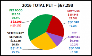
Food is of course the dominant segment at 39.4% followed by the mid-range segments – Veterinary at 26.9% and Supplies at 23.5%. Pet Services is last as expected at 9.3%. The $2.99B drop in food spending resulted in a major share loss from 43.5% in 2015, which was the highest market share since 1998. In 2016 all the other segments had increased spending and picked up the 4.1% lost by Food. The 2016 “pie” is still divided pretty much the way that we have come to expect in recent years with Pet Products controlling 62.9% of total spending. However, was it always this way?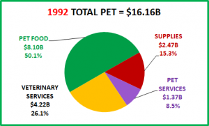
Let’s take a look back, way back to 1992. Why 1992? Because that was the last year that Pet Food “owned” at least a 50% share of Total Pet Spending. As you can see, Veterinary and Services have market shares very close to 2016. The big difference is in Food and Supplies. Food dropped into the 40% range after 1992 and stayed there basically until the great recession. Since then it has been in the mid to upper 30s. Supplies sales have exploded since 1992. There were many factors – including innovative new products, the rise of Pet Chains & SuperStores, the distribution explosion, especially in the mass market – from 86K total outlets in 1992 to 200K today. However, it was also the time when Americans evolved from Pet Owners to Pet Parents, with an urge to spoil their children. We see both short term and long term changes in the Pet Industry.
That trip back was quite a diversion from our stated purpose but it illustrated a very important point in data analysis. Change is constant. We focus on the short term as it is what is happening right now. We drill deeper into the data to better understand what and why it is happening and the impact on different consumer demographic segments. However, it is also important to take a step back to see if any long term trends are in progress. Both of these approaches are necessary and provide information vital to making better business decisions.
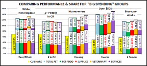
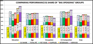
Now let’s get started with a look at the “Big Spenders”. The following 2 charts will compare the market share and performance in all Pet Industry segments by the groups responsible for the bulk of the spending in 10 demographic categories. These are the groups that we identified in our Total Pet analysis to generate at least a 60% market share of spending. As you recall, in the Service segments, we had to alter some groups slightly to better target the spending. However, to have a true side by side comparison we need to use the same groups for all. Since the lowest market share in any situation is 58.1% and 90% of all measurements meet or exceed the 60% goal, the comparison is very valid.
The chart makes it especially easy to compare performance across categories. Remember performance levels above 120% show a very high level of importance for this category in terms of increased spending. Unfortunately, it also indicates a high spending disparity among the segments within the category. There are 2 charts, each with 5 categories.
- White, Non-Hispanic – This group has an 85+% market share in every Segment. Hispanics, African Americans and Asian Americans represent 30% of U.S. CU’s but account for only 8 to 15% of Pet Spending in any category. Factors: Lower incomes for Hispanics and African Americans and lower Pet ownership in Asians and African Americans
- 2+ People in CU – 2 is the magic number in pet ownership. The performance is remarkably even across all segments. It is under 120% because spending tends to go down in larger CU’s, especially 5+ and Singles are almost always last.
- Homeowners – Homeownership is very important in Pet Ownership and subsequently in all Pet Spending. The dip in Supplies and increase in services is actually also related to age. The younger groups spend more on Supplies but are also much less likely to own a home. Older groups, especially the Boomers, are more likely to be homeowners and they spend more on Veterinary & Services.
- Over $50K Income – INCOME MATTERS MOST IN PET SPENDING! Pet Food has the “lowest” high performance. Pet Ownership is still common across lower incomes, but CU’s in the upper 50% of income spend much more and are more likely to purchase upgraded food. The importance of income just increases as spending in industry segments becomes more discretionary – like Supplies and Services, or higher priced – like Veterinary Services. In our individual segment reports on Veterinary and Services, we switched to the over $70K group to better target big spenders.
- Everyone Works – This usually generates higher income so it improves performance. However, not all workers are highly paid. This and the significant contribution by one earner, 2+ CU’s and retirees keep the “scores” below 120%.
- Associates Degree or Higher – More education often correlates with higher income. We see spending performance very similar to Income but even more pronounced. Education can also be important in recognizing the value in Veterinary services and higher priced products. Food performance is noticeably lower showing that Pet ownership is more evenly dispersed across education levels. We “learn” the benefits and value of pets early in life.
- 35 to 64 yrs – A huge spending drop by the 55 > 74 group in conjunction with a spending lift by all groups under 44 resulted in a shift from the 45 to 74 group in 2015. The spending across all age ranges became a little more balanced due to some big up and down changes. Veterinary was up in the 25>44 age group. Services and Veterinary were up in the 54 > 64 group, even as their Food sales plummeted. The performance is still at or 120% so disparity between category segments still exists in all product & service segments.
- All Wage & Salary Earners – This group had the lowest performance of any group. There are 2 reasons. Income is important and it varies widely in this group. The other factor is that the Self-employed and Retirees are significant contributors to Pet Spending. The low performance in Veterinary and Services made us select a new big spending group – “I’m the Boss”, which consists of Mgrs & Professionals, Self-employed and Retirees.
- Married Couples – Being married makes a huge difference in spending in all segments. Singles and Single Parents have a very low spending rate. The Unmarried 2+ Adults CU’s are improving, just over 100% in all but Veterinary.
- All Suburban – Most Pet $ are spent here but both the share and performance of this group are falling due to the big spending increases by the Central City in all segments. This is especially noticeable in Food and Veterinary.
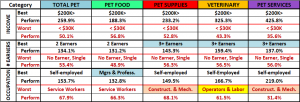
Now we’ll drill a little deeper to look at the Best and Worst performing segments in each category. Highlighted cells are different from Total Pet. We will divide the categories into related groups. First, those related to Income.
- Income – Highest Income = Highest Performance. Lowest Income = Lowest performance. Income matters and it matters most in the nonfood segments. The performance and disparity are astronomical in the two service segments.
- # Earners – More earners = more income. Once again, income is even more important to the nonfood segments.
- Occupation – The Self-employed and Mgrs. & Professionals have the two highest incomes so they should be at the top. The worst performers are a mixture of lower income occupations which are all outperformed by Retirees.
Next are demographics of which consumers have no control – Age and Racial/Ethnicity
- Racial/Ethnic – As expected, White Non-Hispanics are the top performer in all segments. African Americans have the lowest average income and the lowest percentage of pet ownership of any group.
- Age – The Best Performer in all segments but Supplies is the 55>64 year old Boomers. Supplies spending tends to skew a little younger so its best and worst performers are no surprise. By the way, 45>54 have the highest income.
Now we’ll go back to Demographic Categories in which consumers have some control
- Education – Best and worst performers directly tied to education. Difference most pronounced in nonfood segments
- CU Composition – Married is the key. Worst performers are as expected. Pet Food and Veterinary reflect the 55>64 age group. Supplies skews a little younger. Services is a surprise. They just edged out married couples only by 0.2%.
- CU Size– 2 is a magic number. They are Pet focused. Supplies skews younger and CUs are more likely to have a child.
- Housing – Homeowners w/Mortgage and Renters are the perennial winner and loser.
- Area– Smaller Suburbs are the biggest spenders, except for Services which performs better in more populated areas.
- Region – The West usually garners the most wins. Central City helped the Northeast’s performance.
Here are two charts which reinforce the trends that we have seen.
The spending disparity increases in the nonfood segments, especially Services – the importance of Income. This creates more changes, especially at the low end. We also see the impact of the big 2015/2016 $ swing in Food – 6 changes.
Now, let’s look at the Demographic Segments with the Biggest Changes in $. We’ll truly see some differences between the Industry Segments. First, the Income related categories. The differences from Total Pet are highlighted.
- Income – Winners: The $200K is no surprise. $30>49K shows the impact of Retirees. $70>99K is due to Millennials.
- Losers: Literally, a total mixed bag.
- # Earners – Winners – Reinforces the importance of income and shows that almost everyone spent less on Food.
- Losers: Once again it is income and the Retirees really cut back on Food.
- Occupation – Retirees made a lot of spending trade outs. Mgrs. & Professionals also had increases in Food and Supplies so they won Total Pet. Much of the Tech/Sls/Cler. Food spending is coming from 25>34 yr olds.
Now the Age and Racial/Ethnic Categories
- Racial Ethnic – The Hispanics had a good year except for a small drop in Supplies. The White, Non-Hispanic Group couldn’t overcome the $3.4B drop in Food. Note: Every group was up in Services!
- Age – It was all about trade outs. 35>44: Up in Veterinary and Supplies; Down in Services. 55>64: Down big time in Food, but up significantly in Services. 25>34: Paid for most of their Food increase with Supplies $.
Now, we’ll go back to Demographic Categories in which consumers have some control.
- Education – Associates Degree made a major investment in their pets. The Adv. Degree group swapped some $.
- CU Composition – This largely parallels the age category. The winners, except for Services are mostly in the 25>44 age range. The losers in Total Pet and Pet Products are driven by 55>64. Singles are usually at the bottom.
- CU Size – Usually 2-3 People CU’s are the winners and either 1 Person or 5+ People CU’s occupy the lowest spot. The 4 People CU’s had a great year. This was once again undoubtedly due to the younger groups.
- Housing – Not a normal year. We see the impact of youth and Retirees. Also, everyone was up in Supplies.
- Area – Only one conclusion to draw, Central City “Ruled” in 2016.
- Region – South & West are usual winners. The Midwest had a bad year. Northeast won Supplies due to Central City.
I hope that this Visual Comparison helped you to get a “satellite view” of the Pet Industry. Refer back to the earlier chapters to get more details. Although there are numerous individual changes. There are 4 major trends of note:
- The big swing in Pet Food $ due to Value Shopping.
- The 25>44 age group Pet spending was up & $ were more balanced.
- Urbanization trend – Central City was up in every segment.
- Swapping $ between Industry Segments.
And Finally…..
