Attending Global Pet Expo 2019? – It Has It All…and More! You Definitely Need a Plan!

The first Global Pet Expo (APPMA) occurred 61 years ago with 17 exhibitors in 30 booths. The industry and the show have both come a long way since then.  In 2019 attendees will see and experience:

  • 1145 separate exhibitor booths – with companies from the U.S. and 25 other countries – a Global experience!
  • Over 357,000 square feet of booths (Plus 30,000 sq ft for the New Product Showcase) Global Pet Expo 2019 actually occupies more than 18 acres of prime Florida “real estate”.
  • 1000 new items in the New Product Showcase plus 3000 more launched on the exhibit floor
  • Sharing the aisles with 16,000+ attendees, more than 6000 “buyers”.
  • The opportunity to choose from 34 different educational seminars – 49 hours of classes
  • 5 miles of aisles – just to walk the exhibit floor

The show floor is open for 26 hours so let’s put this in perspective and…

“Do the Math!”

 If you don’t attend any seminars, visit the New Product Showcase, stop to chat with anyone in the aisles or for food, a drink or to go to the bathroom and maintain a walking speed of 2.5 mph…

…you can spend about 1 minute and 15 seconds with each exhibitor!

You definitely need a plan!

Global Pet Expo definitely has it all… and more. Attendees will find the broadest selection of products and services while Exhibitors have the opportunity to reach a wide range of buyers across all retail channels.

First and foremost, Global is about Pet Products – Food, treats and a vast array of Supply categories. A regular flow of New Products is always critical to keep businesses and the whole industry strong and growing. Obviously, you must take the time to visit the New Product Showcase. You should also sign up for any relevant classes, network with other industry professionals and…walk the whole show.  There are 3 times as many new products being “launched” on the show floor as there are on display in the New Product Showcase. Plus, 1 of every 3 exhibitors was not at Global 2018. Global is about gathering information and making decisions to improve your business – whether they are made on the spot or put on your “must do” list.

Every business can improve in terms of products. If you are a retailer, what sections of your store are not doing as well as you hoped and need a “facelift” or conversely, what areas are growing and need products to fill additional space? Category managers for distributors and retail chains may only be interested in targeted visits to exhibitors relevant to their “categories”. Representatives may be looking for new manufacturers…in specific product categories. Manufacturers could be looking to find distributors to handle their products or just looking to “check out” the competition. In regard to products, there is always something to see…for everyone!

And Global is the place to see it. It’s all there! With so much to see and do, Time is perhaps the most valuable commodity at the show. How do you make the most of your time on the show floor? Here’s an idea.

In 2014 I first designed a tool in Excel, the Super Search Exhibitor Visit Planner to make “working Global & SuperZoo easier and more productive for ALL attendees – retailers, distributors, reps, groomers, vets…even exhibitors. I have updated the data and produced a tool for every GPE and SuperZoo since then…including GPE 2019.

The “update” is not just exhibitor lists but also to the product category offerings for every exhibitor. I reviewed every exhibitor profile on the show site but I also visited over 1100 websites and conducted separate internet searches to “validate” the product offerings. It is not 100% accurate, but it is close.

What does the SuperSearch do?…It searches for and produces a list of Exhibitors by product categories.

  • From the simplest – “give me a list that I can look at on my phone or tablet in either Booth # order or alphabetically”
  • To the most complex…”can do a simultaneous search for multiple specific product categories, allowing you to personally narrow down the initial results and see the “final” alphabetically or by booth number. The GPE Super Search Exhibitor Visit Planner does both…and more…and does it quickly! Take a look at the Quick Start Guide. You will see that it looks complex but is really quite simple.

GPE 2019 Super Search Exhibitor Visit Planner – Quick Start Guide

First: When you download the Excel file, Remember to Enable Editing & Macros!

The GPE Super Search Exhibitor visit planner is designed to make your time on the show floor more efficient and more productive. With the Super Search you can conduct up to 5 separate and distinct product category searches simultaneously with consolidated results produced in booth # order to facilitate your “journey”. There are detailed instructions for reference and to help you understand the nuances of the tool. However, it is really very simple so let’s get started. (Note: No changes in instructions from 2018) Here is the Dashboard where you set up your searches.

On the dashboard, the first things to note are the numerous category columns. There are 5 different floor sections, 11 different Exhibitor or Animal Types and 32 Dog and/or Cat Product categories. You can search exhibitors for any combination of these.

Let’s take a specific example running 3 simultaneous searches for several Dog/Cat categories:

  • Toys
  • Treats
  • Catnip & Litter (Must sell both)

Now referring to the Dashboard, let’s take it by the numbers:

#1. This column is where you activate each search. Type in a “Y” (Cells C3>C7 will auto-capitalize) This search “line” becomes active.(cell turns green) In our example we are running 3 searches so we have 3 green “Y”‘s.

#2. Now we enter a 1 in the correct column for each search line. Search Line 1: Toys; Search Line 2: Treats.

#3. In Search Line 3 we want exhibitors that sell both Catnip and Litter so we put a 1 in both of these columns.

#4. Now we just “click” the Execute Search Button. The searches are done simultaneously and the results combined into a single list in alphabetical order.

#5. If you would like to view the list in Booth # order, just click the Booth # Sort.

#6. You can switch the list back to an alpha view by clicking the Alpha Sort Button.

#7. To Clear all your search categories and start a new search, Click the Clear Criteria Button. Then click Execute (#4) again and you will be back to the full list

Note: Any Search Line with a Y and no 1’s in any column will always deliver the entire list regardless of what is selected in other lines. Change the Y back to an N in unused search lines. Now a sample of the results:

  • Company A has Toys Only
  • Company B has Dog Treats Only and is also a 1st Time Exhibitor at GPE
  • Company C is on the list for Treats and also has Catnip, but no Litter. This is not unusual as Catnip is often a Treat
  • Company D has Treats & Toys.
  • Company E has both Catnip and Litter and in fact, actually has it all!

Note: The Super Search highlights your search categories so you know “why you are there”. However, it also shows all categories that are available. Some might “pique” your interest while you are visiting the booth.

You can review the exhibitors alphabetically then put the list in Booth # order to make it easier to “work”. The Super Search also allows you to “cut down” the list during your review. (Pg 2; Point #11 – “U Pick ‘em” in Detailed Instructions) But First, I suggest that you “play” with the Super Search to get a “feel” for the tool, and then review the Detailed Instructions. With your “play” experience, the detailed instructions will become a “quick read” and a valuable reference. You will soon be “up to speed” on the full capabilities of Super Search.

Ready to Start Planning?

Use the links below to download the Super Search Tool (Be Sure to Enable Editing/Macros/Content if asked by your computer), the Quick Start Guide and the Detailed Instructions. Then GET STARTED!

[button link=”https://petbusinessprofessor.com/wp-content/uploads/2019/02/GPE-2019-QuickStartGuideSUPERSEARCHExhibitorVisitPlanner.pdf” type=”icon” newwindow=”yes”] Download Quick Start Guide (PDF)[/button]

(To save the PDF to your computer Right Click the download link and select “Save Link As…”)

[button link=”https://petbusinessprofessor.com/wp-content/uploads/2019/02/2019-GPE-SUPERSEARCH-ExhibitorVisitPlannerDETAILED-Instructions-2-21.pdf” type=”icon” newwindow=”yes”] Download Detailed Instructions (PDF)[/button]

(To save the PDF to your computer Right Click the download link and select “Save Link As…”)

[button link=”https://petbusinessprofessor.com/wp-content/uploads/2019/03/GPE2019-SuperSearch-FINAL-.xlsm” type=”icon” newwindow=”no”] Download GPE 2019 Super Search FINAL (Excel)[/button]

(For the Excel file to work on your computer, be sure to enable macros/editing/content if asked.)

NOTE: The SuperSearch has been finalized with changes since 3-11. New exhibitors added between 2/25 and 3/4 are still highlighted in light blue. New exhibitors added between 3/4 and 3/11 are still highlighted in pink. The exhibitors added since 3/11 are highlighted in yellow.



GLOBAL PET EXPO 2019 has it all… and more!

The premiere event of the U.S. pet industry gets under way on March 20th. This is the 61st show in a tradition that began in 1958. Both the show and the industry have grown spectacularly since then. In 1960 spending in the pet industry totaled $1.1B. In 2017 it was $77.1B, with $50B in Pet Products alone. Even accounting for inflation, pet spending has grown 80% faster than H/H income and twice as fast as H/H spending. The GPE began as the APPMA with 17 exhibitors in 30 booths. It now is approaching 1200 exhibitors who occupy over 355,000 square feet of booths plus a 30,000 square foot new product showcase.

However, like everything else, the industry’s growth was and is an evolutionary process. Perhaps, the most significant change was in our attitude towards our pets. Over the years they went from being pets to companion animals then to our pet children as pet parenting became the norm. Recently, this has gone a step further as we have personified and humanized our pets. We now project our needs to those of our pets.

The industry has also evolved as we saw the rise of pet chains and superstores and an explosion of “pet space” in mass market retailers which provided the room for the ever-growing product wants and needs of pet parents. The number of outlets selling pet supplies went from 86,000 in 1992 to over 200,000 today…plus the internet, which essentially has no limit on space. Where was GPE during this time? It was right there providing an efficient method for manufacturers to showcase their products and for attendees to view them and make informed choices to help them satisfy the growing demands of their customers…and build their businesses.

The growth has not been without traumatic events. In recent years we experienced the melamine recall which forever changed the consumers’ view of pet food. Of course, we can’t forget the great recession. The economic impact of this event focused the consumer on value (price + quality) in their buying decisions and they began to research before they buy. In 2017 the industry experienced a bit of a well disguised trauma. There was deflation in Pet products. Consumers recognized the value and spent $7.4B more on pet food and supplies. However, value comes with a price and the price was paid by manufacturers, distributors and retailers. We are now experiencing perhaps the most competitive market in history.

Some of the results of this competition are reflected in small changes at GPE. There have been a number of mergers and acquisitions and it is even tougher for new companies to get started. This has resulted in a slight drop in the actual number of exhibitor booths. However, the average booth size is up 5%. Every product that you’re looking for and plenty that you’ve never seen are at GPE, just merged into bigger spaces. Let’s take a look at what awaits you in Orlando:

First, some 2019 GPE “booth” facts: (Note: These numbers reflect committed booths as of 2/18/19 – more to come)

  • 1134 booths – down 26 from the same time last year, but exhibitors are still opting in. Better late than never.
  • 355,000+ sq ft of exhibit booth space (Not counting the 30,000 sq ft new product area)
  • For the first time 20 x 10 is the most popular size – 394 (34.7%), reflecting the need for more space.
  • Booths are also larger than 2017 – the “average” booth is over 315 sq ft, up 5% from 300 in 2018.
  • Size matters – Booths 300 to 800 sq ft (27%) occupy 42% of the space. Those over 1000 sq ft (5%) cover 26%.

Will you see any new exhibitors or is it the usual group? The “usual” group is definitely there (773 from 2018) but…

  • 361 (32%) of the GPE 2019 Exhibitors did not exhibit at GPE 2018 (1 in every 3 Exhibitors was not at GPE 2018!)

There are Specially Designated “Floor Sections” at GPE. Here is a brief review.

  • International – Separate pavilions for 4 countries – China, Taiwan, Great Britain and Brazil, Total: 53 Booths. However, this is only about 18% of the 295 exhibitors from 25 countries outside the U.S. – GPE is truly GLOBAL!
  • Natural – 166 Booths: Up 22 (+15%) “Natural” still has a very strong consumer appeal.
  • Boutique – 62 Booths: Up 11 (+22%) A bit of a resurgence, but still down slightly from the peak (65) in 2014.
  • Aquatic – 49 Booths but 6 are still open. Popularity of this category is trending down.
  • 1st Time Exhibitors – 113 Booths: The Section is full but most of the 288+ 1st Time exhibitors are on the regular show floor. GPE is a “must do” for new companies and New – products and companies are a major focus of GPE.

There are large numbers of exhibitors in the “regular” floor space who would qualify for inclusion in these sections. You need to “work” the whole show to ensure that you get a full view of the product categories of interest to you. I will again be creating a GPE Exhibitor Visit Planner that allows attendees to plan their floor time by targeting the exhibitors with products of interest. The GPE 2019 SuperSearch will be made available on February 26th and be regularly updated with last minute changes. Now, let’s take a look at the results from this year’s research on exhibitors’ product offerings.

First, we’ll Compare Exhibitor Types – By function: By Animal type (Numbers are based assigned booths as of 2/18/19)

Because of the overall drop in booths, in this chart and others pay particular attention to the change in share. A change of (+/–) 0.5% is significant. In terms of booth count, any increase is significant and take note of any drop of 10% or more.

  • Dogs Still Rule – 84% (5 out of every 6 booths) are selling dog products.
  • Cats continue to gainIn 2019, Cat Products were offered by 57% of exhibitors. Up from 40% in 2014.
  • Fish/Aquatic – This is category had the biggest decrease and is down 34% since 2017.
  • Other Animals – A sharp decrease in both booth number and share in all but horses.
  • Business Services – From POS systems to private label manufacturing, the continued strong growth reflects the growing business needs of attendees. There were only 8 exhibitors in 2014.
  • Distributors – After a big lift, this segment dialed back but is still double the number that exhibited in 2014.
  • Gift/Gen Mdse – This category has been slowly declining since peaking at 91 in 2016.

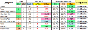
Dogs and Cats are the undisputed royalty of Pet. Because of their huge impact on the industry. I have divided the products designed for them into 32 subcategories. Let’s see how this year’s GPE Top Ten (by booth count) are doing.

While there was shuffling in the rankings, 8 of 10 categories gained share – 5 were up 0.5% or more. Carriers had the biggest gain and made it back to the top 10 after dropping out for 1 year. They replaced shampoos which fell to #12.

  • Treats are still #1 and continue to gain share. 1 in 3 booths offers treats. (Many supplements are in treat form.)
  • OTC Meds/Supplements/Devices continues to gain ground. In 2014 there were only 113 exhibitors.
  • Food has plateaued but Feeding Accessories is falling.
  • Toys – It’s not all about health and nutrition. There is still room for fun. Toys moved up to #2 because C&L’s fell.
  • Apparel – This category gained in count and in share. It is driven by therapeutic devices like vests, not fashion.
  • Collars, Leads & Harnesses – The biggest decrease. They are now below the 2015 level of 247.
  • Beds/Mats gained in rank because of the drop in Food Accessories. They are essentially stable.
  • Grooming Tools – still holding their ground.

Pet Parents’ concern for the overall health and wellness of their “pet children” is still the current biggest trend.

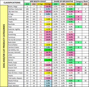
The last chart details the specifics for all 32 of the Dog/Cat product categories that I defined. Of note: All the data inputs for this report and the SuperSearch tool come from  a review of the GPE online exhibitor product listings AND visits to over 1100 websites. They’re not 100% accurate, but pretty close. Which categories are of interest to your business?

GPE 2019 has it all and more, including enhanced educational offerings and the New Product Showcase. However, to reap the benefits, you need a plan. Exhibitors must showcase the “right” items. Attendees need to strategically analyze their data, determine what they need to improve their business and develop a plan to find the products to fulfill their needs. Then…execute the plan. If they do nothing else at GPE, attendees have 1 minute and 19 seconds to spend with each exhibitor. The GPE 2019 SuperSearch will be released next week. It can help. Try it out and…Good luck in Orlando!


Comparing the Spending Demographics of the Industry Segments – SIDE BY SIDE

The first six chapters of this Pet Spending Demographics report have been very detailed, data driven and intense. We looked at the industry as a whole and each of the individual Industry segments separately. In 2017 we saw movement toward more balanced spending in terms of Income and Higher Education and a definite spending migration to lower populated areas in both Rural and Suburban settings. There was another change in consumer behavior that we should note.  In 2015 and again in 2016, we saw how shifts in spending behavior in one major category, Pet Food, can negatively (2015) or positively (2016) impact the spending in others. Consumers, in effect, traded $. In 2017, this was not a major factor. Price deflation in Food and Supplies in conjunction with extraordinarily low inflation in the Services segments, made 2017 a year of “Consumer Value” in the Pet Industry. Remember, Value is the #1 driver in Consumer spending behavior. Consumers recognized the opportunity and took advantage of it by spending $9.84B (14.6%) more on their Pet Children. It was a year for the record books.

In the individual sections of the report we have often referenced the similarities and differences in spending between Total Pet and the individual industry segments. Total Pet Spending is a sum of the parts and not all parts are equal. In this final chapter we are going to put the segments side by side to make the parallels and differences more readily apparent. We will address:

  • “The big spenders” – those groups which account for the bulk of pet spending
  • The best and worst performing segments in each of eleven demographic categories
  • The segments with the biggest changes in spending $ – both positive and negative
  • And of course, the “Ultimate Spending CUs”

The emphasis is on “visual” side by side comparisons to allow you to quickly compare the industry segments. We’ll try to minimalize our comments. You can always reference one of the specific chapters for more details. We’ll also break the charts up into smaller pieces that are demographically related to make the comparison more focused and easier.

Before we get started, let’s take a look at the current market share of the industry segments. The following 2 charts show the 2017 share of spending for each segment and the evolution over the past 25 years. 1992 was the last year that the Food Segment accounted for 50% of Total Pet Spending. By the way, Total Pet Spending was $16.2B in 1992. We have come a long way – +377%; annual growth rate of 6.45%. This will help put our comparisons into better perspective.

Food: 40.3%; Up from 39.4%

Supplies: 24.1%; Up from 23.5%

Veterinary: 26.8%; Down from 26.9%

Services: 8.8%; Down from 10.2%

The Food segment reached the 40% level again. In 2015 it was 43.5%, the highest level since 1998. Supplies also gained ground while both Services segments lost share. The Veterinary segment didn’t keep pace with the Products increase. The 10.2% share for Services in 2016 was the highest since 2006, but 2017 brought some turmoil and a drop in share.

As we look at the migration, both Services segments have maintained a relatively stable share. The big change was in products. The 90’s brought “Pet Parents”, the rise of Pet Chains and Super Stores and a big expansion in the Mass Market. Retailers filled their shelves with Supplies and Consumers filled their Homes. The recent move to more premium foods has allowed the Food Segment to regain a little ground.

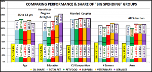
Now let’s get started with a look at the “Big Spenders”. The following 2 charts will compare the market share and performance in all Pet Industry segments by the groups responsible for the bulk of the spending in 10 demographic categories. These are the groups that we identified in our Total Pet analysis to generate at least a 60% market share of spending. As you recall, in the Service segments, we had to alter some groups slightly to better target the spending. However, to have a true side by side comparison we need to use the same groups for all. The market share dips below 60% in 4 situations, to a low of 55%. All these relate to Food, which is yet more evidence that pet parenting is demographically widespread. Even the low point is within 8% of our target and 92% of all measurements meet or exceed the 60% requirement, so the comparison is very valid.

The chart makes it especially easy to compare performance across categories. Remember, performance levels above 120% show a very high level of importance for this category in terms of increased spending. Unfortunately, it also indicates a high spending disparity among the segments within the category. There are 2 charts, each with 5 categories.

  • White, Non-Hispanic – This group has an 84+% market share in every Segment. Minority groups account for 31.5% of CUs but only 10 to 16% of spending in any category. Factors: Lower incomes for Hispanics and African Americans and lower Pet ownership in Asians and African Americans. This group loss share in Veterinary and Supplies, with Supplies replacing Food at the bottom. Food and Services gained share and increased performance.
  • 2+ People in CU – 2 is the magic number in pet ownership. The performance is remarkably even across all segments. Last year share and performance peaked with Food, then moved down through Supplies and Services. Veterinary took over the top spot in Share and Performance. All performances but Services increased because Singles had a bad year. This group is still under 120% because spending tends to go down in larger CU’s, especially 5+.
  • Homeowners – Homeownership is very important in Pet Ownership and subsequently in all Pet Spending. It also increases with age. Supplies had a big increase in share and performance due to a spending lift by older Americans. Food also gained slightly for the same reason. The Services segments were basically unchanged.
  • Over $50K Income INCOME MATTERS MOST IN PET SPENDING! Pet Food still has the “lowest” high performance. Pet Ownership remains very common across lower incomes. The importance of income just increases as spending in industry segments becomes more discretionary – like Supplies and Services, or higher priced – like Veterinary Services. This group had gains in share and performance in all segments but Supplies. However, the gains, especially in Food, were largely fueled by middle and even lower middle-income groups.
  • All Wage & Salary Earners – This group had the lowest performance of any group because Income varies widely and Self-employed and Retirees are significant contributors to Pet Spending. The group made gains in all but the Supplies Segment, which were driven by increases from lower income workers and a spending drop from the Self-employed.

  • 35 to 64 yrs – Includes the 3 highest income segments. In 2016, share and performance were almost even across all segments. A big lift in Food and Supplies spending by the 55>64 yr olds drove up those segments and performance exceeded 120% for the first time. The 45>54 yr olds pushed an increase in Veterinary. However, a big lift in Services spending by the 65+ group combined with a decrease from 45>64 yr olds dropped performance below 120%.
  • Associates Degree or Higher – Higher education often correlates with higher income. We see spending performance very similar to Income but even more pronounced. In 2017 the importance of Education was dialed back a little in the Services segments but remained stable in Supplies. The big change was in Food where the advantage almost vanished. This came as a result of a big spending lift from one segment – HS Grads w/some College.
  • Married Couples – Being married makes a huge difference in spending in all segments. A minimum performance of 126% says it all. In 2017 their high performance became virtually even across all segments as they dialed back on Services but gained over 4 share points in Supplies.
  • Everyone Works – Income is important, but the # of Earners became markedly less important in 2017 with a big drop in share and performance across the board. This was driven by a big year from 1 Earner, 2+ CUs and Retirees.
  • All Suburban – Most Pet $ are spent here but the share and performance of this group has become more volatile. In 2016 they loss ground due to a big across the board spending lift by Central City. In 2017, they held their place in Supplies and Veterinary but lost share to Rural Areas in Food and Services. Food Performance fell below 100%.

Now we’ll drill a little deeper to look at the Best and Worst performing segments in each category. Color Highlighted cells are different from Total Pet; * = New Winner/Loser; ↑↓ = 5+% Performance Change from 2016. We will divide the categories into related groups. First, those related to Income.

  • Income – Highest Income = Highest Performance. Lowest Income = Lowest performance. Income matters and it matters most in the nonfood segments. The performance and disparity are astronomical in the service segments. In most cases the winning performance is dropping, but so is the losing one. Gains are being made in the mid-range.
  • # Earners – More earners = more income. Once again, income is even more important to the nonfood segments. However, 1 Earner, 2+ CUs had a great year. They won and even improved on the winning performance in 2016.
  • Occupation – Mgrs & Professionals moved to the top in income and performance in 2 segments and Total Pet. Blue-Collar was the unexpected winner in Food, which is becoming more balanced. The Blue-Collar group also improved their performance in other segments, even in a losing cause.

Next are demographics of which we have no control – Age and Racial/Ethnicity

  • Racial/Ethnic – As expected, White Non-Hispanics are the top performer in all segments. African Americans have the lowest average income and the lowest percentage of pet ownership of any group.
  • Age – The 55>64 group led in Food & Total. The highest income group, 45>54 won Supplies and took over Veterinary from the 55>64 group. The 65>74 yr olds don’t have a high income but do have an increasing need for Services.

  • Education – Winning and losing has been closely tied to more and less Education, except for 2017, in Pet Food.
  • CU Composition – It was the year for Married Couples Only who turned their focus to their Pet Children. Although you can’t see it here directly, Single parents had a good year and got off the bottom in 2 segments and Total Pet.
  • CU Size– It was absolutely the year of “2”. However, the woes of “1” continued.

  • Housing – Homeowners w/Mortgage and Renters are the perennial winner and loser.
  • Area– The winners are all areas <2500 population. Rural had a huge year in Food. The Services segment also had a surprise winner. Services Spending usually skews more urban. Central City dialed spending back after a great 2016.
  • Region – The West as usual has the most wins. Spending in the South “headed South”.

Here are two summary charts. The first compares the averages.

It is immediately apparent that the difference grows as you move from Food to Supplies to Services. Spending becomes more discretionary. Additionally, while the difference between winners and losers in Total Pet is virtually unchanged from 2016, it grew larger in the Products segments and shrank in the Services segments. This is somewhat unexpected.

  • Food – The high performance by some unexpected winners significantly drove up performance while the losing numbers were stable, so the disparity grew.
  • Supplies – In Supplies the lift was more universal so the relative performance remained stable. A slight lift (<5%) by the winners combined with a slight decline by the losers produced a larger difference.
  • Veterinary – No big changes but the winners and losers moved a little closer together.
  • Services – The turmoil in the market shows. The big users saved money and the small users were attracted to spend. The net result was they moved a little closer. However, the difference is still huge.

This chart shows the number of new winners/losers.

Total Pet had few changes, especially in winners. Total Pet is a sum of the segments. This can mitigate or even cancel out extreme differences in segments. Always look below the surface.

  • Pet Food had a major lift driven by unusual sources. It shows in their number of new winners.
  • Pet Supplies had an almost universal increase. This produces very little change in top or bottom performance.
  • The Veterinary spending increase also came from many of the usual groups.
  • The Services segment was in a negative turmoil which resulted in a lot of changes, especially at the top.

Now, let’s look at the Demographic Segments with the Biggest Changes in $. We’ll truly see some differences between the Industry Segments. Only 9 of 110 segments are repeats. We have color highlighted differences from Total Pet and…

  • Boxed w/green = Winner/Loser same as 2016
  • ↕ = Flipped from 1st/Last in 2016 or vice versa

First, the Income related categories.

  • IncomeWinners: Looks like $100K+ was a key. The $40>69K win reflects the “blue-collar wave” in Food Spending.
    • Losers: <$40K lost 4 of 5. Income matters. The $150>199K loss is may be tied to the big drop by Self-employed.
  • # Earners – Winners – 1 Earner, 2+ CUs. In 2017 the number of Earners became much less important.
    • Losers: From No Earner to 3+ Earners – a mixed bag. Of note, 3 losing CUs were singles.
  • Occupation – The Blue-collar wave also increased spending enough in other segments to win Total Pet. We see the result of the decrease in CUs and spending by Self-employed. Mgrs & Professionals moved to the top in 3 segments.

Now the Age and Racial/Ethnic Categories

  • Racial Ethnic – The biggest, most impactful spending group, White, non-Hispanics made a strong comeback. African Americans, due to a combination of low pet ownership and low income are often the losers. This year, the high income (also low pet ownership) Asians didn’t lose any segment but apparently were consistent low spenders.
  • Age – The 55>64-yr old Boomers came back in a big way. They cut back (or got a better price) on Services but finished 1st or second in every other segment. The 75+ group won Services but lost Veterinary. The <25 group lost 2 segments and total but in 2 of 3 cases, including Total Pet Spending, they actually had a spending increase.

Now, here are more Demographic Categories in which the consumers can make choices.

  • Education – College mattered less in Food but not other segments. Also, the HS Grads w/some College spent $1.17B more in other segments. This parallels the Blue-Collar pattern. Assoc. Degree flipped after a big year in 2016.
  • CU Comp. – In 2017, it was Married Couples only or at least Adults Only. Not a good year for younger families.
  • CU Size – It’s Simple: 2 was the number in 2017. Overall 1 came in last but still spent more in Total Pet than last year.

  • Housing – Homeowners are back on top, although most winners have paid off their mortgage. This reflects the fact that much of the increase was driven by older CUs. Renters were strong in 2016 due to urbanization. Not in 2017.
  • Area – Central City ruled in 2016 but in 2017 we saw a spending movement to areas <2500 pop., Rural or Urban. The larger Suburbs are also back on top in both Supplies and Veterinary. Only Services saw a decrease in any area.
  • Region – The Midwest either won or lost. Also, it was a good year for the Northeast. The West or South are the usual winners, but not in 2017. However, like the Area category, every region spent more in all but Services.

I hope that this Visual Comparison helped you to get a “satellite view” of Pet Industry Spending in 2017. Please refer back to the earlier chapters to get more details.

There is another situation that we should address. 2017 was a spectacular year for the Pet Industry, with big spending increases in every segment but Services. There were so many contributors that in each individual chapter we recognized 6 segments that didn’t win but still performed so well that they deserved Honorable Mention. I reviewed that list again and came up with segments that won Honorable Mention in more than one segment. Here are the “SUPER HMs”.

  • Retirees – Honorable Mention (HM) in 3 segments and Total – Need we say more?
  • $40>69K – They had Honorable Mention in 2 segments and Total, but in Pet Food, they won for biggest increase.
  • Single Parents – With financial challenges, they are usually at or near the bottom. Not in 2017 – 3 HM awards.
  • A/O 2+ Adult Only CUs – 2 HMs, including Total so they performed well in more than just Food.
  • 5+ People CUs – Even with large CUs and multiple children, Consumers still spend Pet $. 2 HMs, including Total Pet.
  • HS Grad w/some College – They won the Food Segment and Total Pet plus had 2 segment HMs – quite a year!

Although there are numerous individual changes, I saw these trends of note:

  1. Value – There was great value in every segment and consumers responded. The 2017 increase was actually greater than Total Pet Spending in 1984. Because of the value, consumers essentially stopped trading $ between segments.
  2. Boomers Bounce Back – The lift was driven by older age groups, especially the 55>64 yr olds.
  3. Premium Penetration – Pet Parents want what’s best for their pet children. Premium Food became more accessible.
  4. Pet Parenting Increase – A likely increase in Pet Parents in the same low/middle income CUs that upgraded in Food.
  5. More balanced spending – in Income, Occupation, # of earners and Education. The groups in the middle and even some lower groups stepped up across numerous segments. Income still matters but the “bar” got a little lower.
  6. De-urbanization – 2016 was the year of Pet spending Urbanization. In 2017 the situation switched around. The best performance and biggest lifts came from low population areas- <2500. More space. More room for Pets and More $pending!

And Finally…..


2017 Pet Services Spending was $6.77B- Where did it come from…?

Now we will look at the last and smallest segment – Pet Services, the only Segment with a spending decrease in 2017. Spending totaled  $6.77B which was down, -$0.07B (-1.0%). The drop was slight but a big change for a segment that has grown consistently since 2011. Services Spending is the most discretionary of any segment so higher income is definitely the dominant factor in consumer spending.

We have categorized 2017 as a year of Value. This was true for Services too. The number of outlets offering services increased radically. This competitive market produced a lot of deals as retailers vied for the Consumers’ $. While the CPI didn’t deflate in 2017, Services had the lowest inflation rate since 2010.  Consumers in all income ranges seek value. They bought a little more often but paid a little less. As expected, this caused some turmoil. Let’s look a little deeper.

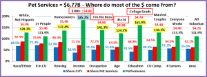
Let’s start by identifying the groups most responsible for the bulk of Services spending in 2017 and the $0.07B decrease. The first chart details the biggest Pet Services spenders for each of 10 demographic categories. It shows their share of CU’s, share of Services spending and their spending performance (Share of spending/share of CU’s). The differences from the products segments are immediately apparent. In order to better target the bulk of the spending we had to alter the groups in four categories – income, education, age and occupation. The performance level should also be noted as 7 of 10 groups have a performance level above 120%. This compares to 7 for Veterinary, 6 for Supplies and only 5 for Food. These big spenders are performing well but it also indicates that there is a large disparity between the best and worst performing segments. Income is absolutely the biggest factor in Services Spending. The categories are presented in the order that reflects their share of Total Pet Spending which highlights the differences of the 6 matching groups.

  1. Race/Ethnic – White, not Hispanic (87.9%) up from 86.8%.This big group accounts for the vast majority of spending in every segment, especially Services. Their performance improved from 124.3% to 128.3% and they moved up to #6 in terms of importance in Services Spending. Minorities are 31.5% of CUs but only generate 12.1% of Services $.
  2. Housing – Homeowners (86.4%) up from 85.7%. Homeownership is a major factor in pet ownership and spending in all industry segments. The Homeowners’ share of Pet Services spending is 86.4% which is the highest of any industry segment. However, even with 137.4% performance, homeownership is only in 4th place in terms of importance for increased Pet Services spending. Their slight share gain came only from an increase in homeowning CUs.
  3. # in CU – 2+ people (79.8%) up from 79.0% The share of market for 2+ CU’s is very close for all segments but lowest in Services. Their performance of 111.9% is down from 112.4% and tied for last. Essentially, they were flat for the year. 2/3-person CUs spent more, but 4+ CUs cancelled the gain. The overall share gain came from a drop by singles.
  4. Occupation – “I’m the Boss” (72.2%) up from 69.2% – The “ I’m the Boss” group consists of Mgrs & Professionals, Self-employed and retired CU’s. This “bossy” group has a large and growing market share and a performance rating that increased from 138% to 141.3%. This ranks them 3rd in terms of importance. These increases were driven by a strong year from the Mgrs & Professionals segment.
  5. Income – Over $70K (71.2%) up from 66.7% The gain in share primarily came from a big increase from the $100>149K group along with a big drop from $30>69K. These indicate big changes in usage. The over $150K CUs also spent 6% less but they probably just got a better price. Services doesn’t break the 100% performance barrier until Income exceeds $100K and then it skyrockets up. This group’s performance rating is 185.2%, up from 180.2% and absolutely shows that CU income is the single most important factor in increased Pet Services Spending.
  6. Education – College Grads (68.8%) down from 69.8% Income generally increases with education. Services spending moves up strongly with each increasing level of education. This is why we shifted the group up to College Grads. Performance of 161.9% was down from 171.7% but a college education is still the 2nd most important factor.
  7. # Earners – “Everyone Works” (64.9%) down from (67.4%) In this group, all adults in the CU are employed. Income is important so a relatively high market share is expected. However, their performance fell to 113.3% from 120.1% and they dropped out of the 120% club. The drops were a due to a strong year by 1 Earner, 2+ CUs and retirees.
  8. CU Composition – Married Couples (64.5%) down from 66.0%. Married couples are a big share of $ and have 120+% performance in all segments. Their performance fell to 130.3% from 135.8% but they stayed in 5th place in terms of importance to Services spending. The decreases were primarily due to a big lift from Unmarried 2+ Adult CUs along with drop in spending by the Married, Oldest Child <6 group.
  9. Age – 45>74 (64.0%) down from 69.0%. Their performance also dropped significantly from 133.7% to 124.5% and their ranking fell from 6th to 7th. The decreases were primarily due to the 45>64 age range spending significantly less, but in 2 ways. The entire group spent 13% less $ for every service. However, the 45>54 yr olds increased their frequency by 5% while the 55>64 yr olds decreased theirs by 2%. Much of this drop for the whole age range was due to value shopping. Another factor was increased spending at both ends. The <25 and 75+ groups both spent more.
  10. Area – Suburban (62.2%) up from 58.7% in share, while performance increased from 107.0% to 111.9%. The lift was due to a big spending increase by small Suburban areas, under 2500, along with a decrease by Central Cities. We should also note that Rural spending was up 28%, mirroring their performance in other segments.

We changed 4 of the spending groups for Services to better target the biggest spenders. Higher income is even more important to Services spending than it is to Veterinary, where we changed 3 groups. Both Services and Veterinary have 7 groups with performance over 120%. However, the performance levels in Services spending in categories related to income are markedly higher. This reinforces an even  bigger spending disparity between the segments in Services.

Now, we’ll look at 2017’s best and worst performing Pet Services spending segments in each category.

Most of the best and worst performers are not a surprise. However, there are 8 that are different from 2016, the most of any segment. 5 of them are in the best category. The only surprise is the 65>74 group. All the other winners have high incomes. As we drill deeper into the data, we will see some similarities with other Industry segments, but each Segment is unique. Changes from 2016 are “boxed”. We should note:

  • Income is even more important to Pet Services. While the 398.8% Performance by the $200K> group is less than last year’s 426%, it is 39% higher than Veterinary and 123% higher than Food.
  • # Earners – 2 Earners – Last year it was 3+ Earners. Both are high income and the only segments in the category with 100+% performance. The winner reflects the outstanding year by 2-person CUs, especially Married Couple Only.
  • Age – 65>74 – This group certainly has an increasing need for Pet Services. However, their income is low. Most are now Baby Boomers, who traditionally spend more on their pets. This group spends 1.1% of their total CU expenditures on their pets. This is second only to the 55>64-yr old group. Only age groups between 45 and 74 have 100+% performance in Services spending.
  • Occupation – Mgrs & Professionals– They took the Income top spot from Self-employed so this switch makes sense.
  • CU Composition Married Couple Only replaced last year’s surprise winner, Married Couples with an oldest child under 6. In 2017 the only 100+% performing CUs with kids are Married, with the oldest child over 6.
  • Area Suburbs <2500 – This area spends a lot of money on their pets, but they truly had a great year in 2017. Amazingly enough, their 148% performance in Pet Services was the lowest score that they had in any segment.
  • Race/Ethnic – It’s not only about income. Asian Americans have the highest income of any Racial/Ethnic group, but they finished last in Services spending performance. This is because they have a low percentage of pet ownership.

It’s time to “Show you the money”. Here are segments with the biggest $ changes in Pet Services Spending.

Pet Services Spending was down $0.07B. This was the first decrease since 2010. However, that drop came as a reaction to the great recession. In 2017, it was a different story. The growing popularity of Pet Services has resulted in a big increase in the number of outlets where they are available. This competitive environment caused turbulence as Retailers vied for the Consumers’ $. The turbulence is very evident in this section. There were no repeat winners or losers from 2016 and 11 of 22 segments actually switched their position from first to last or vice versa. Food came in second, with 9 switches but the other service segment – Veterinary, only had 4. Quite a contrast. Here are the specifics:

  • Education – In 2017, last year’s winner and loser switched positions
    • Winner – BA/BS Degree – Services: $2.47B; Up $0.43B (+21.2%)
      • 2016: Adv. College Degree
    • Loser – Adv. College Degree – Services: $2.18B; Down $0.55B (-20.0%)
      • 2016: BA/BS Degree
    • Comment – College Grads spent the most $ so it is not surprising that they have the biggest changes. What is interesting is that < College Grads led by HS Grads w/some College spent more, while College grads spent less.
  • Occupation – Mgrs & Professionals, the highest income group, had the only significant increase.
    • Winner – Mgrs & Professionals – Services: $2.83B; Up $0.43B (+18.1%)
      • 2016: Retired
    • Loser – Self-employed – Services: $0.65B; Down $0.30B (-31.8%)
      • 2016: Mgrs & Professionals
    • Comment – The white-collar Tech, Sales, Clerical group and Retirees spent a bit more while Blue-Collar workers and Self-employed spent less.
  • Region – Once again the winner and loser flipped from last year.
    • Winner – Midwest – Services: $1.50B; Up $0.41B (+38.4%)
      • 2016: West
    • Loser – West – Services: $1.94B; Down $0.43B (-18.0%)
      • 2016: Midwest
    • Comment – The Northeast also had a small increase.
  • Income – 2017 was a year of mixed messages and tumult.
    • Winner – $100 to $149K – Services: $1.50B; Up $0.37B (+32.3%)
      • 2016: $30 to $49
    • Loser – $30 to $39K – Services: $0.35B; Down $0.16B (-31.4%)
      • 2016: $70 to $99K
    • Comment – Try to follow this: Under $30K was up, +0.5%. $30>50K was down a lot, -33%. The $50>70K group was down a little, -4%. Then the $70>99K group turned it around, +6%. The $100>149K segment took off, up 32%. Time for a final turnaround. The highest income, over $150K group spent 6% less. Value shopping, cutbacks and increased frequency. 2017 had it all.
  • Area Type – Suburbs <2500 led the way but Rural areas also spent more.
    • Winner – Suburbs <2500 – Services: $1.01B; Up $0.28B (+37.9%)
      • 2016: Central City
    • Loser – Central City – Services: $2.20B; Down $0.34B (-13.5%)
      • 2016: Suburbs 2500>
    • Comment – After 2 winning years, Central City flipped to last. Suburbs 2500> has had 2 consecutive down years.
  • Housing – After 2 years, Homeowners w/Mtge, the largest segment, returned to the top spot.
    • Winner – Homeowner w/Mtge – Services: $2.25B; Up $0.27B (+7.4%)
      • 2016: Homeowner w/o Mtge
    • Loser – Homeowner w/o Mtge – Services: $0.98B; Down $0.28B (-12.4%)
      • 2016: Renter
    • Comment – Homeowners w/o Mtge flipped from 1st to last. Central Cities also spent less.
  • Age – In a big surprise, the 75+ group had the biggest $ increase.
    • Winner – 75+ yrs – Services: $0.39B; Up $0.15B (+63.5%)
      • 2016: 55>64yrs
    • Loser – 55>64 yrs – Services: $1.61B; Down $0.28B (-14.8%)
      • 2016: 35>44 yrs
    • Comment: The 55>64-year olds flipped from 1st to last. Their drop, combined with a decrease of -0.17B by the 45>54-year olds created a situation that couldn’t be overcome by the other age groups. In addition to the 75+ year olds, the 65>74, 35>44 and <25 age groups all posted spending increases.
  • # in CU – As we have noted, it was a great year for 2 Person CUs, with a big increase in every segment.
    • Winner – 2 People – Services: $2.94B; Up $0.14B (+5.2%)
      • 2016: 4 Person
    • Loser – 4 People – Services: $0.85B; Down $0.19B (-18.2%)
      • 2016: 1 Person
    • Comment: In 2017, 4 People CUs flipped from 1st to last. 1, 4 and 5+ person CUs spent less on Services. Only 2 or 3 people CUs spent more.
  • CU Composition – An Unusual winner – Unmarried, 2+ Adult CUs. Singles were down so you definitely needed 2.
    • Winner – Unmarried, 2+ Adults – Services: $0.87B; Up $0.14B (+18.6%)
      • 2016: Married Couple Only
    • Loser – Married, Oldest Child <6 – Services: $0.24B; Down $0.19B (-44.4%)
      • 2016: Single
    • Comment – Married Couples Only had the second largest increase. In terms of CUs with Children, all married couples with an oldest child over 6 and even Single Parents spent slightly more on Services.
  • # Earners – 1 Earner, 2+ CUs was the clear winner.
    • Winner – 1 Earner, 2+ CU – Services: $1.33B; Up $0.12B (+10.1%)
      • 2016: 2 Earners
    • Loser – 3 Earners – Services: $0.60B; Down $0.22B (-26.5%)
      • 2016: 1 Earner, Single
    • Comment – 2 was the magic number. All CUs with 2 or more people and 2 or less earners spent more.
  • Race/Ethnic – African Americans had a big percentage increase, but they only have 4.5% of total $.
    • Winner – African American – Services: $0.30B; Up $0.07B (+29.2%)
      • 2016: White, Not Hispanic
    • Loser – Hispanic – Services: $0.42B; Down $0.08B (-16.6%)
      • 2016: African American
    • Comment – White, Non-Hispanics also spent more, but only 0.3%. Asians spent $0.07B less (-44%).

We’ve now seen the winners and losers in terms of increase and decrease in Services Spending $ for 11 Demographic Categories. 2017 was a tumultuous year. The winning increase in each category averaged +$0.25B (+26%) while the biggest decreases averaged -$0.27B (-23%).  That certainly shows a “mixed bag”. We didn’t see any major trends. Income became a little less important, at least in term of the number of Earners. The oldest groups had a strong year. 2 Person CUs, married or unmarried, performed well. We also saw a spending move towards less populated areas, like other segments. The $0.07B decrease was the first since 2010, but even in a decline there are some segments that performed well but didn’t win an award. They deserve….

Honorable Mention

In 2017, Pet Services spending fell for the first time in 7 years. The drop was only 1% and it wasn’t pervasive across the marketplace. 55 of 99 segments did spend less, but 44 spent more so there was some good news. The segments in the graph reflect some minor movement towards more equalized spending in some categories – education, age and even income. Services also mirrored a trend we saw in other industry segments. Spending tended to migrate towards less populated areas, both Rural and Urban.

Summary

The Services segment has usually been “above” changes in other segments. Since 2010 prices have steadily increased but so has Spending. 2017 saw a change. An increase in outlets offering Services created a much more competitive environment. While prices didn’t deflate, inflation slowed significantly, and “deals” abounded as Retailers began a pitched battle for Consumers’ Services $. The net result was turmoil and a 1% decrease in spending.

Pet Services are definitely needed by some groups. However, for most demographics, Services are a convenience and spending is very discretionary in nature. The result of this is that CU income is of paramount importance to increased Services spending. This impacts many demographic categories and we adjusted the big spender groups in 4 categories specifically to accommodate this difference in behavior and to better target where most of the $ are coming from. Just how important is income? 38.4% of CU’s have an income over $70K and account for 71.2% of Services Spending. This is a performance rating of 185.2% – the highest rating earned by any big group in any category in any industry segment.

Performance is an important measurement. Let’s drill deeper into the performance of the big spenders in Pet Services. We identified 5 demographic categories with high performing large groups. (There were 5 for Veterinary and 3 for Food)

Income

Occupation

Higher Education

Homeownership

CU Composition

The biggest producers in these groups are all prime candidates to produce increased Services $ and all are categories in which the consumer can exercise some degree of control. The Racial/Ethnic and Age Categories also have high performance numbers but the consumer has no control over their inclusion in these groups. All 5 of these groups have a performance above 130% and are at their highest level in the Service Segment. This indicates a huge disparity between the best and worst performing segments in the category. This disparity is greater in Services than in any other Industry segment. This does make it easier for industry participants to more effectively target their best customers and identify those demographic segments most in need of improvement. However, some of these may need a lot of help.

The drop in spending caused definite turmoil in this income driven segment. There were 8 changes in the best and worst performing individual segments, but the biggest changes showed up in $. All winners and losers in spending $ were different from 2016, but 7 winners became losers, while 4 losers became winners. There were some surprising winners – 1 Earner- 2+CUs, 2+ Unmarried Adults, African Americans and 75+ year olds. There were no major trends, but we saw:

  1. A spending gain by middle income
  2. # Earners became less important
  3. < College Grads spent more
  4. Spending increase in low population areas

At Last – The “Ultimate” Pet Services Spending Consumer Unit consists of 2 people – a married couple, living alone. They are White, but not of Hispanic origin. At least one of them has an advanced College Degree. They just turned 65 but both of them continue to work, in managerial positions. They’re doing well with an income over $200K. They live in a smaller suburb, near a big city in the Western U.S. and are still paying off the mortgage on their home.

Some Final Services Data: # of CUs – ↑ 0.3%; Spending Frequency – ↑ 0.3%; $ Spent – ↓ 1.6%; Net = Total $ ↓1.0%