2017 Veterinary Spending was $20.67B- Where did it come from…?

Now we will move to the Service Segments – first up is Veterinary Services. We’ll see some big differences from the Product Segments. For years, Veterinary Services prices have had high inflation. This has resulted in CU income becoming the most dominant factor in spending behavior and a reduction in visit frequency. Consumers paid more, just used Veterinary Services less often. The high inflation and prices also resulted in consumers trading Veterinary $ in reaction to big spending changes in other segments, primarily Pet Food.

We have noted that 2017 was different. It was a year of Value. This was also true in the Veterinary segment. While prices did not deflate, inflation hit an all time record low rate. Consumers reacted by spending $2.56B (+14.1%) more on Veterinary Services. The best news was that half of the increase came from an increase in frequency of visits, +7.2%.

Let’s see which groups were most responsible for the bulk of Veterinary spending in 2017 and the $2.56B increase. The first chart details the biggest pet Veterinary spenders for each of 10 demographic categories. It shows their share of CU’s, share of Veterinary spending and their spending performance (Share of spending/share of CU’s). The differences from the product segments are immediately apparent. In order to better target the bulk of the spending we have altered the groups in three categories – income, occupation & age. Another big difference is the performance – 7 of 10 groups perform above 120%. This down from 8 in 2016 but is more than Supplies – 6 and Food – 5. This means that these big spenders are truly performing well but it also signals that there is a far larger disparity between the best and worst performing segments. Income is clearly the biggest factor in Veterinary Spending.  The categories are presented in the order that reflects their share of Total Pet Spending which highlights the differences of the 7 matching categories.

  1. Race/Ethnic – White, not Hispanic (90.0%) down from (92.0%) This group accounts for the vast majority of spending in every segment., but a 90% share is extraordinary. The 131.4% performance rating ranks #3 in terms of importance in Veterinary Spending demographics and reflects the spending disparity. Hispanics, African Americans and Asians account for 31.5% of U.S. CU’s, but they only spend 10% of Vet $. Asians and African Americans have significantly a lower percentage of pet ownership and African Americans have the lowest average CU income.
  2. # in CU – 2+ people (84.1%) up from (79.4%) They had a big gain in share and their performance increased from 112.9% to 118.0%. The performance increase moved them up in importance from last to 8th. The gain in share was driven by increased spending by 2 and 3-person CUs while the performance increase came from a spending drop by Singles. This widened the disparity between segments.
  3. Housing – Homeowners (82.5%) up from (81.7%) Homeownership is a major factor in pet ownership and spending in all industry segments. In terms of importance to increased Veterinary spending, the 131.2% performance rating keeps homeownership in 4th place. Both the share of market and performance increased slightly in 2017. This was driven by a big increase in spending by Homeowners without a Motgage. We should note that Homeownership is not as important to Veterinary Spending as it once was. In 2015 their share was 88.4% with performance of 141.8%.
  4. Education – Associates Degree or Higher (73.8) down from (74.1%) Income generally increases with education. It is also important in understanding the need for regular Veterinary care. Market share was down slightly as was performance, which dropped from 143.2% to 137.4%. However, it is still the 2nd most important factor in Vet spending. The drops were primarily due to a 27.6% increase from HS Grads w/some College – largest in the category.
  5. Age – 45>74 (66.7%) up from (63.3%) Although the younger groups have made Veterinary Spending more of a priority, in 2017 a slight drop by the 35>44 yr olds combined with a lift from the 65>74 group resulted in a change in age range for the big group. This along with a big spending lift from the 45>64 age range generated the increase in share. The performance had an even bigger increase, going from 121.0% to 129.8%. This moved the importance of Age in increased Veterinary Spending up from 7th place to 5th.
  6. Occupation – I’m the Boss (65.9%) up from (64.4%) –“I’m the Boss” includes Mgrs & Professionals, Self-employed and Retirees and has a bigger market share than all wage and salary earners. In 2017, all of the “regular” workers spent more but Mgrs/Professional and Retirees drove the increase. The share gain was minimal due to a spending drop from Self-employed. Even with 129.0% performance. They fell from 5th to 6th in importance.
  7. # Earners – “Everyone Works” (65.9%) down from (69.2%) In this group, all adults in the CU are employed. Even with a loss, the market share of Veterinary $ is the largest share for this group in any segment. Performance fell to 115.0% from 120.1%, which dropped them out of the 120% club. The drop came as a result of a huge increase from 1 Earner, 2+ CUs, with some help from No Earner, 2+ CUs.
  8. Income – Over $70K (65.0%) up from (63.0%) We changed this group from over $50K because Veterinary Spending is so affected by CU income and the $70K level is where the behavior changes. Although the $50>69K had a 27.3% increase, the Over $70K produced 79% of the increase ($2B). The 169.1% performance clearly shows that higher income is THE most important factor in increased Vet spending.
  9. CU Composition – Married Couples (63.8%) up from (61.3%) Married couples have a big market share and 120+% performance in all segments. They gained share due to a big increase from Couples only and a drop from singles. Other categories did better so a performance of 128.9% caused them to fall from 6th to 7th place in importance.
  10. Area – Suburban (62.9%) up from (62.3%) Suburban CU’s are the biggest spenders in every segment. They gained in share– taken from Central Cities, but fell a little in performance to 113.1%. due to a 41% increase from Rural Areas.

We changed 3 of the spending groups for Veterinary to better target the biggest spenders. Higher income is by far the biggest single factor in Veterinary spending. We see the impact of this in many groups as it often contributes to the big spending disparity between segments. The most notable changes were that the # of Earners became less important and spending skewed a little older.

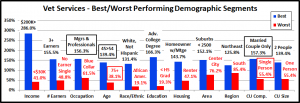
Now, we’ll look at 2017’s best and worst performing Veterinary spending segments in each category.

Almost all of the best and worst performers are those that we would expect. However, there are 5 that are different from 2016. This is more than Supplies (3) but less than Food (7). However, 4 of the 5 changes were in just two categories. This indicates a greater stability in the overall market spending performance. The changes from 2016 are “boxed”. We should note:

  • Income – The 286.0% Performance by the $200K> group is down from last year’s 325.3% but is still very high. The low inflation rate may be closing the disparity gap a little, at least in the middle-income groups.
  • Occupation – Mgrs & Professionals took over as the highest income occupation from the Self-employed. It makes sense that they would become the best performers in Veterinary Spending. Blue-Collar workers, with the lowest income of any working group, remain at the bottom with their performance staying in the 60+% range.
  • Age – The 45>54-year olds, the group with the highest income, are back on top. They just edged out the 54>64-year olds for the win. The worst performing spot switched from the youngest Americans, <25, to the oldest, 75+.
  • CU Composition – It was a strong year for Married Couples Only in all segments, but they had their biggest % increase in Veterinary, +30.6%. Singles had the opposite kind of year and replaced Single Parents on the bottom.
  • # in CU –In 2017, the performance of 2 Person CU’s increased from 130.5% to 139.4%. The gap between them and Singles increased from 61% to 80%. Only 2 and 3 Person CUs perform above 100%.
  • Region – Northeast won again – 3 straight years and passed 120%. The West is the only other region to exceed 100%

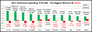
It’s time to “Show you the money”. Here are segments with the biggest $ changes in Veterinary Spending.

2017’s increase of $2.6B built on the $1B lift in 2016. While 16 winners and losers changed, this was much less than in any other segment. 4 segments flipped from 1st to last or vice versa, once again an industry low. With the exception of Self-employed, there were no real surprises. In 4 categories, all segments spent more. Last year there were none. This appears to be a sign of more stable growth. Here are the specifics:

  • # in CU – 2 and 3 Person CUs drove the spending lift.
    • Winner – 2 People – Veterinary: $9.85B; Up $2.04B (+26.1%)
      • 2016: 4 People
    • Loser – Single – Veterinary: $3.29B; Down $0.45B (-11.9%)
      • 2016: 3 People
    • Comment: 4 Person CUs also spent more. Only 5+ CUs and Singles spent less.
  • Race/Ethnic – With a 90% share of total Veterinary $, any % increase by White, non-Hispanics means big $.
    • Winner – White, Not Hispanic – Veterinary: $18.60B; Up $1.93B (+11.6%)
      • 2016: White, Not Hispanic
    • Loser – African American – Veterinary: $0.52B; Up $0.16B (+44.5%)
      • 2016: African Americans
    • Comment – All groups in this category spent more on Veterinary Services. While White, non-Hispanics drove the $, the minority groups drove the percentage increase. Combined they spent 43.1% more.
  • CU Composition – Married Couples Only had a big year in spending, including Veterinary.
    • Winner – Married, Couple Only – Veterinary: $7.34B; Up $1.72B (+30.6%)
      • 2016: Married, Oldest Child 6>17
    • Loser – Single – Veterinary: $3.29B; Down $0.45B (-11.9%)
      • 2016: Single
    • Comment – It was definitely a mixed spending bag in this category. In addition to Singles, Married Couples with an oldest child over 18 or under 6 spent less. Those with an oldest child between 6 and 17 spent more along with single parents. However, you can make a case that 2017 was a year focused on “Adults only”. CU’s with 2+ Adults, married and unmarried spent $2.75B more on Veterinary Services.
  • Occupation – Mgrs. & Professionals continue to lead the way.
    • Winner – Mgrs. & Professionals– Veterinary: $7.98B; Up $1.38B (+20.8%)
      • 2016: Mgrs & Professionals
    • Loser – Self-Employed – Veterinary: $1.47B; Down $0.44B (-31.8%)
      • 2016: Retired
    • Comment – Only Self-Employed spent less and about one third of their decrease came as a result of fewer CUs. Retirees spent $1B more and even Blue-Collar workers had a 10% increase.
  • Area Type – All Areas spent more but the larger Suburbs, over 2500 pop., were the $ leader.
    • Winner – Suburbs >2500 – Veterinary: $9.84B; Up $1.24B (+14.4%)
      • 2016: Central City
    • Loser – Central City – Veterinary: $5.69B; Up $0.27B (+4.9%)
      • 2016: Rural
    • Comment – Rural CUs spent 41% more. In fact, areas under 2500 pop. had a combined increase of $1B.
  • Housing – All Segments had increased spending, but Homeowners w/o a Mtge won the race.
    • Winner – Homeowner w/o Mtge – Veterinary: $6.29B; Up $1.24B (+24.5%)
      • 2016: Renter
    • Loser – Renter – Veterinary: $3.62B; Up $0.31B (+9.3%)
      • 2016: Homeowner w/Mtge
    • Comment – The big lift in spending by Retirees was a major factor in the increase by Homeowners w/o Mtge. Homeowners w/Mtge had a $1B increase after a -$0.9B drop in 2016. Renters flipped to last but still spent more.
  • Education – Those with a BA/BS Degree led the way and are up $1.58B since 2015.
    • Winner – BA/BS Degree – Veterinary: $7.15B; Up $1.22B (+20.6%)
      • 2016: Associates Degree
    • Loser – Associates Degree – Veterinary: $2.21B; Down $0.08B (-3.4%)
      • 2016: Adv. College Degree
    • Comment – Associates Degree flipped from first to last but the drop was minor. Only one other segment had a decrease, < HS Grads. HS Grads w/some College had the biggest percentage increase, up 27.6%.
  • # Earners – 2 Earner CUs narrowly edged out 1 Earner, 2+ CUs for the win.
    • Winner – 2 Earners – Veterinary: $8.79B; Up $1.18B (+24.1%)
      • 2016: 2 Earners
    • Loser – 1 Earner, Single – Veterinary: $2.02B; Down $0.39B (-16.2%)
      • 2016: 1 Earner, 2+ CU
    • Comment – The 1 Earners, 2+ CU group finished second but had a great year, up $1.13B (+42.9%). The No Earner, 2+ CUs were also up an impressive 24.1%. It wasn’t a good year for singles. Single CUs with 1 earner or No earner were the only segments with decreased spending. This data shows why the number of Earners in a CU mattered less in 2017 and why the “Everyone Works” group fell out of the 120% performance club for Veterinary spending.
  • Age – In 2017, the highest income group, 45 to 54 yr. olds had the biggest increase.
    • Winner – 45>54 yrs – Veterinary: $5.23B; Up $1.15B (+28.3%)
      • 2016: 35>44 yrs
    • Loser – 75+ yrs – Veterinary: $0.80B;Down $0.15B (-15.7%)
      • 2016: 75+ yrs
    • Comment: The Veterinary spending increase was widespread as the 35>44 group had the only other minor decrease, -3%. The Under 35 age range had a second consecutive increase. However, overall Veterinary spending “spun” a little older as the 45>74-year olds were up $2.17B, 84.9% of the overall increase.
  • Income – In 2017, $100 to $149K was the winner. This victory usually belongs to an even higher income group.
    • Winner – $100 to $149K – Veterinary: $4.32B; Up $0.93B (+27.4%)
      • 2016: $200K>
    • Loser – $30 to $39K – Veterinary: $1.30B; Down $0.24B (-15.4%)
      • 2016: $40 to $49K
    • Comment – The only other group to spend less was $200K+, a bit of a surprise, to say the least.
  • Region – The Northeast flipped from last to first and all groups had an increase.
    • Winner – Northeast – Veterinary: $4.66B; Up $0.87B (+22.9%)
      • 2016: West
    • Loser – Midwest – Veterinary: $4.20B; Up $0.37B (+9.7%)
      • 2016: Northeast
    • Comment – The South was a close second, up $0.85B.

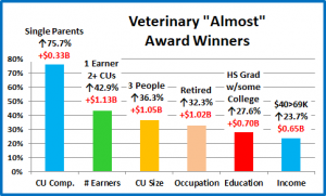
We’ve now seen the winners and losers in terms of increase/decrease in Veterinary Spending $ for 11 Demographic Categories. 2017 had strong growth in Veterinary spending, with fewer surprises than we saw in the products segments. Most of the winners were expected. However, while doing our analysis we saw indications that the growth was becoming somewhat more widespread. First and foremost of these, was the fact that 4 categories had no segments that spent less. However, there were also “hidden” segments that didn’t win but made a significant contribution to a successful 2017. These groups don’t win an award, but they certainly deserve….

HONORABLE MENTION

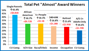
These segments all earned recognition. It is especially great to see the big increase from Single Parents. The other segments all testify to a deeper penetration of the $2.56B lift in Veterinary spending in many categories. In fact, only 18 of 99 segments spent less on Veterinary Services. That means that 82% spent more. We also have suggested that 1 Earner, 2+ CUs, HS Grads w/some College and the $40>69K income group were likely candidates to have increased Pet Ownership. An Increase in Veterinary spending supports that idea.

Summary

In 2015 and 2016 we saw a flip flop in Veterinary Spending – down the first year then up the next, as consumers traded $ with the Pet Food segment. In 2017 we had a unique situation in the industry. It was a year of value in all segments and the consumers took advantage of the situation. In the Veterinary segment we saw record low inflation. Consumers increased both the $ spent and visit frequency. This produced a $2.56B (14.1%) increase.

Veterinary services and spending should be a definite need, like Food, but there are many indications that it is becoming more discretionary and determined by income. It is very obvious when we look at performance. (Share Vet $/Share CUs)

<$30K – 41.0%

$30>50K – 62.5%

$50>70K – 80.9%

$70>99K – 111.7%

$100>149K – 164.5%

$150>199K – 218.3%

$200K> – 286.0%

The “break even” point (100%) occurs at $70K+. CU’s over $70K (38.4%) account for 65% of Veterinary $. In 2017 this group grew in numbers and gained share. Performance fell minimally from 170% to 169% due to a strong performance by the $40>69K group but there were no big changes like we saw in Food.

The performance of other big spending groups is also very important in the Veterinary segment. We identified seven demographic categories with high performing large groups. (There were only 6 for Supplies and 5 for Food) .  Consumers have no control over Race/Ethnicity or Age but in addition to Income, Education, Homeownership, Occupation and Marriage are important factors in Veterinary spending. The high performance in these groups also demonstrates the big spending disparities among segments within these categories.

We saw very little change in these groups. There were 3 changes of note. The “Everyone Works” group lost market share and dropped out of the 120% club due to a strong year from 1 Earner – 2+ CUs and Retirees. The 2+ CU group had increased performance and disparity due to a strong year for 2 & 3 person CU’s and bad performance by singles. Veterinary spending also skewed older in 2017 so the big group changed from 35>64 to 45>74.

2017 was a strong year for the Veterinary segment and relatively balanced. 82% of all segments increased spending and in 4 categories all segments spent more. However, the biggest increases came from expected sources – 2 Person CUs, Married Couple Only, Mgrs & Professionals, White, Non-Hispanics, Homeowners w/Mtge. There were some good performances from groups that showed that gains were also being made in the middle ground. 1 Earner- 2+CUs, HS Grads w/some College, $40>69K and less populated areas (<2500) spent more on Veterinary Services. Our analysis of Food and Supplies suggested increased pet ownership in these groups. The Veterinary data supports that premise.

Finally – The “Ultimate” Veterinary Services Spending Consumer Unit consists of 2 people – a married couple only. They are in the 45 to 54 age range. They are White, but not of Hispanic origin. At least one of them has an advanced College Degree. Both of them work in Managerial positions and their total income exceeds $200K. They live in a small suburb, adjacent to a big city in the Northeastern U.S. and are still paying off the mortgage on their home.



2017 Pet Supplies Spending was $18.58B- Where did it come from…?

Next, we’ll turn our attention to Pets and Supplies. We’ll see some differences from Pet Food as the spending in the Supplies segment is more discretionary in nature. There are other factors too. Many supplies categories have become commoditized so pricing changes (CPI) can strongly impact Consumers’ buying behavior in this segment. Supplies’ Spending can also be affected by the spending behavior in other segments, especially Food. Consumers often trade $ between segments. In 2015 Consumers spent $5.4B more on Pet Food. They helped pay for this by spending $2.1B less on supplies. In 2016, things turned around as Consumers value shopped for premium foods but spent $0.94B more on Supplies. 2017 was different. It was a year of across the board value. Consumers reacted and spent significantly more in 3 industry segments, including Supplies – +$2.74B, a 17.3% increase.

Let’s see which groups were most responsible for the bulk of Pet Supplies spending in 2017 and the $2.74B lift. The first chart details the biggest pet supplies spenders for each of 10 demographic categories. It shows their share of CU’s, share of pet Supplies spending and their spending performance (Share of spending/share of CU’s). Although their share of the Pet Supplies $ may be different from their share of the Total Pet $ or Food, all of the big spending groups are the same. The categories are presented in the order that reflects their share of Total Pet Spending. This highlights the differences in importance. All 10 of the big groups have over a 60% market share. Pet Food had only 7. We’re also back to 6 groups with performance of over 120%. Pet Food had only 5 as Education dropped out. Higher Education correlates with higher income and income is more important in supplies spending. In Pet Supplies spending, Homeowners and Married couples had a big gain in share and the 35>64-yr olds entered the 120+% performance club for the first time. The Everyone Works group had a big drop in share as the # of Earners in a CU became less important. Also, of note, Suburbanites have a significantly larger share of spending on Supplies than they do for Food.

  1. Race/Ethnic – White, not Hispanic (84.2%) down from (85.5%) This large group accounts for the vast majority of spending in every segment. Their performance rating was stable at 122.9%, but this category fell from #3 to #4 in terms of importance in Supplies Spending. The loss in rank was due to a big share gain by Homeowners. Minority groups account for 31.5% of all CUs but spend only 15.8% of Supplies $. This is primarily due to lower income for Hispanics and African Americans and a lower rate of pet ownership in African American and Asian American CUs.
  2. # in CU – 2+ people (82.8%) up from (81.2%) Their overall Supplies performance of 116.1% is relatively high because singles perform so poorly. 2 People CUs dominate share and have the highest performance. However, performance in 2+ CUs only falls below 100% with 5+ people and even then, it is 97.4%. In Supplies spending, it “just takes two.”
  3. Housing – Homeowners (79.4%) up from (74.9%) Homeownership is a major factor in pet ownership and spending in all industry segments. In 2017 it had a major gain in share of Supplies $ and its 126.2% performance, moved it up to 3rd place from 5th in terms of importance for increased Pet Supplies spending. All Homeowners spent more while Renters spent less. However, the bulk of the spending lift – $2.1B (77%) came from Homeowners with a mortgage.
  4. Income Over $50K (71.3%) up from (69.3%) With a performance rating of 138.8%, CU income is the single most important factor in increased Pet Supplies Spending. The increased discretionary nature of much of Supplies spending pushes the performance level slightly higher than that of Pet Food. However, it is still significantly below the Service Segments. Higher Income still generally generates Higher Pet Supply Spending.
  5. Occupation – All Wage & Salary Earners (63.4%) down from (63.8%) – The market share and performance of this group, 103.8%, remained relatively stable. The spending is still skewed towards the higher income, white collar workers. Also, the low performance shows that a lot of spending is done by the Self-employed and Retirees
  6. Age – 35>64 (64.1%) down from (64.2%) Traditionally, Supplies Spending skews more towards the younger groups. The 35>64 group maintained their dominance even though their market share remained flat. Supplies Spending was up in all age groups, but it was primarily driven by the 55>64-yr olds. The number of CUs in the 35>64 group fell by 800,000, all in the 35>54 age range. However, their individual CU Spending on Supplies had a strong increase. The result of this was that their performance level increased to 120.0% and they joined the 120% club in 6th place.     
  7. Education – Associates Degree or Higher (65.6%) up from (63.1%) Unlike Food, Higher Education actually gained market share. Income generally increases with education and we see the impact of this in Supplies. Their performance level rose slightly rose slightly from 122.0 to 122.2%. but they fell from 4th to 5th in importance for generating greater Supplies spending. This drop in rank was also due to the spectacular spending year by Homeowners.
  8. CU Composition – Married Couples (64.2%) up from (59.9%) Married couples are a big share of $ and perform at 120+% in all segments. They gained significantly in Supplies Spending share, as all segments spent more, especially Couples Only. Their performance grew spectacularly from 123.2% to 129.7% and they remain 2nd in importance.
  9. # Earners – “Everyone Works” (62.5%) down from (67.0%) In this group, all adults in the CU are employed. Income is important in Supplies Spending, but like Food, the number of Earners has grown markedly less important. Their performance is 109.1%, down from 116.4%. This is still higher than Food but it reflects a great year by 2+ people CUs with only 1 earner. That group. along with retirees, spend a lot of money on Supplies – 37.5% of Total $.
  10. Area – Suburban (63.0%) up from (62.0%) Suburban CUs are the biggest spenders in every segment. They held their ground in Supplies. A relatively high performance of 113.3% reflects the lower share of Supplies $ in Central Cities.

The biggest spending groups for Pet Supplies are the same as Total Pet and Pet Food. However, the discretionary nature of Supplies causes spending to be more impacted by income than Food. Groups associated with higher income, like Education and # Earners, have higher performance than in Food. Homeownership and Marriage had the most growth in Supplies $. Having 6 groups with 120+% performance also indicates greater disparity between segments.

Now, we’ll look at 2017’s best and worst performing Pet Supplies spending segments in each category.

Almost all of the best and worst performers are those that we would expect. In Pet Supplies spending, there are only 2 that are different from 2016. That is the least change of any segment, 5 fewer than Pet Food and 1 less than for Total Pet. As we move deeper into the data, we will start to see even more differences between the Industry Segments. Changes from 2016 are “boxed”. We should note:

  • Income matters in Supplies spending.
    • The 227.2% Performance by the $200K> group is 27.4% better than their performance in Food.
    • 7 of the 11 winners for best performance had the highest income of any segment in the category. Three came in 2nd – White, not Hispanics, Self-employed and West. 2 Person CU’s were 4th but are more focused on pets.
    • In Categories associated with Income, including # Earners, Occupation and Higher Education, the disparity between the best and worst performers grew in 2017. Any gains that were made occurred in the middle ground.
  • CU Composition – This year’s winner is Married Couples with the oldest child over 18. They finished in a virtual tie with the Oldest Child 6>17. This reflects the strong year that was enjoyed by the entire 35>64-yr age range. Singles are once again last and their performance fell significantly from 65.4% to 60%.
  • # in CU –In 2017 the performance of 2 to 4 people CUs was very close. 5+ underperformed slightly at 97.4% and then we have…Singles. It just takes 2.

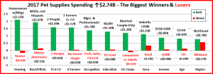
It’s time to “Show you the money”. Here are segments with the biggest $ changes in Pet Supplies Spending.

In 2017 Supplies Spending was up $2.74B, continuing the lift which began in the second half of 2016. There are only 3 repeats – 2 winners and 1 loser. 4 segments switched from last to first or vice versa. 1 Earner, 2+ people CUs was a surprise winner, but the biggest news came from just looking at the overall chart. In 9 of 11 Demographic Categories every segment increased spending on Supplies. Admittedly, some increases were small, but an increase is an increase. This shows just how widespread the big lift in Supplies $  was in the overall market. Here are the specifics:

  • Housing – In 2017, Homeowners spent more. Renters spent less. In 2016 all segments spent more.
    • Winner – Homeowner w/Mtge – Supplies: $10.01B; Up $2.11B (+26.7%)
      • 2016: Homeowner w/o Mtge
    • Loser – Renter – Supplies: $3.83B; Down $0.15B (-3.7%)
      • 2016: Homeowner w/Mtge
    • Comment – Homeowners with a mortgage flipped from last to first. In 2016 they accounted for 49.6% of Supplies $. In 2017 that grew to 53.9% as they produced 78% of the increase.
  • Race/Ethnic – The White, Non-Hispanics share of Supplies spending is 84.2%, but only 75.5% of the lift.
    • Winner – White, Not Hispanic – Supplies: $15.65B; Up $2.07B (+15.2%)
      • 2016: White, Not Hispanic
    • Loser – African Americans – Supplies: $0.71B; Up $0.15B (+26.9%)
      • 2016: Hispanic
    • Comment – African Americans came in last but had a 26.9% increase. Of all the minority groups, Hispanics had the lowest percentage of increase (+20.5%). Supply Spending is very slowly becoming more equal. However, we should note that White, not Hispanics finally broke their spending record of $14.8B. That record was set in…2014.
  • # in CU – It’s simple. All groups registered an increase, but 2 People CUs led the way.
    • Winner – 2 People – Supplies Spending: $7.71B; Up $1.59B (+25.9%)
      • 2016: 3 People
    • Loser– 3 People – Supplies Spending: $3.13B; Up $0.01B (+0.4%)
      • 2016: 5+ People
    • Comment: In addition to 3 People CUs, Single people also underperformed with only a 4.1% increase. The key CU numbers in 2017 were 2, 4 and 5 or more.
  • # Earners – 1 Earner, 2+ CUs rebounded after a decrease in 2016 to post the biggest increase.
    • Winner – 1 Earner, 2+ CU – Supplies: $4.30B; Up $1.57B (+57.5%)
      • 2016: 2 Earners
    • Loser – No Earner, Single – Supplies: $1.21B; Up $0.05B (+4.3%)
      • 2016: 1 Earner, Single
    • Comment – Income is a factor, but the # of Earners was less important in 2017. All CUs, from No Earners to 3 or more Earners, spent more on Pet Supplies. 2 Earner CU’s came in 2nd , up $0.75B (+11.1%) All other segments had increases below 10%. In 2017, 1 Earner- 2+CUs was the biggest driver (57%) behind the $2.74B lift.
  • Occupation – The widespread growth gets even better. In 2016, 1 group spent less. In 2017, all groups spent more.
    • Winner – Mgrs. & Professionals – Supplies: $6.29B; Up $1.39B (+28.4%)
      • 2016: Retired
    • Loser – Tech, Sales, Clerical– Supplies: $2.49B; Up $0.03B (+1.2%)
      • 2016: Self-employed
    • Comment – Managers & Professionals replaced Self-employed as the highest income group and moved back on top of Supplies Spending. They have now registered 3 straight years of increased Supplies Spending. Blue Collar workers also increased Supplies spending – +9.4%. Nothing like Food, but still an increase. No segment $ trading.
  • Education – All groups were up, but BA/BS Degrees led the way.
    • Winner – BA/BS Degree – Supplies: $5.51B; Up $1.30B (+30.9%)
      • 2016: Adv College Degree
    • Loser – High School Grad – Supplies: $2.37B; Up $0.08B (+3.7%)
      • 2016: < HS Grad
    • Comment – The Advanced Degree group was a strong 2nd, up $0.81B (+21.7%). Like the Blue-Collar group, HS Grads w/some College also bought more Supplies, up $0.34B (+11.7%). So, they too had no $ trading for Food.
  • CU Composition – Married Couples Only finished on top, but only 1 segment spent less.
    • Winner – Married, Couple Only – Supplies: $5.58B; Up $1.20B (+27.4%)
      • 2016: Married, oldest child 6>17
    • Loser – Unmarried, 2+ Adults – Supplies: $2.63B; Down $0.11B (-4.0%)
      • 2016: Married, oldest child >18
    • Comment – CUs with children, Married or Single Parents, spent $1.11B more on Supplies. This is 40.5% of the total increase and a radically different pattern from the Food, Service and Veterinary segments.
  • Area Type – Suburbs Over 2500 population flipped from last to first, but all areas spent more.
    • Winner – Suburbs >2500 – Supplies: $8.19B; Up $1.12B (+27.8%)
      • 2016: Central City
    • Loser – Rural – Supplies: $1.53B; Up $0.35B (+29.9%)
      • 2016: Suburbs >2500
    • Comment – Rural areas finished last with a 29.9% increase. Their big lift in Food didn’t hurt Supplies’ spending.
  • Income – Last year 3 income groups spent less on Supplies. This year all groups spent more.
    • Winner – $150 to $199K – Supplies: $2.14B; Up $0.89B (+71.2%)
      • 2016: $200K>
    • Loser – <$30K – Supplies: $2.69B; Up $0.09B (+3.4%)
      • 2016: $150 to $199K
    • Comment – The winner is no surprise, but the lift was fairly balanced. The $40>69K group was up $0.72B (+23%).
  • Age – The 55>64-yr Olds led the way in Supplies just like they did in Food, but all groups spent more.
    • Winner – 55>64 yrs – Supplies Spending: $4.17B; Up $0.82B (+24.3%)
      • 2016: 35>44 yrs
    • Loser – <25 yrs – Supplies Spending: $0.67B; Up $0.14B (+27.4%)
      • 2016: 25>34 yrs
    • Comment: The spending increase was very evenly spread across the age groups with only one group not registering a double-digit percentage increase. The 65>74-year olds were the only group not included in this club as they only spent 8.9% more. By the way, the 75+ group led the way with +31.9%. The <25 group was 2nd, +27%.
  • Region – All groups spent more and the winner and loser are both the same as 2016.
    • Winner – Northeast – Supplies Spending: $3.75B; Up $0.78B (+26.4%)
      • 2016: Northeast
    • Loser – Midwest – Supplies Spending: $3.60B; Up $0.57B (+18.8%)
      • 2016: Midwest
    • Comment – The Northeast is up $1.39B in 2 years and the Midwest flipped from down -$0.30B to up $0.57B

We’ve now seen the winners and losers in terms of increase/decrease in Pet Supplies Spending $ for 11 Demographic Categories. Overall, 2017 was a year of widespread strong growth. The first indication of this was that 9 of 11 categories had no segments that spent less on Supplies. We also saw many of the traditionally strong performers rise to the top again. There was only 1 surprise winner, 1 Earner – 2+ CUs. There were some really big winners – 5 segments generated at least half of the Total $2.74B. However, not every good performer can be “the” winner and some of these “hidden” segments should be recognized for their outstanding performance. They don’t win an award, but they deserve…

HONORABLE MENTION

The numbers from these segments certainly merit their recognition for Honorable Mention. They also provide further evidence of just how widespread and deep the lift in Supplies’ spending was – Single Parents, 4 People CUs, Retirees, even lower middle-income CUs – $40 to $69K. America spent more on Supplies in 2017. There is another fact that irrefutably shows this. Of 99 individual demographic segments, only 6 had a decrease in Supplies spending. That means that 94% spent more. The problem was limiting this list to 6.

Summary

While Pet Food spending has shown a definite pattern, Pet Supplies have been on a roller coaster ride since 2009. Many Supplies categories have become commoditized and react strongly to changes in the CPI. Prices go up and spending goes down…and vice versa. Supplies spending has also been reactive to big spending changes in Food. Consumers spend more to upgrade their Food, so they spend less on Supplies – trading dollars. We saw this in 2015. Then in 2016 the situation reversed. Consumers value shopped for Food, so they spent some of the “saved” money to increase their spending on Supplies.

That brought us to 2017. It turns out that 2017 was to be significantly different. Both Supplies and Food prices deflated. At the same time the inflation rate in both of the Services segments dropped to lows not seen in recent years or in the case of Veterinary, not seen ever before. Value was the “word” and it was available across the market. One of the first things that we noted was the strong evidence that the upgrade to super premium significantly penetrated the consumer market with major lifts from unexpected demographics like Blue-Collar Workers, HS Grads w/some College, 1 Earner- 2+ CUs and lower middle-income groups. This could have negatively impacted Supplies Spending. However, it didn’t. Supplies’ spending increased in these segments, but it also was very strong in the groups that we have come to expect to be the leaders – Homeowners w/Mtge, Managers & Professionals, College Grads and Married Couples. With an increase in 94% of all segments, there was good news everywhere. We returned to a new “normal”, which far exceeded the old.

Among the demographic categories in which a consumer has some control, Higher Income, Marriage, Homeownership and Higher Education are still the biggest factors in increased Supplies spending. Homeownership and Marriage both increased significantly in importance and influence in 2017. While Income remained firmly at the top of the list, there were other changes related to Income which broadened the market for Supplies. The # of Earners became much less of a factor and there also were significant spending gains coming from lower middle-income groups.

Although it is not an absolute necessity like Food, the spending behavior on Pet Supplies can also be a reflection of the percentage of pet ownership across a demographic category. In our analysis of Food spending we suggested that part of the spending increase in unexpected segments may have been derived from an increase in the CU percentage of pet ownership. While not as dramatic as the food increase, all these groups also increased Supplies spending which would add support to the premise of more new Pet Parents.

The other trend that we saw in Food spending was a “movement” for more space – Rural Areas and Suburbs <2500. While not as dramatic as the lift in Food, those 2 areas also had the biggest Supplies spending lift in the category, +29%.

Finally – The “Ultimate” Pet Supplies Spending Consumer Unit consists of 4 people – a married couple, with 2 children, the oldest is over 18. They are in the 45 to 54 age range. They are White, but not of Hispanic origin. At least one of them has an advanced College Degree. Both of them work, running their own business and their oldest child just started a part time, after school job. They’re doing well with an income over $150K. They live in a larger suburb, adjacent to a big city in the Western U.S. and are still paying off the mortgage.


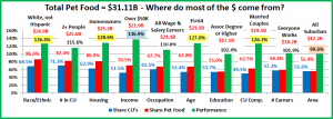
2017 Pet Food Spending was $31.1B – Where did it come from…?

As we continue to drill ever deeper into the demographic Pet spending data from the US BLS, we have now reached the level of individual Industry segments. We will start with Pet Food, the largest and arguably most influential of all. Previously we have noted the trendy nature of Pet Food Spending – 2 years up then spending goes flat or turns downward for a year. In 2015 Pet Food Spending increased by $5.4B as a significant group of consumers upgraded to higher priced Super Premium Foods. In 2016 they value shopped and spending fell $2.99B. In 2017, spending increased by $4.61B (+17.4%). Indications from our Pet Products spending analysis are that this was driven by a deeper market penetration of premium foods along with increased pet ownership. Let’s take a closer look.

First, we’ll see which groups were most responsible for the bulk of Pet Food spending and the $4.61B lift. The first chart details the biggest pet food spenders for each of 10 demographic categories. It shows their share of CU’s, share of pet Food spending and their spending performance (Share of spending/share of CU’s). Although their share of the Pet Food $ may be different from their share of the Total Pet $, all the big spending groups are the same. The categories are presented in the order that reflects their share of Total Pet Spending. This highlights the differences in importance. In Pet Food spending, higher education is far less important. Also, while Income is still the highest performing demographic characteristic, it and the other associated categories, like occupation and # of earners carry less weight in Food spending. Another big difference is that Total Pet had 6 groups performing above 120%. Pet Food had only 5. This indicates that Pet Food spending and Pet ownership is spread more evenly across demographic segments. Pet Products also had only 5 groups over 120%. This reflects the influence of the Pet Food Segment which accounts for 63% of Total Products spending and 40% of all Pet Spending.

  1. Race/Ethnic – White, not Hispanic (86.6%) – up from 85.5%. This large group accounts for the vast majority of spending in every segment. With a 126.4% performance rating, this category ranks #4 in terms of importance in Pet Food Spending demographic characteristics. While Hispanics, African Americans and Asian American account for over 31% of U.S. CU’s, they only spend 13% of Pet Food $. Pet ownership is relatively high in Hispanic households. However, it is significantly lower for African Americans and Asian Americans. This is very evident in Food Spending.
  2. # in CU – 2+ people (82.4%) – up from 81.2%.The share of market for 2+ CU’s is very close for all segments. Their overall Food performance of 115.6% is relatively high because singles perform so poorly. 2 Person households are the “runaway” performance leader but the 2+ group performance doesn’t reach 120% because all 3+ CU’s underperform…slightly. Their lowest performance rating is 91%, which is not bad. The old adage about Pet Spending is still true, “It just takes two.”
  3. Housing – Homeowners (80.9%) – up from 79.9%. Homeownership is a huge factor in pet ownership and more pet spending. At 128.6% performance, homeownership ranks 2nd in terms of importance for increased pet Food spending. Their share of market broke the 80% barrier again in 2017, up from 79.9% in 2016. This came as a result of a big spending increase by Homeowners w/o Mortgages.
  4. Income – Over $50K (70.5%) – up from 67.5%. With a performance rating of 136.9%, CU income is the single most important factor in increased Pet Food Spending. However, the over $50K income group has its smallest market share and lowest performance in the Food Segment. Since Pet Food is a “must buy” for Pet Parents, this is evidence that pet ownership is common across all income levels. Much of the lift in share is coming from middle-income segments which could indicate a probable spreading of the food upgrade and possibly increased pet ownership.
  5. Age – 35>64 (67.8%) – up from 63.1%. The biggest lift came from the 55>64-yr old Boomers. The 35>54-yr old Gen Xers also had a strong contribution. Overall, they gained 4.7% in share and their performance skyrocketed from 116.5% to 127.0%. This put them back in the top 5 at #3. This further identifies the potential owners of the Food upgrade and new Pet Parents.
  6. Occupation – All Wage & Salary Earners (67.7%) – up from 64.8% – The increase in market share was largely driven by a big spending increase by Blue-Collar workers and a drop from Self-Employed. Although performance increased to 110.8% it is still below 120%, which shows that Pet Food spending is widespread across all occupations and at the same time, reflects the substantial Pet Food spending by Retirees. This provides even more specifics regarding the Food upgrade and new Pet Parents.
  7. CU Composition – Married Couples (62.5%) – up from 61.9%. While they gained a little in share, their performance of 126.3% fell from 3rd to 5th place. This reflects the growing importance  of other demographic categories.
  8. # Earners – “Everyone Works” (58.4%) – down from 63.7%. The huge drop in share by this group shows that while income remains important in relation to Pet Food spending, everyone working in a CU matters much less. Their performance fell to 101.9% from 110%. This reflects a great year by 1 Earner – 2+ CU’s and Retirees, who now account for 42% of this category’s Food spending.
  9. Area – Suburban (55.4%) down from 58.1%. Suburban households are still the biggest Food spenders, but they loss share and their performance fell to par, 99.6% due to a stellar year by Rural and an only fair year by Suburbs >2500.
  10. Education – Associates Degree or Higher (55.4%) – down from 58.6%. Pet Food Spending generally increases with education. However, things evened out in 2017. They loss share and performance fell from 113.3% to 102.4%. This provides additional candidates for the drivers behind the expanded food upgrade and new pet ownership trends.

The big spenders for Pet Food are the same as those for Total Pet and Pet Products but generally have a lower market share and performance. Pet Food spending was up $4.6B in 2017. We have strong initial indications that much of the lift came from a deeper penetration in terms of premium food and even increased pet ownership. Income is still important, but Occupation, # of Earners and Higher Education became markedly less so. Let’s drill deeper.

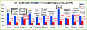
Now, we’ll look at 2017’s best and worst performing Pet Food spending segments in each category.

Even as we drill down to the Industry segment level, many of the best and worst performers are the ones that we would expect. In Pet Food spending, there are  7 that are different from 2017, which is 4 more than for Total Pet. It is the same number as Pet Products but only 3 are “matches”. From this point on we will start to see more and more differences between the Industry Segments. Changes from 2016 are “boxed”. We should note:

  • Income is important in every segment. However, the 178.7% Performance by the $200K> group is down from 188% last year and is by far this group’s lowest performance in any segment. The midrange groups are stepping up.
  • # Earners – 2 or more earners generally means higher income. This year 1 Earner, 2+ CU’s took the top spot. This is another sign that Food spending is becoming more income balanced.
  • Occupation – Blue-Collar workers is a big surprise. Retirees came in last but had a $1B increase. It is also extremely significant that the performance gap from 1st to last has been cut in half from 2016.
  • Education – HS Grads w/some College is yet another indicator of more balanced spending.
  • Age – The 55>64-yr old Boomers, along with Gen Xers are performing best.
  • CU Composition – Married Couples won for the 3rd straight year. Single parents got off the “bottom”.
  • Area – Rural areas had a truly great year and were the only group with 200+% performance.

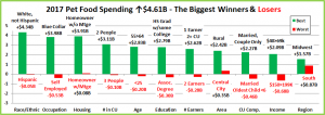
It’s time to “Show you the money”. Here are segments with the biggest $ changes in Pet Food Spending.

There are no repeats – winners or losers, from 2016. 9 of the 22 segments (41%) flipped from 1st to last or vice versa. The surprise performance winners, Blue-Collar, HS Grads w/some College, 1 Earner – 2+CU’s and Rural are all here. Plus, the lower middle-income group, $40>69K also showed us the money. It is at this level where the demographic uniqueness of the different industry segments truly shows up. Here are the specifics:

  • Race/Ethnic – The White, Non-Hispanics share of Food spending is over 85%. A big % increase means Big $.
    • Winner – White, Not Hispanic – Pet Food Spending: $26.94B; Up $4.34B (+19.2%)
      • 2016: Hispanic
    • Loser – Hispanic – Pet Food Spending: $2.12B; Down $0.05B (-2.3%)
      • 2016: White, Not Hispanic
    • Comment – The winner and loser flipped. African Americans spent 28.6% more on Food, but 94% of the increase came from White, non-Hispanics. Both Hispanics and Asian Americans spent less on Pet Food in 2017. However, their combined decrease only totaled -$0.07B, -3%.
  • Occupation – A surprise winner, Blue-Collar! Only Self-Employed and the Tech, Sales & Clerical segment spent less.
    • Winner – Blue-Collar Workers – Pet Food Spending: $8.22B; Up $3.98B (+93.9%)
      • 2016: Tech, Sales, Clerical
    • Loser – Self-Employed – Pet Food Spending: $1.63B; Down $0.53B (-24.3%)
      • 2016: Retired
    • Comment – Here is where the Blue-Collar influence truly shows up. While a 93% increase seems spectacular, it only amounts to a $12 monthly spending increase for existing CU’s. If a number of new Pet Parents were added, the increase would fall to well below $10. The big decrease by the Self-Employed also reflects a 9% drop in CU’s. As these CU’s “went out of business” most migrated to other occupations or retired which affected other categories.
  • Housing – In 2017, all segments spent more on Food.
    • Winner – Homeowners w/o Mtge – Food: $10.19B; Up $03.91B (+62.2%)
      • 2016: Renters
    • Loser – Homeowners w/Mtge – Food: $14.97B; Up $0.08B (+0.6%)
      • 2016: Homeowners w/o Mtge
    • Comment – Homeowners w/o Mtge flipped from last to first while spending for those with mortgages was basically flat. Although the rate of increase slowed for Renters in 2017, it still continued to climb in double digits.
  • # in CU – It’s simple. In 2017 “2” was the magic number, generating 67% of the increase.
    • Winner – 2 People – Pet Food Spending: $14.81B; Up $3.11B (+26.5%)
      • 2016: 4 People
    • Loser – 3 People – Pet Food Spending: $4.20B; Down $0.10B (-2.4%)
      • 2016: 2 People
    • Comment: Both singles and CU’s with 5 or more people also increased Food spending. The only segments with a decrease were 3 or 4 person CU’s. However, they only fell a total of -$0.16B, -2%.
  • Age – The 55>64-yr old group flipped from last to first.
    • Winner – 55>64 yrs – Pet Food Spending: $10.24B; Up $2.83B (+38.2%)
      • 2016: 25>34 yrs
    • Loser – <25 yrs – Pet Food Spending: $0.62B; Down $0.20B (-23.9%)
      • 2016: 55>64 yrs
    • Comment: Although the 55>64-yr old were the biggest drivers, they got over $1.5B in help from the 35>54-yr olds. In fact, all age groups over 35 increased their spending on Pet Food. All groups under 35 spent less, although the only significant drop came from the under 25 segment.
  • Education – HS Grads w/some College, a surprise and an indication of more educational equality in food spending.
    • Winner – HS Grad w/some College – Food Spending: $9.11B; Up $2.79B (+44.0%)
      • 2016: Assoc. Degree
    • Loser – Assoc. Degree – Food Spending: $2.88B; Down $0.30B (-9.4%)
      • 2016: Adv. College Degree
    • Comment – We can’t leave out College Grads – +$1.9B. In fact, all education levels but those with Associates Degrees spent more on Food. Their decrease comes after a 35% lift in 2016 and may just be from value shopping.
  • # Earners – 1 Earner, 2+ CU’s are often under financial pressure. In 2017 they were the big spenders.
    • Winner – 1 Earner, 2+ CU – Pet Food Spending: $8.64B; Up $2.62B (+43.5%)
      • 2016: 1 Earner, Single
    • Loser – 2 Earners – Pet Food Spending: $11.09B; Down $0.28B (-2.4%)
      • 2016: No Earner, 2+ CU
    • Comment – The loser is a bit of a surprise as all segments, but 2 Earner CU’s registered an increase in Pet Food spending. The drop was minor, only -2%, so it is probably part of everyone’s continuing search for a better price.
  • Area Type – All segments had an increase but Rural was spectacular.
    • Winner – Rural – Pet Food Spending: $6.16B; Up $2.42B (+64.8%)
      • 2016: Central City
    • Loser – Central City – Pet Food Spending: $7.71B; Up $0.35B (+4.8%)
      • 2016: Suburbs <2500
    • Comment – Central Cities had an increase but flipped from 1st to last. Biggest growth – all areas under 2500 pop.
  • CU Composition – A strong year for “2”, especially Married Couple Only, who flipped from last to first.
    • Winner – Married Couple Only – Food: $11.11B; Up $2.27B (+25.7%)
      • 2016: Unmarried, 2+ Adults
    • Loser – Married, Oldest Child <6 – Food: $0.60B; Down $0.46B (-43.6%)
      • 2016: Married Couple Only
    • Comment – Married Couples with the oldest child <6 was the only segment in this category to have a decrease. This group is usually younger and often under financial pressure. They dialed back their spending in 3 segments.
  • Income – Pet Food spending moved down the income ladder as the $40>69K segment led the way.
    • Winner – $40 to $69K – Pet Food Spending: $7.50B; Up $2.09B (+38.6%)
      • 2016: $70 to $99K
    • Loser – $150 to $199K – Pet Food Spending: $1.74B; Down $0.68B (-28.1%)
      • 2016: $50 to $69K
    • Comment – The $30>39K group also spent less on Food in 2017. The winner is a surprise, but so is the loser. The $150>199K correlates with the income of the Self-Employed who dropped out, which explains some of the loss.
  • Region – Last year’s winner is this year’s biggest “loser”.
    • Winner – Midwest – Pet Food Spending: $7.13B; Up $1.57B (+28.2%)
      • 2016: South
    • Loser – South – Pet Food Spending: $6.92B; Up $0.87B (+7.9%)
      • 2016: West
    • Comment – All regions were up. The South flipped from 1st to last but are still performing at 99.6%.

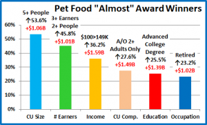
We’ve now seen the “winners” and “losers” in terms of increase/decrease in Pet Food Spending $ for 11 Demographic Categories. Some winning segments in $, like Blue-Collar workers, HS Grads w/some College, 1 Earner- 2+ CUs and the $40 to  $69K income group reinforce our initial observations of increased demographic spending equality as a result of a spread of the premium food upgrade and even the addition of new pet households. We have recognized 11 “winning” segments that drove the $4.61B increase in Pet Food Spending. However, not every good performer can be a winner. Some “hidden” segments should be recognized for outstanding performance. They don’t win an award, but they get…

HONORABLE MENTION

Some of the Honorees, like 5+ CUs, Adults only 2+ CUs and Retirees further support just how wide and deep that the increased spending penetrated the market. Others like 3+ Earners, $100>149K income and CUs with Advanced College degrees show that spending increases also occurred with many of the “usual suspects”.

The Pet Food Spending increase was truly widespread. In fact, only 17 of 99 demographic segments spent less on Pet Food in 2017. That means that 83% spent more.

Summary

After the big spending drop in 2016, 2017 brought a $4.6B increase in Pet Food Spending. This fit right into the pattern of two years up followed by a flat or declining year. However, the 2017 Spending lift was different from the $5.4B increase in 2015. In 2017 we didn’t see consumers trading out $ in other segments to spend on upgraded Food. Both the Supplies and Veterinary segments also had double digit growth.

The increase in 2015 was driven by a movement to upgrade to super premium pet food by a substantial portion of consumers. These consumers were generally more educated, often worked as managers or were self-employed and had higher incomes. In 2016 this group began value shopping for their new food and found great deals online and in some stores, which drove spending down. That brought us to 2017. There was an extremely competitive environment with increased availability and value everywhere on these high-quality foods. This attracted the attention of a different group of consumers. The benefits of upgraded food are apparent to most Pet Parents. Now, they became a viable option for a much larger group. The upgrade “epidemic” spread to HS Grads w/some College, blue-collar workers and even to low middle income groups. It also primarily “infected” those 35 and over, especially the 55 to 65-yr olds.

Although the penetration also increased in some of the traditional groups such as managers/professionals and those with advanced College degrees, it was primarily driven by more balanced spending in a number of demographic categories. Income, homeownership and marriage remain the most important factors in Pet Food Spending. However, the amount of necessary income has been dialed back and your occupation and the number of earners in the CU has become far less important. Higher Education has also become less of a factor. There was another trend of note. Pet Food Spending sought “more space” as Rural areas and Suburbs with a population of under 2500 had a banner year.

Any analysis of Pet Food spending is always very important because of the unique nature of the segment. It is the only Industry Segment that is an absolute spending necessity. If you are a Pet Parent, you must buy food for your pet children and buy it regularly. In fact, every week over 21,000,000 U.S. households buy pet food and/or treats.

Because it is an absolute necessity, the spending behavior on Pet Food is perhaps the most important reflection of the percentage of pet ownership across a demographic category. We have focused on the spread of the premium upgrade as the driver behind the increase. However, there may have been an additional trend at work. The APPA reported an increase in Pet H/Hs from 65% to 68%. The radical increase in Pet Food spending by the segments that we have noted can support both a food upgrade and new pet H/Hs…and help identify the likely new pet parents.

Finally – This year’s “Ultimate” Pet Food Spending Consumer Unit is 2 people – a married couple, alone since their last child moved out and took “his” dog. They are in the 55 to 64 age range. They are White, but not of Hispanic origin. Neither attended College but both received special job training. Only “Dad” still works (too much) at a nearby power plant. With overtime, he will break $100K. Their house is in a rural area in the Midwest and they have a mortgage. They got back in the Pet Parenting “business” after their son left home by adopting a pair of dogs from a local shelter.


2017 Pet Products Spending was $49.69B- Where did it come from…?

We looked at the Total Pet Spending for 2017 and its key demographic sources. Now we’ll start drilling down into the data. Ultimately, we will look at each individual segment but the first stop in our journey of discovery will be Pet Products – Pet Food and Supplies. This classification accounted for $49.69B (64.4%) of the $77.13 in Total Pet spending in 2017. This was up $7.35B (+17.4%) from the $42.34B that was spent in 2016. We have seen that this lift was driven by the market expansion of premium foods along with deflated prices in Supplies. Value was the key driver. Food and Supplies are the industry segments that are most familiar to consumers as they are stocked in over 200,000 U.S. retail outlets, plus the internet. Every week over 21,000,000 U.S. households buy food and/or treats for their pet children.

Pet Food spending turned around in 2017, +$4.61B, while Supplies built on a trend that began in the second half of 2016 to increase spending by $2.74B. We’ll combine the data and see where the bulk of Pet Products spending comes from.

We will follow the same methodology that we used in our Total Pet analysis. First, we will look at Pet Products Spending in terms of the same 10 demographic category groups that were responsible for 60+% of Total Pet spending. A couple fall below the 60% mark for Products, but they are very close. Then we will look for the best and worst performing segments in each category and finally, the segments that generated the biggest dollar gains or losses in 2017.

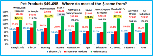
The first chart details the biggest pet product spenders for each demographic category. It shows their share of CU’s, share of pet products spending and their spending performance (spending share/share of CU’s). Although their share of the total products $ may be different from their share of the Total Pet $, the biggest spending groups are the same. The categories are presented in the order that reflects their share of Total Pet Spending. This highlights the differences. In Pet Products spending, higher education and occupation are less important while marriage and age matter more. We should also note that, like Total Pet Spending, Income is the highest performing demographic characteristic. In Pet Products there are 5 groups with a performance rating of over 120%, which is up from 4 last year. However, it is one less than Total Pet. This indicates that Pet Products spending is spread a little bit more evenly across the category segments.

  1. Race/Ethnic – White, not Hispanic (85.7%) This is the largest group and accounts for the vast majority of spending in every segment. With a 125.1% performance rating, this category ranks #4 in terms of importance in Pet Products Spending demographic characteristics. While Hispanics, African Americans and Asian American account for over 30% of U.S. CU’s, they spend less than 15% of Pet Products $. Although pet ownership is relatively high in Hispanic American households, it is significantly lower for African Americans and Asian Americans.
  2. # in CU – 2+ people (82.5%) The spending numbers for Pet Products are very close to those for Total Pet, 82.7%. If you put 2 people together, pets very likely will follow. If you have a pet, you must spend money on food and supplies. Their overall performance of 115.7% is lower because performance decreases as the number of people in the CU increases. However, with performance rating of 99%, even the CU’s with 5 or more people are “earning their share”. The key is “It just takes two.”
  3. Housing – Homeowners (80.3%) Controlling your “own space” has long been the key to pet ownership, larger pet families and more pet spending. At 127.7% performance, homeownership moved up to second place in terms of importance for increased pet products spending. Homeownership increased by 0.5% in 2017. A big factor was the Millennials’ rate improving from 35% to 37%. Good news!
  4. Income – Over $50K (70.9%), up from 68.1%. Pet Parenting is common in all income groups but money does matter in spending behavior for all industry segments. With a performance rating of 137.7%, (up from 136.2%) CU income is also the single most important factor in increased Pet Products Spending. As a general rule,  Higher Income = Higher Pet Products Spending. However, in 2017 much of the increase in share and performance was due to increased spending by the middle income groups, not the $150K+ elite.
  5. Age – 35>64 (66.4%), up from 63.5%. Their performance also increased from 117.2% to 124.3% and they “joined” the 120+% performance club at #5. Although the 35>54 group increased spending by $2.47B, the 55>64-year-old Baby Boomers generated an additional $3.65B, which was half of the total national increase.
  6. Occupation – All Wage & Salary Earners (66.1%), up from 64.4. Pet ownership is widespread across all segments in this group. The low performance, 108.2%, up from 105.7%, reflects this, as well as the contribution by Retirees. However, the lifts in share and performance were driven by a big spending increase from blue-collar workers.
  7. CU Composition – Married Couples (63.1%). Up from 61.1%. Pet parenting and marriage both represent strong commitments. Their performance increased from 125.8% to 127.5 but they fell to 3rd place. Like Homeownership, this group has been growing in importance and they both continue to battle it out for second place behind income.
  8. # Earners – “Everyone Works” (59.9%) down from 65.0%. Their performance is 104.5%, down from 112.8% In this group, all adults in the CU are employed. No group had a bigger drop in share or performance. This is directly a result of the great year by CU’s with 2+ people and only one earner, along with Retirees. Income is a still a priority in Pet Products but not how many people work to get it.
  9. Education – Associates Degree or Higher (59.0%) down from 60.3%. Their performance level also fell from 116.5% to 109.9%. Just 2 years ago this group had a performance level over 120%. In 2017 there was a big spending lift by High School Grads with some College. The current trend and situation shows that Pet Parents don’t need a College degree to recognize and buy, not just what is needed, but what is best for their Pet Children. Responsible Pet ownership is becoming even more widespread across America.
  10. Area – Suburban (58.2%), down from (59.6%). Their performance also fell from 108.6% to 104.7%. Suburban households are still the biggest pet spenders and under normal circumstances they had a pretty good year, +14.7%. However, their share and performance were driven down by a spectacular performance in Rural areas.

Although the biggest spending groups are the same for Pet Products as for Total Pet, there are subtle differences in market share and performance. Money still matters most but how you earn it matters less. Pet Products Spending is definitely becoming more diverse  across occupations, # of earners and education levels.

Now, let’s drill deeper and look at 2017’s best and worst performing Products spending segments in each category.

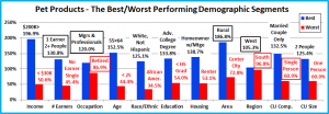
Most of the best and worst performers are the ones that we would expect. However, there are 7 that are different from 2016. That is 2 more than last year and 4 more than Total Pet. Changes from 2016 are “boxed”. We should note:

Only 2 of the Product winners are different from Total Pet – Rural and 1 Earner, 2+ CU’s. The performance of the matching segments is down slightly from Total Pet, with 2 exceptions – the Adv. College Degree and 55>64 segments. The Educated group had a big decrease, from 147.3% to 133.8% and the 55>64-year olds are up from 146.2% to 152.5%.

The average performance of the 2017 Product winners was 142.8%, up from 139.2% – 8 were up. The average for the losers was 60.0%, down from 61.3% – 3 were up. Any reduction in performance disparity is generally being made by the segments in the middle ground, especially in the Occupation and Education categories. We should also note:

  • Occupation – Self-employed lost CU’s and their income and spending fell. Managers & Professionals now have the highest Income and they spent it. Retirees came in last despite a 29.4% increase in spending.
  • Region – The West is back on top while the South flipped from first to last. A 96.8% performance from the loser shows that there is spending parity among the regions.
  • CU Composition – Married Couples Only has back to back wins. The big news is Single Parents got out of the cellar.
  • # Earners – Usually 2 or 3 Earner CU’s are on top. This year 1 Earner, 2+ people CU’s came to the forefront.
  • Area – We said that the Rural areas had a great year. Their performance was second only to $200K+ incomes.

It’s time to “Show you the money”. Here are segments with the biggest $ changes in Pet Products Spending.

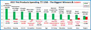
In this section we will see who drove the big increase. There is only one repeat from 2016 – Self-employed spending continues to fall. 7 Segments switched positions – from first to last or vice versa. However, there are also other surprises, like the performance of Blue-Collar, 1 Earner – 2+ CU’s, HS Grads w/some College and Rural.

  • Race/Ethnic – 7% of Pet Products’ Spending comes from White, Non-Hispanics and 87.2% of the increase.
    • Winner – White, Not Hispanic – Products Spending: $42.59B; Up $6.41B (+17.7%)
      • 2016: Hispanic
    • Loser – Asian – Products Spending: $1.13B; Up $0.23B (+25.1%)
      • 2016: White, Not Hispanic
    • Comment – All groups increased their Pet Products spending. Asian Americans finished last, but they had a 25.1% increase. Only Hispanics under performed, with a 6.4% increase.
  • Housing – All segments had an increase in Pet Products spending in 2017.
    • Winner – Homeowner w/o Mtge – Products Spending: $14.93B; Up $4.69B (+45.8%)
      • 2016: Renters
    • Loser – Renter – Products Spending: $9.79B; Up $0.47B (+5.1%)
      • 2016: Homeowners w/o Mtge
    • Comment – 47% of the Rural CU’s have paid off their mortgage. In 55>64 it is 37% and of course Retirees – 58%.
  • # in CU – It was the year of “2” as 2-person CU’s generated 64% of the increase.
    • Winner – 2 People – Products: $22.52B; Up $4.69B (+26.3%)
      • 2016: 4 People
    • Loser – 3 People – Products: $7.33B; Down $0.09B (-1.2%)
      • 2016: 5+ People
    • Comment: The largest CU’s, 5+ came in second with an increase of $1.35B. 3-person CU’s had the only decrease and it was driven down by a reduction in Food spending. Even singles spent more on both Food and Supplies.
  • Occupation – The Blue-Collar workers group is probably the biggest surprise of the report.
    • Winner – Blue-Collar Workers – Products Spending: $11.22B; Up $4.24B (+42.5%)
      • 2016: Tech, Sales Clerical
    • Loser – Self-employed – Products Spending: $3.29B; Down $0.37B (-10.1%)
      • 2016: Self-employed
    • Comment – Blue-Collar workers upgraded their Food, but they also had a big increase in Supplies. Retirees had a great year in both Food and Supplies. The Self-employed decrease came only from Food as Supplies were up.
  • # Earners – More earners generally mean a higher income and more Spending but in 2017 all groups were up.
    • Winner – 1 Earner, 2+ CU – Products Spending: $12.94B; Up $4.19B (+47.9%)
      • 2016: No Earner, Single
    • Loser – No Earner, Single – Products Spending: $2.85B; Up $0.12B (+4.4%)
      • 2016: No Earner, 2+ in CU
    • Comment – The 1 Earner, 2+ CU’s produced 57% of the increase with the biggest lifts in both Food and Supplies. The 3 earner CU’s came in second by spending $1.2B more. No earner, singles flipped from first to last, but still eked out an increase in both Food and Supplies.
  • Age – The Boomers are back…with a big lift that flipped them from last to first!
    • Winner – 55>64 yrs – Products Spending: $14.41B; Up $3.65B (+33.9%)
      • 2016: 75+ yrs
    • Loser – <25 yrs – Products Spending: $1.29B; Down $0.05B (-4.0%)
      • 2016: 55>64 yrs
    • Comment: The 35>54 age range was up $2.47B. The Under 25 group was the only segment with a decrease and it was driven down by Food. The 25>34-year olds also bought less Food, but more Supplies. These two instances of reduced Food spending were the only decreases in either segment across all age ranges.
  • CU Composition – Married Couples Only dominated, producing 47%of the increase with only 23% of the CU’s.
    • Winner – Married, Couple Only – Products Spending: $16.69B; Up $3.47B (+26.3%)
      • 2016: Unmarried, 2+ Adults
    • Loser – Married, oldest child <6 – Products Spending: $1.28B; Down $0.30B (-19.0%)
      • 2016: Married Oldest Child >18
    • Comment – Married Couples with an oldest child under 6 spent -$0.53B less on Food but more on Supplies. This was the only decrease in either Food or Supplies spending across the entire demographic category.
  • Education – Higher Education has equated to increased Pet Products spending. In 2017 it became less of a factor.
    • Winner – HS Grad w/some College – Products Spending: $12.35B; Up $3.12B (+33.9%)
      • 2016: Assoc. Degree
    • Loser – Associates Degree – Products Spending: $5.04B; Down $0.21B (-4.0%)
      • 2016: BA/BS Degree
    • Comment – College Grads still produced the biggest share of the increase but this year’s segment winner, HS Grads w/some College had a big increase in Food spending. This suggests that the food upgrade is becoming widespread. Assoc. Degree (the only negative group) had a big year in 2016 but value shopped for Food in 2017.
  • Income – Income matters in Pet Products spending, but the importance of high income was dialed back in 2017.
    • Winner – $40 to $69K – Products Spending: $11.29B; Up $2.80B (+33.0%)
      • 2016: $70 to $99K
    • Loser – $30 to $39K – Products Spending: $3.30B; Down $0.53B (-13.8%)
      • 2016: $100 to $149K
    • Comment – The lower middle-income group stepped up. In fact, only the $30>39K segment spent less in 2017.
  • Area Type – All areas increased spending, but Central City “flipped” from first to last.
    • Winner – Rural – Products Spending: $7.70B; Up $2.78B (+56.4%)
      • 2016: Central City
    • Loser – Central City – Products Spending: $13.05B; Up $0.86B (+7.0%)
      • 2016: Suburbs >2500
    • Comment –Rural won, but all areas under 2500 pop., rural or urban, generated $4.6B (62%) of the increase.
  • Region – The winners and losers are always changing in this category.
    • Winner – Midwest – Products Spending: $10.73B; Up $2.14B (+24.9%)
      • 2016: Northeast
    • Loser – South – Products Spending: $18.45B; Up $1.60B (+9.5%)
      • 2016: West
    • Comment – The South “lost” with a $1.6B increase. The good news was widespread in this category.

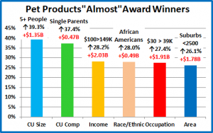
We’ve now seen the “winners” and “losers” in terms of increase/decrease in Pet Products Spending $ for 11 Demographic Categories. 2017 was a great year for Pet Products Spending and the “greatness” was in large part due to the increase being more widespread across demographics. Such winners as Blue-Collar workers, HS Grads with Some College, 1 Earner – 2+ CU’s and Rural areas give evidence to this supposition. Of course, not every good performer can be a winner but some of these “hidden” segments should be recognized for their outstanding performance. In 2017 there were a lot of them. I’ve narrowed it down to 6. They don’t win an award, but they deserve….

HONORABLE MENTION

Pet Products spending was up over $7B in 2017. The strong performance by these groups is immediately apparent and gives further evidence that the increase was demographically widespread. It was a very strong year for 2-person CU’s but also for the biggest CU’s, as 5+ people were up $1.35B (+39.3%). Single Parents are under strong financial pressure but increased spending by 37.4%. The lower middle-income group had the biggest increase but the upper middle income, $100>149K group, wasn’t far behind, up $2B (+28%). African Americans had the biggest percentage increase of any segment in the Racial/Ethnic category. Blue-Collar workers were the stars, but second place belongs to the Retirees, up $1.9B. Increased Pet Products spending in 2017 was about more space. Rural areas won the race, but Suburban areas with a population under 2500 were also up a lot, +26%. In Pet Products spending there was good news from almost everyone. Only 10 of 99 segments had a decrease, so 90% spent more.

Summary

Spending on Pet Products has been on a roller coaster ride since 2015. Many consumers upgraded to Super Premium Food and cut back on Supplies in 2015. In 2016 they value shopped for Food and Spent some of the saved money on Supplies. In 2017 there was increased availability and value in both segments. Consumers recognized the opportunity and spent $7B more.

In 2017, on the surface, big changes weren’t immediately apparent. The demographic groups responsible for most of Pet Products Spending were the same as those in 2016. However, there were changes in their spending share rankings. Marriage and Everyday Workers moved up while the number of Earners and Higher Education became less important. These were the first indications of a movement towards more spending equality in certain demographic categories. In terms of their performance, Income, Homeownership and Marriage still came out on top. However, there were now 5 groups with 120+% performance as Age Group entered the club. Total Pet has the same 5, Plus Higher Education.

When we looked at the performance of individual segments, changes started to become more apparent. Two of the new top performers were notable – 1 Earner – 2+CU’s and Rural Areas. However, when we looked at the biggest gainers in $, that’s when the changes really stood out. Many winners – Blue-Collar, 1 Earner – 2+CU’s, HS Grads w/some College, $40>69K and Rural are real evidence that spending is becoming more demographically balanced across America, especially  in income, occupation and education. There was also a big spending lift in less densely populated areas.

This data raises another issue. Spending money on Food and Supplies is an absolute necessity in Pet Parenting. Obviously, your pet needs food every day so you must buy it regularly and often. Although Supply items are often more discretionary in nature, there are plenty of supplies that are necessities and many more that improve the quality of life for Pets and Pet Parents. Because of this necessity, the spending behavior on Pet Products can be an important reflection of the percentage of pet ownership in a demographic category. The APPA reported that the percentage of Pet Parenting H/H’s rose from 65% to 68% in 2017. We originally attributed the food spending increase to upgrades. Perhaps there were 2 trends going on. The Spending data provides supporting evidence for both an upgrade and new pet ownership. It also helps to identify the participants, or should I say, new Pet Parents. The Food Segment analysis should be interesting.

Finally…The “Ultimate” Pet Products Spending CU is a married couple, alone. They are in the 55 to 64 age range. They are White, but not of Hispanic origin. At least one of them has an advanced College Degree. However, only 1 works, as a manager and earns over $150K. They still have a mortgage on their house in a rural enclave in the West.


2017 Total Pet Spending was $77.13B – Where did it come from…?

Total Pet Spending in the U.S. reached $77.13B in 2017, a $9.84B (14.6%) increase from 2016. These figures and others in this report are calculated from data in the annual Consumer Expenditure Survey conducted by the US BLS. It was a spectacular year for the industry, with the 3 largest segments registering double digit increases while Services spending fell less than 1%. The key factor in this consumer buying surge was value. Super Premium foods became more accessible in both location and price. Supply prices deflated, and both Service segments had record low inflation rates. Although the Service Segment spending fell, there was an increase in purchase frequency. Consumers just paid less. Consumers saw great value and they acted on it. This great success raises some interesting questions and deserves a closer look.

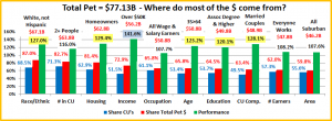
The first question is, “Who is spending most of the $77+ billion dollars?” There are of course multiple answers. We will look at Total Pet Spending in terms of 10 demographic categories. In each category we will identify the group that is responsible for most of the overall spending. Our target number was to find demographic segments in each category that account for 60% or more of the total. To get the finalists, we started with the biggest spending segment then bundled related groups until we reached 60%.

Knowing the specific group within each demographic category that was responsible for generating the bulk of Total Pet $ is the first step in our analysis. Next, we drill even deeper to show the best and worst performing demographic segments and finally, the segments that generated the biggest dollar gains or losses in 2017.

In the chart that follows, the demographic categories appear in ranked order by Total Pet market share from highest to lowest. We also included their share of total CU’s (Financially Independent Consumer Units) and their performance rating. Performance is their share of market vs their share of CU’s. This is an  important number, not just for measuring the impact of a particular demographic group, but also in measuring the importance of the whole demographic category in Spending. These are all large groups with a high market share. A performance score over 120% means that this demographic measure is extremely important in generating increased Pet Spending. I have highlighted the 6 groups with 120+% performance. This is up from 5 in 2016, as the 35>64 yr old age group joined the club.

The groups are the same as in 2016, but some rankings have changed. All Wage Earners, 35>64 yr olds and Married Couples gained in importance while # Earners and Education fell in the ranking.

  1. Race/Ethnic – White, not Hispanic (87.0%) This is the 2nd largest group and accounts for the vast majority of Pet Spending. They increased their performance rating to 127%. This category now ranks #4 in terms of importance in Pet Spending demographic characteristics, up from 5th in 2016. Although we should note that this demographic, along with age, are the 2 areas in which the consumers have no control. Spending disparities are enhanced by differences in other areas like Income, CU Composition and homeownership. There are also apparently cultural differences which impact Pet Spending. Asian Americans rank first in income, education and spending but they rank last in Pet Spending as a percentage of total spending – 0.36% vs a national average of 0.99%.
  2. # in CU – 2+ people (82.7%) It just takes two. Singles have the lowest performance of any group. If you put 2 people together, pets very likely will follow. Their overall performance of 116.0% is lower than expected because performance decreases as the number of people in the CU increases, falling to 85.9% for CU’s with 5+ people.
  3. Housing – Homeowners (81.4%) Controlling your “own space” has long been the key to larger pet families and more pet spending. At 129.4% performance, homeownership still ranks 2nd in terms of importance for increased pet spending. The homeownership rate for Millennials is substantially lower than previous generations when they were the same age. However, it increased from 35% to 37% in 2017. This is definitely good news. Keep it up!
  4. Income – Over $50K (72.9%) Although Pet Parenting is common in all income groups, money does matter. With a performance rating of 141.6%, CU income is the single most important factor in increased Pet Spending. Their performance increased from 140.1% in 2016. However, the increase was driven by the whole range of middle income groups from $50K to $150, not just the elite $150+K.
  5. Occupation – All Wage & Salary Earners (65.8%) – Pet ownership is widespread across all segments in this group. In the past spending has been strongly  skewed towards white collar workers. In 2017, the blue-collar workers stepped up. In share, the group moved up to 5th from 8th Their performance increased to 107.7% but is still low. It remains below 110% because there is still spending disparity within the group and retirees also had a great year!
  6. Age – 35>64 (65.8%) This group moved up in share of spending from 7th to 6th. Although the younger groups have increased their spending in recent years, this group of Boomers and Gen Xers was dominant in 2017. Their performance increased substantially from 118.6% to 123.2% and they joined the elite 120+% group – ranked 5th.
  7. Education – Associates Degree or Higher (64.5%) Income generally increases with education level and so does Pet spending. Education can also be a key factor in recognizing the value in product improvements, like super premium foods. In 2017 this higher educated group fell from 3rd to 7th in share of pet spending. This drop in ranking was due to another segment making a major move. In 2017, High School Grads with some College substantially increased their Veterinary spending but more importantly, they bought into Super Premium Foods in a big “blue wave”. I use this metaphor because there was a corresponding food spending lift by blue-collar workers. Higher Education is still an important factor in spending but the group performance dropped from 127.5% to 120.1% – from 3rd to 6th place.
  8. CU Composition – Married Couples (63.4%) With or without children, two people, committed to each other, is an ideal situation for Pet Parenting. In 2017, primarily due to married couples only CU’s, this group moved up from 8th to 7th in share of spending. They also increased their performance to 128.1%, which still ranks third in importance.
  9. # Earners – “Everyone Works” (62.0%) This is a composite of CU’s, regardless of size, where all adults are employed. This group’s ranking in share of overall pet spending fell from 5th to 9th. Their performance fell from 115.2% to 108.2%. Retirees and CU’s with 2+ people and only one earner have a significant share of Pet spending and both these groups had a great year, which caused this group to lose ground in all areas – despite a $3B spending increase.
  10. Area – Suburban (59.8%) Homeownership is high and they have the “space” for pets. Their share of spending fell slightly from 60.2%. Their performance also fell from 109.7 to 107.6%. The relatively low performance shows how widely spread pet parenting is in all areas. The drop in share and performance was due to a spectacular year by CU’s in Rural areas, in every industry segment, but especially Food.

Total Pet Spending is a sum of the spending in all four industry segments. The “big demographic spenders” listed above are determined by the total pet numbers. Although the share of spending and performance of these groups may vary between segments, every one of them generates a minimum of 55.1% of the spending in every segment. As we analyze individual segments, some of the groups will change to better reflect where most of the business is coming from.

The group performance is a very important measure. Any group that exceeds 120% indicates an increased concentration of the business which makes it easier for marketing to target the big spenders. Although Income over $50K is the clear winner, Homeowners and Married couples are also strong performers. The exceptionally high performance in all six 120+% groups also indicates the presence of segments within these categories that are seriously underperforming. These can be identified and targeted for improvement.

Now, let’s drill deeper and look at 2017’s best and worst performing segments in each demographic category.

Most of the best and worst performers are just who we would expect and there are only 3 that are different from 2016. Changes from 2016 are “boxed”. We should note:

  • Income is very important, which is shown by the 238.5% performance. What is not seen is the radically improved performance from the groups from $40k to $150K as Pet Spending increased across a wide range of incomes.
  • Occupation – Managers and Professionals returned to the top spot for the first time since 2014. The Self-employed loss 9% in CU’s and their income and pet spending plummeted. Blue-collar workers are still at the bottom, but their performance increased from 71% to 88% so the difference between the top and bottom narrowed.
  • CU Composition – Married couple only is the winner for a second consecutive year and their performance is getting stronger. However, the big news is that Single Parents moved up and out of the “loser” spot.
  • # in CU – It just takes 2 and 2 is by far the best performing CU number, regardless if they are married or unmarried.
  • Region – The West is perennially on top. The loser changes almost every year but 92% performance is not too bad.

There was very little change in the “players”, so most expected segments are doing well. In the next section we’ll look at the segments who literally made the biggest difference in the success of 2017.

We’ll “Show you the money”! This chart details the biggest $ changes in spending from 2016.

In this section we will truly see the difference between 2017 and 2016. There are 22 Winners and Losers. None are repeats. In 8 cases the segments actually switched from the biggest increase to the biggest decrease or vice versa.

  • Race/Ethnic – The vast majority of Spending comes from the White, Not Hispanic group…and 85% of the increase.
    • Winner – White, Not Hispan – Spending: $67.14B; Up $8.36B (+14.2%)
      • 2016: Hispanic
    • Loser – Asian – Pet Spending: $1.62B; Up $0.37B (+29.4%)
      • 2016: White, Not Hispanic
    • Comment – All groups spent more. Asian Americans increased their Pet Spending by 29.4% and still came in last!
  • # in CU – 2 People is a logical winner. They have more time and money to focus on their pets.
    • Winner – 2 People – Pet Spending: $35.32B; Up $6.87B (+24.2%)
      • 2016: 4 People
    • Loser – 1 Person – Pet Spending: $13.35B; Up $0.23B (+1/8%)
      • 2016: 3 People
    • Comment: All segments spent more on their pets , but 2 People CU’s generated 70% of the increase. Last year’s winner, 4 People CU’s, came within $0.01B of flipping from first to last. However, Singles “won”.
  • Housing – The biggest segment, Homeowners w/Mtge hasn’t won since 2015.
    • Winner – Homeowner no Mtge – Spent: $23.18B; Up $5.64B (+32.2%) 
      • 2016: Renter
    • Loser – Renter – Pet Spending: $14.32B; Up $0.73B (+5.3%)
      • 2016: Homeowner w/Mtge
    • Comment – Renters flipped. Homeowners w/o Mtge had a lift in all segments. Retirees were a factor.
  • Earners – More earners generally mean a higher income and more Spending, but not this year.
    • Winner – 1 Earner, 2+ CU – Pet Spending: $18.04B; Up $5.44B (+43.2%)
      • 2016: 2 Earners
    • Loser – No Earner, Single – Pet Spending: $4.60B; Up $0.04B (+0.9%)
      • 2016: 1 Earner, 2+ CU
    • Comment – After 2 years of the same Winner and Loser, the 1 Earner, 2+ CU group finally turned it around, in a big way. Even the low-income Single, No Earner group eked out an increase.
  • CU Composition – Up or down, the big changes usually come from some sub-segment of married couples.
    • Winner – Married, Couple Only – $26.30; Up $5.30B (+25.2%)
      • 2016: 2+ Unmarried Adults
    • Loser – Married, oldest child <6 – $2.06B; Down -$0.54B (-20.8%)
      • 2016: Married Oldest Child >18
    • Comment – 2017 was the year of “2” and Married Couples with no human children, regardless of age, are showing a tremendous commitment to their pet “children”.
  • Occupation – Pet Parents are widespread across occupations, but white-collar workers usually drive spending.
    • Winner – Blue-Collar Workers – Spending: $14.6B; Up $4.36B (+42.5%)
      • 2016: Mgrs & Professionals
    • Loser – Self-Employed – Pet Spending: $5.41B; Down -$1.12B (-17.1%)
      • 2016: Retired
    • Comment – In 2017 the Blue-Collar workers were the big movers, largely due to a huge increase in Pet Food spending as they upgraded to super premium.
  • Age – The 55>64 yr olds definitely turned it around.
    • Winner – 55>64 yrs – Pet Spending: $21.44B; Up $4.07B (+23.5%)
      • 2016: 35>44 yrs
    • Loser – <25 yrs – Pet Spending: $1.98B; Up $0.12B (+6.6%)
      • 2016: 55>64 yrs
    • Comment: Every age group spent more in 2017, but the 45>64 group accounted for 65% of the increase.
  • Education – The Associates Degree CU’s went from first to last and were the only group to spend less in 2017.
    • Winner – HS Grad, some College – Spent: $16.47B; Up $3.96B (+31.7%)
      • 2016: Assoc. Degree
    • Loser – Assoc. Degree – Pet Spending: $7.81B; Down -$0.39B (-4.8%)
      • 2016: Adv. College Degree
    • Comment – This year’s winner, High School Grads with Some College, demonstrates that Education has become less of a factor in Pet Spending, at least in some segments.
  • Area Type – All groups spent more, but Rural CU’s, the smallest group, led the way, spending more in all segments.
    • Winner – Rural – Pet Spending: $10.04B; Up $3.43B (+51.9%)
      • 2016: Central City
    • Loser – Central City – Pet Spending: $20.93B; Up $0.78B (+3.9%)
      • 2016: Suburbs >2500
    • Comment – The biggest trend was that areas under 2500 pop., rural or urban, generated 61% of the increase.
  • Income – Only the $30>39K group spent less.
    • Winner – $100 to $149K – Pet Spending: $15.02B; Up $3.32B (+28.4%)
      • 2016: $200K>
    • Loser – $30 to $39K – Pet Spending: $4.95B; Down -$0.93B (-13.8%)
      • 2016: $100 to $149K
    • Comment – The $100>149K group flipped from last to first but there were also strong increases in the mid-range income groups. Bundled together, the $40>99K income range increased spending by $5.17B.
  • Region – Regions vary in size and demographics, but all spent more and had at least a $1.9B increase.
    • Winner – Midwest – Pet Spending: $16.43B; Up $2.92B (+21.6%)
      • 2016: South
    • Loser – West – Pet Spending: $18.56B; Up $1.93B (+11.6%)
      • 2016: Midwest
    • Comment – The Midwest flipped positions but the segments in this category are always changing positions.

We’ve now seen the best overall performers and the “winners” and “losers” in terms of increase/decrease in Total Pet Spending $ for 11 Demographic Categories. Not every good performer can be a winner but some of these “hidden” segments should be recognized for their outstanding performance. In such a great year, there were a number of candidates, but I limited my choices to 6. They don’t win an award, but they deserve….

HONORABLE MENTION

The 2017 performance of these groups doesn’t require a detailed explanation. The numbers on the chart demonstrate just how demographically widespread and significant the 2017 pet spending lift truly was.

Single Parents climbed out of the hole of being the perennial worst performer in their group. African Americans finished last in performance but still had a 30.7% increase. 2 Person CU’s “ruled” in 2017, but the biggest group, 5+ People was also up 30.3%. The $200K group was the best performer and the $100>150K group had the biggest increase, but the income range from $40>69K also spent $3.2B (26.8%) more in 2017. The focus was on the great year that was had by both Managers and Professionals and Blue-Collar workers, but Retirees also had a $2.95B increase. Finally, the spotlight was definitely on married couples only, but the 2+ Adults only group also did pretty well with a $2.7B increase. The good news was truly widespread. In fact, only 9 of 99 distinct demographic segments had a decrease. That means that 91% spent more.

Summary

2015 and 2016 brought turmoil to the market. There was a lift in spending in 2015 as many consumers upgraded to Super Premium foods, but they cut back on spending in other segments to help pay for it. In 2016 they began value shopping for food online and in stores. They used some of the money saved on food to spend on other segments, but not enough, as total spending fell slightly. Then came 2017, when the market was rampant with values. The Services segment saw increased purchase frequency, but consumers paid less. Other Segments had double digit increases and the movement to premium foods made a much deeper penetration across the market.

In 2017, on the surface, big changes weren’t immediately apparent. The demographic groups responsible for most of Total Pet Spending were the same as those in 2016. However, there were changes in their spending share rankings. The number of Earners and Higher Education became less important, while Marriage and Everyday Workers increased their influence. These were indications of a movement towards more spending equality in certain demographic categories.

In terms of performance, the most influential demographic big spending groups increased from 5 to 6, with the Top Three being Income, Home Ownership and Marriage. Knowing the demographic segments in these categories allows industry participants to more effectively target their best customers and… those most in need of improvement.

There was also very little change in the best and worst performing individual demographic segments. The most noticeable changes occurred in $. There were some surprising winners and “near winners” – Rural, Blue-Collar, HS Grads w/some College, $40>69K and Single Parents, to name a few. The most noticeable spending trends seem to be a movement towards more egalitarian spending in terms of income, education and occupation, along with significant growth in less densely populated areas. As always, to get to the heart of the matter and to more actionable data you must “drill down”. This will become even more apparent as we turn our analysis to the individual industry segments.

But before we go…The “Ultimate” Total Pet Spending Consumer Unit in 2017 consists of 2 people – a married couple, alone. They are in the 55 to 64 age range. They are White, but not of Hispanic origin. At least one of the them has an advanced College Degree. They both work as managers and are doing well  – over $200K. They’re working to pay off their house located in a lovely, small suburb of  a metropolitan area with a population of about 2,000,000 in the West.