2016 Pet Services Spending was $6.84B- Where did it come from…?

Now we will look at the last and smallest segment – Pet Services. We’ll see some similarities to other segments, especially Veterinary. However we’ll also see some big differences from the Product Segments and even from Veterinary. Each of these industry segments is unique. For one thing, Services spending is definitely more discretionary in nature than the other segments. This has resulted in CU income becoming the most dominant factor in spending behavior. We’ll see the impact of this in many demographic categories. We have seen some big spending swings in the other Industry Segments in the last 2 years. Services Prices have also been inflating at a rate that is below Veterinary, but much higher than the product segments. Thus far, at least on the surface, neither of these factors has affected the consistent annual growth in spending $ that Services has enjoyed since 2011. Let’s look a little deeper.

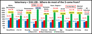
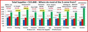
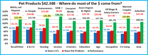
Let’s start by identifying the groups most responsible for the bulk of Services spending in 2016 and the $0.58B increase. The first chart details the biggest Pet Services spenders for each of 10 demographic categories. It shows their share of CU’s, share of pet products spending and their spending performance (Share of spending/share of CU’s). The differences from the other segments are immediately apparent. In order to better target the bulk of the spending we had to alter the groups in four categories – income, education, age and occupation. The performance level should also be noted as 7 of 10 groups have a performance level above 120%. This compares to 8 for Veterinary, 5 for Supplies and only 4 for Food. These big spenders are performing well but it also indicates that there is a large disparity between the best and worst performing segments. Income is absolutely the biggest factor in Services Spending. The categories are presented in the order that reflects their share of Total Pet Spending which highlights the differences of the 6 matching categories.

  1. Race/Ethnic – White, not Hispanic (86.8%) This large group accounts for the vast majority of spending in every segment. With a 124.3% performance rating, this category ranks #7 in terms of importance in Services Spending demographic characteristics. While Hispanics, African Americans and Asian American account for over 30% of U.S. CU’s, they only spend 13.2% of Services $. This is similar to their share of Food and Supplies – about 1% lower, but is 5% higher than their share of Veterinary Spending.
  2. Housing – Homeowners (85.7%) Homeownership is a major factor in pet ownership and spending in all industry segments. The Homeowners’ share of Pet Services spending is 85.7% which is the highest of any industry segment. However, even with 137.3% performance, homeownership is only in 4th place in terms of importance for increased Pet Services spending.
  3. # in CU – 2+ people (79.0%) The share of market for 2+ CU’s is very close for all segments. Their overall Pet Services performance of 112.4% is next to last. Spending is highest in 2>4 people CUs but drops off sharply for 5+ and singles.
  4. Education – College Grads (69.8%) Income generally increases with education. Services spending moves up strongly with each increasing level of education. This is what led us to shift the group up to College Grads. A performance of 171.7% makes a college education the 2nd most important factor in generating greater Services
  5. Occupation – “I’m the Boss” (69.2%) – The “ I’m the Boss” group consists of Mgrs & Professionals, Self-employed and retired CU’s. They have a slightly higher market share and a 30% higher performance than Total Wage & Salary earners. In fact their performance is 138.0% which puts them in 3rd This “bossy” group combines the 2 highest income groups with the strong performing retired group.
  6. Age – 45>74 (69.0%) Services Spending usually correlates with the 35>64 year olds, which includes the 3 highest income groups. However, this changed in 2016. The 35>44 group markedly increased their Veterinary spending and cut back on services. At the same time the 65>74 year olds decided to spend their money on needed services. The result was that the biggest spenders became the 45> 74 group. Their performance is 133.7% and ranks 6th of all the groups. The number is so high because the performances of all groups under 44 and the over 75 group are very low.
  7. # Earners – “Everyone Works” (67.4%) In this group, all adults in the CU are employed. Income is important so the relatively high market share is to be expected. However, their performance is 117.1%, which ranks only 8th in importance. This comes as a result of the strong year by retirees. It also shows that retirees and 1 earner CU’s with 2+ people spend a lot of money on Services – 32.6% of Total $. This similar to the pattern in Supplies.
  8. Income – Over $70K (66.7%) If we went down to the $50K income level, the market share would be 75.5%. However the $50>$69K income group only performs at 67.7%. Performance of CU’s in the $70>99K range goes up to 95.2% but it truly explodes over $100K – 232.2%. To get to the 60% market share goal we chose to group CU’s over $70K in income. This group has a performance rating of 180.2% and absolutely shows that CU income is the single most important factor in increased Pet Services Spending. However, we still have the spending anomalies of the overperforming, retired group and the underperforming, high income Asian Americans.
  9. CU Composition – Married Couples (66.0%) Married couples are a big share of $ and have 120+% performance in all segments. Their performance of 135.8% puts them in 5th place in terms of importance to Services spending.
  10. Area – Suburban (58.7%) Suburban CU’s spend the most $ but spending is balanced across all urban areas, including Central Cities. This is reflected by the low performance of 107.0% Rural areas are the only underperformers.

We changed 4 of the spending groups for Services to better target the biggest spenders. Higher income appears to be even more important to Services spending than it is to Veterinary, where we changed 2 groups. Services has 7 groups with performance over 120%. Veterinary has 8, but the performance levels in Services spending are markedly higher. This indicates an even  bigger spending disparity between the segments in Services than exists in Veterinary.

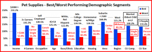
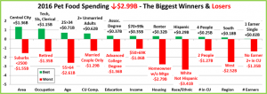
Now, we’ll look at 2016’s best and worst performing Pet Services spending segments in each category.

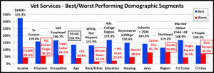
Most of the best and worst performers are not a surprise. In Pet Services spending, there are 7 that are different from 2015, the most of any segment. 4 of them are in the worst category. This is similar to the Veterinary Segment which is also very dependent on higher income for increased spending. As we drill deeper into the data, we will see some similarities with other Industry segments but each Segment is unique. Changes from 2015 are “boxed”. We should note:

  • Income is even more important to Pet Services. The 425.8% Performance by the $200K> group is 30.9% better than their performance in Veterinary and 126.1% higher than what they rang up in Food.
  • # Earners – 3+ Earners – Last year they spent money on a food upgrade. This year they saved money on Food and spent more on everything else. They edged out 2 Earner CUs for the top spot. These highest income groups were the only segments with 100+% Services performance in the category.
  • Age – 55>64 – These Baby Boomers made a big turnaround in 2016. They were up 54% in spending and made a major commitment to Pet Services. It makes sense. They are getting older so their need for services is growing but they still have the third highest CU income in this category so they have the money to pay for it.
  • Education – <HS Grad – In the Services segment, this is the expected loser. In 2016, HS Grads occupied this spot.
  • CU Composition Single Parents finished last. In 2016 it was singles. These groups are invariably at the bottom. Married, Oldest Child <6 had a 54.7% increase and replaced Married Couples Only who had a 146.9% performance.
  • # in CU Singles – In 2016 all 2>4 People CUs improved their performance. The 5+ people and Single segments both had a significant decrease. Singles edged out last year’s loser, 5+ people, for the worst performance.
  • Region – In 2015 the Midwest finished second with 122%. In 2016, they were the only Region with a decrease in Services spending, down $0.56B (-34% ) This left the West as the only region with 100+% performance.

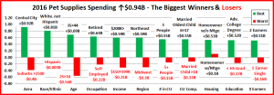
It’s time to “Show you the money”. Here are segments with the biggest $ changes in Pet Services Spending.

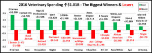
Pet Services was up $0.58B for the 2nd year in a row. Despite this consistency, there was turmoil. There were only 2 repeat losers and 1 repeat winner from 2015. Also, 8 of the winners in 2015 were losers in 2016, while only 3 losers became winners. In 3 categories they just switched positions. This seems somewhat unusual for a segment with steady growth. Also, like Supplies, there was 1 category where all segments spent more. Here are the specifics:

  • Housing – In 2015, spending increased for all segments. In 2016 only Homeowners without a mortgage spent more.
    • Winner – Homeowner w/o Mtge – Services $: $2.25B; Up $0.78B (+53.5%)
      • 2015: Homeowner w/Mtge
    • Loser – Renter – Services $: $0.98B; Down $0.17B (-14.6%)
      • 2015: Renter
    • Comment – We see the impact of increased spending by the older groups and the decrease by the younger ones.
  • Education – Education above HS does matter as the increase was driven by Associates’ and Advanced Degrees.
    • Winner – Adv. College Degree – Services $: $2.73B; Up $0.68B (+33.1%)
      • 2015: BA/BS Degree
    • Loser – BA/BS Degree – Services $: $2.04B; Down $0.25B (-10.9%)
      • 2015: HS Grad only
    • Comment – In 2015 College Grads, led by BA/BS holders fueled the increase. In 2016 the BA/BS group cut back on $ but the Advanced Degree segment more than made up the difference so College Grads are on top again.
  • Age – In 2015, the 25>54 group drove spending up. In 2016 the increase came from 55>74 year olds.
    • Winner – 55>64 yrs – Services Spending: $1.89B; Up $0.66B (+54.0%)
      • 2015: 35>44yrs
    • Loser – 35>44 yrs – Services Spending: $0.9B; Down $0.29B (-24.6%)
      • 2015: 55>64 yrs
    • Comment: We see the impact of other categories and $. The big winners in 2015, the 25>44 group, changed their focus in 2016. The 25>34 yr olds spent more on Food and Veterinary. The 34>45 group turned to Veterinary and Supplies. Both now have more balanced pet spending. The 55>74 group began value shopping for Food in 2016 and spent a lot of the saved money on Services. Only the high income 45>54 group had an increase in both years.
  • Area Type – Central Cities has two consecutive years of increases totaling $0.99B
    • Winner – Central City – Services Spending: $2.54B; Up $0.66B (+34.8%)
      • 2015: Suburbs 2500>
    • Loser – Suburbs 2500> – Services $: $3.28B; Down $0.16B (-4.5%)
      • 2015: Rural
    • Comment – The Suburbs 2500> didn’t have a good year. They spent less in Services and in fact, all pet segments.
  • Region – All regions but the Midwest showed increases in 2016. In 2015 all regions showed growth.
    • Winner – West – Pet Services Spending: $2.36B; Up $0.55B (+30.5%)
      • 2015: Midwest
    • Loser – Midwest – Services Spending: $1.09B; Down $0.56B (-34.0%)
      • 2015: Northeast
    • Comment – The West is up $0.76B since 2014. Only the Midwest has a decrease from 2014, down $0.25B.
  • Occupation – In 2015 the higher income jobs led the way. In 2016 it was the lower income jobs, plus self-employed.
    • Winner – Retired– Services Spending: $1.39B; Up $0.5B (+56.8%)
      • 2015: Mgrs. & Professionals
    • Loser – Mgrs. & Professionals – Services: $2.39B; Down $0.26B (-9.9%)
      • 2015: Retired
    • Comment – The Retired and Service worker groups had a huge turnaround from down $0.35B in 2015 to up $0.76B in 2016. The Mgrs and Tech worker groups went the other direction from up $0.82B to down $0.37B. All 4 groups are up from 2014. The Self-employed group is the only segment with increases in both 2015 and 2016.
  • Race/Ethnic – The White, Non-Hispanics share of Supplies spending is 86.8% so even a 7.5% increase is a winner.
    • Winner – White, Not Hispanic – Services $: $5.93B; Up $0.41B (+7.5%)
      • 2015: White, Not Hispanic
    • Loser – African American – Services $: $0.24B; Up $0.02B (+11.3%)
      • 2015: African American
    • Comment – In 2016 all racial/ethnic groups spent more on Services. This is somewhat of a surprise in a segment which is so driven by income. The Asians had the biggest percentage increase at 29.1%. The African Americans finished last 2 years in a row but at least in 2016 it was for the lowest increase, not the biggest decrease.
  • Income – 2016 was a year of mixed messages as the $30 to $49K group won – largely driven by the retirees.
    • Winner – $30 to $49K – Services Spending: $0.92B; Up $0.40B (+78.6%)
      • 2015: $150K>
    • Loser – $70 to $99K – Services $: $0.91B; Down $0.08B (-8.0%)
      • 2015: $70 to $99K
    • Comment – The 2 year drop from $70>99K reflects the changing spending behavior of the various demographic category segments which fall into this upper middle income group.
  • # in CU – A big turnaround for the winner which reflects the spending of all Married Couples with children.
    • Winner – 4 People – Services Spending: $1.04B; Up $0.34B (+48.2%)
      • 2015: 1 Person
    • Loser – 1 Person – Services Spending: $1.43B; Down $0.21B (-12.8%)
      • 2015: 4 People
    • Comment: In 2016 2>4 people CU’s spent more. All others spent less. In 2015 the increase came from the 1>3 people CU’s as singles “stepped up”. Only the 5+ group spent less for 2 consecutive years. Financial pressures?
  • # Earners – In 2016 every segment but 1 earner, singles spent more.
    • Winner – 2 Earners – Services Spending: $2.86B; Up $0.34B (+13.6%)
      • 2015: 1 Earner, Single
    • Loser – 1 Earner, Single – Services $: $0.93B; Down $0.29B (-23.9%)
      • 2015: 2+ in CU with 1 Earner
  • Comment – In 2015 only CU’s where all adults worked spent more. In 2016, the retired folks and 2+ CU’s with only 1 earner also got on board the increase “Train”. Only the single workers were left at the station with a decrease.
  • CU Composition – Every CU with 2 or more adults, with or without children spent more on Services in 2016.
    • Winner – Married Couple Only – Services: $2.17B; Up $0.17B (+8.4%)
      • 2015: Single
    • Loser – Single – Services $: $1.43B; Down $0.21B (-12.8%)
      • 2015: Unmarried, 2+ Adults
    • Comment – Increased Pet Services spending was very widespread across this demographic category. Only CU’s with single adults or single parents spent less.

We’ve now seen the winners and losers in terms of increase/decrease in Pet Services Spending $ for 11 Demographic Categories. Overall, 2016 was a year with much stronger and more widespread gains than losses. The winning increase in each category averaged +56% while the biggest decreases averaged -16%. We saw strong contributions from the 55 to 74 age group, the Central City and the West. The $0.58B increase matched 2015 and was the 5th consecutive increase, totaling $2.5B (+56.5%). Like the other Pet Segments, not every good performer can be “the” winner and some of these hidden segments should be recognized for their outstanding performance. They don’t win an award but they deserve…

Honorable Mention

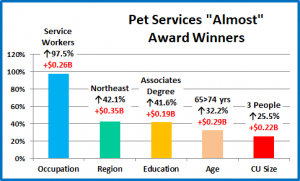
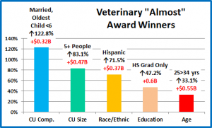
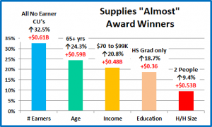
Pet Services spending was up $0.58B in 2016. The increase was in tune with the segment’s performance since 2011. It was relatively demographically widespread as 49 of 82 segments (59.8%) spent more on Services. These “almost” winners reinforce the contributions of the older folks, families and Central Cities. We also see that you don’t have to have a big income or a Master’s Degree to buy Pet Services. These 5 segments aren’t award winners but their combined Services spending increase was significant at $1.31B.

Summary

In 2015 and 2016, significant changes in spending behavior for Pet Food first negatively affected, then positively affected spending in the Supplies and Veterinary segments. Through this turmoil, Services spending seemed unfazed, quietly registering a $0.58B increase in both years. The increase was relatively widespread with 60% of all demographic segments registering an increase. Also, all segments in the Racial/Ethnic category increased spending on Services

Pet Services are definitely needed by some groups. However, for most demographics, Services are a convenience and spending is very discretionary in nature. The result of this is that CU income is of paramount importance to increased Services spending. This impacts many demographic categories and we adjusted the big spender groups in 3 categories specifically to accommodate this difference in behavior and to better target where most of the $ are coming from. Just how important is income? 37% of CU’s have an income over $70K and account for 66.7% of Services Spending. This is a performance rating of 180.7% – the highest rating earned by any group in any category in any industry segment.

Performance is an important measurement. Let’s drill deeper into the performance of the big spenders in Pet Services. We identified 5 demographic categories with high performing large groups. (There were 6 for Veterinary and 3 for Food)

  • Income
  • Occupation
  • Higher Education
  • Homeownership
  • CU Composition

The biggest producers in these groups all generate increased Services $ and all are categories in which the consumer can exercise some degree of control. The Racial/Ethnic and Age Categories also have high performance numbers but the consumer has no control over their inclusion in these groups. All 5 of these groups have a performance above 133%. This is incredibly high and indicates a huge disparity between the best and worst performing segments in the category. This disparity is greater in Services than in any other Industry segment. On the one hand this is good news as it makes it easier for industry participants to more effectively target their best customers. It also allows them to identify those demographic segments most in need of improvement. Unfortunately, these lowest performing groups may need considerable assistance.

There was definite turmoil in this income driven segment. There were 7 changes in the best and worst performing individual segments but the biggest changes showed up in $. 19 of 22 winners and losers in spending $ were different from 2015. In fact 8 2015 winners became losers in 2016, while 3 losers became winners. There were also some surprising winners, like the Retirees, Central City and the $30>49K income group. There were 2 major trends of note:

  1. The “older” movement – The biggest increases came from the 55>74 age groups.
  2. The Urbanization of the U.S. is reflected in Services with strong spending growth by Central City.

Finally – The “Ultimate” Pet Services Spending Consumer Unit consists of 2 people – a married couple, living alone now that their last child finally moved out. They are in the 55 to 64 age range. They are White, but not of Hispanic origin. At least one of them has an advanced College Degree. Both of them work, running their own business. They’re doing well with an income over $200K. They still live in a larger suburb, near a big city in the Western U.S. and are still paying off the mortgage on their home.


2016 Veterinary Spending was $18.12B- Where did it come from…?

Now we will move to the Service Segments – first up is Veterinary Services. We’ll see some big differences from the Product Segments. Veterinary Services prices have had years of high inflation. This has resulted in CU income becoming the most dominant factor in spending behavior. We’ll see the impact of this in many demographic categories. Veterinary Spending is also affected by the spending behavior in other segments. In 2015 Consumers spent $5.4B more on Pet Food. They helped pay for this by spending $0.47B less on Veterinary Services. In 2016, things turned around as Consumers value shopped for premium foods but spent $1.01B more on Veterinary visits. This lift more than made up for the drop in 2015 and got this segment back on the right track. Regular Veterinary care is definitely “needed” but the skyrocketing prices have forced many Pet Parents to delay or even forego procedures, which is an unfortunate result.

Let’s see which groups were most responsible for the bulk of Veterinary spending in 2016 and the $1.01B increase. The first chart details the biggest pet Veterinary spenders for each of 10 demographic categories. It shows their share of CU’s, share of pet products spending and their spending performance (Share of spending/share of CU’s). The differences from the product segments are immediately apparent. In order to better target the bulk of the spending we had to alter the groups in two categories – income and occupation. Another big difference is the performance level. 8 of 10 groups have a performance level above 120%. This compares to 5 for Supplies and only 4 for Food. It means that these big spenders are truly performing well but it also signals that there is a far larger disparity between the best and worst performing segments. Income is absolutely the biggest factor in Veterinary Spending.  The categories are presented in the order that reflects their share of Total Pet Spending which highlights the differences of the 8 matching categories.

  1. Race/Ethnic – White, not Hispanic (92.0%) This group accounts for the vast majority of spending in every segment. However, the 92% share is extraordinary. The 131.9% performance rating ranks #3 in terms of importance in Pet Food Spending demographic characteristics and reflects the spending disparity. Hispanics, African Americans and Asian American account for over 30% of U.S. CU’s, but they only spend 8% of Veterinary $. This result comes from a mixture of two factors – lower income and reduced pet ownership, which especially impacts African Americans.
  2. Housing – Homeowners (81.7%) Homeownership is a major factor in pet ownership and spending in all industry segments. In terms of importance to increased Veterinary spending, the 131.0% performance rating puts homeownership in 4th place. The Homeowners’ share of market fell sharply from 88.4% in 2015. This is directly related to the increased spending by younger generations who are less likely to own a home than older Americans.
  3. # in CU – 2+ people (79.4%) The share of market for 2+ CU’s is very close for all segments. Their overall Veterinary spending performance of 112.9% is the lowest of any category and one of only 2 with a performance below 120%. CU’s with 2 to 4 people still perform best. However, in 2016 CU’s with 4+ people increased their spending, while those with 1 to 3 people spent less. This reflects the increased spending of younger families which has helped to make Veterinary spending a little more balanced across segments in this category.
  4. Education – Associates Degree or Higher (74.1%) Income generally increases with education. It is also important in understanding the need for regular Veterinary care. We see the effect of this in the large market share for this group and a performance of 143.2%, making higher education the 2nd most important factor in Veterinary spending.
  5. # Earners – “Everyone Works” (69.2%) In this group, all adults in the CU are employed. The 69.2% market share of Veterinary $ is the largest share for this group in any segment. This and a performance of 120.1% reinforce the importance of income to Veterinary spending. However, this performance rating is relatively low for this category, 8th place. CU’s with 2+ people and only one earner and retired people still spend a lot of Veterinary $.
  6. Age – 35>64 (65.5%) Veterinary Spending has skewed more towards older groups. In 2015 over 75% of the spending came from those over 45. In 2016 the Gen Xers and Millennials stepped up their commitment to Veterinary services. The 35>44 year olds passed the 65>74 group in spending so the dominant group became 35>64 years old. Their 121.0% performance level is above the 120% benchmark but it is down 6% from 128.5% in 2015 and is only in 7th place. Veterinary spending is becoming a little more balanced across age groups.
  7. Occupation – I’m the Boss (64.4%) –“I’m the Boss” is a group which includes Managers & Professionals, Self-employed and retired people. Income and “control” are clearly key factors in Veterinary spending and this “bossy” group has a bigger market share and better performance than all wage and salary earners.The 128.3% performance of this group ranks them 5th in importance for spending and shows the disparity between “bosses” and workers.
  8. Income – Over $70K (63.0%) We changed this group from over $50K because Veterinary Spending is so affected by CU income and the $70K level is where the behavior changes. The $50>69K group has a performance rating of 73%. The $70>99K group performs at 111% and performance continues to grow with higher incomes. The 170.1% performance clearly shows that higher income is THE most important factor in increased Veterinary spending.
  9. Area – Suburban (62.3%) Suburban CU’s are the biggest spenders in every industry segment. Their performance of 113.6% is relatively low for the Veterinary segment and reflects the strong spending growth in Central Cities.
  10. CU Composition – Married Couples (61.3%) Married couples are an important segment for the Pet Industry – with a big market share and 120+% performance in all segments. Their performance of 126.2% puts them in 6th place in terms of importance to Veterinary spending.

We changed 2 of the spending groups for Veterinary to better target the biggest spenders. Higher income is by far the biggest single factor in Veterinary spending. We see the impact of this in many groups as it often contributes to the big spending disparity between segments. Spending Disparity may be the norm in this segment. Consider the fact that the Veterinary segment has 8 big spending groups with a spending performance of 120+% . Supplies had 5 and Food only 4.

Now, we’ll look at 2016’s best and worst performing Veterinary spending segments in each category.

As usual, most of the best and worst performers are those that we would expect. However, there are 6 that are different from 2015. That is the same as Pet Food. However, 5 of the 6 changes were in the worst performance. The impact of higher income is once again evident as Veterinary spending performance is more volatile among the lower income segments in each category. Changes from 2015 are “boxed”. We should note:

  • Income – The 325.3% Performance by the $200K> group is 32% higher than last year’s 245.5%. As Veterinary prices continue their strong inflation, income is becoming even more important in spending behavior. Last year’s loser was the $30>39K group. They had a major cut back in Veterinary spending as they upgraded their Food. Money matters.
  • Age – The 55>64 year olds are back on top. They cut back on Veterinary spending to upgrade their food in 2015. In 2016 they value shopped for food and spent a little more at Veterinary clinics.
  • # Earners – In 2015, all 1 earner and no earner CU’s performed below 100%. In 2016, the 1 earner, 2+ people CU’s passed 100% due to the younger crowd. The No earner, singles replaced the 1 earner, singles at the bottom.
  • Race/Ethnic – Last year’s “loser” was Hispanic Americans. In 2016 African Americans’ Veterinary spending performance fell to 15.5%, which was the lowest performance by any group in any industry segment.
  • # in CU –In 2015 the worst performer was CU’s with 5+ people. In 2016 the younger families increased their Veterinary spending and singles fell to the bottom.
  • Region – In 2016 only the Northeast and South spent less. The Northeast stayed #1 but the South fell to the bottom.

It’s time to “Show you the money”. Here are segments with the biggest $ changes in Veterinary Spending.

2016 was up $1.01B after a $0.47B drop in 2015. This produced a lot of changes. There was only 1 repeat winner and 2 repeat losers. In 5 cases, last year’s loser was this year’s winner and in 5 other cases, the opposite occurred. In fact, in 3 categories both the winner and loser from 2015 swapped positions. The size of the changes was also surprising as were some of the winners – Renters, Associates’ Degree, Central City and CU’s with young children. Here are the specifics:

  • # Earners – The formula for success in this category in 2016 was very simple. CU’s of any size in which all adults worked, spent more. All other CU’s spent less.
    • Winner – 2 Earners – Veterinary Spending: $7.61B; Up $2.27B (+42.6%)
      • 2015: 1 Earner, 2+ in CU
    • Loser – 1 Earner, 2+ in CU – Veterinary Spending: $2.64B; Down $1.61B (-37.9%)
      • 2015: 2 Earners
    • Comment – In 2015 we saw the impact of the food upgrade on this category. Every segment that had increased Food spending had a decrease in Veterinary and vice versa. In 2016 we got back to a more normal pattern which reflects the importance of income in Veterinary Spending.
  • Area Type – Every category segment that was down in 2015 was up in 2016 and vice versa.
    • Winner – Central City – Veterinary: $5.42B; Up $1.77B (+48.6%)
      • 2015: Rural
    • Loser – Rural – Veterinary Spending: $1.41B; Down $0.54B (-27.8%)
      • 2015: Suburbs <2500
    • Comment – Central City bounced back from a $0.89B drop in 2015 and is now up $0.88B since 2014.
  • Occupation – In 2016 the winner and loser from 2015 swapped positions to produce a more expected result.
    • Winner – Mgrs. & Professionals– Veterinary: $6.60B; Up $1.58B (+31.5%)
      • 2015: Retired
    • Loser – Retired– Veterinary Spending: $3.15B; Down $1.41B (-30.9%)
      • 2015: Mgrs & Professionals
    • Comment –2016 saw at least a small increase from all occupations except Construction workers/Laborers and retired people. Their 2016 spending drop came after both of these groups had big increases in 2015.
  • Region – The West is the big winner in 2016, but they are the actually the biggest loser since 2014 – down $0.3B
    • Winner – West – Veterinary Spending: $4.57B; Up $1.47B (+47.4%)
      • 2015: Northeast
    • Loser – Northeast – Veterinary : $3.80B; Down $0.74B (-16.2%)
      • 2015: West
    • Comment – The Northeast lost some ground in 2016, but they are still the big winner since 2014 – up $0.75B
  • Income – In 2016 the $200K> group was the big driver. All CU’s making less than $200K were down $0.35B
    • Winner – $200K> – Veterinary Spending: $3.31B; Up $1.36B (+69.9%)
      • 2015: <$30K
    • Loser – $40 to $49K – Veterinary: $1.01B; Down $0.75B (-42.6%)
      • 2015: $50 to $69K
    • Comment – Since 2014 the $150K> is up $1.06B. Under $150K CU’s are down $0.52B. INCOME
  • Housing – The increase by the renters is being driven by the younger CU’s and Central City.
    • Winner – Renter – Veterinary: $3.31B; Up $1.32B (+66.4%)
      • 2015: Homeowner w/o Mtge
    • Loser – Homeowner w/Mtge – Veterinary: $9.76B; Down $0.93B (-8.7%)
      • 2015: Renter
    • Comment – The biggest concern is that Homeowners with a mortgage have the largest share of market (53.9%) and the best performance (150.6%) of any segment but they have spent $1.32B less since 2014 – down 11.9%.
  • Education – Those with a BA/BS or Associates degree are the big drivers – Up $1.67B in 2016 and $2.03B since 2014.
    • Winner – Associates Degree – Veterinary Spending: $2.29B; Up $1.31B (+133.4%)
      • 2015: BA/BS Degree
    • Loser – Adv. College Degree – Veterinary Spending: $5.20B; Down $1.29B (-19.9%)
      • 2015: HS Grads Only
    • Comment – Those with a BA/BS degree are the only segment to show increases in both 2015 and 2016 – Total increase = $1.42. Strangely, the Advanced degree group had the biggest decrease since 2014 – down $0.8B
  • # in CU – Bigger families “ruled”. CU’s with 4+ people were up $1.74B. 3 or less CU’s were down $0.73B
    • Winner – 4 People – Veterinary Spending: $2.64B; Up $1.27B (+93.2%)
      • 2015: 2 Person
    • Loser – 3 People – Veterinary Spending: $2.88B; Down $0.43B (-13.0%)
      • 2015: 3 People
    • Comment: Only 3 people CU’s had decreases in both 2015 and 2016 and they are down $1.2B since 2014. For every other segment, those that were up in 2015 were down in 2016 and vice versa – a topsy turvy year.
  • Race/Ethnic – The White, Non-Hispanic share of Veterinary $ is 92.0%, up from 90.6% in 2015 – a huge disparity.
    • Winner – White, Not Hispanic – Veterinary: $16.67B; Up $1.16B (+7.5%)
      • 2015: White, Not Hispanic
    • Loser – African American – Veterinary: $0.36B; Down $0.34B (-48.8%)
      • 2015: African Americans
    • Comment – The White, non-Hispanic group has the only consistent growth. Hispanics and Asian Americans have an up and down pattern. African Americans are a concern. Their Vet spending is down $1.18B (76.6%) since 2014.
  • Age – In 2016, the 35>44 and 55>64 age groups were up $1.58B, but in 2015 these groups were down $2.07B.
    • Winner – 35>44 yrs – Veterinary Spending: $3.08B; Up $0.86B (+38.5%)
      • 2015: 75+ yrs
    • Loser – 75+ yrs – Veterinary Spending: $0.95B; Down $0.75B (-44.1%)
      • 2015: 55>64 yrs
    • Comment: Veterinary spending is showing a youth movement. The 25>34 age group was the only segment to have increased spending in both 2014 and 2015 and registered the biggest increase from 2014, +$0.79B. All the age groups under 45 had a total increase of $1.54B in 2016 over 2015.
  • CU Composition – The big turnaround by last year’s loser correlates with the spending lift by the 35>44 age group.
    • Winner – Married, Oldest child 6>17 – Veterinary: $2.12B; Up $0.55B (+35.2%)
      • 2015: Unmarried, 2+ Adults
    • Loser – Single – Veterinary: $3.74B; Down $0.17B (-4.2%)
      • 2015: Married, Oldest Child 6>17
    • Comment – The biggest lift in 2016 came from Married Couples with their oldest child under 18. Among married couples, if you had a child over 18 or no children at home, you spent less. The only segment with 2 consecutive years of increases was Unmarried, 2+ adult CU’s. Their Veterinary spending was up $1.15B, 68.0% from 2014.

We’ve now seen the winners and losers in terms of increase/decrease in Veterinary Spending $ for 11 Demographic Categories. 2016 was a year of big $ changes and we saw a lot of winners and losers from 2015 switching places in 2016. The impact of income on spending was evident in many categories. The increased commitment to the Veterinary segment by the younger groups was also very apparent. The $1.01B spending increase in 2016 more than made up for the $0.47B drop in 2015. It’s time to note that there were other segments that weren’t “winners” but made a significant contribution to a successful 2016. They don’t win an award but they deserve…

Honorable Mention

Veterinary spending was up $1.01B in 2016. The increase more than made up for the $0.47B drop in 2015. Demographically, it was evenly split, as 41 of 82 segments (50%) spent more. The “almost” winners in the chart reinforce the performance of the younger Americans and show that you don’t need to have a College degree to take your Pet to the Vet. The Hispanics also bounced back after a tough 2015. These 5 segments didn’t win any awards but their combined Veterinary spending increase totaled $2.31B – impressive!

Summary

In 2015 the huge spending increase generated by consumers who opted to upgrade to Super Premium pet food was partially paid for by decreases in spending on Veterinary Services (-$0.47B) and Supplies (-$2.1B). In 2016 consumers looked for the best price on their Food and the Veterinary segment got their money back and more with a $1.01B increase. This was much better than Supplies which regained less than half of the lost ground.

Veterinary services and spending should be a definite need, like Food, but there are many indications that it is becoming more discretionary, at least among demographic segments with low or even middle incomes. 50% of all CU’s have an income of $50K or less. In 2013 they generated 33% of all Veterinary spending. In 2016 it was 18%. But it is just not the lowest incomes. 77% of U.S. CU’s have an income of $100K or less. Their share of Veterinary spending is down from 70.4% in 2013 to 54% in 2016. Money shouldn’t matter so much in a category that is so important to the health and well-being of our pet companions. As a reaction to the rapidly rising prices, many Pet Parents are choosing to delay or even forego entirely some Veterinary services. They are also actively seeking alternatives. We have seen this in the meteoric rise of medications and supplements, especially in treat form, and even at retail, where some outlets offer a “Veterinary day” when consumers can bring their pets to get services like vaccinations at big discounts from clinic prices.

The performance of the bulk of the spenders is also very important in the Veterinary segment. We identified six demographic categories with high performing large groups. (There were only 3 for Pet Food)

  • Income
  • HigherEducation
  • Homeownership
  • Occupation
  • CU Composition
  • # Earners

The big players in these groups all generate increased Veterinary spending and are categories in which the consumer can exercise some degree of control. The Racial/Ethnic and Age Categories also have high performers but consumers have no control over inclusion in these groups. The performance of segments within these categories allows industry participants to target both their best customers as well as those most in need of improvement, but it also truly highlights the tremendous demographic disparities in Veterinary Spending.

Perhaps because Veterinary spending is so driven by income, there was a lot of turmoil in 2016, first among the worst performing individual segments – with 5 new losers. However, it was most apparent in the segments with the biggest changes in $. 19 of 22 winners and losers in spending $ were different from 2015. In fact, 10 segments actually swapped winning in 2015 for losing in 2016 or vice versa. There were 2 major trends of note:

  1. The youth movement – younger groups showed their commitment to their pets through increased Vet spending.
  2. Urbanization is happening in Veterinary spending too, with an exceptionally strong performance by Central City.

Finally – The “Ultimate” Veterinary Services Spending Consumer Unit consists of 3 people – a married couple, with their 18+ year old child. They are in the 55 to 64 age range. They are White, but not of Hispanic origin. At least one of them has an advanced College Degree. Everyone works in the household. The parents have their own business which is doing well, generating an income of over $200K. Their child works part time while going to school. They live in a small suburb, adjacent to a big city in the Northeastern U.S. and are still paying off the mortgage on their home.


2016 Pet Supplies Spending was $15.84B- Where did it come from…?

Next we’ll turn our attention to Pets and Supplies. We’ll see some differences from Pet Food as the spending in the Supplies segment is much more discretionary in nature. There are other factors too. Many product categories have become commoditized so pricing changes (CPI) can strongly impact Consumers’ buying behavior in this segment. Supplies’ Spending is also affected by the spending behavior in other segments. In 2015 Consumers spent $5.4B more on Pet Food. They helped pay for this by spending $2.1B less on supplies, primarily by purchasing 10% less frequently. In 2016, things turned around as Consumers value shopped for premium foods but spent $0.94B more on Supplies. This “lift” didn’t get the segment back to the $17B spent in 2014 but it was a good start in getting Supplies back on track.

Let’s see which groups were most responsible for the bulk of Pet Supplies spending in 2016 and the $0.94B lift. The first chart details the biggest pet supplies spenders for each of 10 demographic categories. It shows their share of CU’s, share of pet products spending and their spending performance (Share of spending/share of CU’s). Although their share of the Pet Supplies $ may be different from their share of the Total Pet $ or Food, all of the big spending groups are the same. The categories are presented in the order that reflects their share of Total Pet Spending. This highlights the differences in importance. In Pet Supplies spending, Homeowners have the lowest market share for any industry segment. However, the share of spending for Suburbanites is larger than for Food. All Pet Parents need supplies, regardless of their housing arrangement. However, if you have more space you have room for more supplies. Income is still the highest performing demographic characteristic and we’re back to 5 groups performing above 120%. Pet Food had only 4 as Education dropped out. Increased Education correlates with increased income and income is more important in supplies spending.

  1. Race/Ethnic – White, not Hispanic (85.5%) This large group accounts for the vast majority of spending in every segment. With a 122.9% performance rating, this category ranks #3 in terms of importance in Pet Food Spending demographic characteristics. While Hispanics, African Americans and Asian American account for over 30% of U.S. CU’s, they only spend 14% of Pet Supplies $. Pet ownership is relatively high in Hispanic American households. However, it is significantly lower for African Americans and Asian Americans which is reflected in Supplies spending.
  2. # in CU – 2+ people (81.2%) The share of market for 2+ CU’s is very close for all segments. Their overall Supplies performance of 114.6.1% is relatively high because singles perform so poorly. Although performance peaks in 3 People CU’s, it still remains relatively high in larger CU’s. It only falls below 100% in 5+ people CU’s and even then, it is 97.4%. In Supplies’ Spending, it definitely “just takes two.”
  3. Housing – Homeowners (74.9%) Homeownership is a major factor in pet ownership and spending in all industry segments. However, with 120.0% performance, homeownership is in 5th place in terms of importance for increased pet Supplies spending. The Homeowners’ share of market fell only slightly from 75.4% in 2015. Although all segments in this category registered spending gains in Supplies in 2016, Renters gained a little ground as they had a slightly bigger percentage increase than all Homeowners.
  4. Income – Over $50K (69.3%) With a performance rating of 138.6%, CU income is the single most important factor in increased Pet Supplies Spending. The increased discretionary nature of much of Supplies spending pushes the performance level slightly higher than that of Pet Food. However, it is still significantly below the Service Segments. Although they are not as pronounced as in the Food segment, we still have the same anomalies of retired Americans spending more on their pets than their income would suggest and the higher income, Asian Americans spending much less. However, Higher Income still generally generates Higher Pet Supplies Spending.
  5. # Earners – “Everyone Works” (67.0%) In this group, all adults in the CU are employed. This group’s high share of Pet Supplies $ reinforces the importance of income in Supplies spending. Their performance is 116.4%, which is higher than Food but doesn’t reach the 120% level. In this case, it shows that CU’s with 2+ people and only one earner, along with retired people, still spend a lot of money on Supplies – 33% of Total $.
  6. Age – 35>64 (64.2%) Traditionally Supplies Spending skews more towards the younger groups. The 35>64 group repeated their dominance from last year with a slightly higher market share, up from 62.3% in 2015. Their 118.5% performance level also improved from 114.6% and is approaching the 120% level. There was some turmoil in the category as the 25>34 age group cut back on Supplies to help “pay” for increased spending on Pet Food. However, the 65+ year olds stepped up their Supplies spending, which more than made up the difference.
  7. Occupation – All Wage & Salary Earners (63.8%) – The market share and performance of this group, 104.6%, are very similar to those for food. The spending is definitely skewed towards the higher income, white collar workers. Also, the low performance shows that a lot of spending is being done by the Self-employed and retired groups.
  8. Education – Associates Degree or Higher (63.1%) Income generally increases with education. We see the effect of this with a larger market share for this group than in Food and a radically improved performance level of 122.0%. This makes higher education the 4th most important factor in generating greater Supplies
  9. Area – Suburban (62.0%) Suburban CU’s are the biggest spenders in every segment. The fairly high performance of 113.0% reflects the lower share of Supplies $ in Central Cities and the truly Rural areas.
  10. CU Composition – Married Couples (59.9%) Married couples are a big share of $ and have 120+% performance in all segments. Their performance of 123.2% puts them in 2nd place in terms of importance to Supplies spending.

The biggest spending groups for Pet Supplies are the same as those for Total Pet and Pet Food. However, the discretionary nature of Supplies causes spending to be more impacted by income than Food. Groups associated with higher income, like Education and # Earners, have higher performance than in Food. The numbers are actually close to those of Total Pet. Supplies also has 5 groups performing above 120%, which shows greater disparity between segments.

Now, we’ll look at 2016’s best and worst performing Pet Supplies spending segments in each category.

As usual, most of the best and worst performers are those that we would expect. In Pet Supplies spending, there are only 4 that are different from 2015. That is less change than the 6 in Pet Food but it is still 1 more than for Total Pet. As we move deeper into the data, we will start to see even more differences between the Industry Segments. Changes from 2015 are “boxed”. We should note:

  • Income matters and is growing even more important. The 233.3% Performance by the $200K> group is 23.9% better than their performance in Food and 8.9% higher than last year.
    • Of Note: 8 of the 11 winners for best performance had the highest income of any segment in the category and the other 3 – White, not Hispanics, Suburbs <2500 population and 3 people Cu’s, were all second in income.
  • CU Composition – This year’s winner is Married Couples with the oldest child between 6 and 17. This reflects the strong performance by the 45>54 age group as well as the improved performance of the 35>44 group. Both are almost all Gen Xers. This year’s lowest performer was singles. Last year it was single parents. Quite frankly, every year these two groups are invariably at or near the bottom in performance.
  • # in CU –In 2015 there was a virtual tie in performance for all CU’s of 2 or more people. 2016 was different in that only 2 or 3 people CU’s had performance over 100% and the 3 people group finished on top. Singles are perennially the worst performers.
  • Region – In 2015 the Midwest finished second with 103.6%. In 2016, they were the only Region with a decrease in $.

It’s time to “Show you the money”. Here are segments with the biggest $ changes in Pet Supplies Spending.

2016 was up $0.94B after a $2.1B drop in 2015 so there were a lot of changes. There are 2 repeat winners and 3 repeat losers. In 3 categories, last year’s loser was this year’s winner. In 1 category the winner and loser from 2015 switched positions. Retired persons were a surprise winner but the big news came from the Housing category where all segments had an increase. This occurred only one other time in 2016 – in Services: Racial/Ethnic Ctgy . Here are the specifics:

  • Area Type – Central Cities has two consecutive years of increases totaling $1.36B
    • Winner – Central City – Supplies Spending: $4.84B; Up $0.92B (+23.4%)
      • 2015: Central City
    • Loser – Suburbs >2500 – Supplies Spending: $7.07B; Down $0.4B (-5.3%)
      • 2015: Rural
    • Comment – The larger Suburbs have the largest share of Supplies $, but they are now down $1.18B since 2014.
  • Race/Ethnic – The White, Non-Hispanics share of Supplies spending is 85.8%. In 2015 they were down $2B.
    • Winner – White, Not Hispanic – Supplies: $13.58B; Up $0.81B (+6.3%)
      • 2015: Hispanic
    • Loser – Hispanic – Supplies: $1.34B; Down $0.003B (-0.2%)
      • 2015: White, Not Hispanic
    • Comment – Only Hispanics had increased Supplies spending in 2015. In 2016, they were the only group that spent less but it was a very small decrease – only $3M. The biggest concern is that the White, Non-Hispanic group is still down $1.2B from 2014.
  • Age – In 2015, all age groups spent less on Supplies. In 2016 only 2 groups spent less – 25>34 and 55>64.
    • Winner – 35>44 yrs – Supplies Spending: $3.13B; Up $0.69B (+28.1%)
      • 2015: <25 yrs
    • Loser – 25>34 yrs – Supplies Spending: $2.11B; Down $0.56B (-21.0%)
      • 2015: 45>54 yrs
    • Comment: The 35>44 Gen Xers had the biggest increase while the 25>34 Millennials registered the only significant decrease. They spent a lot more on food so they cut back on supplies. Perhaps the biggest surprise was the $0.59B increase from the over 65 group.
  • Occupation – In 2015, all but 1 group – Mgrs/Prof., spent less. In 2016, all but 1 group – self-employed, spent more.
    • Winner – Retired– Supplies Spending: $2.57B; Up $0.63B (+32.1%)
      • 2015: Mgrs. & Professionals
    • Loser – Self-employed– Supplies Spending: $1.50B; Down $0.22B (-12.7%)
      • 2015: Retired
    • Comment – The Retired group had a huge turnaround from down $0.35B in 2015 to up $0.63B in 2016. Unfortunately, they “paid” for it with a $1.35B decrease in Food spending. Perhaps, the best news was that every wage or salary earning occupation had an increase. This showed that the increase was very widespread.
  • Income – In 2016, three income groups spent less on Supplies but that is better than 2015 when every group was down.
    • Winner – $200K> – Supplies Spending: $2.08B; Up $0.59B (+39.6%)
      • 2015: $100 to $149K
    • Loser – $150 to $199K – Supplies Spending: $1.25B; Down $0.31B (-20.1%)
      • 2015: $70 to $99K
    • Comment – The winner is no surprise. The surprise is that the combined $100>199K group was down $0.61B
  • Region – The Northeast is a bit of a surprise. Their strong showing was driven by the Central Cities.
    • Winner – Northeast – Supplies Spending: $2.97B; Up $0.59B (+24.7%)
      • 2015: West
    • Loser – Midwest – Supplies Spending: $3.03B; Down $0.3B (-8.9%)
      • 2015: Midwest
    • Comment – The Midwest is down $1.7B (-36%) since 2014. They have fallen from best to worst in performance.
  • # in CU – It’s simple. 2 and 3 people CU’s had the biggest increases with 3 people winning by only $0.02B.
    • Winner – 3 People – Supplies Spending: $3.12B; Up $0.55B (+21.4%)
      • 2015: 1 Person
    • Loser – 5+ People – Supplies Spending: $1.47B; Down $0.15B (-9.5%)
      • 2015: 5+ People
    • Comment: In 2015, singles were flat in spending while all other sizes spent less. In 2016, CU sizes from 1 to 3 people all posted increased Supplies spending while the CU’s with 4 or more people spent less.
  • CU Composition – The winner correlates with the lift in spending from the 35>44 age group.
    • Winner – Married, Oldest child 6>17 – Supplies: $2.58B; Up $0.55B (+27.2%)
      • 2015: Unmarried, 2+ Adults
    • Loser – Married, Child >18 – Supplies: $1.48B; Down $0.13B (-8.2%)
      • 2015: Married, oldest child >18
    • Comment – Only Married Couples with an oldest child under 6 or over 18 and single parents spent less on supplies in 2016. All other CU composition segments spent more.
  • Housing – All Housing segments spent more on Supplies in 2016.
    • Winner – Homeowner w/o Mtge – Supplies: $3.96B; Up $0.53B (+15.5%)
      • 2015: Renter
    • Loser – Homeowner w/Mtge – Supplies: $7.9B; Up $0.1B (+1.3%)
      • 2015: Homeowner w/o Mtge
    • Comment – With the Homeowners without a mortgage, we have another last to first position switch. Much of this segment’s spending was driven by the retired group.
  • Education – A big change from last year when all education levels had reduced spending.
    • Winner – Adv. College Degree – Supplies Spending: $3.71B; Up $0.52B (+16.4%)
      • 2015: All College Grads
    • Loser – <High School Grad – Supplies Spending: $0.66B; Down $0.17B (-20.6%)
      • 2015: HS Grad or less
    • Comment – The Advanced Degree group spends the most per CU and had the biggest increase. Only those without a High School diploma and strangely, those with a BA/BS, spent less on Supplies.
  • # Earners – In 2016 the “unlucky” number was 1. Only 1 earner CU’s, regardless of size, spent less on Supplies.
    • Winner – 2 Earners – Supplies Spending: $6.72B; Up $0.51B (+8.2%)
      • 2015: 2 Earners
    • Loser – 1 Earner, Single – Supplies Spending: $1.91B; Down $0.16B (-7.7%)
      • 2015: 2+ in CU with 1 Earner
    • Comment – Income is a factor, especially when discretionary spending produces financial pressures. 2 and 3 Earner CU’s spent substantially more as did the retired, No Earner CU’s. A 1 Earner CU has had the biggest decrease for 2 consecutive years.

We’ve now seen the winners and losers in terms of increase/decrease in Pet Supplies Spending $ for 11 Demographic Categories. Overall, 2016 was a year of moderate changes. The winning increase in each category was generally around $0.5B while the biggest decrease was usually in the $0.2 to $0.3B range. We saw strong contributions both from the Gen Xers and the over 65 age group. While the $0.94B increase did not gain back the $2.1B spending drop in 2015, it’s a good start. As we have noted before, not every good performer can be “the” winner and some of these “hidden” segments should be recognized for their outstanding performance. They don’t win an award but they deserve…

Honorable Mention

Pet Supplies spending was up $0.94B in 2016. While the increase was not huge, it was relatively demographically widespread as 53 of 82 segments (64.6%) spent more on Supplies. The “almost” winners in the chart reinforce the performance of both the older, retired Americans and the middle income group. We also see that you don’t have to have a College degree to buy Pet Supplies. These 5 segments didn’t win any awards but their combined Supplies spending increase totaled $2.57B. They made a difference.

Summary

In 2015 and 2016 we saw how significant changes in spending behavior in one Industry segment can impact the other segments. In 2015 a large group of consumers upgraded their Pet Food to Super Premium and spending took off – up $5.4B. However, in order to help pay for the upgrade, they cut their spending on Supplies (-$2.1B) and Veterinary ($0.5B). The $2.1B decrease resulted in a spending drop in Supplies in 74 of 82 Demographic segments (90%). It was pervasive. However, 2016 brought another change. Consumers began seriously price shopping for their high end Food, at retail and on the internet. They managed to save $2.99B and they used some of this savings to spend $0.94B more on Supplies and $1B more on Veterinary Services. Supplies didn’t come all the way back but it was a good start as almost 2/3 of the demographic segments increased spending in 2016.

Pet Supplies spending is more discretionary than Food but there are still many categories which are real needs for Pet Parents – dog collars and leads, cat litter, feeding bowls and even dog toys and chews, to name a few. Other categories like carriers, clothing and flea & tick items also become real needs under certain circumstances. The big difference between the Supply needs and Food needs is frequency of purchase. Overall, Pet Supplies are purchased less often than Pet Food and Treats but much more often than either of the Service Segments.

Although it is not an absolute necessity like Food, the spending behavior on Pet Supplies can also be a reflection of the percentage of pet ownership across a demographic category. The performance of the bulk of the spenders is also very important. We identified four demographic categories with high performing large groups. (There were 3 for Pet Food)

  • Income
  • Higher Education
  • Homeownership
  • CU Composition

Increased income, higher education, homeownership and being married all generate increased pet supplies spending and all are categories in which the consumer can exercise some degree of control. The disparity in performance of segments within these categories allows industry participants to more effectively target both their best customers as well as those most in need of improvement.

The Value shopping for Food caused considerable turmoil in that segment. The bounce back in Supplies was a little calmer and more evenly dispersed. There were only 4 changes in the best and worst performing individual segments. As usual the biggest changes showed up in $. There were some surprising winners, like the Northeast, Central Cities and Retirees. There were also 2 major trends of note:

  1. The Age “split” – The biggest increases came from the 35>44 and the over 65 age groups.
  2. The U.S. continues to Urbanize and our Pets are coming with us. Rent…Own… All Housing options work for pets.

Finally – The “Ultimate” Pet Supplies Spending Consumer Unit consists of 3 people – a married couple, with their 17 year old child. They are in the 45 to 54 age range. They are White, but not of Hispanic origin. At least one of them has an advanced College Degree. Both of them work, running their own business and their child just started a part time, after school job. They’re doing well with an income over $200K. They still live in a small suburb, adjacent to a big city in the Western U.S. and are still paying off the mortgage.


2016 Pet Food Spending was $26.5B- Where did it come from…?

As we continue to drill ever deeper into the demographic Pet spending data from the US BLS, we have now reached the level of individual Industry segments. We will begin with Pet Food, the largest and arguably most influential of all. In other reports we have noted the trendy nature of Pet Food Spending – 2 years up then spending goes flat or turns downward for a year. 2015 and 2016 were prime examples of this. Pet Food Spending increased by $5.4B in 2015 as a significant group of consumers upgraded to higher priced Super Premium Foods. In 2016 they started looking for the best deal and their spending fell $2.99B (-10.1%). However, the $26.5B spent on Pet Food in 2016 was still $2.4B (10%) higher than 2014. The segment is just taking a pause in its upward climb.

Let’s see what and more specifically, which groups were most responsible for the bulk of Pet Food spending and the $2.99B downturn. The first chart details the biggest pet food spenders for each of 10 demographic categories. It shows their share of CU’s, share of pet products spending and their spending performance (Share of spending/share of CU’s). Although their share of the Pet Food $ may be different from their share of the Total Pet $, all of the big spending groups are the same. The categories are presented in the order that reflects their share of Total Pet Spending. This highlights the differences in importance. In Pet Food spending, higher education is less important while the wage and salary earners have a slightly higher share of the business. We should also note that, like Total Pet Spending, Income is the highest performing demographic characteristic. Another big difference is that Total Pet had 5 groups performing above 120%. Pet Food had only 4. This indicates that Pet Food spending and Pet ownership are spread more evenly across demographic segments. Pet Products also had only 4 groups over 120%. This reflects the influence of the Pet Food Segment which accounts for 63% of Total Products spending and 39% of all Pet Spending.

  1. Race/Ethnic – White, not Hispanic (85.5%) This large group accounts for the vast majority of spending in every segment. With a 122.5% performance rating, this category ranks #4 in terms of importance in Pet Food Spending demographic characteristics. While Hispanics, African Americans and Asian American account for over 30% of U.S. CU’s, they only spend 15% of Pet Food $. Pet ownership is relatively high in Hispanic American households. However, it is significantly lower for African Americans and Asian Americans. This is very evident in Food Spending.
  2. # in CU – 2+ people (81.2%) The share of market for 2+ CU’s is very close for all segments. Their overall Food performance of 116.1% is relatively high because singles perform so poorly. It doesn’t reach 120% because performance decreases as the number of people in the CU increases, falling to 78.5% for CU’s with 5 or more people. However, the old adage about Pet Spending is still true, “It just takes two.”
  3. Housing – Homeowners (79.9%) Homeownership is a huge factor in pet ownership and more pet spending. At 128.0% performance, homeownership ranks 2nd in terms of importance for increased pet Food spending. However, the share of market fell from 83% in 2015. This came as a result of a big spending increase by Renters, which can in turn be linked directly to Millennials, who had a both a big spending increase and a low % of homeownership.
  4. Income – Over $50K (67.5%) With a performance rating of 134.9%, CU income is the single most important factor in increased Pet Food Spending. However, the over $50K income group has its smallest market share in the Food Segment. Since Pet Food is a “must buy” for Pet Parents, this is evidence that pet ownership is common across all income levels. The anomalies of behavior that we had in Total Pet – Older Americans spend more on their pets than their income would suggest and the higher income, Asian Americans spend much less – are magnified in the Pet Food segment. However, Higher Income still generally generates Higher Pet Food Spending.
  5. Occupation – All Wage & Salary Earners (64.8%) – The high market share and a low performance of 106.3% show that Pet ownership is widespread across all occupations and at the same time, reflects the substantial Pet Food spending which is done by the Self-employed and retired groups.
  6. # Earners – “Everyone Works” (63.7%) In this group, all adults in the CU are employed. This group’s high share of Pet Food $ reinforces the importance of income in pet Food spending. However the group’s performance is 110.7%, which is considerably lower than that of the income category. This is a reminder that CU’s with 2+ people and only one earner and retired people have a lot of pets and spend a lot of money on Food – 36% of Total $.
  7. Age – 35>64 (63.1%) Driven by the Baby Boomers move to Super Premium, the 45>74 year age group dominated the spending in 2015. In 2016, virtually everyone started value shopping. The 35>44 age group spent less on Food but their decrease was smaller than the 65>74 year olds. This moved the bulk of the spending to the 35>64 group, but the “victory” margin was small. The 116.5% performance level was considerably less than last year’s 135.8%. This shows that spending is becoming more evenly spread across age groups. Plus, the 25>34 yr olds really stepped up.
  8. CU Composition – Married Couples (61.9%) Pet parenting and marriage both represent strong commitments. With a performance of 127.3% marriage is in third place in terms of importance to Pet Food spending.
  9. Education – Associates Degree or Higher (58.6%) Pet Food Spending generally increases with education. However, with a market share below 60% and a performance level of 113.3%, higher education is much lower in importance in Food spending. It’s a very real indication that we learn the benefits of Pet ownership very early in life.
  10. Area – Suburban (58.1%) Suburban households are still the biggest Food spenders, but a market share of only 58.1% and a low performance of 105.9% indicate that an increasing number of pets are finding homes in Central Cities.

The biggest spending groups for Pet Food are the same as those for Total Pet and Pet Products. However, Pet food generally has a slightly lower market share and performance. This is showcased by the fact that there are only 4 groups with performance above 120%. Increased income still is the biggest driver of Pet Food Spending but the drop in performance by the higher education group is one of the best examples of the demographic diversity in pet ownership.

Now, we’ll look at 2016’s best and worst performing Pet Food spending segments in each category.

Even as we drill down to the Industry segment level, most of the best and worst performers are the ones that we would expect. In Pet Food spending, there are only 6 that are different from 2015 but that is 1 more than for Pet Products and 3 more than for Total Pet. From this point on we will start to see more and more differences between the Industry Segments. Changes from 2015 are “boxed”. We should note:

  • Income is growing more important in every segment. Food is no exception. The 188.3% Performance by the $200K> group is up 3.9% from last year but it is still by far this group’s lowest performance in any segment. The performance breakeven point for Food is about $50K, but it truly accelerates for incomes over $100K.
  • # Earners – Money matters and 2 or more earners generally means higher income. This year 2 Earner CU’s just edged out the 3 Earner CU’s for the top spot.
  • Occupation – Mgrs. & Professionals also passed last year’s winner – Self-employed. Both have higher incomes. There was a big increase in the number of service workers but their spending rate didn’t keep up. so they fell to last place.
  • Age – The performance of the Under 25 group fell in 2016 while the Over 75 group increased from 39% to 56%.
  • CU Composition – Married Couples only repeated as the best performing group. Last year, Singles were the worst performing group but in 2016, financial pressures drove the performance of Single Parents to the bottom.
  • Region – The South had a good year while the West, the perennial winner had a bad one. The Northeast finished last again, but their performance radically improved from 75.7% in 2015, which was largely due to Central Cities.

It’s time to “Show you the money”. Here are segments with the biggest $ changes in Pet Food Spending.

There are no repeats – winners or losers, from 2015. After the big lift in 2015, the best way to describe 2016 was topsy-turvy. In 6 cases the 2015 winner became this year’s loser. In 5 cases the opposite occurred. This includes three categories where both switched. There are also some surprise winners, like Renters and Central Cities. It is at this level where the demographic uniqueness of the different industry segments truly shows up. Here are the specifics:

  • Area Type – Central Cities went from last to first in Food and actually had a big spending increase in every segment.
    • Winner – Central City – Pet Food Spending: $7.35B; Up $1.36B (+22.8%)
      • 2015: All Suburban
    • Loser – Suburbs <2500 – Pet Food Spending: $4.05B; Down $1.55B (-27.7%)
      • 2015: Central City
    • Comment – The small Suburbs (<2500) still spent the most per CU on Food but in 2016 they spent 25.9% less.
  • Occupation – The biggest drops came from retired persons and the self-employed who both had big lifts in 2015.
    • Winner – Tech, Sales & Clerical – Pet Food Spending: $4.68B; Up $1.15B (+32.6%)
      • 2015: Mgrs. & Professionals
    • Loser – Retired– Pet Food Spending: $4.40B; Down $1.35B (-23.5%)
      • 2015: Operators & Laborers
    • Comment – The Tech, sales & clerical group increased their CU spending on Pet Food by 22.8%. That put them above the national CU spending average for the first time and generated the biggest $ increase by any occupation, despite a decrease of 4% in CU’s. Mgrs. & Professionals spent slightly more, but not enough.
  • Age – Value shopping for premium Pet Food in 2016 moved the 55>64 age group from Big Winner to Big Loser.
    • Winner – 25>34 yrs – Pet Food Spending: $3.70B; Up $0.71B (+23.8%)
      • 2015: 55>64 yrs
    • Loser – 55>64 yrs – Pet Food Spending: $7.41B; Down $2.61B (-26.0%)
      • 2015: 25>34 yrs
    • Comment: Only 2 age groups had increased spending on Pet Food and they were at almost the opposite ends of the spectrum – 25>34 yrs and the over 75 group. In 2015, they both spent significantly less on Pet Food while almost all other groups were showing big increases. It looks like they are either ahead of or behind the curve.
  • CU Composition – The winner is a surprise. The big changes usually come from a married demographic segment.
    • Winner – Unmarried, 2+ Adults – Food: $4.51B; Up $0.62B (+15.9%)
      • 2015: Married Couple Only
    • Loser – Married Couple Only – Food: $8.83B; Down $1.29B (-12.8%)
      • 2015: Married All Children <18
    • Comment – Unmarried, 2+ adults and married couples with their oldest child under 6 were the only segments in this category to have an increase. This is further evidence of the positive impact of the 25>34 age group.
  • Education – College graduates must be the best at value shopping for Food. They spent $2.66B less than in 2015.
    • Winner – Associates Degree – Pet Food Spending: $3.18B; Up $0.37B (+13.2%)
      • 2015: All College Grads
    • Loser – Adv. College Degree – Pet Food Spending: $5.48B; Down $1.36B (-19.9%)
      • 2015: HS Grad or less
    • Comment – CU’s with an Associates’ Degree or a HS diploma and some college credits were the only segments with increased spending on Pet Food. In 2016 both more and less education meant reduced spending.
  • Income – Value shopping for Food created turmoil at all income levels. Only the $70>99K group spent more on food.
    • Winner – $70 to $99K – Pet Food Spending: $4.98B; Up $0.35B (+7.7%)
      • 2015: $100 to $149K
    • Loser – $50 to $69K – Pet Food Spending: $3.84B; Down $1.06B (-21.7%)
      • 2015: $70 to $99K
    • Comment – The winner and loser are adjacent income tiers. Apparently, a few $ more can make a big difference.
  • Housing – In 2015, all segments spent more on Food. In 2016, there is only one and the least likely of the group.
    • Winner – Renters – Pet Food Spending: $5.33B; Up $0.32B (+6.3%)
      • 2015: Homeowner w/o Mtge
    • Loser – Homeowner w/o Mtge – Pet Food Spending: $6.28B; Down $2.79B (-30.8%)
      • 2015: Renter
    • Comment – Another big position switch with Renters. The loser reflects the big decrease in spending by retirees.
  • Race/Ethnic – The White, Non-Hispanics share of Food spending is over 85%. A double digit % decrease means Big $.
    • Winner – Hispanic – Pet Food Spending: $2.17B; Up $0.29B (+15.2%)
      • 2015: White. Not Hispanic
    • Loser – White, Not Hispanic – Pet Food Spending: $22.6B; Down $3.41B (-13.1%)
      • 2015: Hispanic
    • Comment – All Racial/Ethnic groups spent more on food in 2015. In 2016, it was only the Hispanics and African Americans. While African Americans had a slightly smaller $ increase, +$0.17B, their spending rose by a strong 17%. After a spending drop in 2014, both of these groups have now produced 2 consecutive years of increases.
  • # in CU – It’s simple. In 2016 4 was the “magic” number. Only 4 people CU’s had increased Pet Food spending.
    • Winner – 4 People – Pet Food Spending: $3.65B; Up $0.25B (+7.2%)
      • 2015: 2 People
    • Loser – 2 People – Pet Food Spending: $11.70B; Down $1.27B (-9.8%)
      • 2015: 5+ People
    • Comment: In 2015 the biggest spending growth came from 2 or 3 people CU’s. In 2016, the combined Pet Food spending for these 2 groups fell by $2.49B. The increase in spending from the 4 person CU does correlate to the performance of Millennials, specifically the 25>34 yrs age group.
  • Region – Last year’s winner is this year’s biggest loser. Out West, it was all about Value shopping for Food.
    • Winner – South – Pet Food Spending: $11.01B; Up $0.18B (+1.7%)
      • 2015: West
    • Loser – West – Pet Food Spending: $5.69B; Down $2.52B (-30.7%)
      • 2015: Northeast
    • Comment – The South also had a 1% increase in CU’s which contributed to the increase.
  • # Earners – More earners means more income and spending, right? In 2016 the magic number for Pet Food was 1.
    • Winner – 1 Earner, Single – Pet Food Spending: $3.3B; Up $0.02B (+0.5%)
      • 2015: 2 Earners
    • Loser – No Earner, 2+ in CU – Pet Food Spending: $2.03B; Down $1.35B (-40.0%)
      • 2015: 2+ in CU with 1 Earner
    • Comment – The loser is understandable. There were only 2 segments with increased spending in this category – 1 earner singles and 1 earner CUs with 2+ people. However, their combined increase was only $0.03B – $30 million dollars. If this sounds odd, remember a no earner CU was the winner for Pet Products spending.

We’ve now seen the “winners” and “losers” in terms of increase/decrease in Pet Food Spending $ for 11 Demographic Categories. The results reinforce that it was an “unusual” year. There were 22 groups named as winners or losers. 11 of them, 50% occupied the exact opposite position this year as they did in 2015. This produced some truly surprising winners, like Central Cities and renters. The contribution made by the Millennials was also very evident across multiple demographic categories. Of course, not every good performer can be a winner and some of these “hidden” segments should be recognized for their outstanding performance. They don’t win an award but they deserve….

Honorable Mention

Pet Food spending was down $2.99B in 2016. In fact only 19 of 82 Demographic segments posted an increase. We have already named a number of these in our report. We want to add a few more that also deserve credit for their performance. These 5 weren’t the best performers or groups with the biggest $ increase. However, together they generated an increase of $1.4B in Pet Food spending. Some, like the 75+ group and African Americans may be a bit of a surprise but all deserve credit for their increase in Food $.

Summary

In 2015 and 2016 we saw significant changes in Pet Food spending behavior which reinforced the importance and impact that the Food segment has on the Total Industry and the other segments. In a very real demonstration of the humanization of our Pets, in 2015 a large group of Pet Parents chose to upgrade their Pet Food to super premium. This generated a $5.4B increase in spending. However, it came with a price. To help pay for this they chose to cut back their spending on Supplies and Veterinary Services by $2.6B. In 2016 the biggest driver in U.S. consumer spending came to the forefront – price. Consumers began to shop for the best price on their premium food – in other retail outlets and the internet. How widespread was this obsession? Very! In fact 63 of 82 demographic segments -77% – reduced their Food spending by $2.99B. However, Pet Parents didn’t just pocket the savings. They spent most of it, $2.5B in other segments.

Any analysis of Pet Food spending is always very important because of the unique nature of the segment. While some elements of Pet Food spending, like the form and quality, are very discretionary, it is the only Industry Segment that is an absolute spending necessity. If you are a Pet Parent, you must buy food for your pet children. Also, since your pet needs food every day, you must buy it regularly. The purchase frequency far exceeds other segments and in fact, every week over 20,000,000 U.S. households buy pet food and/or treats.

Because it is an absolute necessity, the spending behavior on Pet Food is perhaps the most important reflection of the percentage of pet ownership across a demographic category. The performance of the bulk of the spenders is also very important. We identified three demographic categories with high performing large groups. (There were 4 for Total Pet)

  • Income
  • Homeownership
  • CU Composition

Increased income, homeownership and being married all generate increased pet food spending and all are categories in which the consumer can exercise some control. The disparity in performance of segments within these categories allows industry participants to more effectively target both their best customers and… those most in need of improvement.

The Value shopping in 2016 did cause some turmoil and the age group skewed a little younger this year but there was relatively little change in the best and worst performing individual segments. The big changes occurred in $. There were some surprising winners – 25>34 yrs, Central City and Renters, to name a few. Two of the biggest trends noted in our analysis are:

  1. Millennials (25>34) are growing up in their Pet Food Spending behavior.
  2. The U.S. continues to become more urbanized every day and we are taking our pets with us into the City.

Finally – The “Ultimate” Pet Food Spending Consumer Unit is down to 2 – a married couple, alone since their last child finally moved out. They are in the 55 to 64 age range. They are White, but not of Hispanic origin. At least one of them has an advanced College Degree. They gave up their own business in favor of managers’ salaries that total over $200K. They relocated to the South from the West, but still live in a small suburb, adjacent to a big city and have a mortgage.

2016 Pet Products Spending was $42.34B- Where did it come from…?

We looked at the Total Pet Spending for 2016 and its key demographic sources. Now it’s time to start drilling down into the data. We will ultimately look at each individual segment but the first stop in our journey of discovery will be Pet Products – Pet Food and Supplies. Taken as a total, this classification accounted for $42.34B (63%) of the $67.29 in Total Pet spending in 2016. This was down $2.05B (-4.5%) from the $44.39B that was spent in 2015. We have seen that this drop in spending came largely as a result of intense value shopping for premium foods. It’s also important to remember that although the products’ share of spending fell slightly from (65%) in 2015, Food and Supplies are the industry segments that are most familiar to consumers. They are stocked in over 200,000 U.S. retail outlets, including over 17,000 Vet Clinics, plus the internet. Every week over 20,000,000 U.S. households buy food and/or treats for their pet children.

Pet Food spending dropped by $2.99B in 2016 but at the same time spending on Pet Supplies spending increased by $0.94B. We’ll bundle them together and see where the bulk of Pet Products spending comes from?

We will proceed with the same methodology that we used in our Total Pet Analysis. First, we will look at Pet Products Spending in terms of 10 demographic categories to determine what groups are responsible for 60+% of the spending. Then we will look for the best and worst performing segments in each category and finally, the segments that generated the biggest dollar gains or losses in 2016.

The first chart details the biggest pet product spenders for each demographic category. It shows their share of CU’s, share of pet products spending and their spending performance (Share of spending/share of CU’s). Although their share of the total products $ may be different from their share of the Total Pet $, all of the big spending groups are the same. The categories are presented in the order that reflects their share of Total Pet Spending. This highlights the differences in importance. In Pet Products spending, higher education is less important while the wage and salary earners have a slightly higher share of the business. We should also note that, like Total Pet Spending, Income is the highest performing demographic characteristic. However, for Pet Products there are only 4 groups with a performance rating of over 120%. Total Pet had 5. This indicates that Pet Products spending is spread a little bit more evenly across the category segments.

  1. Race/Ethnic – White, not Hispanic (85.5%) This is the largest group and accounts for the vast majority of spending in every segment. With a 122.5% performance rating, this category ranks #4 in terms of importance in Pet Products Spending demographic characteristics. While Hispanics, African Americans and Asian American account for over 30% of U.S. CU’s, they spend less than 15% of Pet Products $. Although pet ownership is relatively high in Hispanic American households, it is significantly lower for African Americans and Asian Americans.
  2. # in CU – 2+ people (81.2%) The spending numbers for Pet Products are very close to those for Total Pet. If you put 2 people together pets very likely will follow. If you have a pet, you must spend money on food and supplies. Their overall performance of 115.5% is lower because performance decreases as the number of people in the CU increases. However, it is still relatively high at 85.5% for CU’s with 5 or more people. The key is “It just takes two.”
  3. Housing – Homeowners (78.0%) Controlling your “own space” has long been the key to pet ownership, larger pet families and more pet spending. At 125.0% performance, homeownership ranks 3rd in terms of importance for increased pet products spending. Since Homeownership relates directly to pet ownership and spending, the lower homeownership rate for Millennials should be a concern for the future of the industry.
  4. Income – Over $50K (68.1%) Pet Parenting is common in all income groups but money (income) does matter in spending behavior for all industry segments. With a performance rating of 136.2%, CU income is also the single most important factor in increased Pet Products Spending. We have the same anomalies of behavior as we had with Total Pet. Older Americans spend more on their pets than their income would suggest and the higher income, Asian Americans spend much less. However, as a general rule,  Higher Income = Higher Pet Products Spending.
  5. # Earners – “Everyone Works” (65.0%) In this group, all adults in the CU are employed. This group’s high share of pet products spending is more evidence of the growing importance of income in pet products spending. However, the performance of 112.8% is slightly lower than Total Pet. It is also much lower than that of the income category. Remember, retired folks and CU’s with 2+ people and only one earner have a lot of pets and spend a lot of money.
  6. Occupation – All Wage & Salary Earners (64.4%) – Pet ownership is widespread across all segments in this group. The low performance, 105.7% demonstates this and also reflects the substantial contributions being made by the Self-employed and retired groups.
  7. Age – 35>64 (63.5%) In recent years the 45>74 year age group dominated the spending. With the Baby Boomers value shopping for premium Pet Food and the Gen Xers buying significantly more supplies, the bulk of Pet Products spending shifted slightly. The 65>74 group was edged out in Pet Products spending by the 35>44 group. The overall 35>64 age group includes the 3 highest income levels so this change isn’t a total surprise. The 117.2% performance level indicates that pet parenting is common among all ages.
  8. CU Composition – Married Couples (61.1%) Pet parenting and marriage both represent strong commitments. With a performance of 125.8% marriage moves up to second place in terms of importance to Pet Products spending.
  9. Education – Associates Degree or Higher (60.3%) Pet Products Spending generally increases with education.  However, much of Pet Products spending is about buying the things that are absolutely required in order to be a good Pet Parent. With a performance level of 116.5%, higher education dropped out of the top 5 and fell below the “magic” 120% level. This truly indicates how widespread pets are across all education levels in America.
  10. Area – Suburban (59.6%) Suburban households are still the biggest pet spenders, but the relatively low market share and low performance of 108.6% indicate that more and more pets are finding homes in Central Cities.

The biggest spending groups are the same for Pet Products as for Total Pet. However, there are subtle differences in market share and in performance. Money still matters most but there are only 4 groups performing above the 120% level in Pet Products spending, one less than in Total Pet. In general, the Pet Product spending analysis better represents the demographic diversity of Pet ownership in the U.S.

Now, let’s drill deeper and look at 2016’s best and worst performing Products spending segments in each category.

Most of the best and worst performers are the ones that we would expect. There are only 5 that are different from 2015 but that is 2 more than for Total Pet. Changes from 2015 are “boxed”. We should note:

  • Income is growing more important as the 205% performance is up 9.6% from last year. This increase is magnified as it comes in a year in which the performance of the average winner fell 14% and that of the average loser rose 4%. Except for income, spending is becoming more diverse across the segments in demographic categories.
  • CU Composition – Last year the winner was married couples with a child over 18. This year it is the married couple only. The exceptionally high performance reflects the influence of Millennials just getting started added to that of the aging Baby Boomers. Single Parents replaced Singles as the lowest performing segment in this category. This is understandable as they are generally under intense financial pressure.
  • Region – The South had a great year and they wrested the top spot from the perennial winner, the West. Although the Northeast finished last again, their performance radically improved from 79.7% in 2015. Spending on Pet Products seems to be becoming more balanced across the regions.
  • # Earners – Money matters and 2+ earners generally means higher income. This year 2 Earner CU’s just edged out the 3 Earner CU’s for the top spot.
  • Age – The Under 25 group improved their performance slightly (+1%) in 2016 but they fell into the bottom spot because the performance of the Over 75 group jumped from 39% to 54% – an amazing improvement!

It’s time to “Show you the money”. Here are segments with the biggest $ changes in Pet Products Spending.

In this section we will see just how tumultuous 2016 was. There are no repeats from 2015. In 2 categories the 2015 winners and losers switched positions. In 3 other categories, last year’s winner is this year’s loser. However, there are also other surprises, like the performance of the 75+ age group and the good and bad performance of no earner CU’s.

  • Area Type – The Central City had the single biggest increase of any demographic segment.
    • Winner – Central City – Products: $12.19B; Up $2.28B (+23.0%)
      • 2015: All Urban
    • Loser – Suburbs >2500 – Products: $18.43B; Down $1.82B (-9.0%)
      • 2015: Rural
    • Comment – The largest Suburbs, the area with the biggest share of the business, had the biggest decrease.
  • Occupation – The traditionally big spending self-employed group value shopped their way to a big decrease.
    • Winner – Tech, Sales & Clerical – Products: $7.14B; Up $1.32B (+22.6%)
      • 2015: Mgrs. & Professionals
    • Loser – Self-employed – Products: $3.66B; Down $1.32B (-26.5%)
      • 2015: Operators & Laborers
    • Comment – The Tech, sales & clerical group’s increase is even more impressive, considering the fact that they have 4% fewer CU’s. For the first time, their Pet Products’ spending exceeds the national CU average.
  • CU Composition – The big spending changes usually come from some sub-segment of married couples. However…
    • Winner – Unmarried, 2+ Adults – Products: $7.25B; Up $0.92B (+14.5%)
      • 2015: Married Couple Only
    • Loser – Married, oldest child >18 – Products: $3.73B; Down $1.21B (-24.5%)
      • 2015: Married All Children <18
    • Comment – Unmarried, 2+ adults and married couples with their oldest child under 6 were the only segments in this category to have an increase. This is corroborating evidence of the positive impact of the younger groups.
  • Income – Last year’s winner and loser just swapped places in 2016. Value shopping for Food created turmoil.
    • Winner – $70 to $99K – Products: $7.77B; Up $0.83B (+12.0%)
      • 2015: $100 to $149K
    • Loser – $100 to $149K – Products: $7.18B; Down $1.38B (-16.1%)
      • 2015: $70 to $99K
    • Comment – The loser wasn’t the biggest loser in either Food or Supplies but spending fell significantly in both.
  • Region – Last year’s winner is this year’s biggest loser. Out West, it was all about Value shopping for Food.
    • Winner – Northeast – Products: $7.20B; Up $0.74B (+11.5%)
      • 2015: West
    • Loser – West – Products: $9.70B; Down $2.21B (-18.6%)
      • 2015: Midwest
    • Comment – The success of the Northeast is directly related to the great increase in Central City spending.
  • Housing – In 2015 all segments had an increase in Pet Products spending. In 2016, there is only one.
    • Winner – Renters – Products: $9.31B; Up $0.63B (+7.2%)
      • 2015: Homeowner w/o Mtge
    • Loser – Homeowner w/o Mtge – Products: $10.24B; Down $2.26B (-18.1%)
      • 2015: Renter
    • Comment – Another big position switch which reflects the “youth spending lift” and the Boomer decline.
  • Age – Ready for a really big surprise? The Silent generation spoke up in 2016.
    • Winner – 75+ yrs – Products: $2.27B; Up $0.57B (+33.4%)
      • 2015: 55>64 yrs
    • Loser – 55>64 yrs – Products: $10.76B; Down $2.61B (-19.5%)
      • 2015: 25>34 yrs
    • Comment: All the groups under 45 increased Products’ spending but they were all up and down between food and supplies. The over 75 group was the only age group with increased spending on both food and supplies.
  • Education – Apparently College prepares you for a lot of things, including value shopping for Food…down $2.66B
    • Winner – Associates Degree – Products: $5.25B; Up $0.56B (+11.9%)
      • 2015: All College Grads
    • Loser – BA/BS Degree – Products: $11.08B; Down $1.42B (-11.4%)
      • 2015: HS Grad or less
    • Comment – CU’s with an Associates’ Degree or a HS diploma and some college credits were the only segments with increased spending on Pet Products. BA/BS wasn’t the worst in Supplies or Food but spending fell in both.
  • Race/Ethnic – 85.5% of Pet Products’ Spending comes from White, Non-Hispanics so even a small change = Big $.
    • Winner – Hispanic – Products: $3.51B; Up $0.28B (+8.8%)
      • 2015: White. Not Hispanic
    • Loser – White, Not Hispanic – Products: $36.18B; Down $2.6B (-6.7%)
      • 2015: African American
    • Comment – In addition to Hispanics, both African Americans and Asian Americans increased their Pet Products spending in 2016. African Americans came in 2nd with a $0.21B increase and they were also the only group in this demographic category to spend more on both food and supplies.
  • # Earners – More earners generally means a higher income and more Spending, so no Earners means….
    • Winner – No Earner, Single – Products: $2.73B; Up $0.19B (+7.3%)
      • 2015: 2 Earners
    • Loser – No Earner, 2+ in CU – Products: $3.36B; Down $1.05B (-23.8%)
      • 2015: 2+ in CU with 1 Earner
    • Comment – The loser is understandable. There were only 2 segments with increased spending in this category – 2 earners and no earner, singles. The no earner, single CU wasn’t a winner in either Food or Supplies. They won Products by being 75+, living alone in a rental property in a Central City with a retirement income of $30>40K.
  • # in CU – In 2016 only CU’s with 4 people showed increased Pet Products spending.
    • Winner – 4 People – Products: $5.70B; Up $0.11B (+2.1%)
      • 2015: 2 People
    • Loser – 5+ People – Products: $3.44B; Down $0.79B (-18.7%)
      • 2015: 4+ People
    • Comment: 4 person CU’s had increased spending on Food but bought slightly less Supplies. There are 3 other segments in different categories that match that pattern – married couples with the oldest child under 6, the 25>34 year age group and of course, Millennials.

We’ve now seen the “winners” and “losers” in terms of increase/decrease in Pet Products Spending $ for 11 Demographic Categories. It has truly been an eye opener. In 5 cases last year’s winner was this year’s loser. We have seen evidence of the significant contributions made by the younger groups in 2016 and we have had some truly surprising winners like the over 75 age group, no earner – singles and renters. Of course, not every good performer can be a winner but some of these “hidden” segments should be recognized for their outstanding performance. They don’t win an award but they deserve….

Honorable Mention

Pet Products spending was down over $2B in 2016 so any increase is significant. These 5 groups were not the best performers or groups with the biggest $ increase. However, together they generated an increase of $1.6B in Pet Products spending. The HS Grads with some college and the 35>44 age group together produced an extra $1B. African Americans and Construction Workers &  Mechanics had a big percentage increase. The $30>39K group had the only spending increase by a group making under $70K.

Summary

In both 2015 and 2016 we saw significant changes in spending behavior which strongly impacted the Pet Products sector of the industry. In 2015 a large number of households opted to upgrade to Super Premium foods. This resulted in a huge increase in Food spending but also reduced spending in other segments, especially Supplies. In 2016, consumers began a concerted effort to find the best price on their premium pet foods. They were successful and they saved a lot of money – $2.99B. This freed up funds for increased spending in the other segments, including $0.94B on Supplies.

On the surface, this seems like a very simple explanation – spent much less on Food and somewhat more on Supplies. Just do the addition and subtraction and our analysis should be done.  However, as we have learned, “simple” rarely applies in the Pet Industry. This is especially true of the Pet Products sector. Food and Supplies represent roughly 2/3 of all Pet Spending but it is more than just $.

Spending money on Food and Supplies is an absolute necessity in Pet Parenting. Obviously, your pet needs food every day so you must buy it regularly and often. Although Supply items are somewhat more discretionary in nature there are plenty of supplies that are also necessities for good pet parenting. Depending on the pet, you need things like a collar and lead, a feeding bowl and cat litter. Even durable dog toys are a “must have” in some situations. The big difference between Food and Supplies is the frequency of purchase. On average, Food is bought about every 3 weeks. Consumers buy dog toys every month or two. Collars are purchased annually at best and feeding bowls are bought about every 5-6 years. Cat litter is purchased on a regular routine because it is definitely a “must have” item for cat owners.

Because of the necessity, the spending behavior on Pet Products can be a more important reflection of the percentage of pet ownership in a demographic category than the data for Total Pet. The performance of a group is also very important. We identified three demographic categories with high performing large groups. (There were 4 for Total Pet)

  • Income
  • Homeownership
  • CU Composition

Increased income, homeownership and being married all generate increased pet products spending. These are all demographic characteristics in which the consumer has some control. The demographic segments in these categories allow industry participants to more effectively target their best customers and… those most in need of improvement.

Regarding big spenders, the age group skewed a little younger this year but there was very little change in the best and worst performing individual segments. The big changes occurred in $. There were some surprising winners – Central City, 75+ yrs & No Earner Singles, to name a few. Next up: We will drill even deeper into the Food & Supplies Segments.

Finally…The “Ultimate” Pet Products Spending Consumer Unit is down to 2 – a married couple, alone – their last child finally moved out. They are still in the 55 to 64 age range. They are White, but not of Hispanic origin. At least one of them has an advanced College Degree. They both still work in their own business and they’re earning over $200K. They still have a mortgage on their house located in a small suburb adjacent to a big city in the South. (Total Pet was West)