Comparing the Spending Demographics of the Industry Segments – SIDE BY SIDE
The first six chapters of this Pet Spending Demographics report have been very detailed, data driven and intense. We looked at the industry as a whole and each of the individual Industry segments separately. In 2017 we saw movement toward more balanced spending in terms of Income and Higher Education and a definite spending migration to lower populated areas in both Rural and Suburban settings. There was another change in consumer behavior that we should note. In 2015 and again in 2016, we saw how shifts in spending behavior in one major category, Pet Food, can negatively (2015) or positively (2016) impact the spending in others. Consumers, in effect, traded $. In 2017, this was not a major factor. Price deflation in Food and Supplies in conjunction with extraordinarily low inflation in the Services segments, made 2017 a year of “Consumer Value” in the Pet Industry. Remember, Value is the #1 driver in Consumer spending behavior. Consumers recognized the opportunity and took advantage of it by spending $9.84B (14.6%) more on their Pet Children. It was a year for the record books.
In the individual sections of the report we have often referenced the similarities and differences in spending between Total Pet and the individual industry segments. Total Pet Spending is a sum of the parts and not all parts are equal. In this final chapter we are going to put the segments side by side to make the parallels and differences more readily apparent. We will address:
- “The big spenders” – those groups which account for the bulk of pet spending
- The best and worst performing segments in each of eleven demographic categories
- The segments with the biggest changes in spending $ – both positive and negative
- And of course, the “Ultimate Spending CUs”
The emphasis is on “visual” side by side comparisons to allow you to quickly compare the industry segments. We’ll try to minimalize our comments. You can always reference one of the specific chapters for more details. We’ll also break the charts up into smaller pieces that are demographically related to make the comparison more focused and easier.
Before we get started, let’s take a look at the current market share of the industry segments. The following 2 charts show the 2017 share of spending for each segment and the evolution over the past 25 years. 1992 was the last year that the Food Segment accounted for 50% of Total Pet Spending. By the way, Total Pet Spending was $16.2B in 1992. We have come a long way – +377%; annual growth rate of 6.45%. This will help put our comparisons into better perspective.
Food: 40.3%; Up from 39.4%
Supplies: 24.1%; Up from 23.5%
Veterinary: 26.8%; Down from 26.9%
Services: 8.8%; Down from 10.2%
The Food segment reached the 40% level again. In 2015 it was 43.5%, the highest level since 1998. Supplies also gained ground while both Services segments lost share. The Veterinary segment didn’t keep pace with the Products increase. The 10.2% share for Services in 2016 was the highest since 2006, but 2017 brought some turmoil and a drop in share.
As we look at the migration, both Services segments have maintained a relatively stable share. The big change was in products. The 90’s brought “Pet Parents”, the rise of Pet Chains and Super Stores and a big expansion in the Mass Market. Retailers filled their shelves with Supplies and Consumers filled their Homes. The recent move to more premium foods has allowed the Food Segment to regain a little ground.
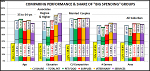
Now let’s get started with a look at the “Big Spenders”. The following 2 charts will compare the market share and performance in all Pet Industry segments by the groups responsible for the bulk of the spending in 10 demographic categories. These are the groups that we identified in our Total Pet analysis to generate at least a 60% market share of spending. As you recall, in the Service segments, we had to alter some groups slightly to better target the spending. However, to have a true side by side comparison we need to use the same groups for all. The market share dips below 60% in 4 situations, to a low of 55%. All these relate to Food, which is yet more evidence that pet parenting is demographically widespread. Even the low point is within 8% of our target and 92% of all measurements meet or exceed the 60% requirement, so the comparison is very valid.
The chart makes it especially easy to compare performance across categories. Remember, performance levels above 120% show a very high level of importance for this category in terms of increased spending. Unfortunately, it also indicates a high spending disparity among the segments within the category. There are 2 charts, each with 5 categories.
- White, Non-Hispanic – This group has an 84+% market share in every Segment. Minority groups account for 31.5% of CUs but only 10 to 16% of spending in any category. Factors: Lower incomes for Hispanics and African Americans and lower Pet ownership in Asians and African Americans. This group loss share in Veterinary and Supplies, with Supplies replacing Food at the bottom. Food and Services gained share and increased performance.
- 2+ People in CU – 2 is the magic number in pet ownership. The performance is remarkably even across all segments. Last year share and performance peaked with Food, then moved down through Supplies and Services. Veterinary took over the top spot in Share and Performance. All performances but Services increased because Singles had a bad year. This group is still under 120% because spending tends to go down in larger CU’s, especially 5+.
- Homeowners – Homeownership is very important in Pet Ownership and subsequently in all Pet Spending. It also increases with age. Supplies had a big increase in share and performance due to a spending lift by older Americans. Food also gained slightly for the same reason. The Services segments were basically unchanged.
- Over $50K Income – INCOME MATTERS MOST IN PET SPENDING! Pet Food still has the “lowest” high performance. Pet Ownership remains very common across lower incomes. The importance of income just increases as spending in industry segments becomes more discretionary – like Supplies and Services, or higher priced – like Veterinary Services. This group had gains in share and performance in all segments but Supplies. However, the gains, especially in Food, were largely fueled by middle and even lower middle-income groups.
- All Wage & Salary Earners – This group had the lowest performance of any group because Income varies widely and Self-employed and Retirees are significant contributors to Pet Spending. The group made gains in all but the Supplies Segment, which were driven by increases from lower income workers and a spending drop from the Self-employed.
- 35 to 64 yrs – Includes the 3 highest income segments. In 2016, share and performance were almost even across all segments. A big lift in Food and Supplies spending by the 55>64 yr olds drove up those segments and performance exceeded 120% for the first time. The 45>54 yr olds pushed an increase in Veterinary. However, a big lift in Services spending by the 65+ group combined with a decrease from 45>64 yr olds dropped performance below 120%.
- Associates Degree or Higher – Higher education often correlates with higher income. We see spending performance very similar to Income but even more pronounced. In 2017 the importance of Education was dialed back a little in the Services segments but remained stable in Supplies. The big change was in Food where the advantage almost vanished. This came as a result of a big spending lift from one segment – HS Grads w/some College.
- Married Couples – Being married makes a huge difference in spending in all segments. A minimum performance of 126% says it all. In 2017 their high performance became virtually even across all segments as they dialed back on Services but gained over 4 share points in Supplies.
- Everyone Works – Income is important, but the # of Earners became markedly less important in 2017 with a big drop in share and performance across the board. This was driven by a big year from 1 Earner, 2+ CUs and Retirees.
- All Suburban – Most Pet $ are spent here but the share and performance of this group has become more volatile. In 2016 they loss ground due to a big across the board spending lift by Central City. In 2017, they held their place in Supplies and Veterinary but lost share to Rural Areas in Food and Services. Food Performance fell below 100%.
Now we’ll drill a little deeper to look at the Best and Worst performing segments in each category. Color Highlighted cells are different from Total Pet; * = New Winner/Loser; ↑↓ = 5+% Performance Change from 2016. We will divide the categories into related groups. First, those related to Income.
- Income – Highest Income = Highest Performance. Lowest Income = Lowest performance. Income matters and it matters most in the nonfood segments. The performance and disparity are astronomical in the service segments. In most cases the winning performance is dropping, but so is the losing one. Gains are being made in the mid-range.
- # Earners – More earners = more income. Once again, income is even more important to the nonfood segments. However, 1 Earner, 2+ CUs had a great year. They won and even improved on the winning performance in 2016.
- Occupation – Mgrs & Professionals moved to the top in income and performance in 2 segments and Total Pet. Blue-Collar was the unexpected winner in Food, which is becoming more balanced. The Blue-Collar group also improved their performance in other segments, even in a losing cause.
Next are demographics of which we have no control – Age and Racial/Ethnicity
- Racial/Ethnic – As expected, White Non-Hispanics are the top performer in all segments. African Americans have the lowest average income and the lowest percentage of pet ownership of any group.
- Age – The 55>64 group led in Food & Total. The highest income group, 45>54 won Supplies and took over Veterinary from the 55>64 group. The 65>74 yr olds don’t have a high income but do have an increasing need for Services.
- Education – Winning and losing has been closely tied to more and less Education, except for 2017, in Pet Food.
- CU Composition – It was the year for Married Couples Only who turned their focus to their Pet Children. Although you can’t see it here directly, Single parents had a good year and got off the bottom in 2 segments and Total Pet.
- CU Size– It was absolutely the year of “2”. However, the woes of “1” continued.
- Housing – Homeowners w/Mortgage and Renters are the perennial winner and loser.
- Area– The winners are all areas <2500 population. Rural had a huge year in Food. The Services segment also had a surprise winner. Services Spending usually skews more urban. Central City dialed spending back after a great 2016.
- Region – The West as usual has the most wins. Spending in the South “headed South”.
Here are two summary charts. The first compares the averages.
It is immediately apparent that the difference grows as you move from Food to Supplies to Services. Spending becomes more discretionary. Additionally, while the difference between winners and losers in Total Pet is virtually unchanged from 2016, it grew larger in the Products segments and shrank in the Services segments. This is somewhat unexpected.
- Food – The high performance by some unexpected winners significantly drove up performance while the losing numbers were stable, so the disparity grew.
- Supplies – In Supplies the lift was more universal so the relative performance remained stable. A slight lift (<5%) by the winners combined with a slight decline by the losers produced a larger difference.
- Veterinary – No big changes but the winners and losers moved a little closer together.
- Services – The turmoil in the market shows. The big users saved money and the small users were attracted to spend. The net result was they moved a little closer. However, the difference is still huge.
This chart shows the number of new winners/losers.
Total Pet had few changes, especially in winners. Total Pet is a sum of the segments. This can mitigate or even cancel out extreme differences in segments. Always look below the surface.
- Pet Food had a major lift driven by unusual sources. It shows in their number of new winners.
- Pet Supplies had an almost universal increase. This produces very little change in top or bottom performance.
- The Veterinary spending increase also came from many of the usual groups.
- The Services segment was in a negative turmoil which resulted in a lot of changes, especially at the top.
Now, let’s look at the Demographic Segments with the Biggest Changes in $. We’ll truly see some differences between the Industry Segments. Only 9 of 110 segments are repeats. We have color highlighted differences from Total Pet and…
- Boxed w/green = Winner/Loser same as 2016
- ↕ = Flipped from 1st/Last in 2016 or vice versa
First, the Income related categories.
- Income – Winners: Looks like $100K+ was a key. The $40>69K win reflects the “blue-collar wave” in Food Spending.
- Losers: <$40K lost 4 of 5. Income matters. The $150>199K loss is may be tied to the big drop by Self-employed.
- # Earners – Winners – 1 Earner, 2+ CUs. In 2017 the number of Earners became much less important.
- Losers: From No Earner to 3+ Earners – a mixed bag. Of note, 3 losing CUs were singles.
- Occupation – The Blue-collar wave also increased spending enough in other segments to win Total Pet. We see the result of the decrease in CUs and spending by Self-employed. Mgrs & Professionals moved to the top in 3 segments.
Now the Age and Racial/Ethnic Categories
- Racial Ethnic – The biggest, most impactful spending group, White, non-Hispanics made a strong comeback. African Americans, due to a combination of low pet ownership and low income are often the losers. This year, the high income (also low pet ownership) Asians didn’t lose any segment but apparently were consistent low spenders.
- Age – The 55>64-yr old Boomers came back in a big way. They cut back (or got a better price) on Services but finished 1st or second in every other segment. The 75+ group won Services but lost Veterinary. The <25 group lost 2 segments and total but in 2 of 3 cases, including Total Pet Spending, they actually had a spending increase.
Now, here are more Demographic Categories in which the consumers can make choices.
- Education – College mattered less in Food but not other segments. Also, the HS Grads w/some College spent $1.17B more in other segments. This parallels the Blue-Collar pattern. Assoc. Degree flipped after a big year in 2016.
- CU Comp. – In 2017, it was Married Couples only or at least Adults Only. Not a good year for younger families.
- CU Size – It’s Simple: 2 was the number in 2017. Overall 1 came in last but still spent more in Total Pet than last year.
- Housing – Homeowners are back on top, although most winners have paid off their mortgage. This reflects the fact that much of the increase was driven by older CUs. Renters were strong in 2016 due to urbanization. Not in 2017.
- Area – Central City ruled in 2016 but in 2017 we saw a spending movement to areas <2500 pop., Rural or Urban. The larger Suburbs are also back on top in both Supplies and Veterinary. Only Services saw a decrease in any area.
- Region – The Midwest either won or lost. Also, it was a good year for the Northeast. The West or South are the usual winners, but not in 2017. However, like the Area category, every region spent more in all but Services.
I hope that this Visual Comparison helped you to get a “satellite view” of Pet Industry Spending in 2017. Please refer back to the earlier chapters to get more details.
There is another situation that we should address. 2017 was a spectacular year for the Pet Industry, with big spending increases in every segment but Services. There were so many contributors that in each individual chapter we recognized 6 segments that didn’t win but still performed so well that they deserved Honorable Mention. I reviewed that list again and came up with segments that won Honorable Mention in more than one segment. Here are the “SUPER HMs”.
- Retirees – Honorable Mention (HM) in 3 segments and Total – Need we say more?
- $40>69K – They had Honorable Mention in 2 segments and Total, but in Pet Food, they won for biggest increase.
- Single Parents – With financial challenges, they are usually at or near the bottom. Not in 2017 – 3 HM awards.
- A/O 2+ Adult Only CUs – 2 HMs, including Total so they performed well in more than just Food.
- 5+ People CUs – Even with large CUs and multiple children, Consumers still spend Pet $. 2 HMs, including Total Pet.
- HS Grad w/some College – They won the Food Segment and Total Pet plus had 2 segment HMs – quite a year!
Although there are numerous individual changes, I saw these trends of note:
- Value – There was great value in every segment and consumers responded. The 2017 increase was actually greater than Total Pet Spending in 1984. Because of the value, consumers essentially stopped trading $ between segments.
- Boomers Bounce Back – The lift was driven by older age groups, especially the 55>64 yr olds.
- Premium Penetration – Pet Parents want what’s best for their pet children. Premium Food became more accessible.
- Pet Parenting Increase – A likely increase in Pet Parents in the same low/middle income CUs that upgraded in Food.
- More balanced spending – in Income, Occupation, # of earners and Education. The groups in the middle and even some lower groups stepped up across numerous segments. Income still matters but the “bar” got a little lower.
- De-urbanization – 2016 was the year of Pet spending Urbanization. In 2017 the situation switched around. The best performance and biggest lifts came from low population areas- <2500. More space. More room for Pets and More $pending!
And Finally…..


